Specialist Advanced Tech & AI Platforms Comparison Website Template
Segment is an AI-powered personalization landing page template built for teams that need to make a data-driven case fast. It combines a live interactive demo header, modular industry-report cards, head-to-head comparison layouts, and a conversion-focused audit prompt into one commanding, dashboard-style single page.
by Rocket studio
Quick summary
Segment is a card-grid landing page template designed for personalization engine platforms. It opens with a functioning in-browser demo, escalates through data-backed modular cards, and closes every competitive claim with a single audit-focused call to action. The visual system feels like a command center built for decisions, not decoration.
Who this template is for
This template is built for teams that sell or champion real-time personalization technology. It speaks directly to buyers who need to prove return on investment before a single line of code ships.
- E-commerce directors running high-revenue online stores who are frustrated with flat conversion rates and irrelevant product recommendations
- Growth product managers at software platforms who need to show different onboarding experiences to enterprise buyers versus independent users
- Retention leads at media companies tracking churn and trying to justify investment in smarter audience experiences
What problem this template solves
Most personalization platforms lose deals not because the product is weak, but because the pitch is generic. A static screenshot and a bullet list of features do not close an eight-figure budget conversation.
- Prospects cannot feel what real-time personalization does from a PDF or a feature table alone
- Competitive claims go unverified when there is no structured comparison to legacy rule-based tools or outdated recommendation widgets
- High-intent buyers leave without a concrete next step when the page has no proof mechanism tied to their own site
What you get with this template
You get a fully structured, single-page layout that functions as both a live product demo and a business-case builder. Every section is designed to move a skeptical buyer from curiosity to conviction.
- An interactive header that simulates real personalization in the browser, no static image required
- A modular card grid where each card carries a data finding, a micro-chart reference, a competitive comparison, or a named case study metric
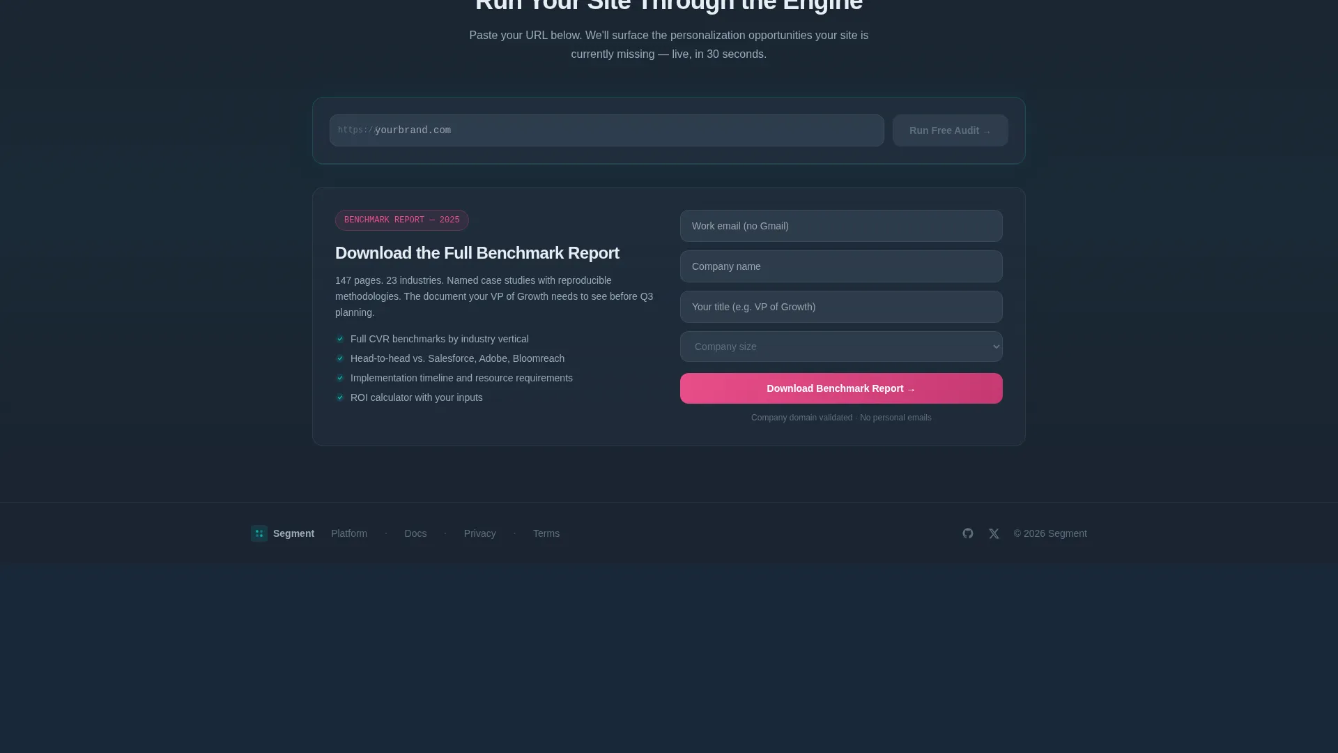
- A dual conversion path: a live audit input for high-intent visitors and a benchmark report download gate for those who need more evidence first
Feature list
This template packages several purposeful components that work together to build trust and drive action.
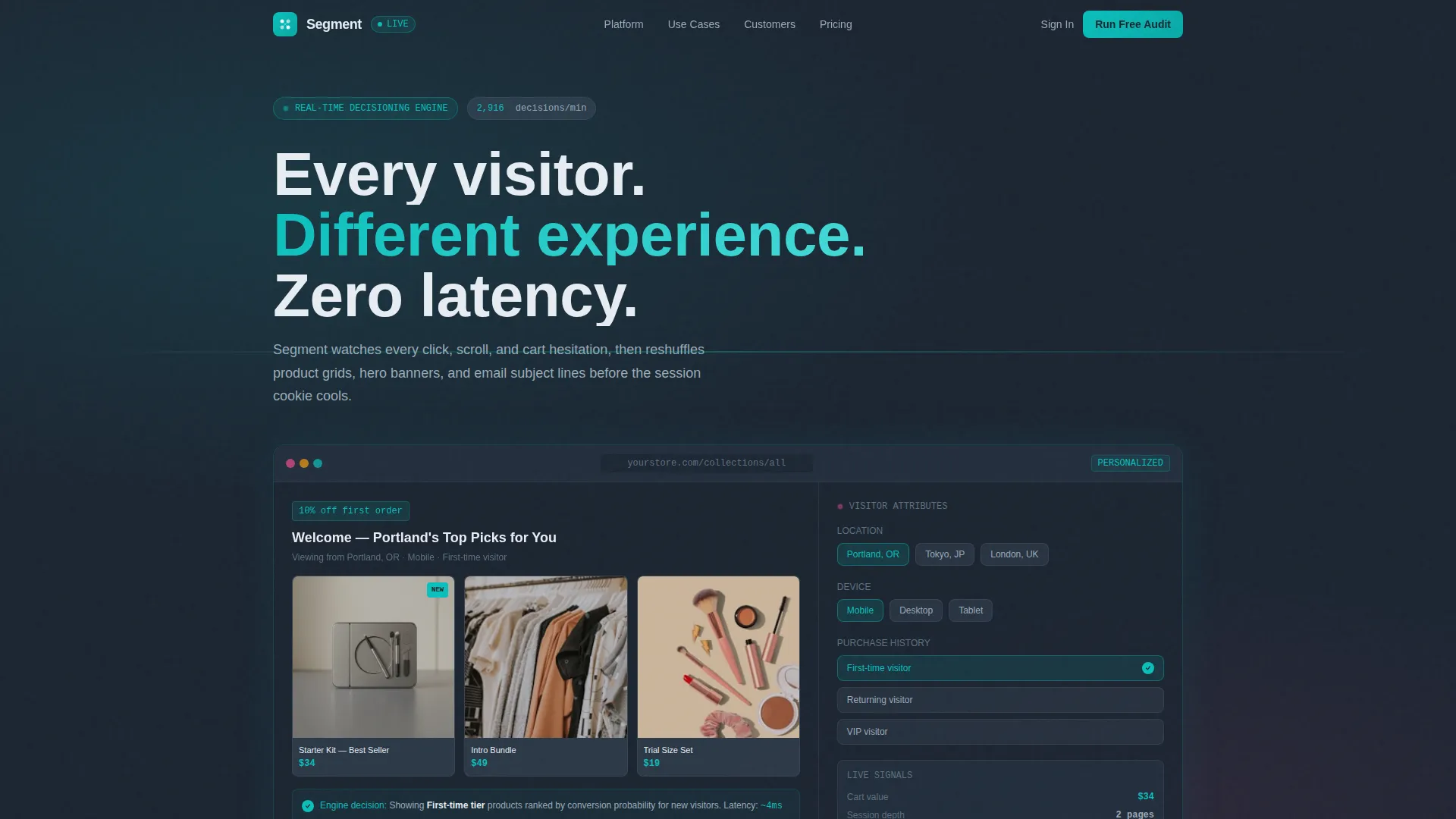
Interactive In-Browser Demo Header
The header renders a simulated storefront directly in the browser. Visitor attributes on the right panel toggle location, device type, and purchase history. The product grid, headline copy, and discount badge on the left rearrange in real time. The visitor experiences the product before reading a single feature claim.
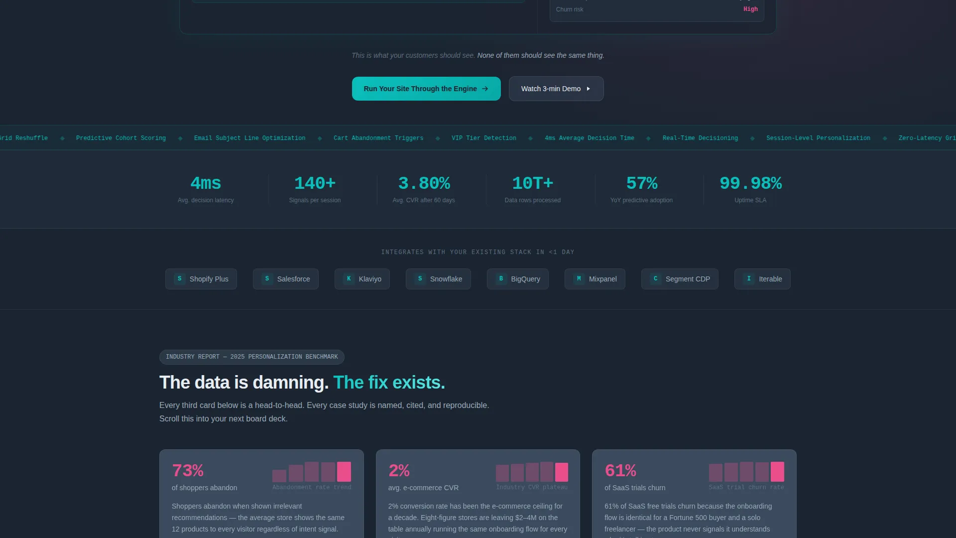
Modular Industry Report Card Grid
Each card in the grid is a self-contained data finding. Cards carry a statistic, a cited source reference, a micro-chart, and a teal annotation explaining how the engine addresses that specific failure point. The grid escalates from industry problem to competitive gap to named proof, building an airtight case card by card.
Head-to-Head Comparison Cards
Every third card flips into a structured versus layout. These comparison cards pit the personalization engine against legacy rule-based tools, manual A/B testing, and outdated recommendation widgets. Each comparison card ends with a micro call-to-action that scroll-anchors directly to the audit input field.
Named Case Study Proof Cards
Case study cards appear throughout the grid as proof punctuation. They carry specific named metrics, such as a percentage lift in average order value for a direct-to-consumer brand within a defined timeframe. These cards make the competitive case feel concrete and verifiable rather than hypothetical.
Dual Conversion Path Layout
The primary conversion path is an audit input field where visitors enter their site URL to trigger a simulated personalization opportunity report. The secondary path offers a downloadable benchmark report behind a work-email gate with company domain validation. Both paths feed the same proving moment.
Dashboard Pro Visual System
The layout uses a deep command-center charcoal base with teal as the primary active-state color. Cool slate surfaces the card backgrounds. Catalyst magenta is reserved exclusively for competitive differentiators and winning metrics. Every color communicates state and meaning, not style alone.
Page sections overview
| Section | Purpose |
|---|---|
| Interactive Demo Header | Let visitors experience live personalization before reading any copy |
| Single Tagline Line | Anchor the core promise beneath the demo with one memorable sentence |
| Industry Problem Cards | Lead the grid with data-backed failure statistics and source citations |
| Versus Comparison Cards | Pit the engine against legacy tools in a structured head-to-head layout |
| Case Study Proof Cards | Punctuate the grid with named metrics and real outcome examples |
| Primary Audit call to action | Capture high-intent visitors with a URL input and live audit simulation |
| Benchmark Report Gate | Offer a downloadable report behind a work-email and company-size form |
Design & branding system
The visual identity follows a Dashboard Pro theme using the Teal Catalyst color system. The palette is information-dense but never cluttered, with each color assigned a specific communicative role.
- Deep command-center charcoal (#1B2431) forms the page base, cool slate (#3B4B5E) surfaces card backgrounds, and primary teal (#0ABFBC) signals active states and system confirmations
- Catalyst magenta (#E94E8A) appears only on competitive differentiator callouts and winning metric highlights, keeping its impact sharp and intentional
- The overall aesthetic sits between a Bloomberg terminal and a Scandinavian interface studio: every visual element earns its place by communicating data state, not decoration
Mobile & speed optimization
The modular card grid is structured to adapt naturally across screen sizes. The layout prioritizes information hierarchy so that key data findings and calls to action remain prominent on smaller viewports.
- Each card is a self-contained unit, so the grid reflows without losing the logical escalation from problem to proof to conversion
- The dual conversion paths remain accessible at all scroll depths, keeping the audit field and the report download gate within reach regardless of device
How this template helps you convert
The conversion architecture is deliberate. Every structural choice funnels a skeptical visitor toward one proving moment: running their own site through the engine.
- The interactive header demo removes the most common early objection by letting visitors see personalization working before they evaluate any written claim
- The escalating card grid builds a business case in sequence, moving from industry data to competitive proof to named results, so the visitor arrives at the audit field already convinced
- Every comparison card ends with a scroll-anchored micro call-to-action, meaning competitive claims do not just inform the visitor but actively redirect them toward the conversion point
Other information about this template
This template is categorized under Advanced Tech and Artificial Intelligence Platforms within the Technology space. It is purpose-built for the personalization engine niche and carries a strong intersection match for teams operating at the convergence of those three classification layers.
- The template style is Card Grid (Modular), making individual sections easy to reorder, replace, or expand as the platform's messaging evolves
- The creative direction is Industry Report, meaning the page reads like a research-grade document that drops evidence progressively rather than front-loading a sales pitch
- The header concept is Interactive Preview, a live in-browser simulation rather than a static image or video embed
- The landing page direction is Comparison/Versus, so the structural logic centers on proving superiority over alternatives rather than simply listing capabilities
- This template is well suited for use by teams building on or pitching to audiences familiar with platforms such as Segment, where real-time data decisioning and audience personalization are core product expectations

Theme
Dashboard Pro
Creative direction
Industry Report
Color system
Teal Catalyst
Style
Card Grid (Modular)
Direction
Comparison/Versus
Page Sections
Interactive In-browser Demo Header
Modular Industry Report Card Grid
Head-to-head Comparison Cards
Named Case Study Proof Cards
Dual Conversion Path Layout
Related questions
Can I use this template without a live personalization engine connected?
How does the benchmark report gate work?
Is the card grid easy to customize for different industries?
What makes this template different from a standard product landing page?
Who is the gated benchmark report path designed for?


