No-Code Enterprise Software Professional Website Template
Sentinel is a hub-and-spoke landing page template built for no-code security information and event management (SIEM) platforms. It combines an animated dashboard header, anchor navigation, industry-stat-led spoke sections, and a frictionless freemium signup flow. The design runs on a void-black and electric-chartreuse palette that feels native to the security operations world.
by Rocket studio
Quick summary
Sentinel is a single-page, anchor-nav landing page template designed for no-code SIEM platforms targeting lean security teams. It opens with a living dashboard preview, guides visitors through five buyer-checklist spokes, and drives toward a free-tier signup. Every section leads with a problem stat, then immediately contrasts it with a product capability.
Who this template is for
This template was built for founders and practitioners who need to sell a no-code security platform to time-pressed buyers. It speaks the language of people who own security without a dedicated team behind them.
- Series-A startup CTOs running security operations with a small team
- Mid-market compliance managers preparing for SOC 2 audits without a dedicated Security Operations Center (SOC)
- DevOps leads who have been handed security responsibilities and need detections live quickly
What problem this template solves
Most security software landing pages describe features in abstract terms. Buyers who are under real pressure need proof, not promises. They need to see the product working before they hand over a work email.
- No-code SIEM platforms often lose buyers because pages bury the free tier details and add unnecessary signup friction
- Lean teams need to feel that setup is genuinely fast, not just marketed as fast
- Compliance-driven buyers need to see control mapping before they trust a new tool
What you get with this template
You get a fully structured, one-page layout with five named spoke sections, a sticky anchor navigation bar, and a freemium conversion flow. Every component maps to a real buyer moment in the security evaluation journey.
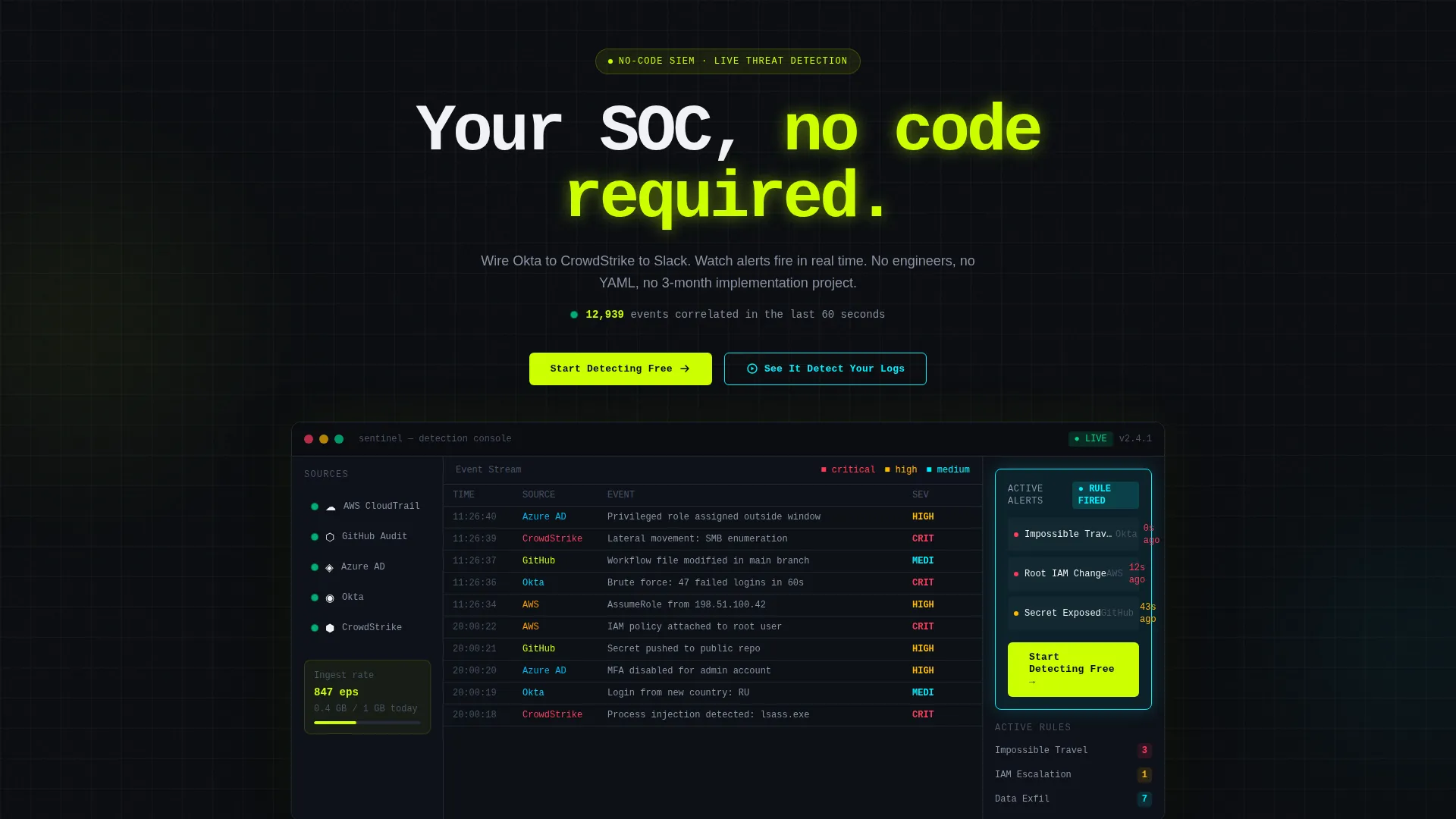
- An animated dashboard header preview showing connected integrations, a live event timeline, and firing alert cards
- Five anchor-nav spokes labeled Ingest, Detect, Respond, Comply, and Price, each opening with a sourced industry statistic
- A minimal two-field signup form and a secondary sandbox demo path built into the conversion flow
Feature list
This section covers the core structural and interactive capabilities built into the Sentinel template.
Animated Dashboard Header
The header fills roughly 80 percent of the viewport with a pixel-accurate recreation of the product interface. A left rail shows connected source integrations with green pulse indicators. A center pane streams new log rows every 1.5 seconds. A right-side alert card flashes cyan when a correlation rule fires. The primary call to action appears inside the mock as if it is a native product button.
Hub-and-Spoke Anchor Navigation
A five-spoke anchor nav bar pins to the top of the page on scroll. Each spoke label matches the buyer's real evaluation checklist: Ingest, Detect, Respond, Comply, and Price. This structure lets visitors jump directly to the section most relevant to their role without losing context.
Industry-Stat-Led Spoke Sections
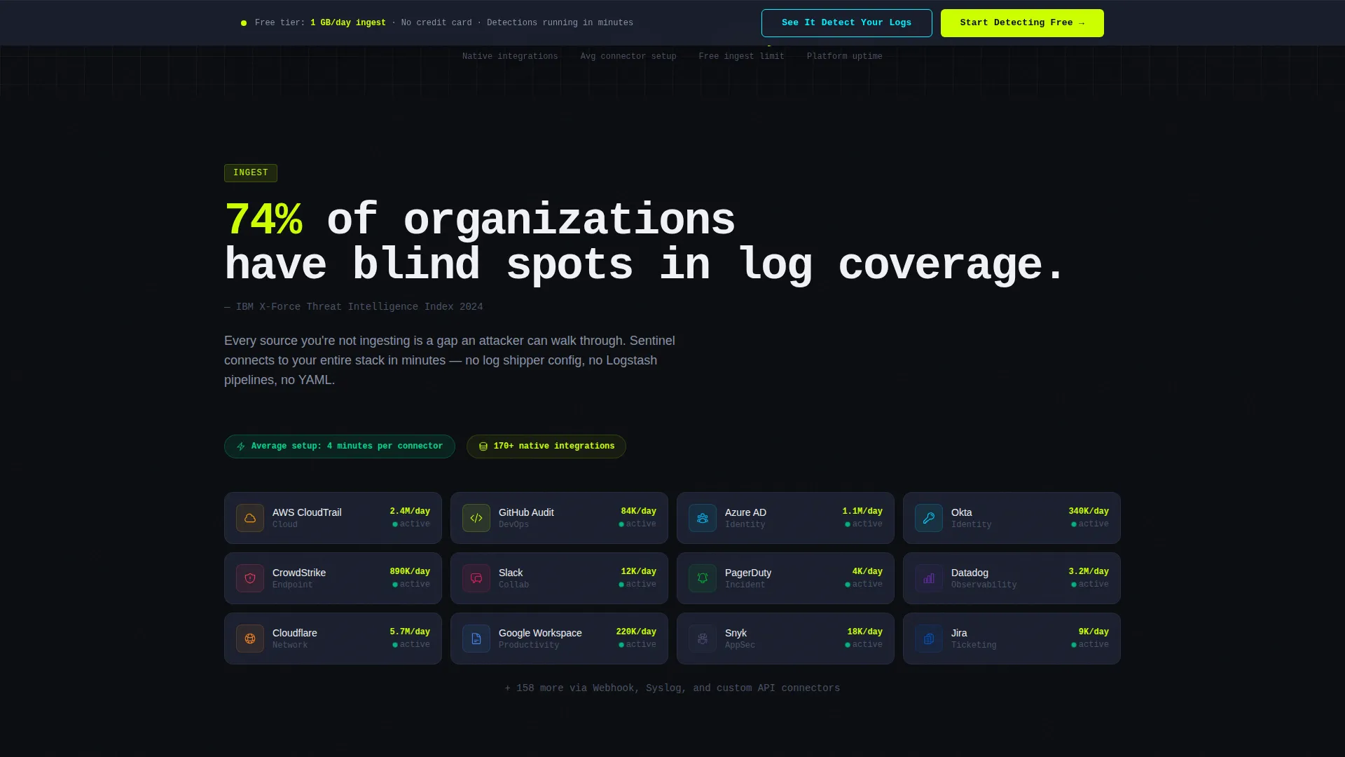
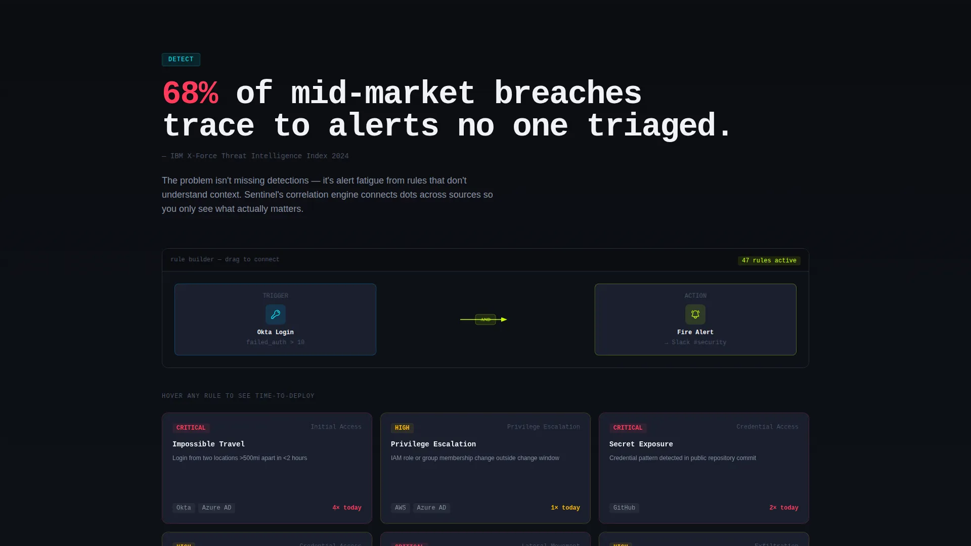
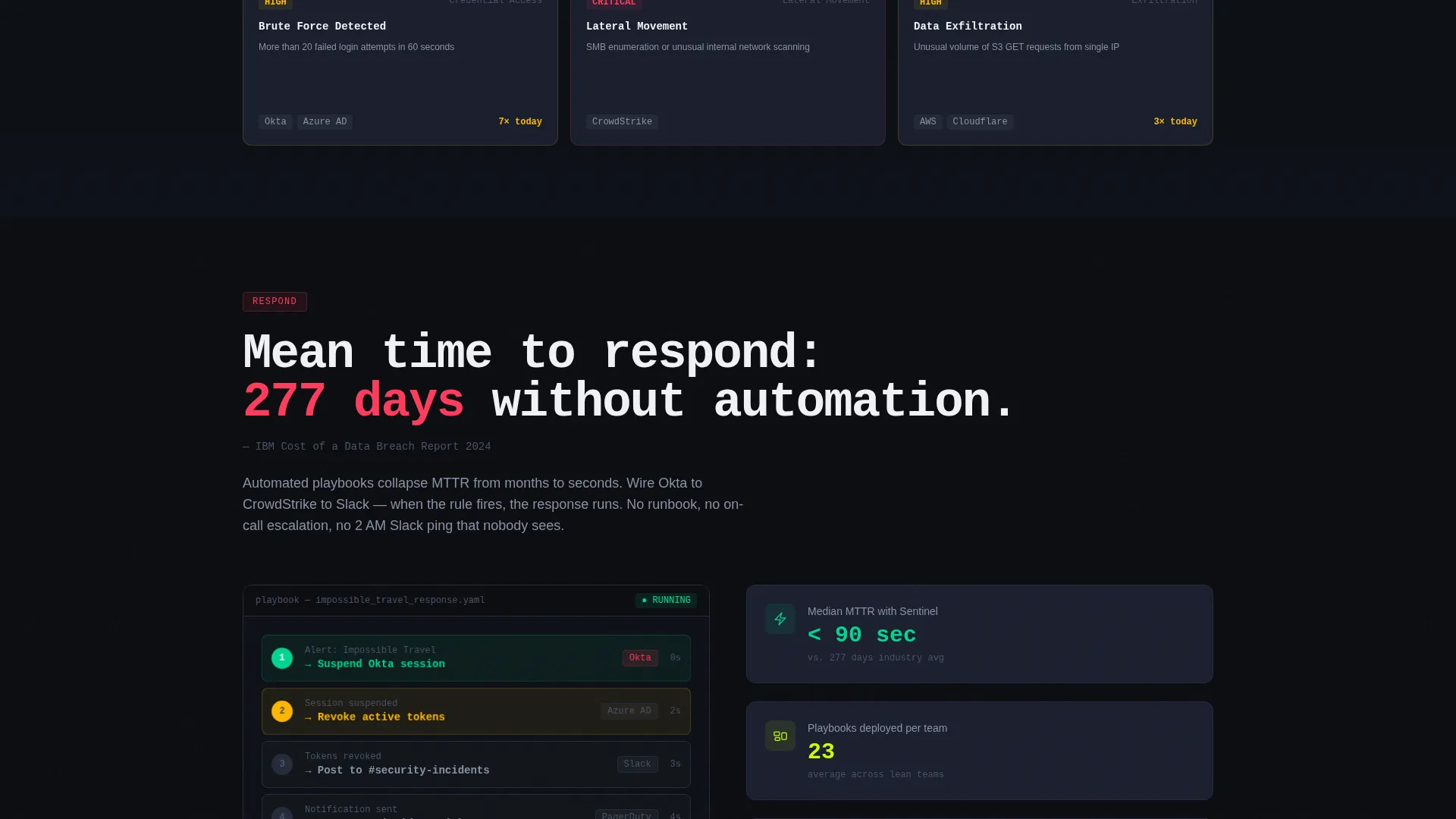
Every spoke section opens with a bold, sourced statistic drawn from breach-cost and staffing research. The stat is immediately followed by an annotated product screenshot that shows the relevant capability. The rhythm is problem, proof, then product, repeated across all five sections to escalate the cost of inaction while reducing perceived setup effort.
Micro-Interaction Layer
Connector icons animate into position as the visitor scrolls into each spoke. Detection rule cards flip to reveal an average setup time of four minutes. A compliance mapping table checks off SOC 2 controls as the visitor passes them on scroll. These interactions reward engagement and reinforce how fast the platform is to deploy.
Freemium Conversion Flow
The primary call to action, "Start Detecting Free," appears first inside the header dashboard mock and then resurfaces as a sticky bottom bar after the second spoke. The signup form asks only for a work email and a company name. A secondary path, "See It Detect Your Logs," opens a sandbox demo pre-seeded with synthetic attack data so prospects experience a real correlation firing before committing any live data.
Free Tier Transparency Block
The template states the free tier's 1 GB per day ingest limit plainly beside every primary call-to-action instance. Visitors never have to navigate away to find the catch. This honesty block is a deliberate trust signal placed at the point of maximum intent.
Page sections overview
| Section | Purpose |
|---|---|
| Dashboard header | Animate the product user interface and anchor the primary call to action |
| Sticky anchor nav | Let visitors jump to Ingest, Detect, Respond, Comply, or Price |
| Ingest spoke | Show log source connectivity with a stat and annotated screenshot |
| Detect spoke | Present correlation rule speed with a flip-card time-to-deploy reveal |
| Respond spoke | Demonstrate automated playbook flow with connector animation |
| Comply spoke | Show SOC 2 control mapping table with scroll-triggered checkmarks |
| Price spoke | State the free tier limit and paid tier options clearly |
| Sticky bottom bar | Resurface the primary call to action after the second spoke |
| Sandbox demo path | Let prospects experience a live correlation before signing up |
| Minimal signup form | Capture work email and company name with zero extra friction |
Design & branding system
The visual identity runs on the Acid Digital color system mapped to a Startup Velocity theme. It is built to feel like a dark-mode terminal at the moment a command returns successfully.
- Void black (#0B0D11) dominates every background surface; cool slate (#1A1F2E) fills card surfaces and the navigation rail
- Electric chartreuse (#CCFF00) drives every interactive element, live-count badge, and rule-trigger animation so nothing competes with the primary action
- Phosphor cyan (#00F0FF) marks secondary indicators and graph lines inside the dashboard preview; tight monospace typography runs the headline above the dashboard mock
Mobile & speed optimization
The template is structured for responsive display across screen sizes, with the dashboard header and spoke sections adapting to narrower viewports without losing the visual hierarchy.
- The sticky anchor nav and sticky bottom bar remain accessible on mobile so conversion entry points are never buried by scroll
- Micro-interactions are scoped to scroll triggers rather than autoplay, keeping motion purposeful and reducing layout complexity on smaller screens
How this template helps you convert
Sentinel is engineered to earn the click before asking for it. Every structural choice moves a skeptical, time-pressured buyer closer to the free-tier signup.
- The dashboard header shows the product working in the first three seconds of the visit, replacing abstract feature claims with visible evidence of the platform in motion
- The industry-stat-plus-screenshot rhythm in each spoke section frames inaction as the real risk, then immediately offers a concrete and fast-looking solution, compressing the buyer's perceived time to value
- The two-field signup form and the always-visible free tier ingest limit remove the two most common objections, friction and hidden cost, so the visitor's only remaining decision is whether to start now or later
Other information about this template
This template is designed for teams building or marketing no-code security platforms, but the structural pattern works broadly across enterprise software categories where proof-before-signup is the dominant conversion challenge.
- The Industry Report creative direction means each section functions as a mini-research brief, a format that resonates strongly with compliance and procurement buyers who are used to reading vendor reports
- The Freemium/Trial landing page direction means the template assumes a self-serve growth motion; it is not structured for a sales-qualified-lead form or a demo-request-only funnel
- The template style is Hub and Spoke with anchor navigation, which keeps a long single-page layout navigable without requiring a multi-page site structure
Theme
Startup Velocity
Creative direction
Industry Report
Color system
Acid Digital
Style
Hub & Spoke (Anchor Nav)
Direction
Freemium/Trial
Page Sections
Animated Dashboard Header Preview
Five-spoke Anchor Navigation
Stat-led Spoke Sections
Scroll-triggered Micro-interactions
Frictionless Freemium Conversion Flow
Related questions
Can I adapt this template for a sales-led funnel instead of a free tier?
How many anchor-nav spoke sections does this template include?
Is the animated dashboard header required, or can it be simplified?
What does the sandbox demo path show visitors before they sign up?
Where is the free tier ingest limit disclosed in the template?



