Privacy-First ITSM Comparison Landing Page Template
The Sentinel privacy-first ITSM comparison landing page template is built for security-focused IT teams who need to prove data sovereignty without apology. It pairs a dramatic void-and-violet visual identity with a scroll-driven feature matrix that makes the encryption gap between Sentinel and competing service management platforms impossible to ignore.
by Rocket studio
Quick summary
This single-page template gives privacy-first service management teams a sharp, high-conviction comparison landing page. The layout moves visitors from a full-width dashboard screenshot through a sticky feature matrix, then into a clear call-to-action bar. Every section is created to build trust row by row, turning skepticism into a confident click toward the live demo.
Who this template is for
This template is created for teams that sell or evaluate enterprise-grade service management tools where data security is non-negotiable. The design and copy architecture fit organizations where compliance is a boardroom conversation, not a checkbox.
- Security and IT leaders at mid-market healthcare firms navigating audit pressure and strict data governance requirements
- IT directors at European fintech companies who need documented data residency controls and verifiable configuration records
- Government system administrators who deploy infrastructure in air-gapped environments and cannot tolerate third-party cloud dependency
What problem this template solves
Most ITSM comparison pages treat security as a footnote. They list features without addressing the hard questions that a CISO or IT director actually asks during procurement. This template is created to address that gap directly.
- Competing platforms rarely disclose encryption architecture details, leaving buyers unable to quickly grasp where data exposure risk actually lives
- Standard comparison tables flatten every solution into similar-looking rows, hiding critical differences in deployment model and data residency controls
- Teams involved in regulated industries need a page that earns trust before asking for a click, not one that buries compliance details in a PDF download
What you get with this template
You get a fully designed, single-page comparison layout that is ready to configure with your own branding and content. Every component is created with a clear purpose tied to the buyer journey.
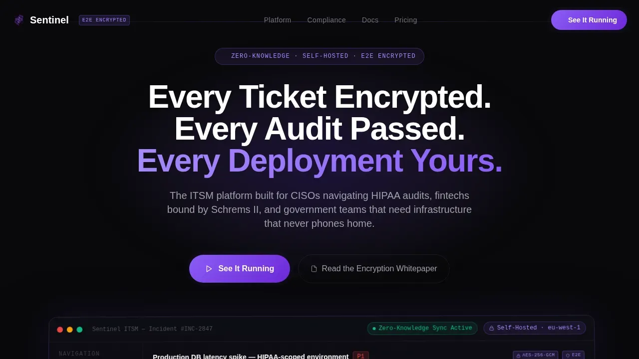
- A hero section with a tilted frosted glass dashboard screenshot card, ambient violet glow, and a fade-in headline that sets the security-first tone immediately
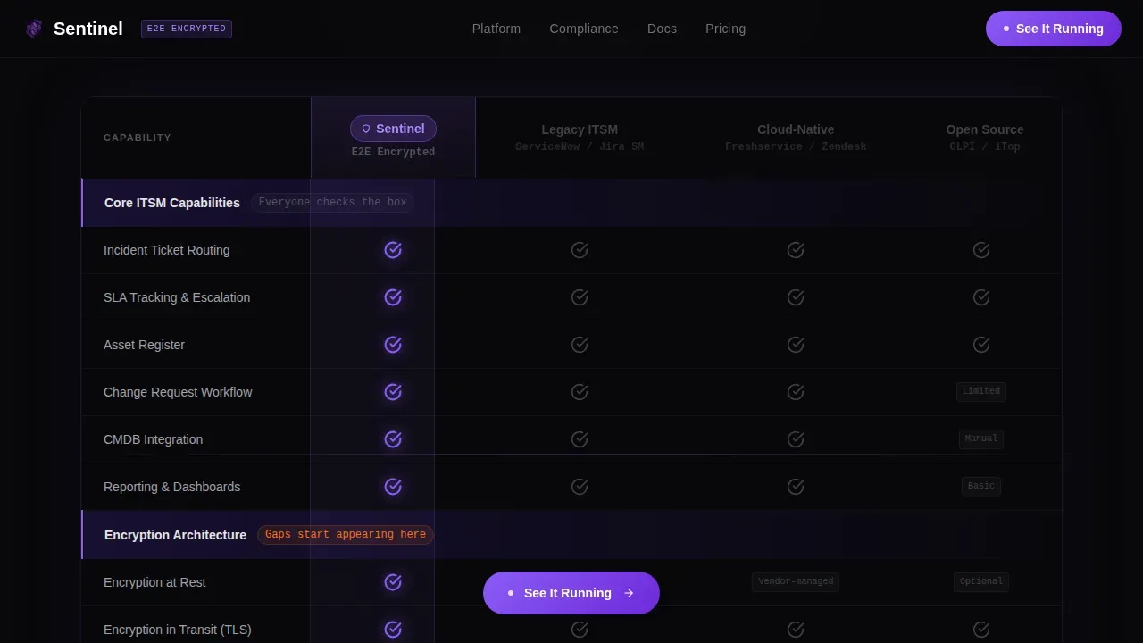
- A sticky feature matrix comparing your platform against three anonymized competitor columns, with scroll-triggered row animations and violet checkmark highlights
- A full-width call-to-action bar beneath the comparison table plus a floating pill button that follows the scroll, both linking to your live demo environment
Feature list
This template is built around components that serve a specific conversion goal. Each one is created with the right visual weight and interaction behavior to keep a technically sophisticated user engaged.
Scroll-Triggered Comparison Table
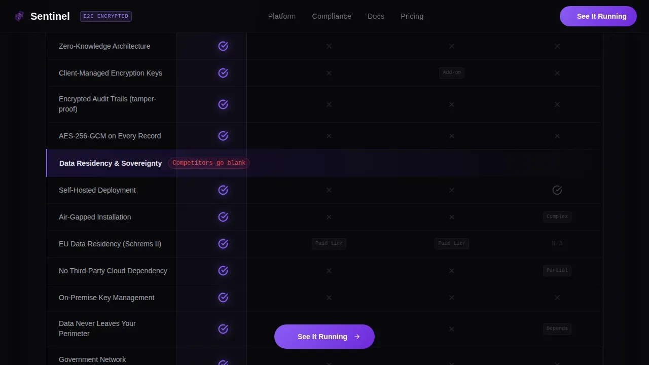
The core of the page is a sticky feature matrix that reveals rows as the visitor scrolls. Categories escalate in stakes: basic service management features appear first, then encryption architecture, then data residency controls, then compliance certifications. Violet checkmarks animate in against grayed-out competitor columns, building a visual pattern that makes the security gap undeniable.
Hero Dashboard Screenshot Block
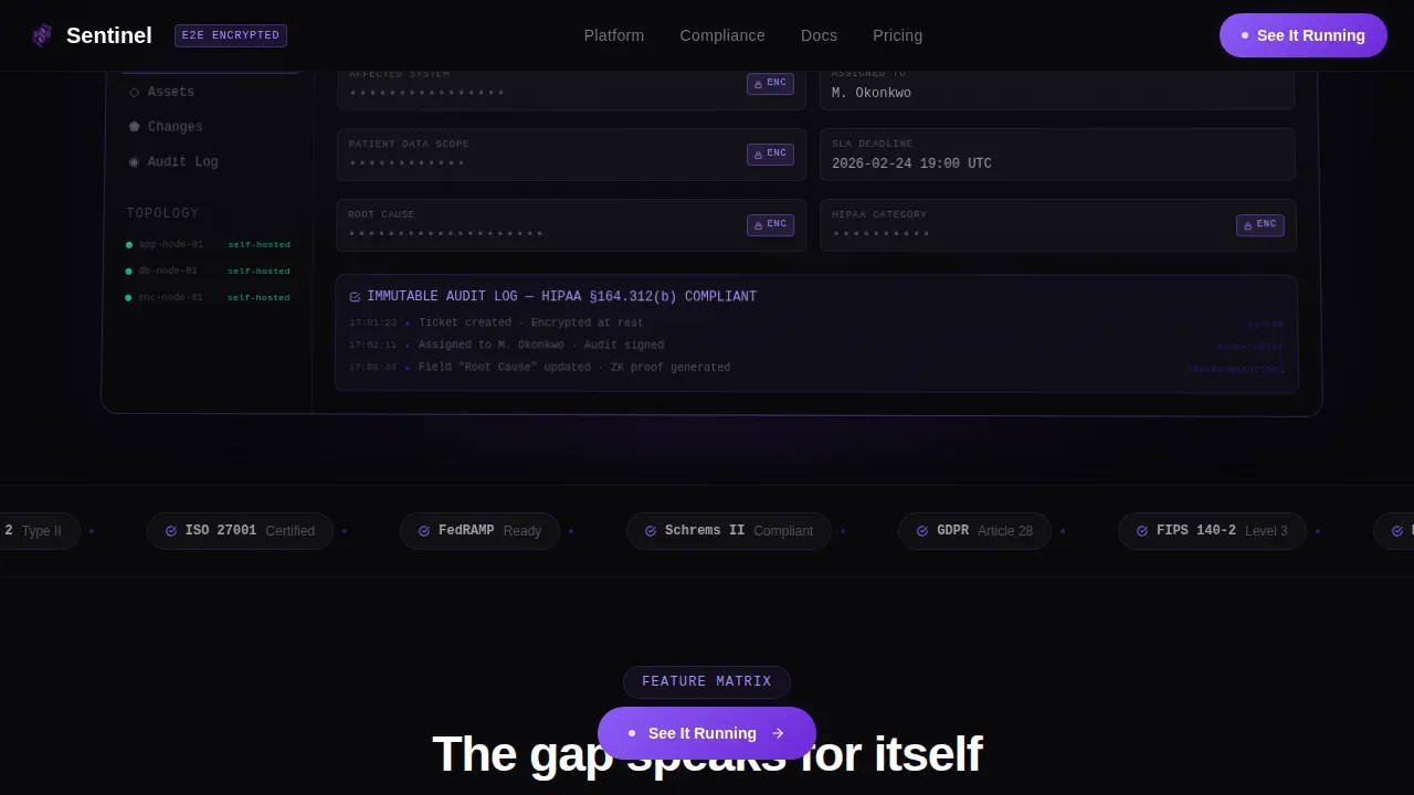
The header places a pixel-perfect dashboard screenshot on a frosted glass card tilted at a subtle two-degree perspective. The card floats above the void background with a soft violet ambient glow beneath it. The headline fades in above the card, setting a terminal-aesthetic tone that resonates immediately with security operations professionals.
Floating Call-to-Action Pill
A persistent pill button follows the scroll at all times, giving the visitor a low-friction path to the demo at any point in the page. The button pulses with electric violet to draw attention without disrupting the reading flow. No form is required on this page; the click leads directly to the interactive demo environment.
Animated Checkmark and Status System
Each comparison row uses a visual status system: violet checkmarks for supported capabilities, muted gray crosses for gaps. The animation trigger fires on scroll entry, so each row lights up as the visitor reaches it. This rhythm creates a sense of discovery that keeps the page feeling active rather than static.
Secondary Resource Link Block
Beneath the call-to-action bar, a plain text secondary link points technical buyers toward the encryption whitepaper. This gives a more cautious user a path that fits their due-diligence practices without cluttering the primary conversion flow. Both links are created to serve different buyer confidence levels in the same scenario.
Compliance Badge Footer Row
A linear single-row footer displays recognizable compliance certification marks. This social proof section is created to address the final hesitation a security leader might have before clicking through. Deployment counts and certification status indicators reinforce credibility at the bottom of the page.
Page sections overview
| Section | Purpose |
|---|---|
| Hero screenshot block | Establish security-first tone with dashboard visual and headline |
| Sticky comparison table | Show feature gap across service management competitors row by row |
| Call-to-action bar | Drive clicks to live demo with full-width and floating button |
| Secondary resource link | Capture technical buyers who need whitepaper details first |
| Compliance badge footer | Reinforce trust with certification marks and deployment status |
Design & branding system
The visual identity runs on a Void and Violet color system that treats darkness as the primary canvas. Every element floats on translucent frosted glass cards layered over absolute void black, creating an obsidian depth that signals serious infrastructure without feeling sterile.
- Core palette: void black at #09090B, deep ultraviolet at #2D1B69, electric violet at #8B5CF6 for active states and call-to-action pulses, cool zinc at #A1A1AA for body text, and pure white for headlines
- Typography pairing: Manrope for display headlines and user interface labels, JetBrains Mono for data fields, table values, and technical status indicators
- Border and surface treatment: one-pixel violet gradient borders on glass cards, frosted panel overlays at four percent opacity, and soft ambient glow beneath hero assets
Mobile & speed optimization
This template is designed desktop-first to match the workstation-based workflow of CISOs and IT directors. The layout scales to mobile as a fallback, preserving the core comparison table and call-to-action elements.
- Static content sections use server component architecture for fast initial load; scroll animation logic is isolated to client components to avoid blocking the main render
- The sticky table header and floating call-to-action pill are built to reflow cleanly on smaller viewports, keeping the primary conversion path accessible on any screen
- High-contrast void and violet palette maintains visual clarity without relying on color alone to convey comparison status
How this template helps you convert
This page is created to earn the click before it asks for one. The layout builds a logical, visual case that makes the demo feel like the only sensible next step.
- The comparison table escalates from familiar features to differentiating security capabilities, so by the time a user reaches data residency and audit-readiness rows, the gap is already visible and the call-to-action feels inevitable
- The floating pill button and the full-width bar beneath the table give the visitor two low-friction entry points to the demo, removing the need to scroll back up or search for a next step
- The secondary whitepaper link captures technical buyers who need cryptographic proof before they act, reducing drop-off from the segment most likely to become long-term enterprise customers
Other information about this template
This template is created for teams building or marketing privacy-first service management solutions in regulated industries. The design and section architecture reflect practices drawn from how security-focused buyers actually evaluate software.
- Microsoft Sentinel is Microsoft's cloud-native security information and event management solution, deployed in an organization's Azure tenant and accessed via the Microsoft Azure portal. Teams familiar with the Microsoft Sentinel platform will recognize the security operations workflows this template is designed to reflect.
- Microsoft Sentinel integrates with tools like ServiceNow for IT service management workflows. Logic Apps automate the Microsoft Sentinel integration with ServiceNow, enabling automatic ticket creation and bidirectional status sync. A ServiceNow incident created from a Microsoft Sentinel alert can trigger a run playbook action, and the ServiceNow instance updates automatically when incident status changes.
- Azure Sentinel, now known as Microsoft Sentinel, uses Azure Logic Apps as the foundation for automation. An automation rule in Microsoft Sentinel can define conditions that trigger specific actions without requiring deep technical knowledge to configure. Every automation rule should have a predefined use case to keep the automation architecture clear and maintainable.
- Azure workbooks support data analysis and visualization of security incidents across a log analytics workspace. A KQL query in workbooks can gather data and visualize security incident volume grouped by severity over a defined period. The log analytics layer allows teams to monitor alerts, compare incidents against baseline values, and export findings to a spreadsheet for further analysis.
- Microsoft Sentinel leverages native integrations with Microsoft Defender tools and Azure Monitor for analysis and automation capabilities across the enterprise digital landscape. The elastic compute and storage capabilities inherent in Azure give the Microsoft Sentinel solution a cost and scale advantage over on-premise log analysis options.
- Automation Rules in Microsoft Sentinel can be created using the built-in interface and do not require extensive knowledge before use. Organizations should configure service accounts with the correct permissions and avoid code reuse when multiple teams create separate playbooks. Defining adoption and migration budgets early supports a stable, cost-effective deployment strategy.
- This template is suitable for any company building a comparison page in the privacy-first enterprise software space. It can also support adjacent project scenarios such as security orchestration tool comparisons, cloud infrastructure vendor evaluations, or any context where an itil role-aware buyer needs to quickly grasp the advantages of one solution over another in the same table.
- The table of contents for this page is implicit in the scroll flow: hero, comparison, call-to-action, and footer. Buyers involved in procurement can search for specific capability rows without losing context, thanks to the sticky header that keeps column labels visible throughout the scroll.
Theme
Tech Glass
Creative direction
Feature Matrix
Color system
Void & Violet
Style
Comparison Table
Direction
Click-Through
Page Sections
Scroll-triggered Feature Matrix
Hero Dashboard Screenshot Card
Floating Pill Call-to-action Button
Animated Row Status System
Secondary Whitepaper Resource Link
Compliance Badge Footer Row
Related questions
Does this template include actual comparison data or placeholder content?
Can I change the number of competitor columns in the comparison table?
Is this page designed to collect leads directly?
What compliance certifications does the template display?
Who handles maintenance of the template after purchase?



