Cybersecurity Directory Landing Page Template
Sentinel is a hub-and-spoke cybersecurity directory landing page built for high-stakes buyers. It leads with an animated stats wall, a terminal-style search bar, and anchor-nav spokes covering threat categories, top-rated vendors, new arrivals, and compliance-mapped listings. A two-step lead form captures qualified shortlist requests, while a separate path converts vendor signups.
by Rocket studio
Quick summary
Sentinel is a single-page cybersecurity directory landing page built around urgency and depth. It opens with a live-style metrics wall, moves through anchor-nav spokes, and closes with a two-step lead generation form. The design runs a terminal-black and phosphor-green color system that mirrors a real network operations center environment.
Who this template is for
This template is built for teams that run or launch a cybersecurity vendor directory. It serves both the buyers browsing the directory and the providers wanting to be listed.
- Security procurement leads and CISOs building shortlists before board reviews
- Startup CTOs who need an incident response partner fast after a failed audit
- Directory operators and platform founders who need to convert both supply and demand leads
What problem this template solves
Finding a trusted cybersecurity vendor under time pressure is genuinely hard. Buyers need to compare options by threat type, compliance framework, and budget without wading through generic results. This template gives a directory platform the structure and visual credibility to earn that trust immediately.
- No clear way to signal directory scale and quality at first glance
- Buyers bounce when filtering options feel shallow or poorly organized
- Supply-side providers lack a clear path to claim or submit a vendor profile
What you get with this template
You get a fully structured, single-page hub-and-spoke landing page designed specifically for a cybersecurity directory and listing site. Every section is purpose-built to move a specific type of visitor toward a specific action.
- An animated stats wall header with rolling counters and a terminal-style search bar
- Four anchor-nav spokes: Threat Categories, Top Rated This Quarter, New Arrivals, and Compliance Mapped
- A two-step progressive lead form and a separate vendor profile claim path
Feature list
This template packs several tightly scoped features that work together to build credibility and drive conversions in a high-trust, high-stakes niche.
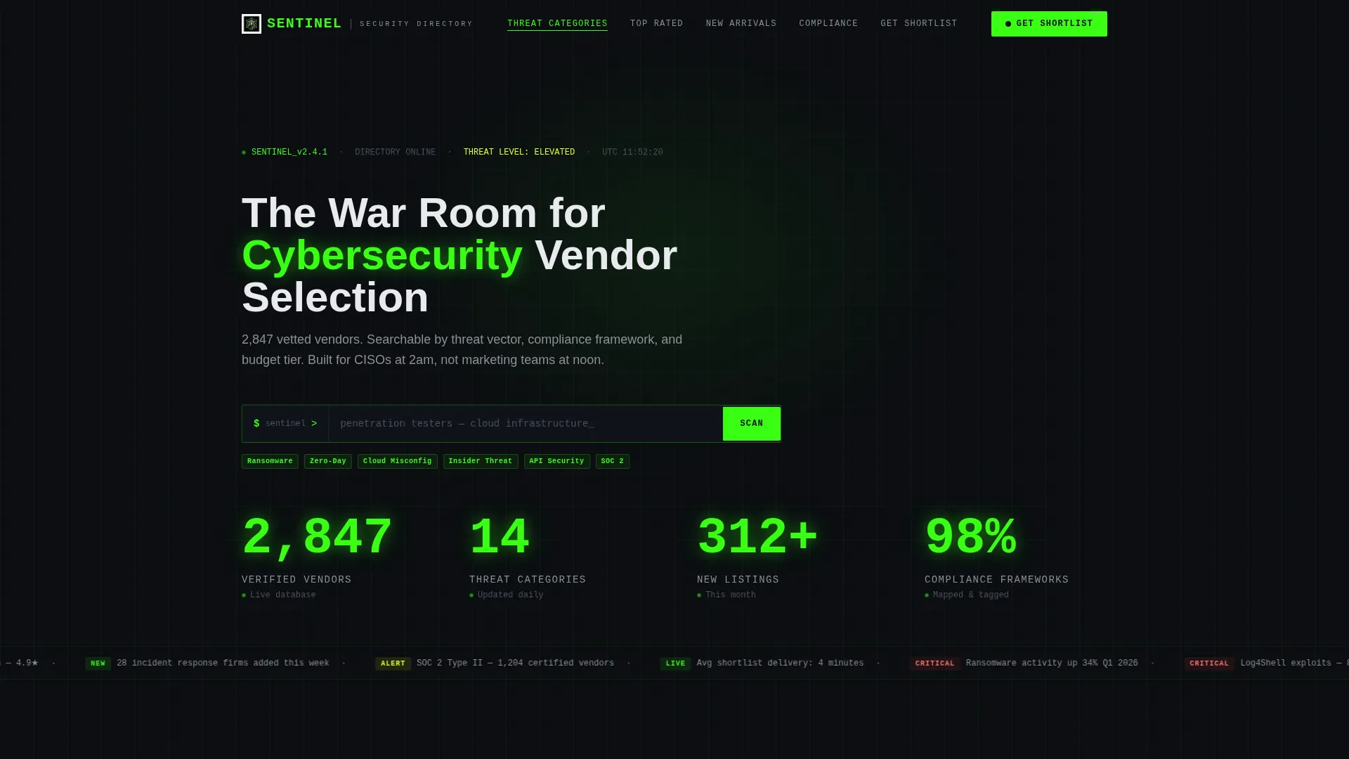
Animated Stats Wall Header
The header fills the full viewport with a dark canvas. On load, counters animate upward in phosphor-green monospace type, displaying figures like verified vendor counts, threat categories, and new monthly listings. A blinking cursor sits inside a terminal-style search bar pre-filled with ghost text, making the data itself the visual centerpiece.
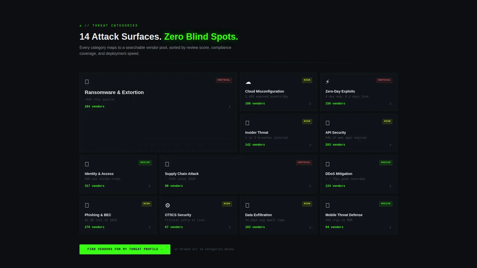
Hub and Spoke Anchor Navigation
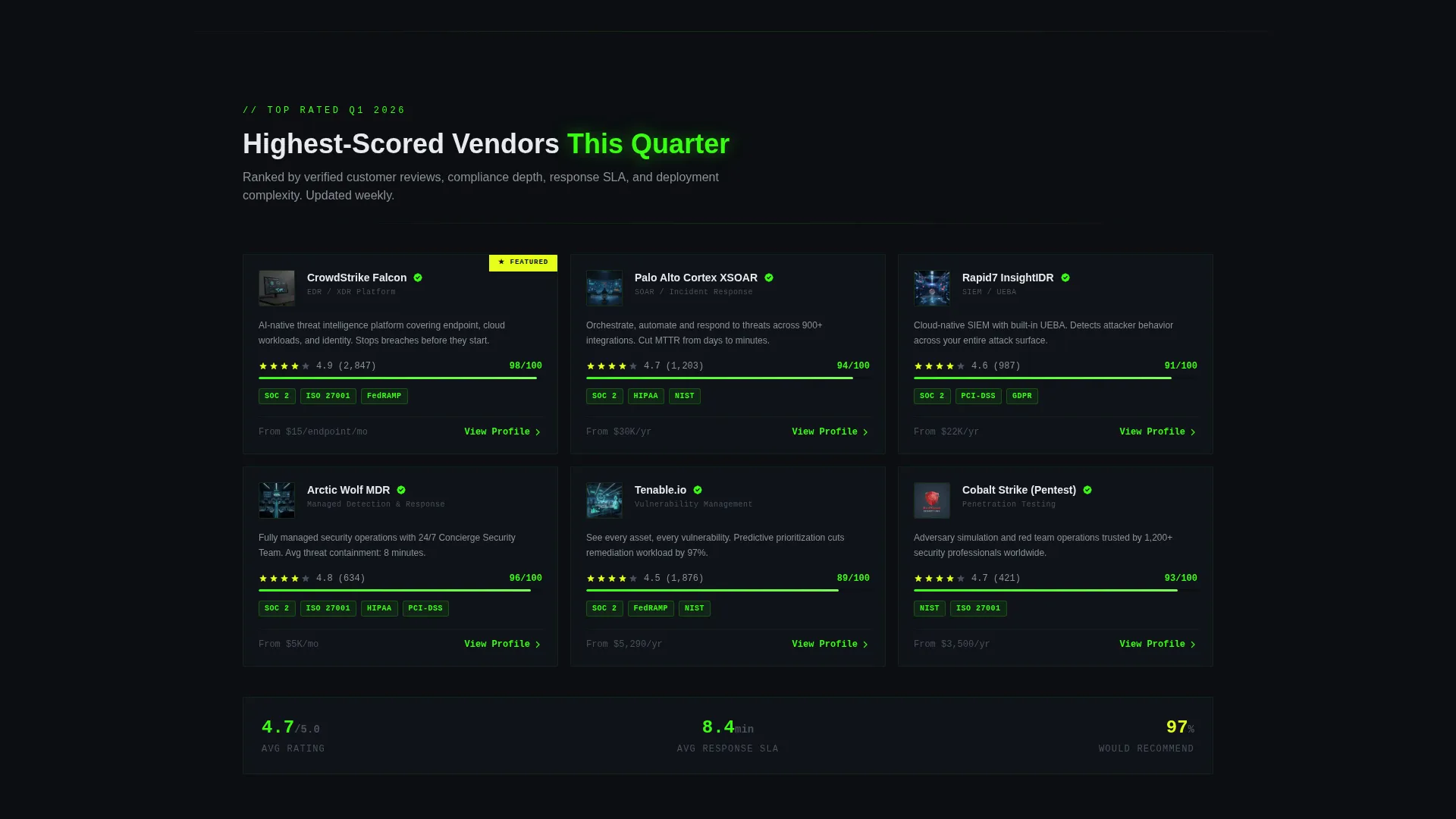
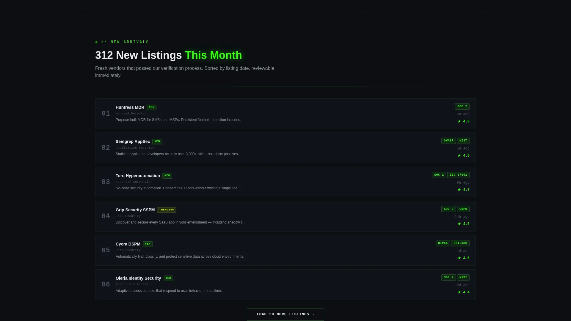
A persistent anchor navigation bar links to four distinct spokes: Threat Categories, Top Rated This Quarter, New Arrivals, and Compliance Mapped. Each spoke loads with a micro-animation styled like a system module initializing. This structure lets visitors jump directly to the content tier most relevant to their current task.
Compliance-Mapped Filtering Section
The Compliance Mapped spoke organizes vendor listings by framework, covering categories such as NIST, ISO 27001, and HIPAA. This gives procurement-focused visitors a direct path to vendors who already align with their required standards, reducing shortlist effort significantly.
Two-Step Progressive Lead Form
The primary call to action, labeled "Get Your Shortlist," uses a two-step form. Step one collects industry vertical and primary threat concern via dropdown, with options including ransomware, insider threat, and cloud misconfiguration. Step two captures company size, compliance requirements, and work email. No phone field is included, respecting this audience's data caution.
Dual Conversion Paths
The page cleanly separates buyer and vendor conversions. Visitors seeking vendor recommendations follow the "Get Your Shortlist" form flow. Vendors and providers follow a separate "Claim Your Vendor Profile" path. Both paths are visible without competing, keeping the page focused while serving two distinct audiences.
Launch Energy Scroll Sequencing
The page is structured as a countdown-style scroll experience. Sections escalate in specificity, moving from overall directory scale to curated picks to granular compliance filters to live review scores. Every section ends with a contextual call to action that deepens engagement rather than repeating the same generic prompt.
Page sections overview
| Section | Purpose |
|---|---|
| Stats Metrics Wall | Animate directory scale on load and prompt search |
| Anchor Nav Bar | Provide fast access to all four content spokes |
| Threat Categories Spoke | Browse vendors organized by threat vector |
| Top Rated Spoke | Surface highest-scored vendors this quarter |
| New Arrivals Spoke | Highlight recently added and verified listings |
| Compliance Mapped Spoke | Filter vendors by regulatory framework |
| Get Your Shortlist Form | Capture qualified buyer leads in two steps |
| Claim Vendor Profile | Convert provider visitors into supply-side leads |
Design & branding system
The visual identity runs the Acid Digital color system on a Dashboard Pro theme. Every design decision reinforces the feel of a live network operations center rather than a standard marketing page.
- Terminal black (#0B0E11) dominates all backgrounds, creating a focused nocturnal atmosphere
- Phosphor green (#39FF14) marks live data, active states, counter animations, and primary calls to action
- Voltage yellow (#E4FF1A) fires only on alerts, badges, and hover states; signal white (#E8EAED) keeps body text readable without breaking the dark environment
Mobile & speed optimization
The template is structured for a clean mobile experience. The anchor navigation and spoke sections are designed to reflow gracefully at smaller screen sizes.
- Counter animations and terminal search bar scale down without losing their visual impact on narrow viewports
- The two-step form collapses into a single-column layout on mobile, keeping the input flow straightforward
- Section-by-section scroll sequencing works naturally on touch devices, maintaining the countdown-style momentum across all screen sizes
How this template helps you convert
The conversion architecture is built around earning the click before asking for it. Visitors see proof of directory depth before they ever reach a form field.
- The animated stats wall establishes scale and legitimacy within the first few seconds, so buyers arrive at the form already trusting the data behind it.
- The two-step progressive form reduces friction by splitting the ask into two small steps, and the absence of a phone field signals respect for this audience's privacy expectations.
- The dual conversion paths separate buyer and vendor intent cleanly, so neither audience feels like they landed on the wrong page.
Other information about this template
This template is built specifically for the cybersecurity directory and listing site niche. It is suited to founders, operators, and marketing teams launching or relaunching a vendor discovery platform in the security space.
- The template style is Hub and Spoke with anchor navigation, making it straightforward to expand or reorder spokes as the directory grows
- The Dashboard Pro theme and Acid Digital color system are pre-configured and do not require custom color work to match the intended aesthetic
- Creative direction follows a Launch Energy pattern, meaning the scroll experience is intentionally paced to build urgency and specificity as visitors move down the page
- The header concept is a Stats and Metrics wall, a proven pattern for directory-style pages where volume and verification signal trustworthiness before any copy is read
Theme
Dashboard Pro
Creative direction
Launch Energy
Color system
Acid Digital
Style
Hub & Spoke (Anchor Nav)
Direction
Lead Generation
Page Sections
Animated Stats Wall Header
Hub and Spoke Anchor Navigation
Compliance-mapped Filtering Section
Two-step Progressive Lead Form
Dual Conversion Paths
Launch Energy Scroll Sequencing
Related questions
Who is this landing page template designed for?
Can the template handle both buyer and vendor audiences at the same time?
What does the two-step lead form collect?
How many anchor-nav spokes does the template include?
Can I update the counter numbers shown in the stats wall?


