Sequence - Powerful Genetictesting Landing Page Template
Sequence is a comparison table landing page built for genetic testing booking. It lets patients, clinicians, and self-pay users filter, compare, and book tests side by side, sorted by panel size, turnaround time, insurance acceptance, and lab accreditation. The interface leads with a live, interactive data table that makes the value proposition impossible to miss.
by Rocket studio
Quick summary
Sequence is a single-page, data-first template designed for genetic testing booking platforms. Visitors land on a functioning mini-table, filter tests by the criteria that matter most to them, and move toward booking without friction. The layout feels like a professional industry report, dense with trust signals, easy to scan, and built to convert through comparison.
Who this template is for
This template serves a specific intersection of clinical and consumer users. It was designed with real decision-makers in mind, not a generic healthcare audience.
- Genetic counselors triaging carrier screening options for couples under time pressure
- Oncologists ordering hereditary cancer panels, such as BRCA screens, who need fast, reliable lab comparisons
- Self-pay patients searching for whole exome sequencing who need plain-language guidance through clinical terminology
What problem this template solves
Booking a genetic test online is often chaotic. Lab websites bury pricing, hide turnaround times, and rarely let users compare options head to head. Sequence removes that friction entirely.
- Patients cannot easily compare panels, gene counts, and out-of-pocket costs across multiple labs in one place
- Clinicians waste time hunting for insurance pre-authorization data and lab accreditation details scattered across separate websites
- Self-pay users searching by condition or gene name hit walls of jargon with no clear next step
What you get with this template
You get a fully structured comparison table landing page with interactive filtering built into the header itself. Every section is designed to build trust through data density, not marketing language.
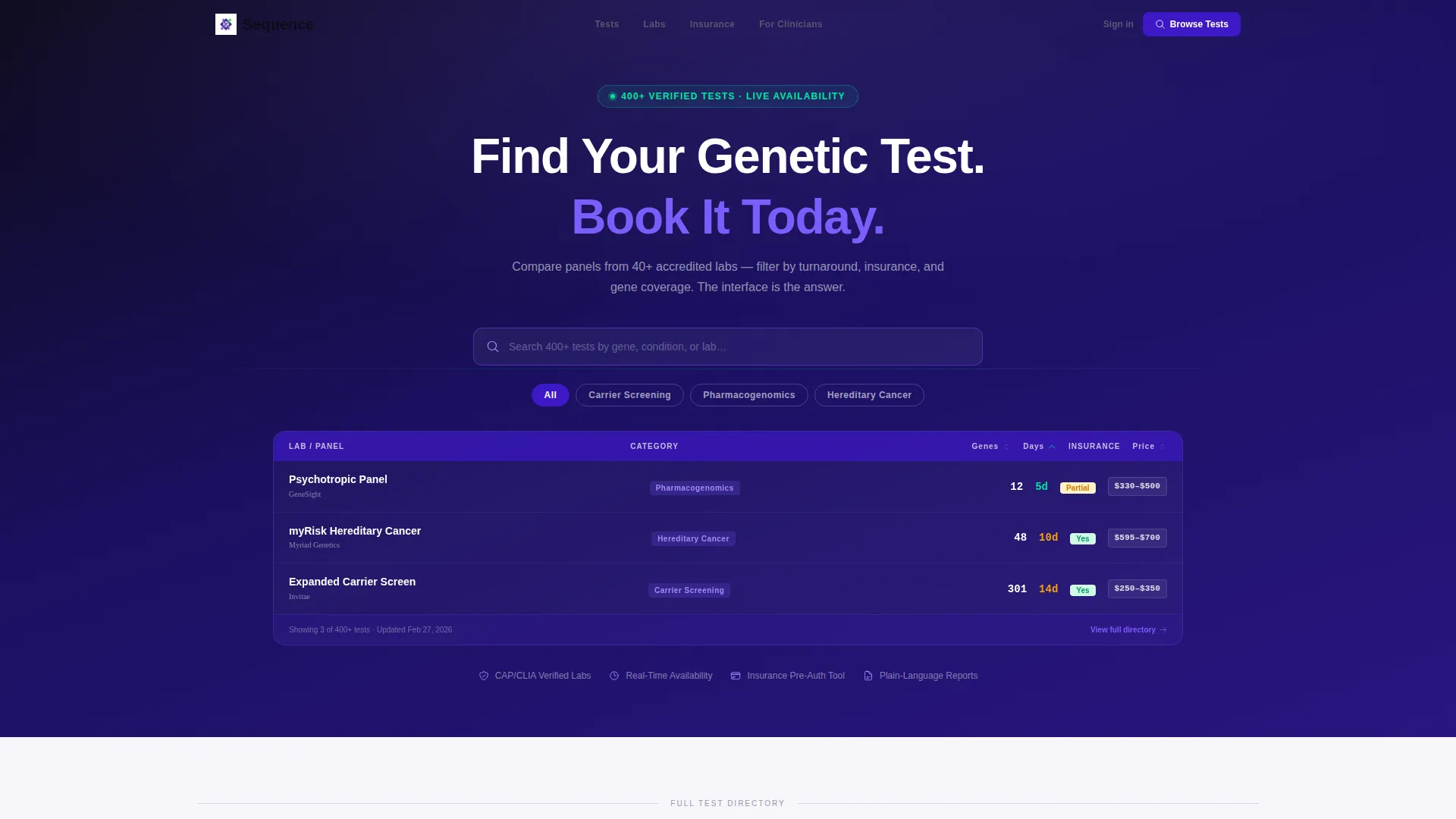
- An interactive header table pre-loaded with three test categories: carrier screening, pharmacogenomics, and hereditary cancer panels
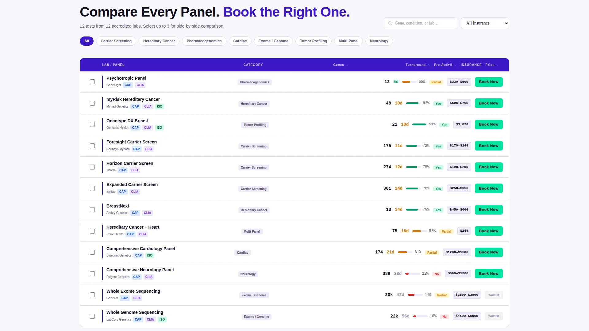
- A sticky "Compare Selected Tests" bar that activates when a visitor selects two or more rows, opening a side-by-side detail overlay
- A three-step booking form covering test confirmation, insurance or self-pay toggle, and specimen collection method selection
Feature list
This template delivers six tightly scoped features, each grounded in the comparison-first experience the brief describes.
Live Interactive Header Table
The header skips hero images entirely. Instead, it loads a functioning mini-table with real columns for lab name, panel gene count, average turnaround in business days, and a live price-range badge. Visitors can sort and filter before they scroll a single pixel.
Search Bar with Ghost Text Prompt
A blinking cursor inside the search bar displays the ghost text "Search 400+ tests by gene, condition, or lab..." This sets the scope of the directory immediately and invites exploration rather than passive reading.
Sticky Comparison Bar
Once a visitor checks two or more test rows, a sticky bottom bar labeled "Compare Selected Tests" appears. It opens a side-by-side detail overlay complete with gene overlap Venn diagrams and out-of-pocket cost estimates.
Inline "Book Directly" Row Action
Each table row includes a "Book Directly" button styled in sequencing-green (#00E5A0). It leads to a focused three-step form: test selection confirmation, insurance or self-pay toggle, and preferred specimen collection method (blood draw or mailed saliva kit).
Data-Dense Trust Sections
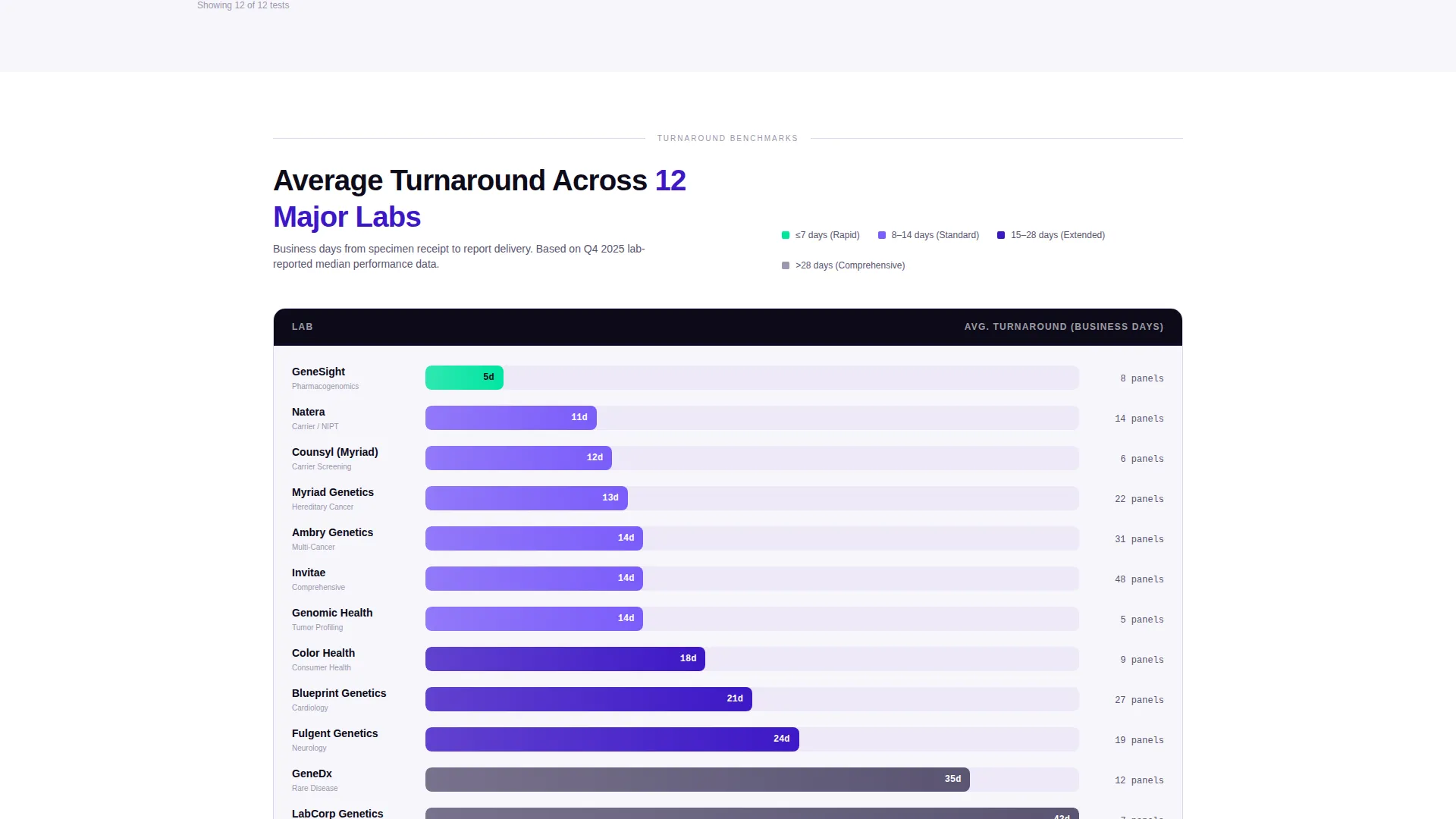
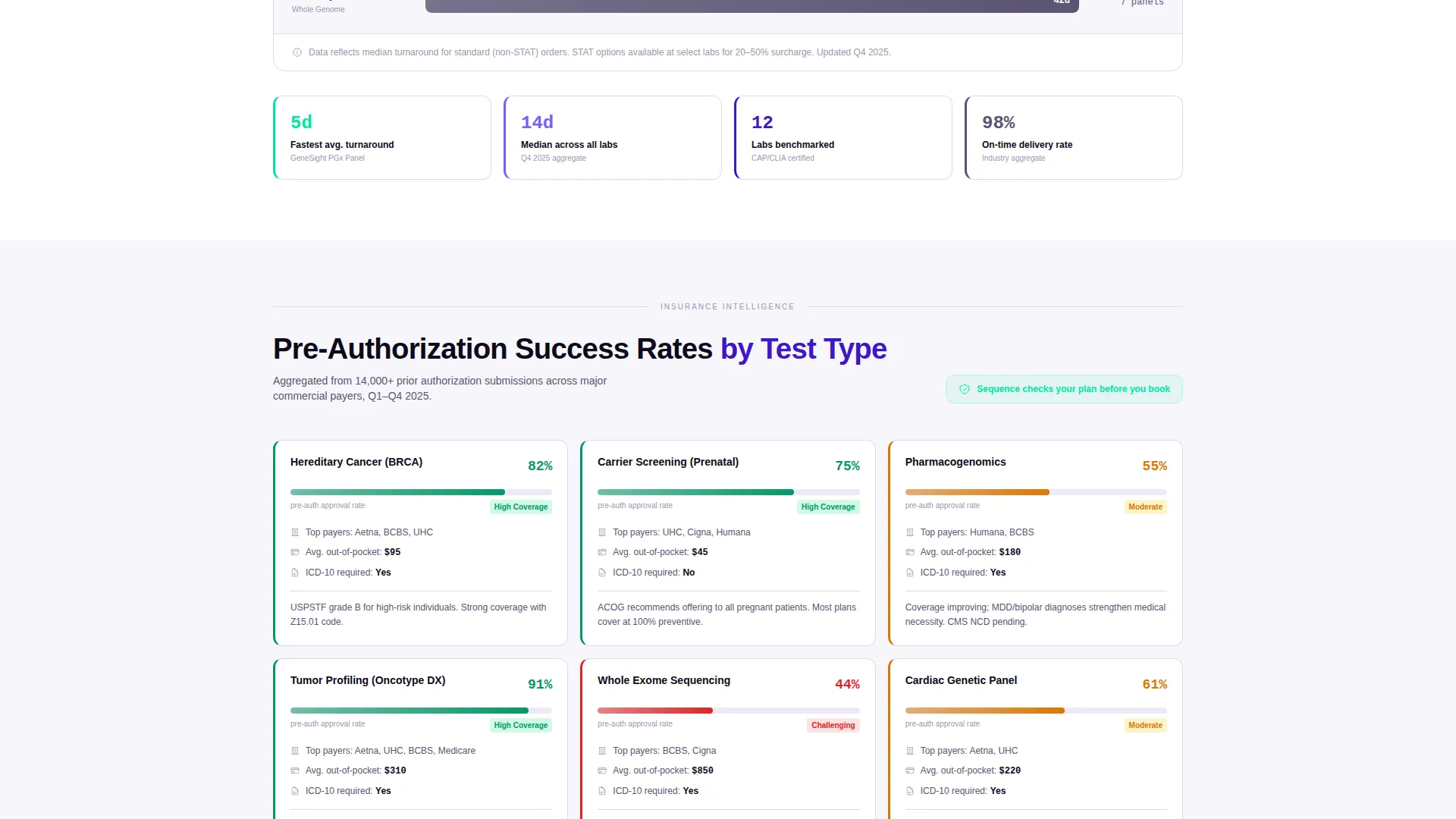
After the interactive header, the page scrolls through sections styled like a published white paper. These include horizontal bar charts of average turnaround benchmarks across twelve major labs, insurance pre-authorization success rates by test type, and a methodology note on how listings are verified.
Directory and Discovery Layout
The overall page follows a Directory and Discovery theme. Content is organized so each scroll reveals more evidence rather than more persuasion, turning the reading experience into a process of informed decision-making.
Page sections overview
| Section | Purpose |
|---|---|
| Interactive Header Table | Let visitors filter and sort tests immediately on arrival |
| Search Bar | Direct entry by gene name, condition, or lab |
| Turnaround Benchmarks | Show average turnaround across twelve labs via bar charts |
| Pre-Authorization Rates | Display insurance success rates by test type |
| Listing Methodology Note | Build credibility by explaining how labs are verified |
| Sticky Comparison Bar | Trigger side-by-side overlay when two rows are selected |
| Side-by-Side Overlay | Compare gene overlap and cost estimates in detail |
| Three-Step Booking Form | Confirm test, set payment method, choose specimen type |
Design & branding system
The visual identity follows an Electric Indigo color system. Every color choice serves a functional role, making the interface feel like a lab monitor rather than a marketing page.
- Deep data-field indigo (#3D17C6) anchors headers and table column spines; luminous helix violet (#7B5CFA) activates on hover states and active filters
- Clinical white (#F7F6FB) fills table cell backgrounds to maintain readability across dense data rows
- Sequencing-green (#00E5A0) is reserved exclusively for "Book Now" buttons and availability badges, creating a clear and consistent action signal
Mobile & speed optimization
The template is structured to remain navigable on smaller screens without losing the data density that makes it useful. Comparison-heavy layouts require particular care on mobile viewports.
- The interactive header table is designed to stay functional and scrollable on touch devices
- The sticky comparison bar and three-step booking form maintain their usability at reduced screen widths
- Section-by-section scroll pacing mirrors an industry report cadence, keeping content digestible even on a phone screen
How this template helps you convert
Sequence converts through a comparison-first flow. By the time a visitor clicks any call to action, they have already done the work of deciding.
- The interactive header table hooks visitors immediately with utility, making the interface itself the pitch before a single marketing claim appears.
- The sticky "Compare Selected Tests" bar creates a natural, low-pressure next step the moment a visitor engages with two rows.
- The three-step booking form reduces drop-off by breaking the commitment into small, clear decisions: which test, how to pay, and how to submit a sample.
Other information about this template
This template is designed for the genetic testing booking system niche within the broader Genetic Testing Vertical SaaS category. It sits at the intersection of directory utility and conversion design.
- The template style is a Comparison Table, making it well suited for any vertical where side-by-side decision-making drives purchases
- The creative direction follows an Industry Report cadence, which is particularly effective for clinical and health-tech audiences who respond to evidence over emotion
- The header concept is an Interactive Preview, meaning the first thing a visitor sees is a working tool, not a tagline
- This template is categorized under Technology and is built to support Genetic Testing Vertical SaaS platforms that need a patient-facing or clinician-facing booking interface
Theme
Directory & Discovery
Creative direction
Industry Report
Color system
Electric Indigo
Style
Comparison Table
Direction
Comparison/Versus
Page Sections
Live Interactive Header Table
Search Bar with Ghost Text Prompt
Sticky Comparison Bar
Inline Book Directly Action
Data-dense Trust Sections
Directory and Discovery Layout
Related questions
Who is the primary audience for this template?
Does the template include the booking form?
Can this template work as a lab directory without a booking flow?
What makes the comparison overlay more than a standard popup?
Is this a single-page template or a multi-page layout?



