Maintenance Services Landing Page Template
Dispatch is a single-page home services landing page template built for tradespeople, franchise managers, and marketing agencies. It leads with a dashboard-style hero, walks visitors through a structured feature comparison table, and closes with layered calls-to-action. The dark Midnight Blue visual system feels operational from the first scroll, and every section is designed to earn the conversion before the visitor leaves.
by Rocket studio
Quick summary
Dispatch is a home services landing page template with a bold Midnight Blue design system, a dashboard hero section, and a feature comparison table at its core. It is built for owner-operators, franchise managers, and agencies who need a site that communicates professionalism and booking-readiness immediately. The layout guides every visitor toward a clear action.
Who this template is for
This template is designed for people in the trades who need a credible online presence fast. It also serves the teams managing multiple locations or building sites on behalf of clients.
- Owner-operators such as independent plumbers and electricians scaling beyond referrals
- Franchise managers who need a consistent, deployable page across dozens of locations
- Marketing agencies building and white-labeling home services sites for their trade clients
What problem this template solves
Many home services businesses rely on outdated social profiles or no website at all. That means missed calls, lost jobs, and no way for potential customers to self-serve a booking. This template addresses the gap between "no presence" and "fully operational."
- Gives tradespeople a professional starting point without a lengthy agency engagement
- Replaces the visual chaos of generic themes with a purpose-built layout for home services
- Shows prospective customers proof of capability before they ever pick up the phone
What you get with this template
The template delivers a complete, structured single-page layout built around a comparison-table creative direction. Every section has a defined role, from the hero mockup to the bottom email capture.
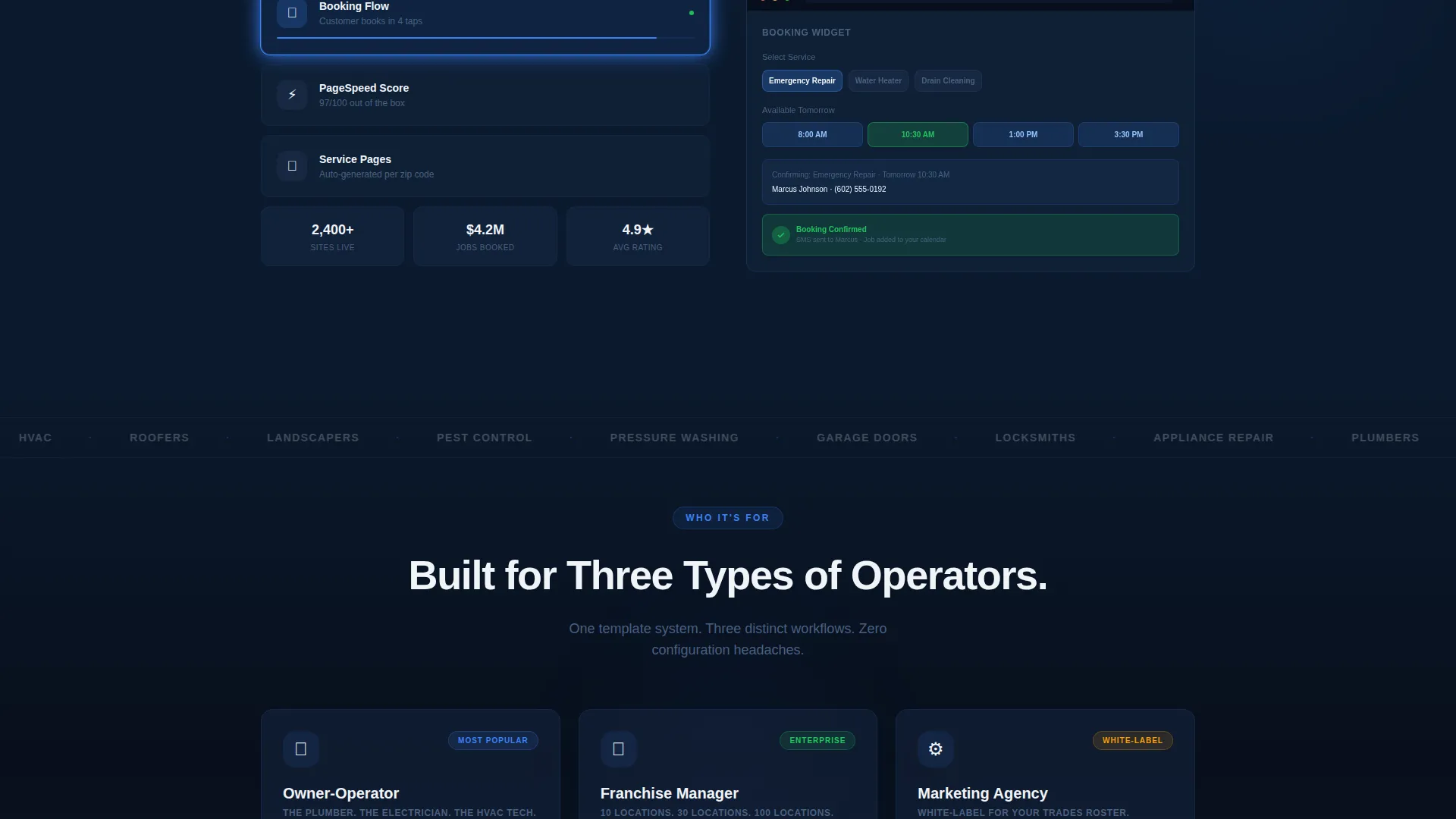
- A browser-frame dashboard hero with an angled mockup, booking widget preview, review carousel, service area map, and a pulsing click-to-call button
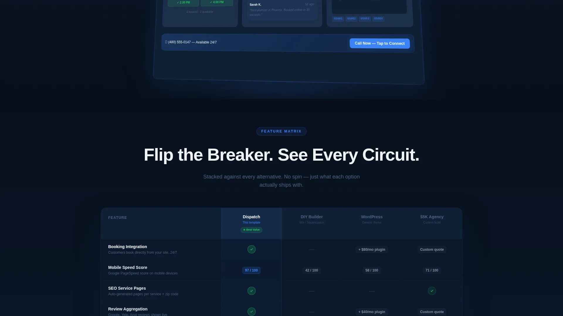
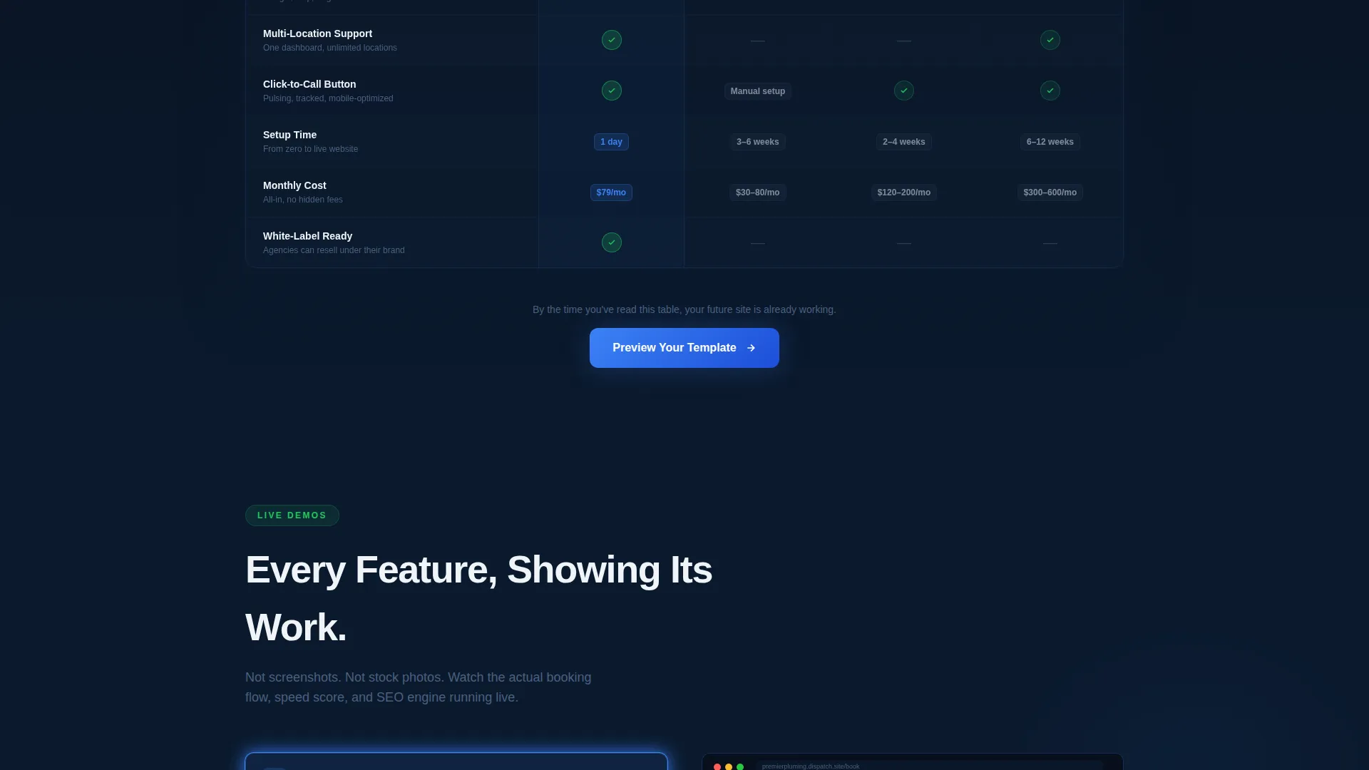
- A feature matrix comparing this template against a do-it-yourself build, a generic theme, and a high-cost agency project
- Three strategically placed calls-to-action: beside the hero, floating after the comparison table, and above a single-field email capture at the bottom
Feature list
This template is built around a defined set of visible components and interaction patterns drawn directly from the design brief.
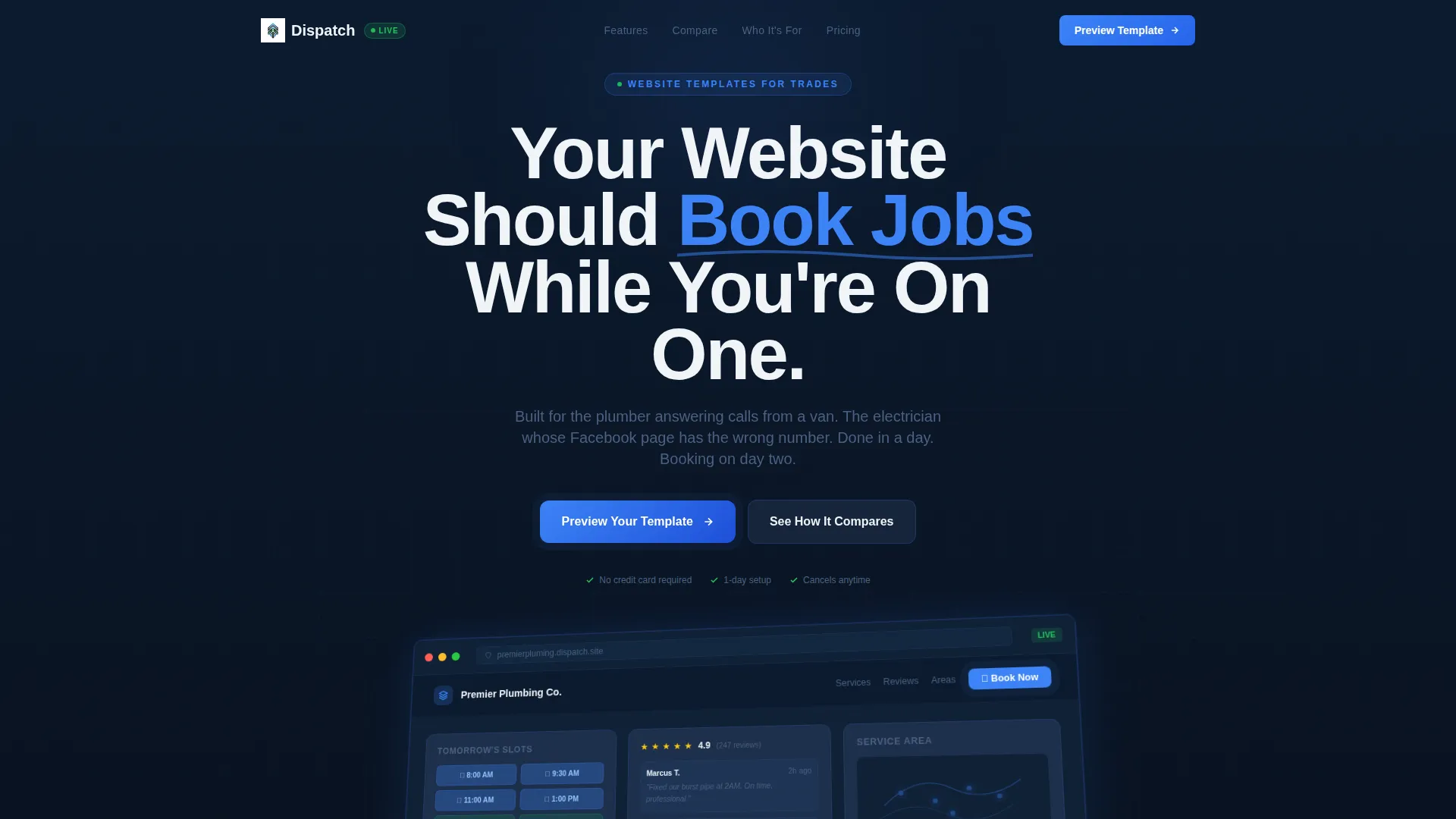
Dashboard Hero with Browser Mockup
The header opens with a browser-frame screenshot of a home services site mid-operation. It shows a booking widget, a review carousel, a zip-code-highlighted service area map, and a pulsing click-to-call button. The mockup floats at a slight angle over the dark background with a soft ambient glow beneath it.
Structured Feature Comparison Table
The core of the page is a matrix that stacks this template against three alternatives: a do-it-yourself build, a generic theme solution, and a premium agency project. Rows cover booking integration, mobile speed, search-engine-ready service pages, review aggregation, and multi-location support. Signal green checkmarks and muted dashes make the comparison immediately readable.
Micro-Demo Expansion Blocks
Below the comparison table, each winning feature expands into a short animation or visual proof. These include a booking flow animation, a before-and-after speed screenshot, and a service page that auto-populates from a zip code entry. The pace of visual reward accelerates with each scroll.
Layered Call-to-Action System
The primary call-to-action, "Preview Your Template," appears three times across the page. It sits anchored beside the hero, floats after the final table row, and returns at the bottom above a single-field email capture for visitors who are not yet ready to click through.
Midnight Blue Visual System
The color palette uses deep navy, interface slate, electric blue for interactive elements, and clean off-white for content surfaces. Signal green marks active states and checkmarks. Every color has a functional role, and together they create a fleet-management-screen aesthetic that feels operational rather than decorative.
Startup Velocity Theme Structure
The layout follows a Startup Velocity theme, meaning sections are tight, purposeful, and acceleration-paced. Each scroll delivers new proof. There is no filler content between sections, and the visual momentum builds from hero to final call-to-action without interruption.
Page sections overview
| Section | Purpose |
|---|---|
| Dashboard Hero | Opens with a browser-frame mockup showing the template in active use |
| Headline Fade-In | Delivers the core value message above the hero mockup |
| Feature Matrix Table | Compares this template against three real-world alternatives row by row |
| Micro-Demo Blocks | Expands each winning feature into a short animation or visual proof |
| Floating call to action Bar | Anchors the primary call-to-action after the comparison table |
| Email Capture Strip | Collects visitor emails with a single field for those not yet ready to click |
Design & branding system
The visual identity follows a Midnight Blue color system designed to feel operational and authoritative. It draws from the aesthetic of fleet management software and command-center dashboards, applied to a home services context.
- Core palette: deep command-center navy (#0B1A2E), interface-panel slate (#1C2E4A), live-wire electric blue (#3B82F6) for interactive highlights, and dispatch white (#F0F4F8) for content surfaces
- Accent color: signal green (#22C55E) used exclusively for checkmarks and active states in the comparison table
- Theme style: Startup Velocity, meaning tight section spacing, purposeful type hierarchy, and a layout where every pixel carries a functional role
Mobile & speed optimization
The template is structured to render clearly on mobile screens without losing the visual weight of the comparison table or the hero mockup. The layout adapts so that the core selling sections remain readable at any viewport width.
- The comparison table is designed to scroll or reflow cleanly on smaller screens so rows remain legible
- The layered call-to-action system keeps at least one conversion touchpoint visible regardless of scroll depth or screen size
How this template helps you convert
The page is built around a show-don't-tell conversion philosophy. Every design decision from the hero through the final email capture is oriented toward moving the visitor forward.
- The dashboard hero shows a working home services site before any copy is read, giving visitors an immediate sense of what they are getting rather than asking them to imagine it.
- The feature comparison table creates a clear value argument without requiring the visitor to do research elsewhere, removing friction from the decision.
- The three-touch call-to-action system meets visitors at different levels of readiness, so no one leaves without a clear next step.
Other information about this template
This template suits a range of deployment contexts and is practical for both independent operators and agency teams managing multiple client accounts.
- The white-label use case is supported by the design structure, which is neutral enough to be rebranded for different trade businesses without rebuilding the layout
- The template style is a comparison table landing page, a format that performs well when the buyer needs to justify a choice quickly
- The creative direction is Feature Matrix, and the header concept is Dashboard Preview, both of which signal a data-forward, proof-first approach to presenting the offer
Theme
Startup Velocity
Creative direction
Feature Matrix
Color system
Midnight Blue
Style
Comparison Table
Direction
Click-Through
Page Sections
Dashboard Hero with Browser Mockup
Feature Comparison Matrix
Micro-demo Expansion Blocks
Three-touch Call-to-action System
Midnight Blue Operational Color System
Startup Velocity Layout Structure
Related questions
Can this template be used for multiple trade businesses?
What does the comparison table actually compare?
Do I need design experience to customize this template?
Is this template suited for a single business or a multi-location operation?
What is the primary call-to-action on this template?


