Serverless Computing Technology Complete Professional Website Template
A dark-themed, stats-first comparison landing page built for serverless computing tools and frameworks. It pairs a full-width CLI screenshot header with a detailed competitor comparison table, hard-number callout banners, and a sticky conversion bar. Designed for backend engineers, startup CTOs, and platform teams who need to make a fast, evidence-backed case for going serverless.
by Rocket studio
Quick summary
This is a single-page, comparison-driven landing page template for a serverless computing framework. It leads with a product screenshot header, runs a spine-level competitor comparison table through the scroll, and closes with a sticky call-to-action bar. The design runs on a Void and Violet color system built to make performance numbers impossible to ignore.
Who this template is for
This template is built for technical teams and founders who need to justify a serverless infrastructure decision quickly and clearly. It speaks the language of engineers and decision-makers who have outgrown clunky server management.
- Backend engineers tired of managing container orchestration clusters at odd hours
- Startup founders and chief technology officers who need production-grade infrastructure on an early-stage budget
- Platform and DevOps teams at mid-size companies migrating legacy monoliths one endpoint at a time
What problem this template solves
Convincing a team to switch infrastructure stacks is hard when the argument lives in a slide deck. This template replaces narrative persuasion with direct, cited, side-by-side evidence so the visitor's current stack exposes its own cost and latency problems before a single word of sales copy appears.
- Engineers spend hours assembling benchmark comparisons that still get dismissed as biased
- Stakeholders stall on decisions because the switching risk feels larger than the staying cost
- Generic product pages bury the numbers that actually drive technical buy-in
What you get with this template
You get a fully structured, dark-mode landing page that puts performance data front and center. Every section is arranged to move a skeptical technical reader from curiosity to conviction without relying on abstract claims.
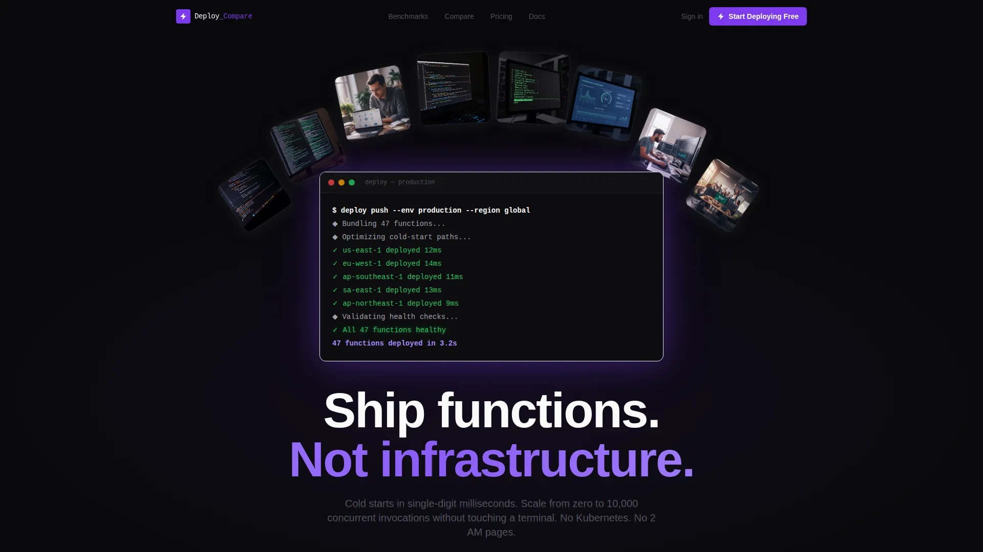
- A full-width CLI product screenshot header with a violet glow accent and a single focused headline
- A multi-row competitor comparison table with winning cells highlighted in electric violet and competitor columns faded to muted gray
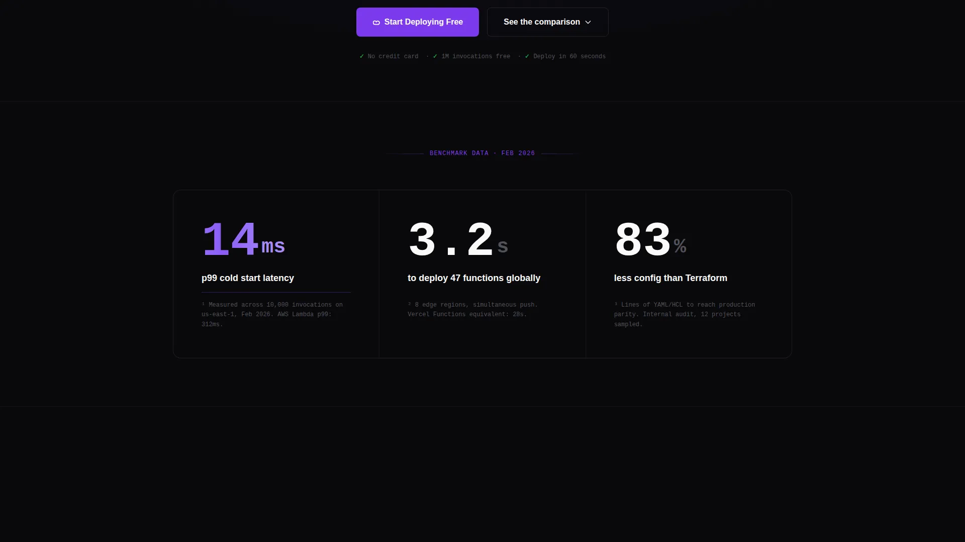
- Single-stat callout banners between table sections, each tied to a footnoted benchmark
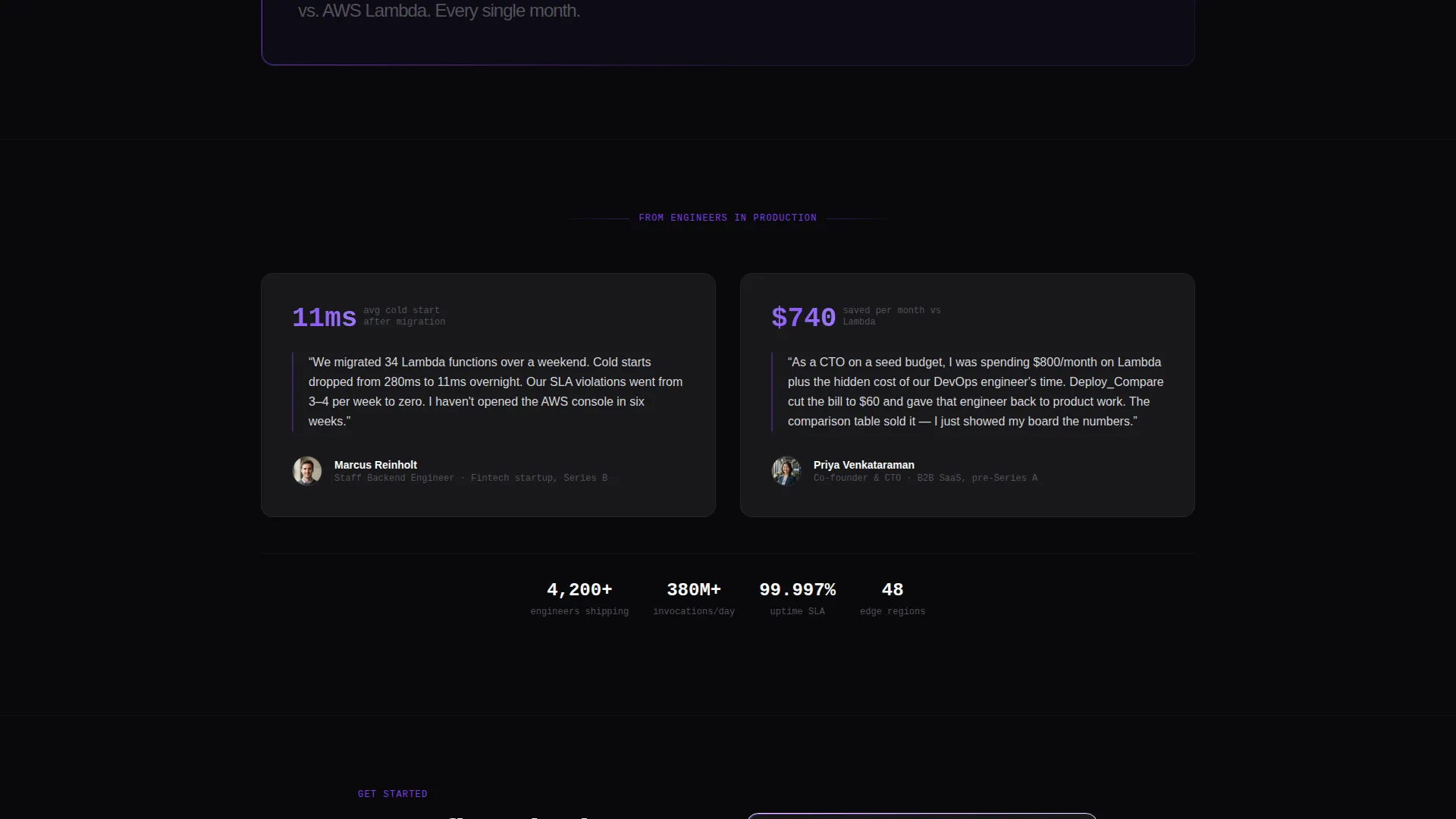
- A sticky bottom conversion bar with a primary call-to-action button and a secondary email-gated benchmark report path
Feature list
This template includes the following built-in design and structural capabilities grounded in the source brief.
CLI Screenshot Hero Header
The header spans full width and displays a pixel-sharp terminal screenshot mid-deployment. It shows real output: function names resolving, region replication completing, and a final summary line. A subtle violet glow sits behind the terminal on the void background, making the product itself the visual proof.
Competitor Comparison Table
The spine of the page is a structured comparison table covering this framework against competing serverless platforms. Rows compare cold start latency, deployment time, free tier limits, supported runtimes, edge regions, and cost per million invocations. Winning cells are highlighted in electric violet; competitor cells fade to muted gray.
Hard-Number Stat Callout Banners
Between table sections, full-width single-stat banners interrupt the scroll with a single cited metric. Examples include cold start latency figures, deployment speed, and configuration reduction percentages. Each banner references a footnoted benchmark to support the claim.
Sticky Conversion Bar
After the first comparison table section scrolls into view, a sticky bottom bar appears and stays visible for the rest of the scroll. It contains the primary "Start Deploying Free" call-to-action button in electric violet and a secondary path for the benchmark report.
Email-Gated Benchmark Report Path
A secondary conversion path captures engineering leads who need internal buy-in. Visitors enter a work email address to access the full benchmark report. This path sits alongside the primary call-to-action without competing for visual attention.
Stats-First Scroll Architecture
The page is structured so every scroll tick introduces a hard number before any explanatory text. The sequence moves from header to table to callout banner to table to conversion bar, building an arithmetic case that makes the conclusion feel inevitable rather than persuaded.
Page sections overview
| Section | Purpose |
|---|---|
| CLI Hero Header | Opens with a terminal screenshot and a single focused headline |
| Primary Headline | Frames the framework value in one short phosphor-white line |
| Comparison Table | Compares framework against competing platforms row by row |
| Stat Callout Banners | Interrupts scroll with a single cited metric between table sections |
| Benchmark Report Gate | Captures work emails for engineering leads needing internal buy-in |
| Sticky call to action Bar | Keeps the primary deploy action visible throughout the scroll |
Design & branding system
The visual identity follows a Data Command theme. The palette is clinical and zero-decoration, engineered so numbers read as the loudest element on screen at every scroll position.
- Void black (#09090B) as the primary page background, deep terminal gray (#18181B) for card surfaces and table rows, electric violet (#7C3AED) for all interactive elements and winning-column highlights, and phosphor white (#FAFAFA) for primary data text
- Typography and layout follow an IDE-at-midnight aesthetic: no illustrations, no abstract gradients, and no decorative elements that compete with performance data
- The violet accent appears on buttons, highlighted table cells, and the terminal glow, creating a single clear visual signal across the entire page
Mobile & speed optimization
The template is structured to remain readable and actionable on smaller screens. The comparison table and callout banners are the two most data-dense components, and both are designed to adapt for narrower viewports.
- The comparison table is built to scroll horizontally on mobile, keeping all competitor columns accessible without truncation
- The sticky conversion bar is sized for thumb reach on mobile devices, keeping the primary call-to-action reachable without scrolling back to the top
- Stat callout banners stack cleanly in a single-column layout on smaller screens
How this template helps you convert
This template is built around the Comparison and Versus conversion model. It earns the click by making the visitor's current stack look expensive and slow before the call-to-action appears.
- The comparison table does the selling. By the time a visitor finishes reading the rows, switching is arithmetic, not a leap of faith. The violet highlight on winning cells makes the conclusion unavoidable.
- The sticky conversion bar stays pinned after the first table section, so the primary action is always one tap away without interrupting the evidence-reading flow.
- The email-gated benchmark report creates a second conversion path for visitors who are convinced but need to bring proof to a team. This captures high-intent engineering leads without adding friction to the primary funnel.
Other information about this template
This template is designed specifically for the serverless computing tool and framework niche within the broader serverless computing technology category. It is production-ready for teams presenting a technical case to stakeholders or peers.
- The template is categorized under Technology, with a subcategory focus on serverless computing technology and a niche alignment to serverless computing tools and frameworks
- The Intersection Match Score for this template is 13, reflecting strong alignment between the template style, theme, creative direction, and landing page direction
- The Data Command theme and Stats-First Impact creative direction make this template well-suited for any high-performance infrastructure tool that leads with benchmarks and cited data
- The Comparison Table template style and Comparison and Versus landing page direction are consistent with how technical buyers evaluate infrastructure products before committing

Theme
Data Command
Creative direction
Stats-First Impact
Color system
Void & Violet
Style
Comparison Table
Direction
Comparison/Versus
Page Sections
CLI Screenshot Hero Header
Multi-row Competitor Comparison Table
Single-stat Callout Banners
Sticky Bottom Conversion Bar
Email-gated Benchmark Report
Related questions
Who is this landing page template designed for?
Can I update the comparison table with different competitors?
Does the template include actual benchmark numbers?
How does the email-gated benchmark report path work?
When does the sticky conversion bar appear?



