Session - Intentional TherapyNewsletter Landing Page Template
Session is a bento grid landing page template built for therapy and counseling email newsletter promotion. It features a Tech Glass visual identity, a Feature Tab Switcher header, and a Stats-First layout that turns open-rate data into compelling proof. The Comparison/Versus module stacks this approach against alternatives, guiding solo practitioners, group practice owners, and therapy-adjacent coaches toward their first send.
by Rocket studio
Quick summary
Session is a single-page bento grid landing page template designed for therapists and counseling professionals promoting a weekly email newsletter. It leads with striking typographic stats, a glass-morphic tab-switching header, and a direct comparison module that makes the case for intentional, templated email over improvised alternatives.
Who this template is for
This template speaks directly to mental health professionals who want their digital presence to match the care they bring to clinical work. It suits anyone building a practice through consistent, well-crafted email communication.
- Solo practitioners who are growing a private practice waitlist through a weekly newsletter
- Group practice owners who want to nurture referral networks with a polished, reliable send
- Therapy-adjacent coaches who need a Monday morning email to land with genuine authority
What problem this template solves
Many therapists know they should be sending newsletters but keep putting it off. The design-from-scratch process feels disconnected from clinical identity, and the results rarely reflect professional standards.
- Building emails manually is time-consuming and the output often feels generic or off-brand
- Without a clear structure, therapists lose the consistent inbox presence that builds waitlist momentum
- Vague metrics make it hard to know whether a newsletter is actually working for the practice
What you get with this template
This template gives you a complete, ready-to-customize bento grid landing page structured around proof, clarity, and conversion. Every section is purposeful and prompt-backed.
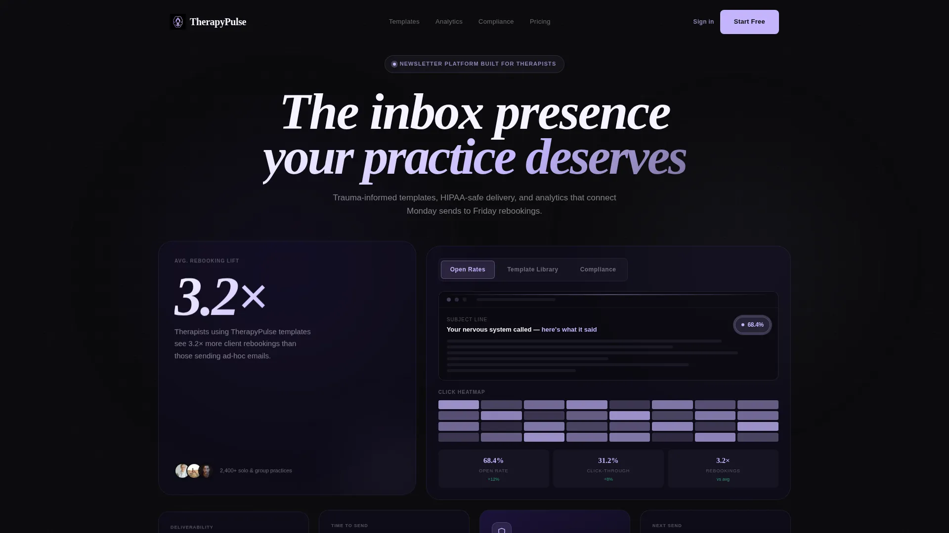
- A Feature Tab Switcher header with three glass-morphic tabs showing live-styled email previews, a template library view, and a compliance surface
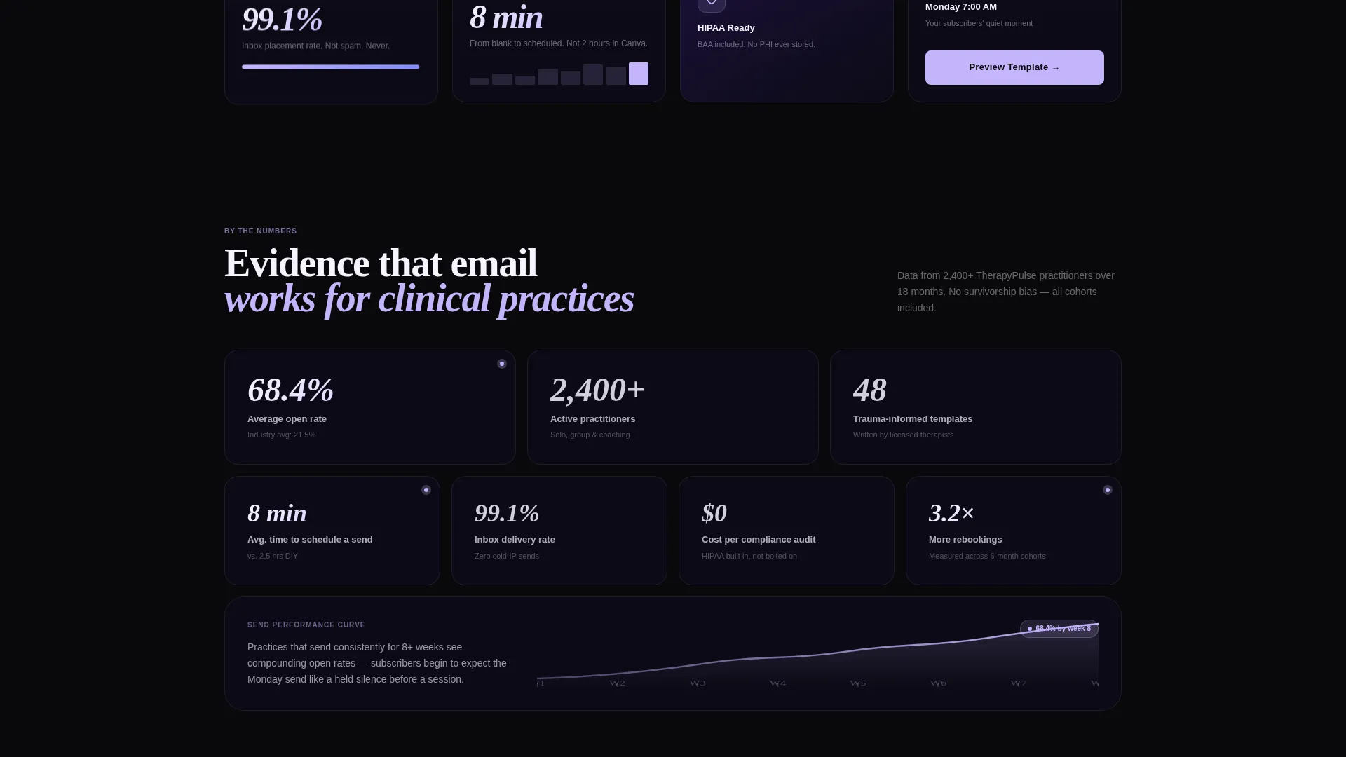
- A Stats-First bento grid that opens with a bold typographic stat and tightens into a mosaic of deliverability numbers and time-to-send comparisons as you scroll
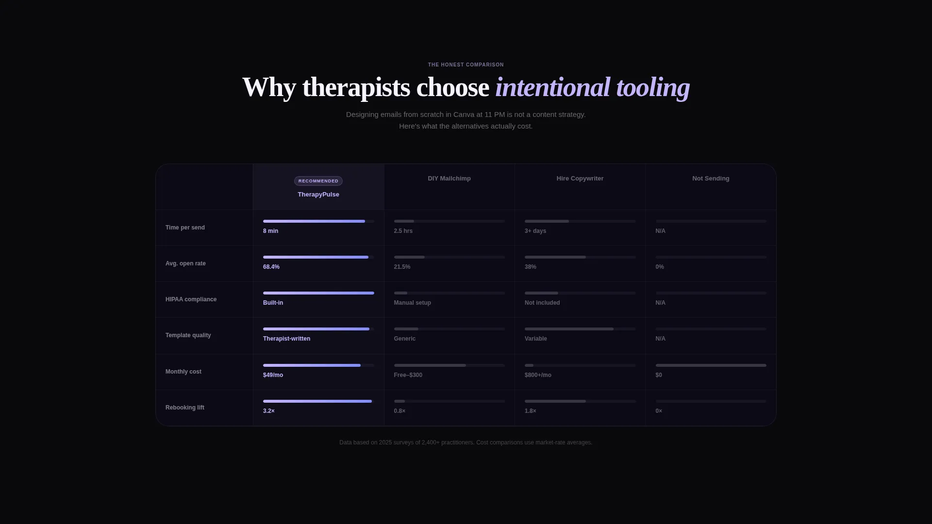
- A Comparison/Versus module that measures this template against do-it-yourself email tools, hiring a copywriter, and not sending at all, across six animated dimensions
Feature list
This template is built around distinct, purposeful components. Each one serves a specific role in turning a visitor into a confident first-time subscriber or practice owner ready to send.
Feature Tab Switcher Header
Three frosted glass tabs sit at the top of the hero bento card. The default tab shows a live-styled email mid-render, complete with a subject line, a pulsing open-rate badge at 68.4%, and a miniature reader heatmap. Each tab transition uses a smooth dissolve animation, making every surface feel interactive rather than static.
Stats-First Bento Grid Layout
The scroll opens with a massive typographic statement that immediately challenges the assumption that email does not work for clinical practices. Below it, individual bento cells each hold one number paired with one visual proof point, including deliverability percentages and average time-to-send comparisons. The grid density increases as you scroll, building a layered mosaic of evidence.
Comparison and Versus Module
A central bento module stacks the Session template against three named alternatives across six measurable dimensions. Each advantage row animates on scroll, making the performance gap visible and immediate. The module does the persuasion work so the call to action simply needs to open the door.
Dual Call-to-Action Path
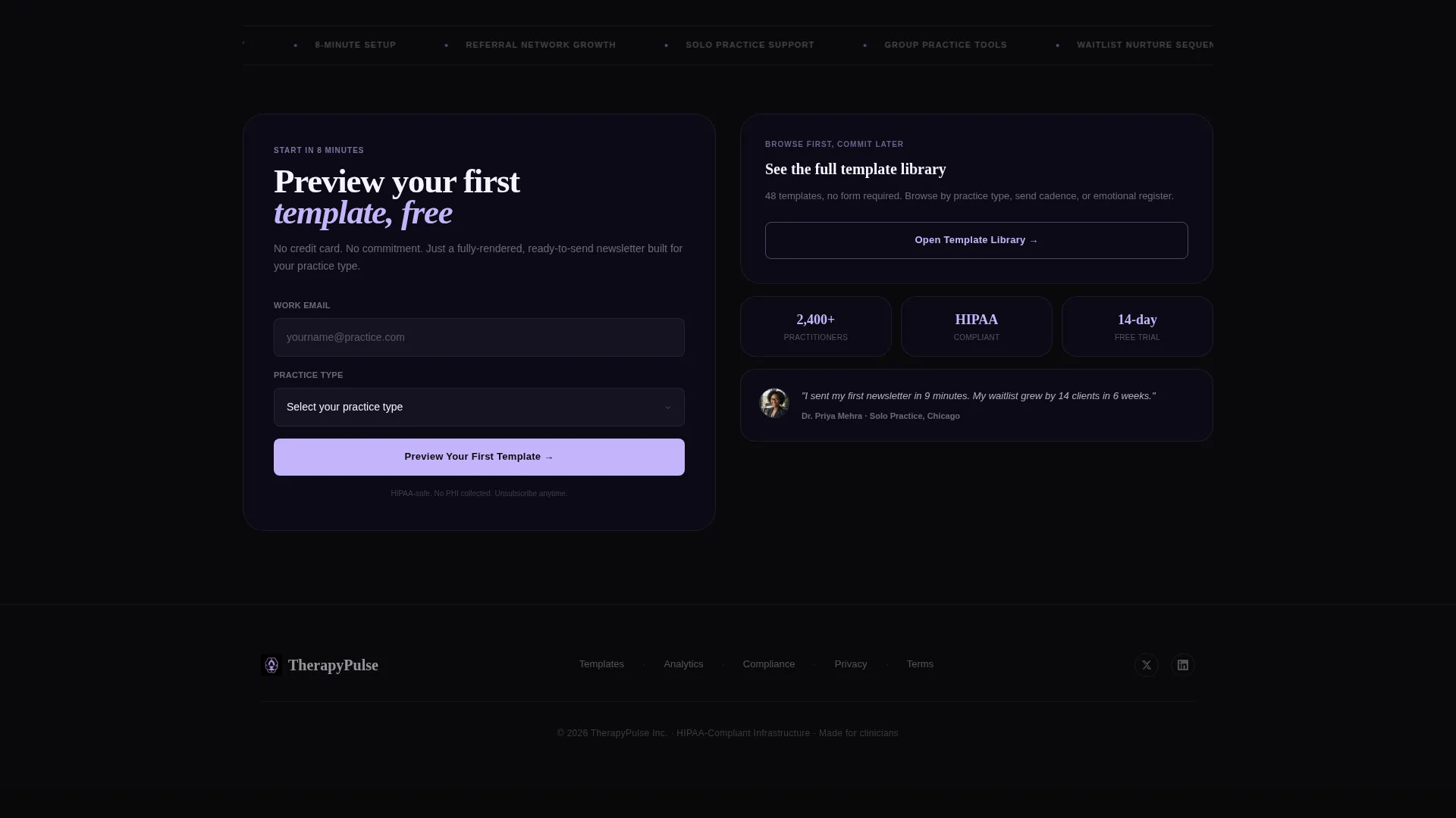
The primary call to action reads "Preview Your First Template" and appears after the comparison grid. It asks only for an email address and practice type. A secondary path, "See the Full Template Library," opens a lightbox gallery with no form required, letting skeptical visitors browse before committing.
Trauma-Informed Copy Structure
The template is built around copy frameworks suited to therapy and counseling audiences. Subject line examples, body copy rhythm, and section sequencing reflect the deliberate, grounded tone that clinical audiences recognize and trust.
Void and Violet Visual Identity
The color system uses absolute void black, deep ultraviolet, frosted glass lilac, and phosphor white. Bento cards float on ultraviolet at 12% opacity with glass blur. Lilac marks every interactive surface and metric highlight. Phosphor white keeps body copy effortlessly readable against dark backgrounds.
Page sections overview
| Section | Purpose |
|---|---|
| Feature Tab Switcher | Showcases email preview, template library, and compliance tabs interactively |
| Typographic Stat Hero | Opens scroll with a bold, practice-relevant statistic to reset visitor assumptions |
| Stats Bento Grid | Delivers deliverability numbers and time-to-send proof in individual tightening cells |
| Comparison Module | Stacks template against three alternatives across six animated dimensions |
| Primary call to action Block | Captures email address and practice type after comparison evidence lands |
| Lightbox Gallery Path | Lets skeptical visitors browse the template library without submitting a form |
Design & branding system
The visual identity follows a Tech Glass theme that feels clinical in its darkness and warm only where it glows. Every design choice reinforces the feeling of a notification lighting up a quiet, dark screen.
- Color palette: absolute void black (#09090B) for backgrounds, deep ultraviolet (#2D1B69) for floating bento cards at 12% opacity glass blur, frosted glass lilac (#C4B5FD) for interactive surfaces and metric highlights, and phosphor white (#F5F3FF) for all body text
- Typography and spacing use a deliberately luminous, high-contrast approach that keeps each stat and label immediately readable
- Glass-morphic card styling, dissolve tab animations, and scroll-triggered advantage bar animations create a cohesive interactive layer throughout the page
Mobile & speed optimization
The bento grid layout is structured to remain readable and visually coherent across screen sizes. The grid's tightening density on scroll translates well to narrower viewports by naturally prioritizing the most impactful cells.
- Individual bento cells are self-contained, so each stat and visual proof point holds its meaning on a small screen without relying on surrounding context
- The lightbox gallery and tab switcher are designed as touch-friendly interactive components, keeping the no-form browsing path accessible on mobile
How this template helps you convert
Every structural decision in this template is built to move a hesitant practice owner from curiosity to action. The page earns trust incrementally before it ever asks for an email address.
- The Stats-First opening immediately reframes email as a measurable growth tool for clinical practices, breaking the common assumption that newsletters are low-impact for therapists.
- The animated Comparison/Versus module removes the main objection by showing exactly how this template outperforms the three most likely alternatives, letting the evidence close the case before the call to action appears.
Other information about this template
This template sits within the Technology category and is specifically scoped to the therapy and counseling digital presence niche. It is intended for use as a standalone promotional landing page for a weekly therapy newsletter product.
- The template style is Bento Grid, using the Tech Glass theme and Void and Violet color system as described in the source brief
- The creative direction is Stats-First Impact, meaning data and proof points lead every scroll moment rather than lifestyle imagery or generic copy
- The landing page direction is Comparison/Versus, making the competitive context a structural feature rather than an afterthought
- The header concept is a Feature Tab Switcher, a component style suited to showcasing multiple product surfaces without requiring separate pages
Theme
Tech Glass
Creative direction
Stats-First Impact
Color system
Void & Violet
Style
Bento Grid
Direction
Comparison/Versus
Page Sections
Feature Tab Switcher Header
Stats-first Bento Grid
Animated Comparison Module
Dual Call-to-action Path
Trauma-informed Copy Structures
Void and Violet Visual Identity
Related questions
Who is the Session landing page template designed for?
Do I need coding skills to use this template?
Can group practice owners use this template as well as solo practitioners?
What makes the comparison module effective for converting visitors?
Can visitors browse templates without submitting a form?



