Session - Powerful TherapyPractice Landing Page Template
Session is a modular card grid landing page template built for a therapy and counseling membership platform. It leads with a live cost calculator that shows practitioners exactly how much they overpay across fragmented tools. The Void & Violet visual identity, flipping comparison cards, and a sticky savings bar work together to guide solo therapists, group practice owners, and newly licensed clinicians toward signing up.
by Rocket studio
Quick summary
Session is a single-page, card grid landing page template designed for a therapy and counseling membership platform. It opens with a working cost calculator, then unfolds a modular card layout where every card represents one tool the platform replaces. The dark Void & Violet color system and comparison-first structure make the value case before any emotional appeal.
Who this template is for
This template is built for founders and operators launching a digital practice platform aimed at mental health professionals. It speaks directly to three practitioner profiles and converts by proving financial value first.
- Solo therapists managing multiple disconnected apps who want one consolidated subscription
- Group practice owners losing revenue to patchwork tool stacks involving separate scheduling, video, and records systems
- Newly licensed clinicians who want a polished, established-looking digital presence from day one
What problem this template solves
Therapists and counselors typically juggle five or more separate tools just to run a basic practice. The fragmentation costs real money every month and creates workflow friction that cuts into clinical time. This template tackles that problem head-on by making the financial waste visible before asking for any commitment.
- Visitors see their exact monthly tool-sprawl cost tallied in real time before they read a single headline
- The card-flip comparison layout reduces tool-by-tool confusion into one clear side-by-side view
- The no-credit-card signup flow removes the last barrier once the ROI has already been proven on screen
What you get with this template
You get a fully structured, single-page layout built around a modular card grid and a live interactive calculator. Every section serves a specific conversion role, from hook to decision.
- An interactive cost calculator pre-loaded with realistic line-item costs and caseload sliders
- Flipping comparison cards that reveal feature-by-feature breakdowns on hover
- A sticky bottom savings bar, a competitor toggle table, and a context-aware call-to-action system
Feature list
This template includes the following built-in design and layout features drawn directly from the source brief.
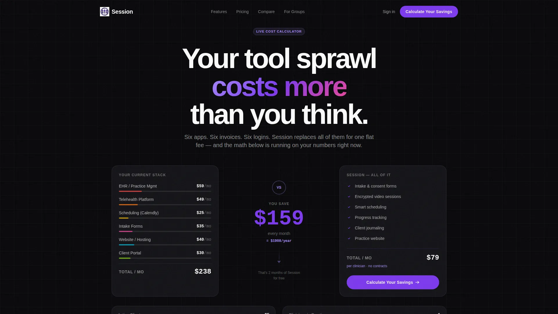
Live Cost Calculator Header
The page opens with a two-column calculator already running. The left column stacks typical monthly tool costs with each line item ticking upward. The right column holds the single membership fee steady. A violet savings figure grows between them in real time, and caseload sliders let visitors adjust the numbers themselves.
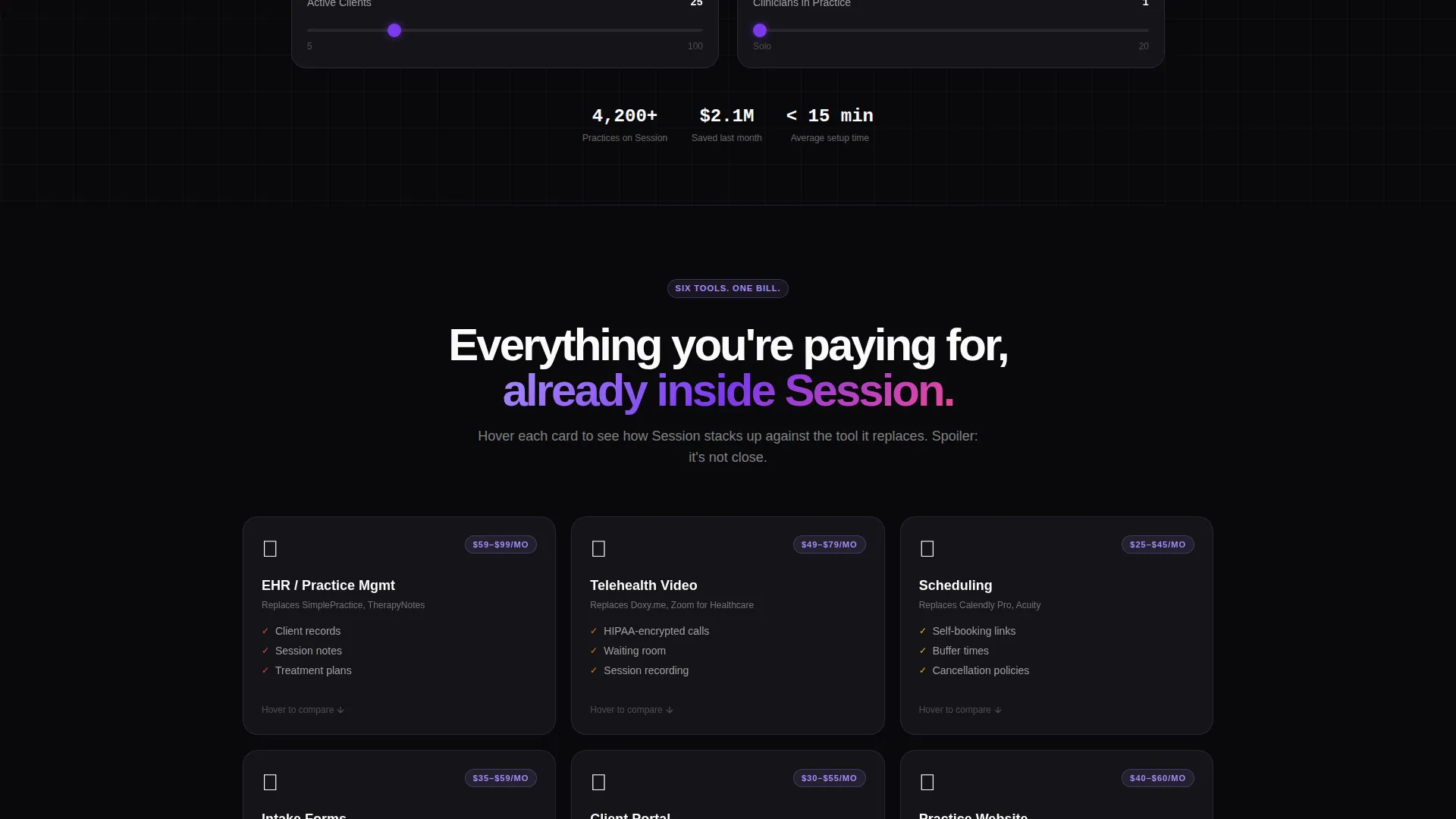
Flipping Comparison Card Grid
Each modular card in the grid represents one tool the platform replaces. Cards show calm product information on the front face. On hover, the card flips to reveal a feature-by-feature comparison between the replaced tool and the platform.
Context-Aware Call-to-Action System
The primary call-to-action reads "Calculate Your Savings" at page load. After the visitor interacts with the calculator, it transforms into "Switch Your Stack," anchoring the decision to their own computed numbers rather than a generic pitch.
Sticky Savings Bar
After the visitor scrolls past roughly forty percent of the page, a persistent bottom bar appears. It displays the visitor's calculated savings figure alongside a "Start Your Free Month" button, keeping the value case visible at every scroll depth.
Competitor Toggle Comparison Table
A structured comparison table near the bottom of the page lets visitors toggle between the platform and five named competitors across twelve feature rows. The platform's violet checkmarks contrast clearly against competitor gray dashes.
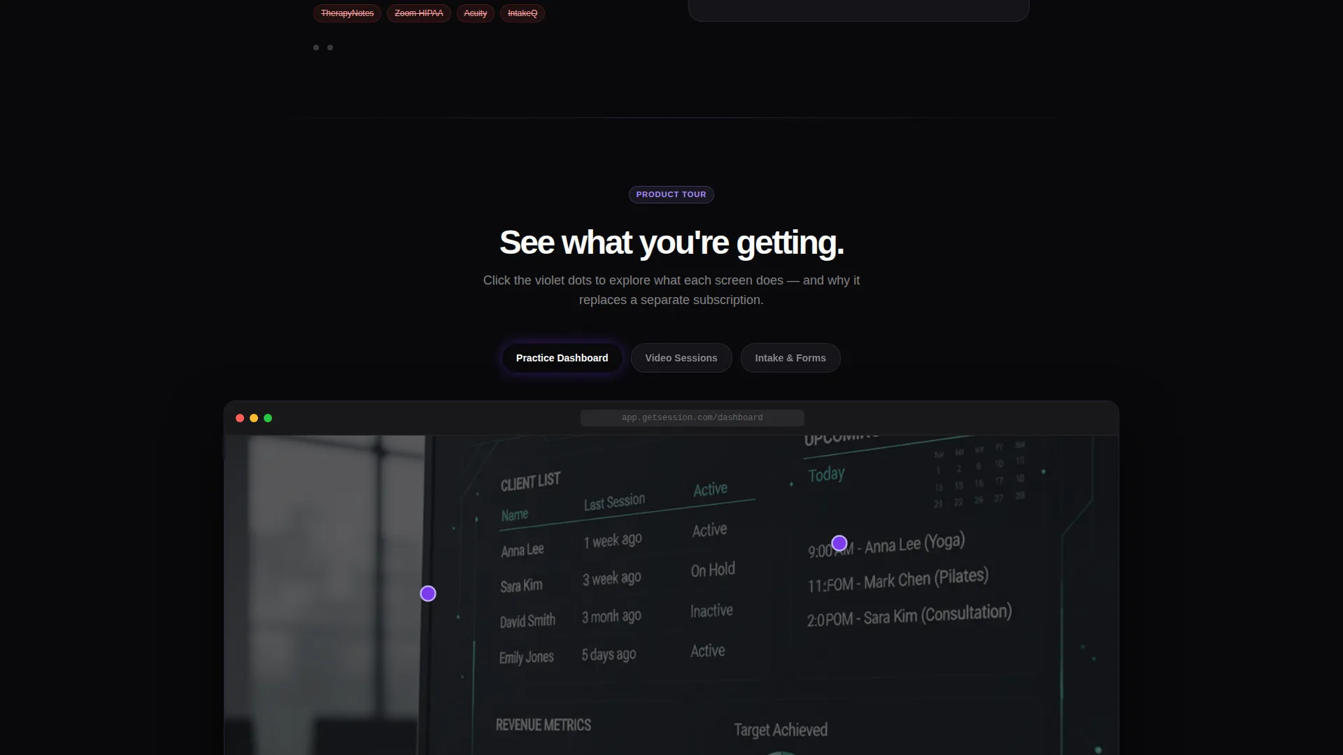
Annotated Product Screenshot Cards
The final card group in the grid displays sprint-style product screenshots. Violet annotation dots appear on each screenshot and expand on click to reveal contextual feature explanations.
Page sections overview
| Section | Purpose |
|---|---|
| Calculator Header | Opens with live cost comparison tool |
| Tool Replacement Cards | Modular grid, one card per replaced tool |
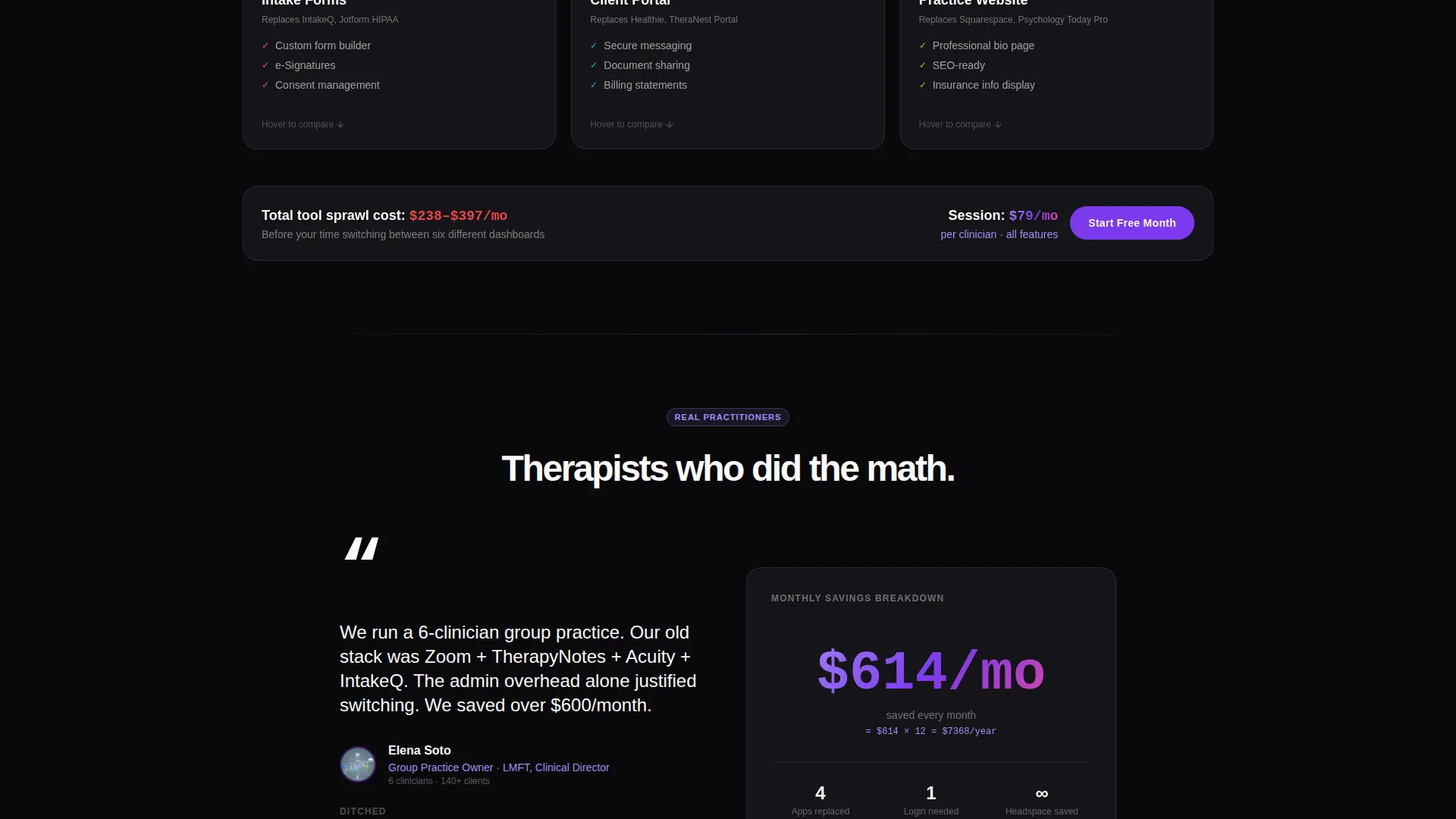
| Practitioner Testimonial Cards | Mid-grid social proof from real practitioners |
| Product Screenshot Cards | Annotated sprint-style feature visuals |
| Competitor Comparison Table | Toggle table across twelve feature rows |
| Sticky Savings Bar | Persistent call to action tied to calculated savings |
| Signup Form | Email, license type, and caseload only |
Design & branding system
The template uses a Void & Violet color system built around four core values. The palette feels focused and purposeful without leaning on clinical clichés.
- Absolute void black (#09090B) dominates backgrounds and section dividers; electric violet (#7C3AED) drives calls-to-action, progress bars, and active states
- Soft iris (#A78BFA) softens card borders, tag labels, and hover states; clinical white (#FAFAFA) is reserved for card faces and body typography
- The overall aesthetic channels Startup Velocity energy, combining a dark late-night coding feel with the quiet confidence of a tool that is already ready to use
Mobile & speed optimization
The modular card grid layout is structured to reflow cleanly across screen sizes. No individual section depends on hover-only interaction as the sole way to access content.
- Card flip interactions are designed with touch-friendly fallback states so mobile visitors still see comparison content
- The sticky savings bar is positioned to remain visible and tappable on smaller screens without blocking primary content
- Sliders in the cost calculator are sized and spaced for comfortable thumb interaction on mobile devices
How this template helps you convert
The page is built around a Comparison/Versus conversion strategy. Every scroll depth advances the visitor from awareness to decision using their own data.
- The calculator delivers a personalized savings number in the first seconds of the visit, replacing generic headline claims with math the visitor computed themselves.
- The card grid then dismantles objections tool by tool, moving from informational cards to testimonial cards to annotated screenshots in a deliberate rhythm that builds confidence steadily.
- The sticky savings bar and context-aware call-to-action close the loop by keeping the visitor's own calculated figure visible and pairing it with a low-friction, no-credit-card signup offer.
Other information about this template
This template is categorized under Technology with a subcategory focus on Therapy and Counseling Digital Presence. It is designed specifically for the therapy and counseling membership site niche and carries an intersection match score of 13, indicating a tightly aligned pairing of theme, creative direction, and niche intent.
- The template theme is Startup Velocity, meaning the design language prioritizes speed, clarity, and immediate perceived value over decorative styling
- The header concept is Interactive Preview, a pattern where the tool itself serves as the first and strongest hook before any descriptive copy appears
- The landing page direction is Comparison/Versus, making it best suited for platforms competing in a crowded tool market where practitioners already use identifiable alternatives
Theme
Startup Velocity
Creative direction
Calculator/Tool First
Color system
Void & Violet
Style
Card Grid (Modular)
Direction
Comparison/Versus
Page Sections
Live Interactive Cost Calculator
Flipping Modular Comparison Cards
Context-aware Call-to-action
Sticky Bottom Savings Bar
Competitor Toggle Comparison Table
Annotated Product Screenshot Cards
Related questions
Who is the ideal buyer for this template?
Can I edit the calculator values to match my own pricing?
Is this template designed for platform builders or for individual therapists?
What information does the signup form collect?
How many competitors does the comparison table support?



