Cosmetology School Landing Page Template
Shears is a single-page cosmetology and barber school landing page template built around real graduate stories and a confident typographic identity. It uses a zigzag case study narrative to move visitors emotionally toward one clear action: booking a free campus visit. The design is sharp, minimal, and purpose-built for career-focused enrollment programs.
by Rocket studio
Quick summary
Shears is a precision-crafted cosmetology school landing page template that leads with bold editorial typography and converts through graduate storytelling. Alternating zigzag sections follow real students from enrollment to licensure. The layout is built for vocational programs that need to earn trust fast and convert career-changers into enrolled students.
Who this template is for
This template is made for cosmetology schools, barber academies, and vocational beauty programs that want a landing page with real emotional pull. It works especially well for schools running structured enrollment cycles with a defined program length.
- Cosmetology and barber school admissions teams building a standalone enrollment page
- Vocational training directors who want to lead with student outcomes rather than program features
- Independent school operators targeting career-changers, recent graduates, and working parents
What problem this template solves
Most cosmetology school pages look the same: stock photos of smiling graduates, a list of course hours, and a generic contact form. That approach fails to communicate what actually changes in a person's life after nine months of training. Shears solves this by replacing feature lists with proof-driven stories.
- Prospective students struggle to picture themselves in a program, and generic pages do nothing to close that gap
- Schools lose warm leads who want more than a brochure but are not ready to call
- A single undifferentiated page cannot speak to career-changers, recent high school graduates, and single parents at the same time
What you get with this template
You get a fully structured single-page layout with a clear conversion path and two lead-capture mechanisms. Every section is designed around a specific persuasive function, from the declaration headline to the downloadable program guide offer.
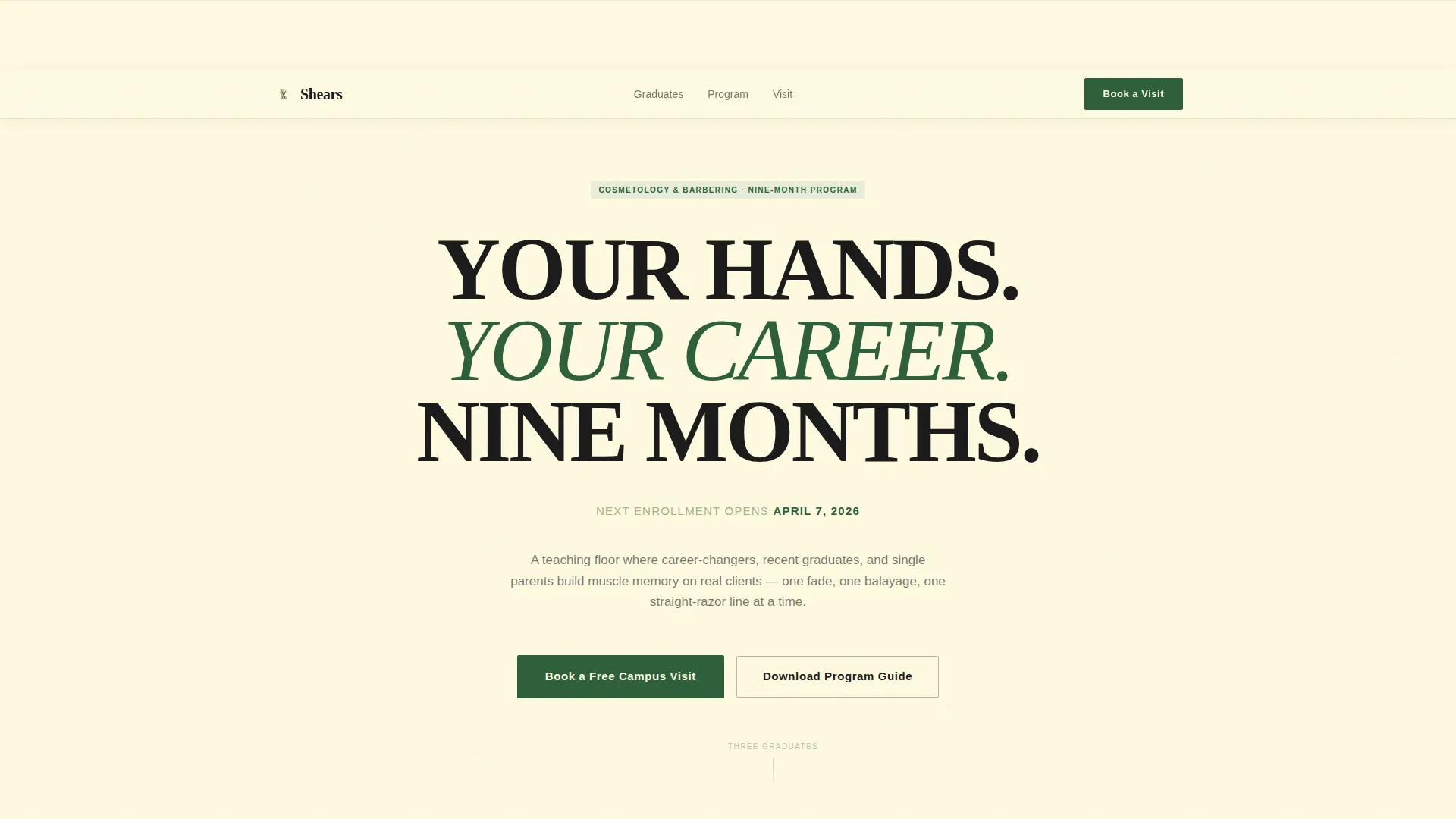
- A giant centered headline section that opens with authority and names the next enrollment date in sage-colored subtext
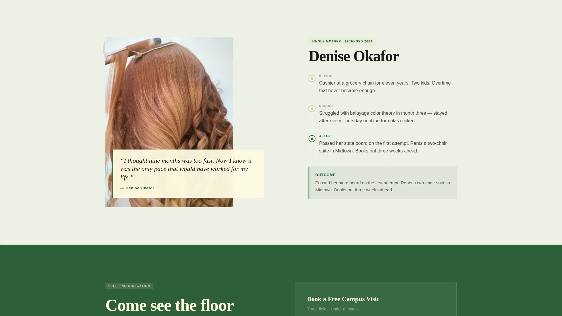
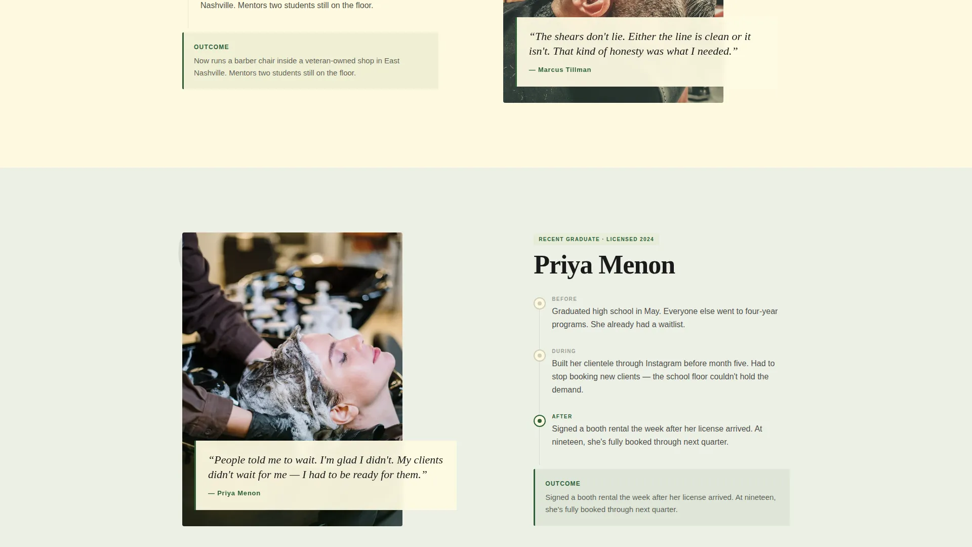
- Three alternating zigzag case study sections, each pairing a graduate portrait and pull-quote with a before, during, and after timeline
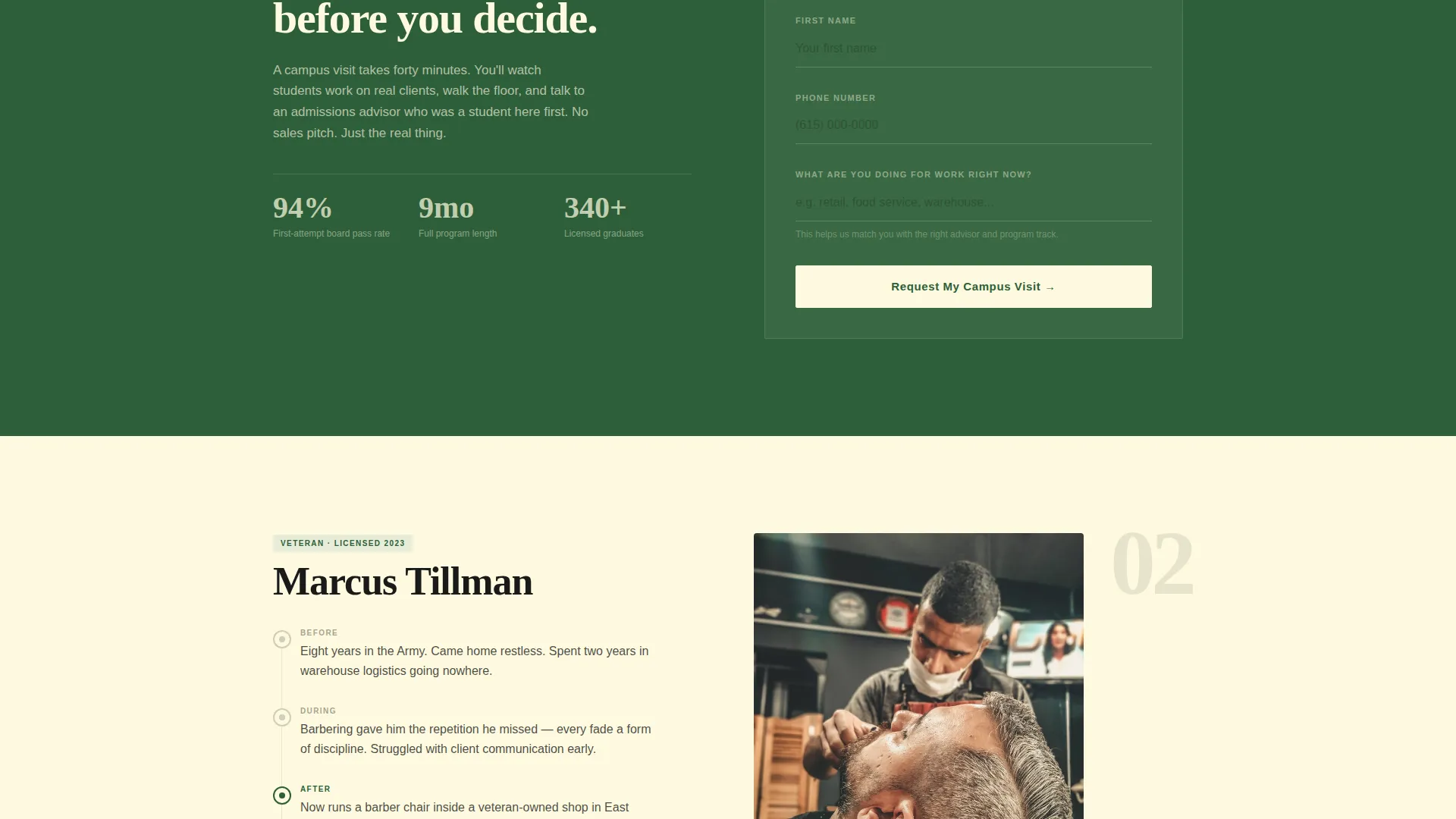
- A primary conversion form with three targeted fields and a secondary email-capture path for the downloadable program guide
Feature list
This template includes the following built-in components and design decisions.
Giant Declaration Headline Header
The header opens on a full cream field with a single oversized serif headline. No background image competes with the message. A one-line sage subtext below the headline names the next enrollment date, signaling urgency without pressure.
Zigzag Case Study Narrative Sections
Each alternating section follows one graduate from their life before training through their struggles on the school floor to their outcome after passing the state board exam. Left panels hold a portrait and pull-quote; right panels hold the timeline. As the visitor scrolls, each story raises the stakes.
Strategic Primary Conversion Form
The form appears after the second case study, once emotional investment is established. It asks for a first name, a phone number, and one open question: "What are you doing for work right now?" That single field simultaneously qualifies the lead and prompts the visitor to name their own gap.
Secondary Email-Capture Path
A separate offer of a downloadable program guide gives hesitant visitors a lower-commitment next step. It captures an email address in exchange, keeping the lead warm without requiring an in-person commitment.
Botanical Color System Applied at Layout Level
Sage washes alternate across section backgrounds. Fern anchors buttons and progress indicators. Cream carries body text sections. Pruning-shear black frames all typographic edges and user interface lines, creating an editorial feel that reads as high-end and intentional.
Corporate Precision Typography System
The template uses a tight, high-contrast serif at declaration scale for the main headline, with clear typographic hierarchy flowing through pull-quotes, timeline labels, body copy, and call-to-action buttons. Every weight and size decision reinforces the school's credibility.
Page sections overview
| Section | Purpose |
|---|---|
| Declaration headline header | Opens with authority and names the enrollment date |
| First case study | Introduces the single mother graduate story |
| Second case study | Tells the veteran barber story |
| Primary conversion form | Captures name, phone, and work-status qualifier |
| Third case study | Closes with the teenage prodigy story |
| Secondary guide offer | Captures email in exchange for program guide |
Design & branding system
The visual identity follows a Corporate Precision theme through a Botanical color system. The palette was designed to feel like a high-end apothecary: natural but exacting, warm but never casual.
- Four core colors: deep fern (#2D5F3A) for buttons and indicators, pressed sage (#A3B18A) for alternating backgrounds, cream linen (#FEFAE0) for body sections, and pruning-shear black (#1A1A1A) for typography and user interface edges
- A tight high-contrast serif at declaration scale for the headline, with structured hierarchy flowing through every text layer below it
- Minimal visual decoration: no stock photography in the header, no decorative icons, and no competing graphic elements that dilute the editorial confidence
Mobile & speed optimization
The template is structured for clean single-column stacking on smaller screens. The zigzag layout collapses gracefully so portrait panels and timeline content read in logical order on mobile.
- Alternating left-right panels reflow into a single vertical column without losing narrative sequence
- The primary conversion form is compact and touch-friendly, keeping the three input fields accessible on any screen size
- Typography scales are set to remain legible and impactful at mobile viewport widths, preserving the declaration quality of the headline
How this template helps you convert
The conversion strategy is built directly into the page structure. Every design and copy decision earns trust before asking for anything.
- The case study narrative compounds emotional investment across three graduate stories before the primary call to action appears, so the visitor already believes in the outcome when they reach the form.
- The primary form's open-ended work-status question makes the visitor articulate their own reason to change, which is one of the most effective natural conversion mechanisms a form can use.
- The secondary program guide offer creates a second conversion path for visitors who are not ready to book a visit, keeping the school's pipeline active at both the ready and the considering stages.
Other information about this template
This template is categorized under Education and Training, specifically within the Vocational and Trade School subcategory. It is purpose-built for the cosmetology and barber school niche.
- The Freemium and Trial landing page direction means both a zero-commitment campus visit and a free downloadable guide are used as entry points, lowering the barrier for first contact
- The Case Study Narrative creative direction is intentional for audiences who are making high-stakes career decisions and need social proof in story form, not in testimonial blurbs
- The template style is Zigzag and Alternating, a layout pattern that creates visual rhythm and keeps scroll momentum moving downward through the page
- The header concept is Giant Headline Centered, a deliberate choice that signals institutional confidence without relying on lifestyle photography
Theme
Corporate Precision
Creative direction
Case Study Narrative
Color system
Botanical
Style
Zigzag/Alternating
Direction
Freemium/Trial
Page Sections
Giant Declaration Headline Header
Zigzag Case Study Narrative Layout
Strategic Primary Conversion Form
Secondary Email-capture Offer
Botanical Color System at Layout Level
Corporate Precision Typography System
Related questions
Can I customize the graduate stories with my own school's alumni?
What does the primary conversion form collect?
Is the downloadable program guide file included?
Who is this landing page template built for?
Can the color palette be updated to match an existing school brand?



