Retail Digital Presence Comparison Website Template
Shelf is a bold brutalist retail landing page template built for comparison-driven conversion. It stacks your platform against named competitors in a high-contrast, scroll-powered layout. With stark typography, exposed grid structures, animated counters, and a sticky call-to-action bar, Shelf makes the case for your product before visitors ever reach the signup form.
by Rocket studio
Quick summary
Shelf is a single-page comparison landing page template engineered for retail and e-commerce brands. It leads with a cinematic product screenshot hero, drops into a row-by-row competitor table, and closes with social proof and a pinned call-to-action bar. Every section is built to move visitors forward with momentum, not hesitation.
Who this template is for
This template speaks directly to teams who need a professional, high-impact landing page fast. It is built for decision-makers who rely on data to justify switching platforms, not on polished marketing copy.
- Direct-to-consumer brand managers frustrated with app-heavy store setups who need fast conversion pages
- E-commerce directors evaluating replatforming and looking for clear feature comparisons to share with stakeholders
- Growth leads at digitally-native brands who have outgrown their first landing page builder and need a credible upgrade
What problem this template solves
Most retail landing pages look like every other product page on the web. They blend in, load slow, and bury the proof. Visitors leave before they understand why your platform is the better choice.
- Generic layouts fail to communicate a clear, bold product position against named competitors
- Cluttered page structures make it hard for visitors to read the comparison data they actually need
- Weak conversion flows gate the call to action too early, before trust is established
What you get with this template
You get a fully structured, custom built comparison landing page that does the selling through layout and evidence. No email gate appears until visitors have scrolled past the table and absorbed at least three proof points.
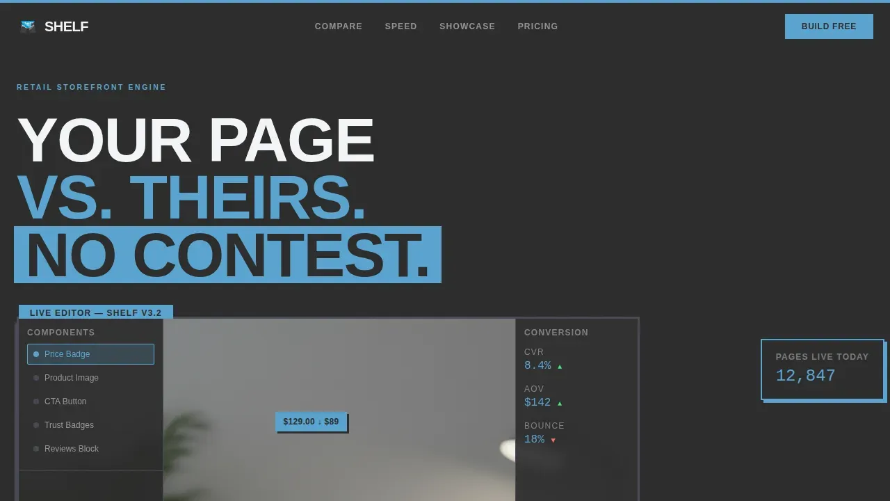
- A brutalist hero section with a product screenshot on a concrete-gray plinth and a stamped uppercase headline
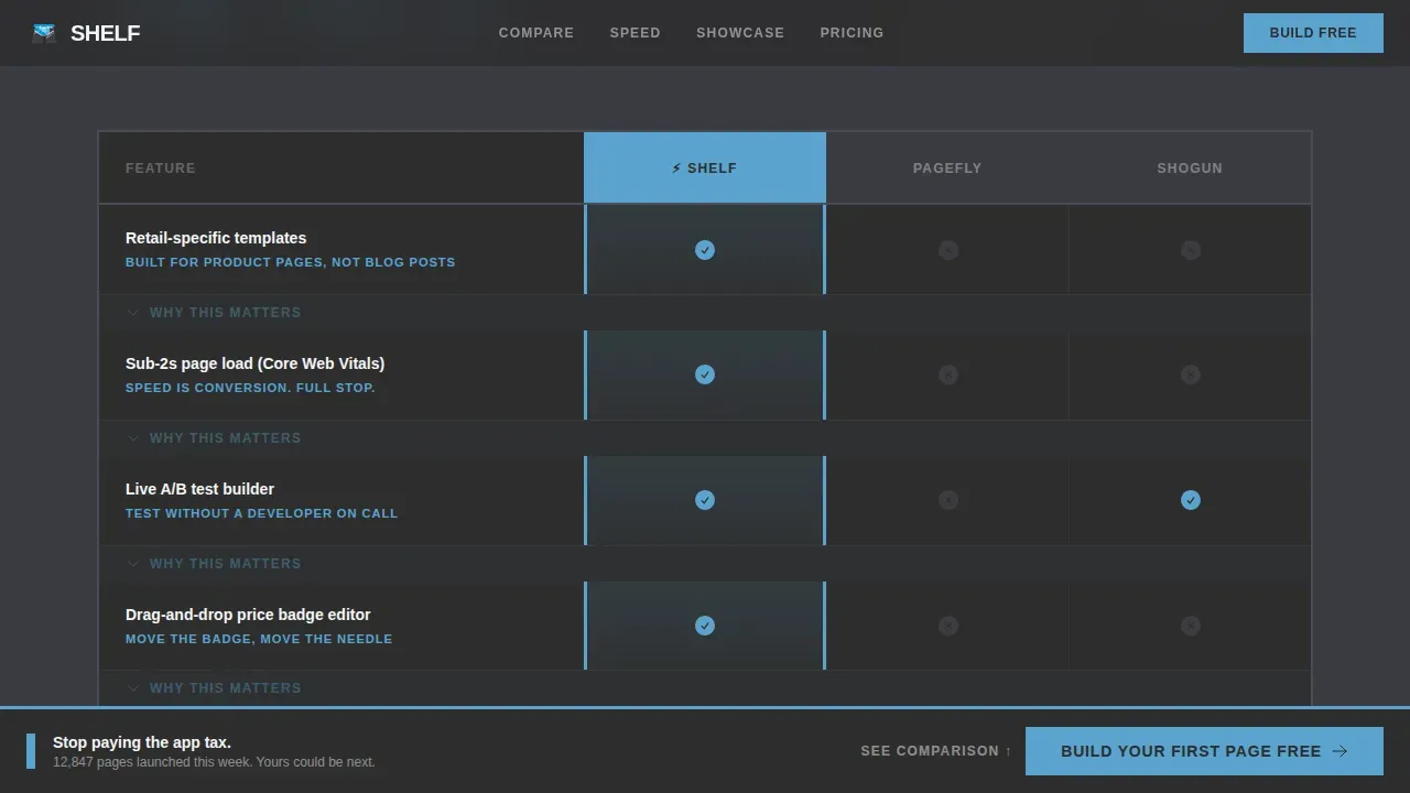
- A full competitor comparison table with accordion expansion, scroll-triggered row reveals, and an embedded secondary call to action
- A live-stat ticker, speed test visualization, bento grid page showcase, testimonial section, and a sticky bottom call-to-action bar
Feature list
This template supports a focused set of high-impact features. Each one is drawn directly from the project brief and designed to work together as a single, conversion-focused landing page.
Brutalist Hero Section
The hero section places a pixel-sharp product screenshot on a raw concrete-gray plinth with no rounded corners and no drop shadow. Bold typography in condensed uppercase dominates the space. The design uses stark typography and high contrast to deliver an immediate visual punch that sets the tone for the entire page.
Scroll-Triggered Comparison Table
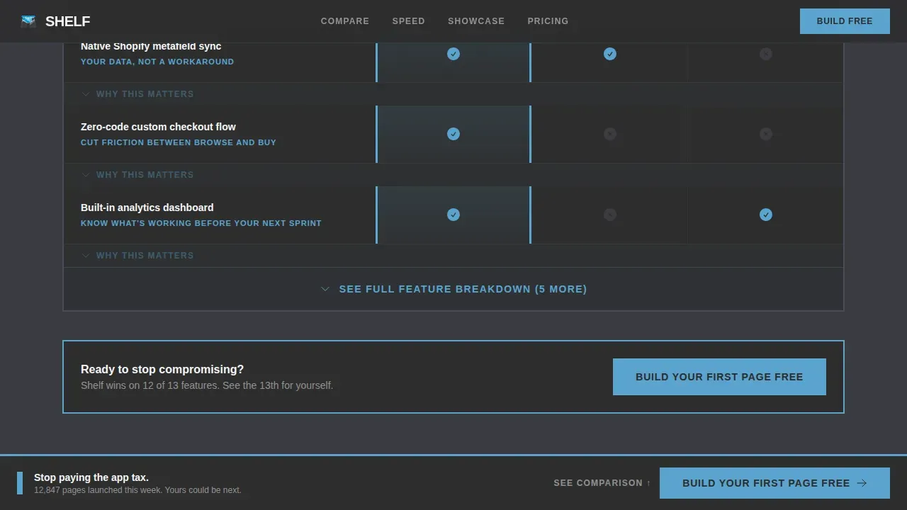
The comparison table is the core of this landing page. Rows snap into view on scroll using GSAP ScrollTrigger stagger reveals. Sky-blue checkmarks and muted-slate indicators work across columns, and each row carries a one-line verdict in bold text. An accordion inside the table expands to reveal granular feature descriptions when visitors want a deeper breakdown.
Animated Live-Stats and Speed Ticker
Below the table, animated counters display live pages launched this week. A side-by-side speed test visualization makes load time differences easy to read and understand at a glance. This section adds honest, data-forward proof that supports the comparison claims above it.
Bento Grid Page Showcase
A bento grid carousel displays real retail pages built on the platform. Visitors can browse actual product work without leaving the landing page. This showcase builds confidence before any signup request appears.
Sticky Conversion Bar
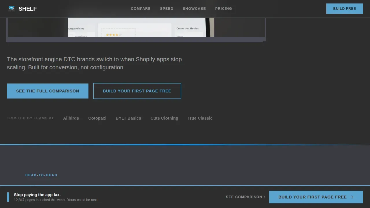
A brutalist sticky bar is pinned to the bottom of the viewport throughout the scroll. The primary call to action reads "Build Your First Page Free" and renders in sky-blue on charcoal for maximum high contrast visibility. It catches visitors at every stage of the page without interrupting the reading flow.
Page sections overview
| Section | Purpose |
|---|---|
| Hero with Screenshot | Anchor attention with bold product visual and headline |
| Competitor Comparison Table | Row-by-row feature comparison with accordion detail |
| Live Stats Ticker | Animated counters showing real platform activity |
| Speed Test Visual | Side-by-side load time proof point |
| Page Showcase Carousel | Bento grid of real retail pages built on platform |
| Social Proof and Pricing | DTC testimonials and transparent pricing tiers |
| Footer | Linear single-row footer with minimal navigation |
Design & branding system
The design system follows a Slate and Sky palette rooted in neo brutalism. Heavy concrete tones carry the structure; open-sky colors carry the action. The result is a high contrast visual system that feels industrial below and clear above.
- Colors: poured-concrete charcoal (#2D2D2D) as the primary background, open-sky blue (#5BA4CF) for accents, electric cerulean (#0095FF) for hover states and winning-column highlights, and cracked-cloud white (#F4F5F7) for text panels
- Fonts: Cabinet Grotesk for bold display and body text, DM Mono for stat figures and comparison data, both contributing to the stark typography that defines this style
- Layout principles follow brutalist design conventions: exposed grid structures, visible thick borders, intentional asymmetry, and unconventional layouts that reject polished or decorative excess
Mobile & speed optimization
The template is designed desktop-first, reflecting how e-commerce directors and brand managers research and evaluate tools. A mobile fallback layout is included so the page remains functional on all screen sizes.
- The responsive layout adapts the comparison table and bento grid for smaller device widths without breaking the visual hierarchy
- Fast loading behavior is supported by using server components for static sections and client components only for animated or interactive elements
- Smooth scroll behavior and GSAP animations are scoped to client-side rendering, keeping the initial page load lean
How this template helps you convert
The conversion strategy in this template is sequential and deliberate. It builds evidence first, then presents the call to action at the moment of highest conviction.
- The comparison table does the primary selling work. Visitors see feature rows, verdicts, and expandable detail before a single signup request appears, which builds trust through honest data presentation.
- The sticky call-to-action bar is always visible but never intrusive. It catches visitors at the natural moment of decision without interrupting the comparison process.
- The email capture only appears after visitors have scrolled past the table and encountered at least three social proof points, protecting conversion quality by qualifying intent first.
Other information about this template
This template is one of the more technically ambitious options in its category. Developers with experience in GSAP and component-based code will find the animation architecture easy to extend. Teams without deep technical knowledge can still customize colors, fonts, text, and layout sections without touching the animation code.
- The shelf bold brutalist retail landing page template is listed in the marketplace and can be explored alongside other free templates to compare scope and style
- The template supports connection to tracking tools such as Google Analytics so teams can monitor visitor behavior and measure conversion outcomes
- Keyboard navigation is supported in interactive components including the accordion, carousel, and comparison toggle, making the page more accessible for a broader range of people
- The design is future proof in the sense that its brutalist aesthetic is built on raw structure rather than trend-dependent decoration, so it ages well as visual styles shift
- Neo brutalism as a design movement continues to gain traction across digital product and portfolio pages, and this template sits confidently within that category
- The footer follows Pattern 1 as a linear single-row layout, keeping the page exit clean and professional
- DTC clients and e-commerce services teams can use this template as a standalone project or as a starting point to build toward a broader website presence
Theme
Bold Brutalist
Creative direction
Launch Energy
Color system
Slate & Sky
Style
Comparison Table
Direction
Comparison/Versus
Page Sections
Brutalist Hero with Product Screenshot
Scroll-triggered Comparison Table
Animated Live-stats Ticker
Bento Grid Page Showcase
Sticky Bottom Conversion Bar
Social Proof and Pricing Section
Related questions
Do I need to write code to use this template?
Can I customize the colors and fonts to match my brand?
Is the comparison table editable?
Who is this landing page designed for?
Does the template work on mobile devices?



