Church & Religious Software Complete Cost Calculator Website Template
Shepherd is a church learning management system landing page template built for ministry leaders who turn Sunday sermons into structured weeklong learning. It opens with a live ministry ROI calculator, then guides visitors through a modular card grid that compares Shepherd against generic platforms. The design uses a Monochrome Steel palette with stained-glass amber accents and smooth kinetic card transitions.
by Rocket studio
Quick summary
Shepherd is a single-page landing page template for a church-focused learning management system. It leads with an embedded ROI calculator, proves value through personalized results, then walks visitors through a side-by-side comparison grid. The dynamic motion design and Monochrome Steel color system give the page a reverent but modern feel that fits a ministry technology offering.
Who this template is for
This template is built for ministry technology providers and church software teams that need to communicate their platform's value quickly and clearly. It speaks directly to the decision-makers inside congregations who manage structured learning programs.
- Associate pastors running midweek Bible studies for groups of fifty or more adults
- Children's ministry directors coordinating age-graded curricula across multiple campuses
- Denominational training coordinators onboarding new church planters across state lines
What problem this template solves
Church education programs often depend on disconnected tools: shared drives, printed handouts, email threads, and spreadsheets. Ministry leaders lose hours each week managing logistics that a single platform could handle. This template helps a church learning management system provider show exactly how much time and effort their platform saves before asking for a commitment.
- Manual coordination across Sunday school, small groups, and new member classes wastes volunteer hours
- Generic learning platforms lack scripture-specific content tools and church calendar awareness
- Ministry leaders lack a clear way to measure curriculum consistency across campuses or cohorts
What you get with this template
You get a fully structured, conversion-focused landing page layout designed specifically for a church learning management platform. Every section is intentional and sequenced to move a ministry visitor from curiosity to confidence.
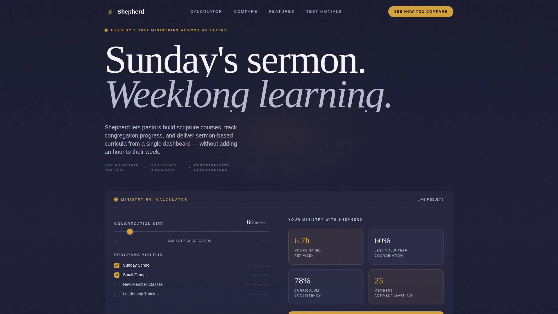
- An embedded ministry ROI calculator in the header viewport with animated results cards
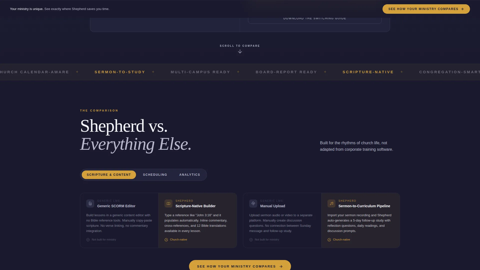
- A modular comparison card grid with toggle categories and smooth kinetic transitions
- A sticky bottom call-to-action bar, a two-field sign-up form, and a gated PDF secondary conversion path
Feature list
This template delivers a focused set of interactive and structural features grounded in the source brief. Each one serves the core goal of showing ministry leaders exactly what they stand to gain.
Ministry ROI Calculator Header
The header section embeds a live calculator directly in the first viewport. Visitors select congregation size using a slider and check boxes for their active programs, including Sunday school, small groups, new member classes, and leadership training. The tool instantly renders a results card showing hours saved per week, volunteer coordination reduction, and a curriculum consistency score. Numbers animate upward with eased motion, and steel-colored cards flip into place like display board tiles.
Modular Comparison Card Grid
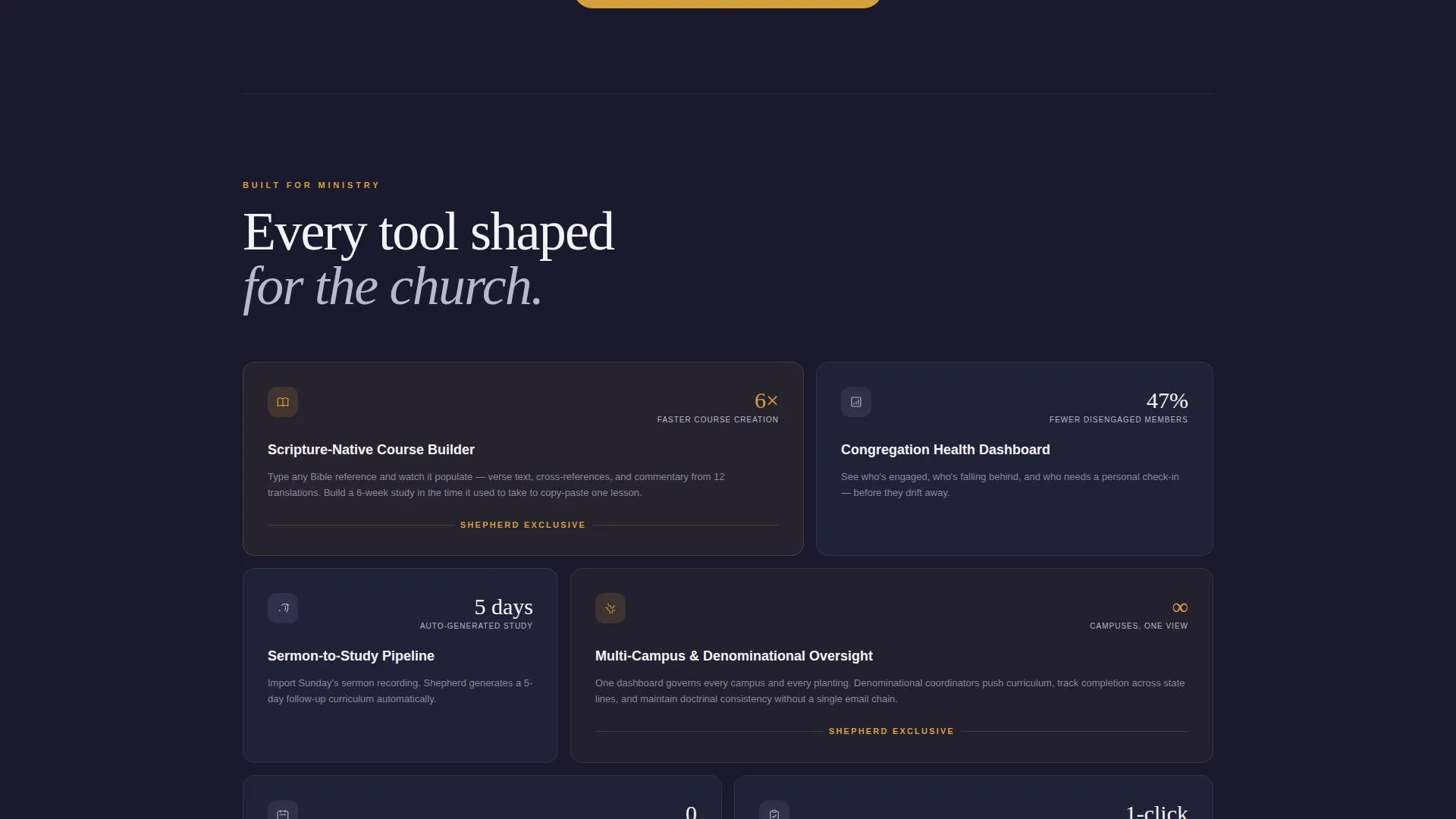
Below the calculator, the page presents a modular card grid comparing the platform against generic learning management systems and against doing nothing at all. Each card pair uses a left-right layout: a gray-toned competitor card on the left and an amber-highlighted Shepherd card on the right. Visitors toggle between comparison categories covering scripture-specific content tools, church calendar integration, and congregation analytics. The grid subtly reshuffles with smooth kinetic transitions at each scroll checkpoint.
Dual Conversion Path Design
The primary call to action, "See How Your Ministry Compares," appears first inside the calculator results card. It repeats again as a sticky bottom bar after the third comparison row. Clicking opens a minimal two-field form asking only for church name and email. A secondary path offers a downloadable switching guide as a gated asset for visitors who are not yet ready to commit, requiring only an email address.
Dynamic Motion Interaction System
The template uses a Dynamic Motion theme throughout. Card animations, grid reshuffling, and number transitions are all driven by smooth eased motion to keep the visitor's eye in gentle constant movement. The kinetic design avoids distraction while reinforcing the feeling that the platform is active, modern, and purposeful.
Personalization-Led Persuasion Flow
The page is structured so that the visitor's own data appears before any feature description. The calculator results create a sense of ownership over the numbers. When the comparison cards appear afterward, they feel like confirmation of what the visitor already suspects rather than a cold sales pitch.
Page sections overview
| Section | Purpose |
|---|---|
| Calculator Header | Deliver personalized ministry ROI results instantly |
| Results Card Display | Show hours saved, coordination reduction, and consistency score |
| Comparison Card Grid | Compare platform against generic tools and manual processes |
| Toggle Category Bar | Let visitors filter comparisons by relevant ministry category |
| Primary call to action Card | Prompt sign-up after the calculator delivers results |
| Sticky call to action Bar | Reinforce the call to action after the third comparison row |
| Two-Field Sign-Up | Capture church name and email with minimal friction |
| Gated PDF Offer | Convert undecided visitors with a downloadable switching guide |
Design & branding system
The visual identity uses a Monochrome Steel color system built around four core tones and one reserved accent. The palette evokes the weight and quiet of a steel-framed cathedral at dusk.
- Core tones: forge black (#1A1A2E), brushed gunmetal (#3D3D5C), altar silver (#B8B8CC), and communion white (#F4F4F8)
- Stained-glass amber (#D4A03C) is reserved exclusively for interactive states and call-to-action elements
- The Dynamic Motion theme drives all card animations, grid transitions, and number reveals throughout the page
Mobile & speed optimization
The modular card grid layout is designed to reflow cleanly across screen sizes. Comparison card pairs and the calculator interface are structured to work as well on a phone as on a desktop monitor.
- Modular card components stack vertically on smaller screens without losing the left-right comparison logic
- The sticky call-to-action bar remains anchored at the bottom of the viewport on mobile for persistent visibility
- Animated transitions use eased motion patterns that feel intentional rather than heavy on any device
How this template helps you convert
This template is built around a single insight: people trust numbers they generated themselves more than numbers a brand gives them. The entire page structure is engineered around that principle.
- The ROI calculator in the first viewport delivers a personalized result before any feature pitch begins, giving visitors a data point they feel ownership over.
- The comparison card grid then positions every feature as confirmation of what the calculator already suggested, reducing resistance and making the primary call to action feel like a natural next step.
- The dual conversion path catches both ready buyers through the two-field form and early-stage visitors through the gated switching guide, widening the net without diluting the main offer.
Other information about this template
This template is categorized under Technology, specifically within the Church and Religious Software subcategory and the Church and Religious Learning Management niche. It is a strong fit for teams building or marketing a church learning management system that handles scripture courses, congregation progress tracking, and sermon-based curricula delivery.
- The template style is Card Grid (Modular), making it straightforward to extend or reorder comparison categories as a product evolves
- The page type is a single landing page, meaning all conversion logic lives in one scrollable flow without routing visitors to secondary pages
- The header concept is Interactive Preview, using a functional tool rather than a static hero image to earn attention in the first few seconds
- The creative direction is Calculator/Tool First, meaning the platform's value is demonstrated through the visitor's own inputs before any marketing copy is encountered
Theme
Dynamic Motion
Creative direction
Calculator/Tool First
Color system
Monochrome Steel
Style
Card Grid (Modular)
Direction
Comparison/Versus
Page Sections
Ministry ROI Calculator with Animated Results
Modular Comparison Card Grid
Dual Conversion Path Layout
Dynamic Motion Interaction Theme
Personalization-first Persuasion Structure
Related questions
Can I customize the calculator inputs for my platform?
Does the comparison grid support more than three toggle categories?
Is this template suitable for a denominational software provider?
What does the gated PDF conversion path involve?
Can the sticky call-to-action bar be removed or repositioned?



