Church Volunteer Management Landing Page Template
Shepherd is a single-page volunteer management landing page template built for churches and ministry organizations. It features a live-feel dashboard header, a side-by-side comparison table, and a structured lead-generation form flow. The design uses a glassmorphic navy-and-violet palette that feels purposeful and modern, helping coordinators see why their current system is already falling short.
by Rocket studio
Quick summary
Shepherd is a church volunteer management landing page template designed to replace spreadsheets, group texts, and clipboard sign-ups. Built on a Startup Velocity theme with a glassmorphic visual system, it walks visitors through a feature comparison, proves the cost of their current workarounds, and guides them toward booking a demo or downloading a staffing resource.
Who this template is for
This template is made for teams who manage volunteers at a faith-based or nonprofit organization and need a convincing, conversion-focused landing page to present their platform.
- Executive pastors and volunteer coordinators managing serve teams across one or more campuses
- Nonprofit ministry directors running regular programs such as food pantries with variable weekly headcounts
- Software founders or product teams building church volunteer management tools who need a credible, ready-to-launch landing page
What problem this template solves
Most church volunteer coordinators are piecing together their workflow from tools that were never designed for the job. A comparison-driven landing page helps them see the gap clearly and feel the pull toward a better solution.
- Visitors arrive with normalized frustrations: duplicate scheduling, burnout they can not measure, and last-minute gaps they fill manually every week
- Generic landing pages fail to make the cost of inaction feel real; this template uses a structured comparison table to make the contrast unavoidable
- Without a clear secondary conversion path, visitors who are not ready to demo simply leave; the gated checklist offer captures them instead
What you get with this template
This template gives you a complete, section-led single-page layout ready for a church volunteer platform. Every section has a defined purpose in the conversion journey.
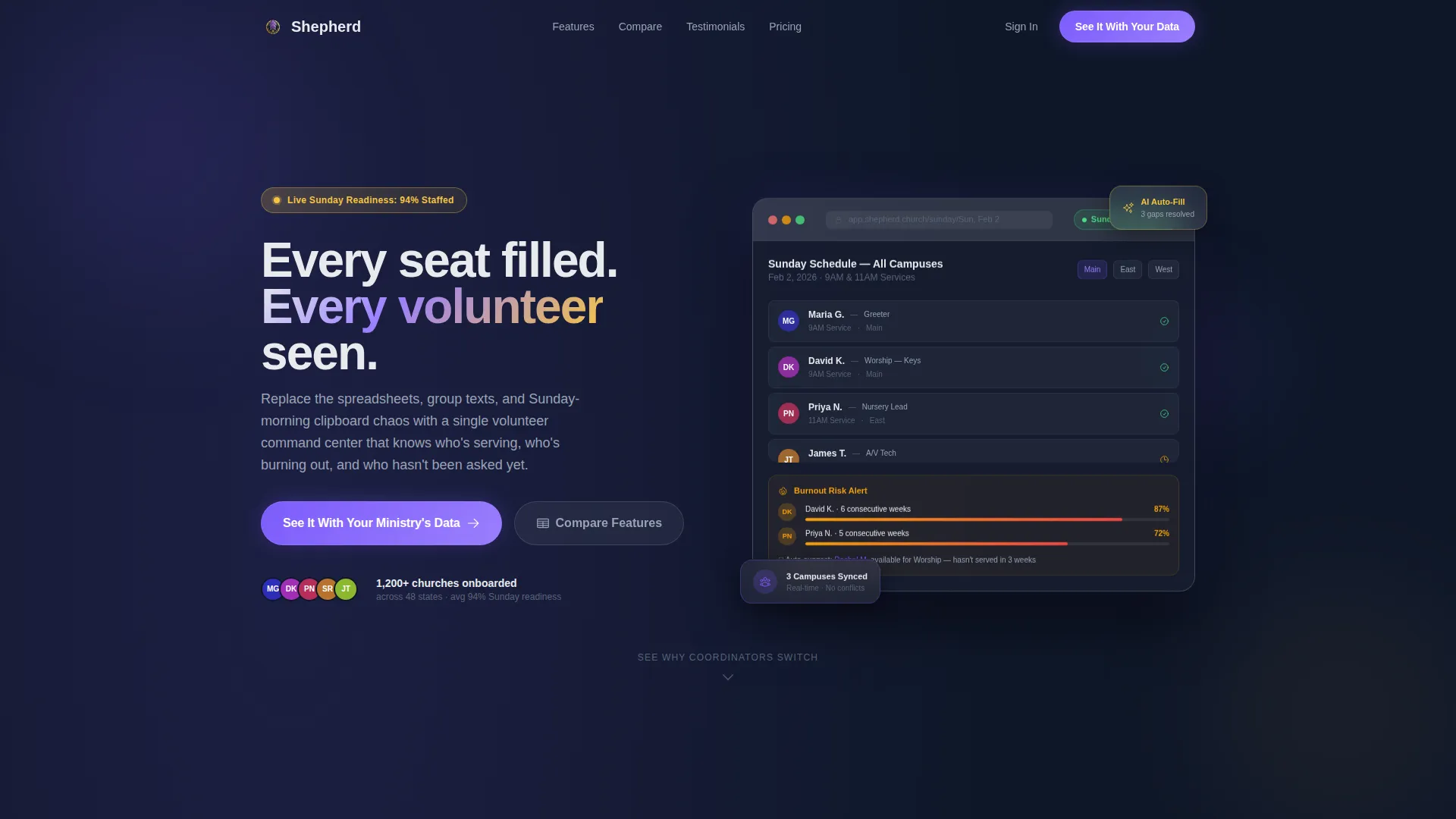
- A frosted-glass dashboard header with live-feel scheduling data, burnout indicators, and a readiness badge
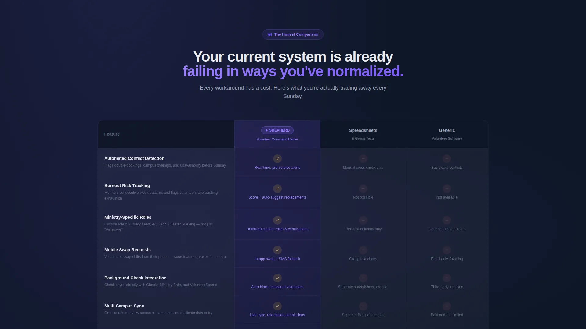
- A three-column feature comparison table contrasting the platform against spreadsheet workflows and generic volunteer software
- Three strategically placed calls to action and a full-width bottom form with a congregation-size slider and an open-text field
Feature list
This template is built around six distinct capabilities, each grounded in the source brief and designed to support a realistic conversion flow for a volunteer management platform.
Living Dashboard Header
The header displays a frosted-glass browser frame floating on deep navy. Inside it, a volunteer scheduling grid shows real-name entries, a burnout-risk sidebar with amber indicators, an auto-fill suggestion engine, and a green readiness badge. A subtle parallax effect separates the dashboard layer from the background, adding visible depth.
Three-Column Comparison Table
The comparison table is the page's central argument. It places the platform side by side against spreadsheet-based workflows and generic volunteer software across six rows: automated schedule conflict detection, burnout tracking, ministry-specific role assignment, mobile swap requests, background check integration, and multi-campus sync. Gold checkmarks contrast with muted gray dashes to make the winning rows immediately readable.
Expanding Feature Glass Cards
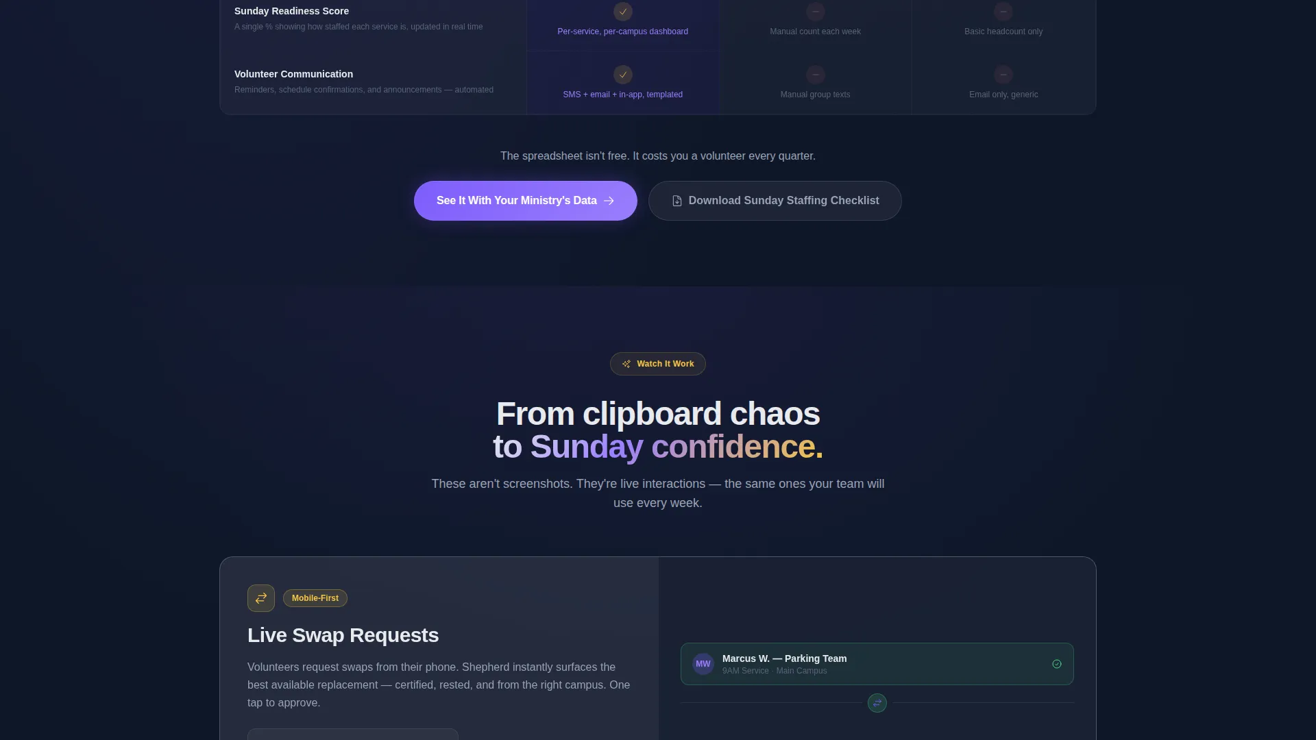
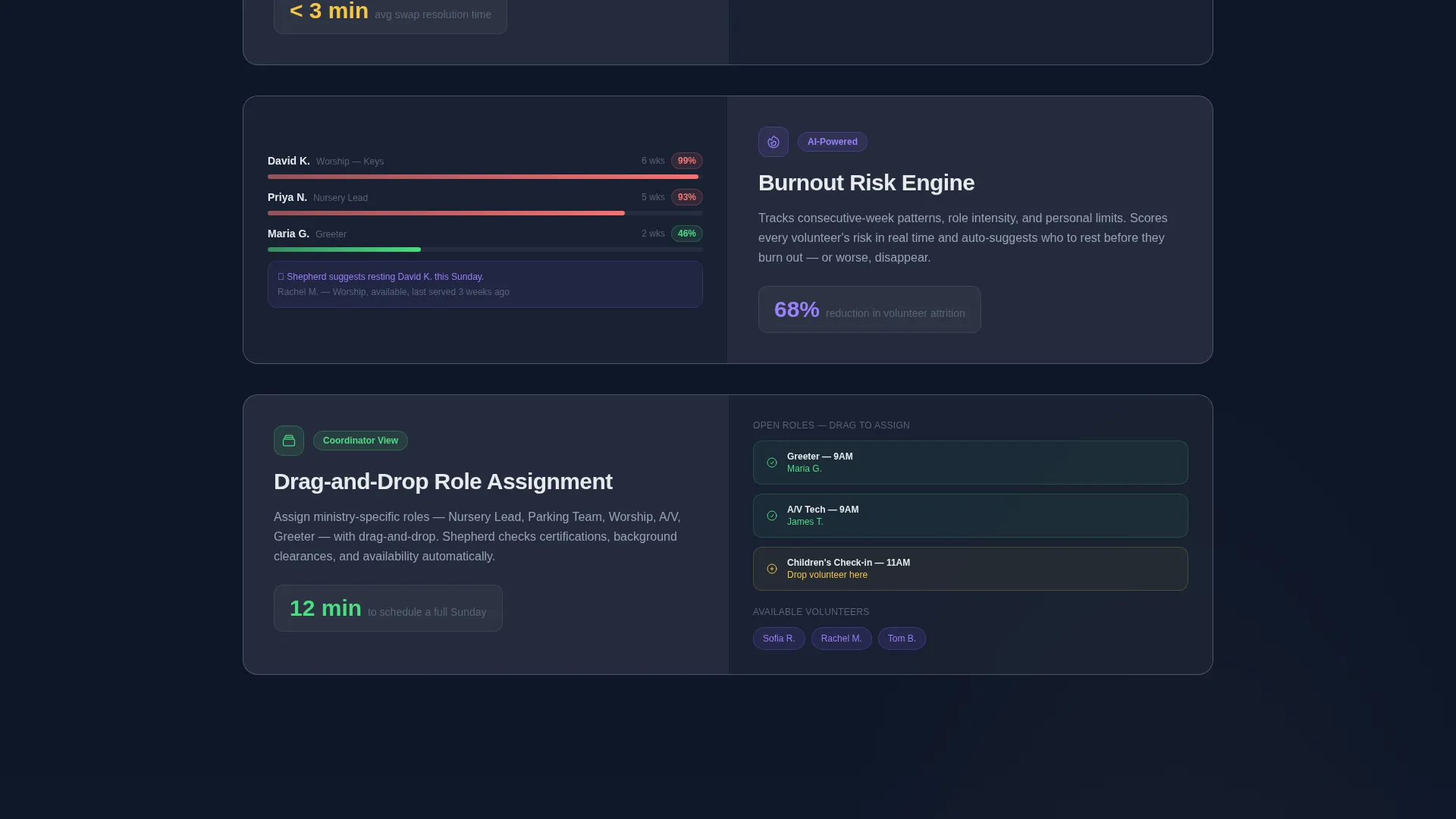
Below the comparison table, each platform advantage expands into its own frosted-glass card. Each card includes a micro-interaction: a swap-request animation, a burnout score recalculating in view, or a drag-and-drop role assignment. This escalating scroll moves visitors from convenience to insight to indispensability.
Multi-Stage call to action Placement
The primary call to action, "See It With Your Ministry's Data," appears three times: pinned beneath the dashboard header, again after the comparison table, and finally inside the full-width bottom form. Repetition without redundancy keeps the conversion path present throughout the scroll.
Structured Lead Capture Form
The bottom form section opens with church name (for emotional investment), then a congregation-size slider with four ranges, then the coordinator's email, then one optional open-text field asking about their biggest volunteer headache. The field order is intentional and mirrors how a real sales conversation would start.
Gated Secondary Offer
A secondary conversion path offers a downloadable Sunday Staffing Checklist as a gated resource for visitors who are not ready to book a demo. This captures intent from undecided visitors without losing them entirely.
Page sections overview
| Section | Purpose |
|---|---|
| Dashboard Header | Opens with live-feel scheduling preview and headline |
| First call to action Block | Pins primary call to action beneath the header |
| Comparison Table | Contrasts platform against two alternative approaches |
| Feature Card Scroll | Expands each table win into an animated glass card |
| Second call to action Block | Re-presents primary call to action after the comparison |
| Lead Capture Form | Full-width bottom form for demo requests |
| Secondary Offer Strip | Presents gated checklist for undecided visitors |
Design & branding system
The visual identity follows a Startup Velocity theme expressed through a glassmorphic color system. Every layer is intentional: deep navy grounds the page, frosted glass panels float over it, and color accents are reserved for specific roles.
- Deep sanctuary navy (#0F1729) as the primary background, frosted white at 12% opacity for glass card layers, and clean white (#E8EAED) for body text
- Soft liturgical violet (#7C5CFC) used exclusively for buttons and interactive states; warm candle gold (#F5C542) reserved for highlights, badges, and notification pings
- Glass panels carry a 24-pixel blur and 1-pixel luminous borders, giving each card a sense of depth and separation from the background
Mobile & speed optimization
The template is structured for practical use across device sizes, with a layout designed to translate the glassmorphic desktop experience into a readable mobile format.
- Glass card components and the comparison table are designed to reflow cleanly on smaller screens without losing the visual hierarchy
- The parallax dashboard header and micro-interaction cards are scoped to their sections, so the scroll experience remains focused and purposeful on mobile
How this template helps you convert
The page is not just a feature list. It is structured as a sequential argument that makes inaction feel more costly than booking a conversation.
- The dashboard header opens with specific, realistic data that makes visitors feel like they are already inside the product, lowering their guard before the comparison begins.
- The three-column table systematically names every workaround the visitor currently tolerates, placing their frustration in a public column labeled "Spreadsheets and Group Texts."
- The multi-stage call to action placement and the gated checklist ensure that every visitor, whether ready to demo or still deciding, has a clear and low-friction next step.
Other information about this template
This template is built inside the Shepherd platform concept and is suited for teams in the church and religious software space who need a credible, professional landing page that reflects the seriousness of volunteer coordination work.
- The template style is a Comparison Table layout within a Lead Generation page direction, making it well-suited for competitive positioning in the church volunteer management category
- The header concept is a Dashboard Preview, a pattern that works well for software platforms because it shows rather than tells
- The creative direction follows a Feature Matrix approach, meaning the scroll is structured to build a cumulative case rather than simply listing benefits
Theme
Startup Velocity
Creative direction
Feature Matrix
Color system
Glassmorphic
Style
Comparison Table
Direction
Lead Generation
Page Sections
Dashboard Header with Live-feel Data
Three-column Feature Comparison Table
Expanding Animated Feature Cards
Multi-stage Call to Action Placement
Structured Lead Capture Form
Gated Secondary Conversion Path
Related questions
Who is this landing page template designed for?
What sections are included in this template?
Can I use this template if my congregation is small?
What is the gated checklist offer for?
Does the template include the comparison table content?



