E-Commerce Parcel Logistics Pricing Website Template
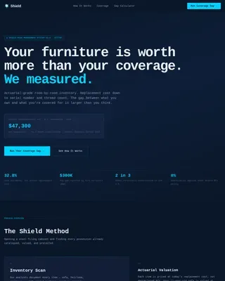
Shield is a hub-and-spoke landing page template built for e-commerce parcel insurance and risk management platforms. It opens with a live loss calculator, then guides fulfillment managers and operations directors through technical spec tables, carrier liability comparisons, API integration details, and tiered pricing, all styled as a logistics control room in a dark Carbon Fiber palette.
by Rocket studio
Quick summary
Shield is a single-page, anchor-nav template for per-shipment parcel insurance platforms targeting direct-to-consumer fulfillment teams and third-party logistics operators. A live calculator opens the page, followed by five data-dense spoke sections that replace sales copy with hard numbers. The Carbon Fiber visual system keeps every element purposeful and information-ready.
Who this template is for
This template is built for insurtech and e-commerce logistics platforms that need to convert technically minded buyers. It speaks directly to operators who evaluate products through data, not narrative.
- Direct-to-consumer fulfillment managers tracking damage claim rates and their impact on quarterly margins
- Third-party logistics operations directors managing carrier liability gaps across multiple warehouse locations
- Shopify Plus merchants who have experienced high-value parcel loss and need per-shipment declared-value coverage
What problem this template solves
Most carrier liability tops out at a fixed low amount per parcel, far below the declared value of the goods inside. Operators often don't see the full gap until it shows up as a margin problem at quarter end. This template makes that gap impossible to ignore.
- Visitors arrive at a live calculator that instantly shows current exposure versus full coverage cost
- The sticky comparison bar and pre-populated table keep the liability gap visible throughout the entire scroll
- Technical spec sections answer objections before they form, removing friction from the decision to sign up
What you get with this template
You get a complete, production-ready landing page layout with structured sections, interactive components, and a precise visual system. Every element connects back to the core conversion goal: showing the cost of under-coverage and making signup feel like the obvious next step.
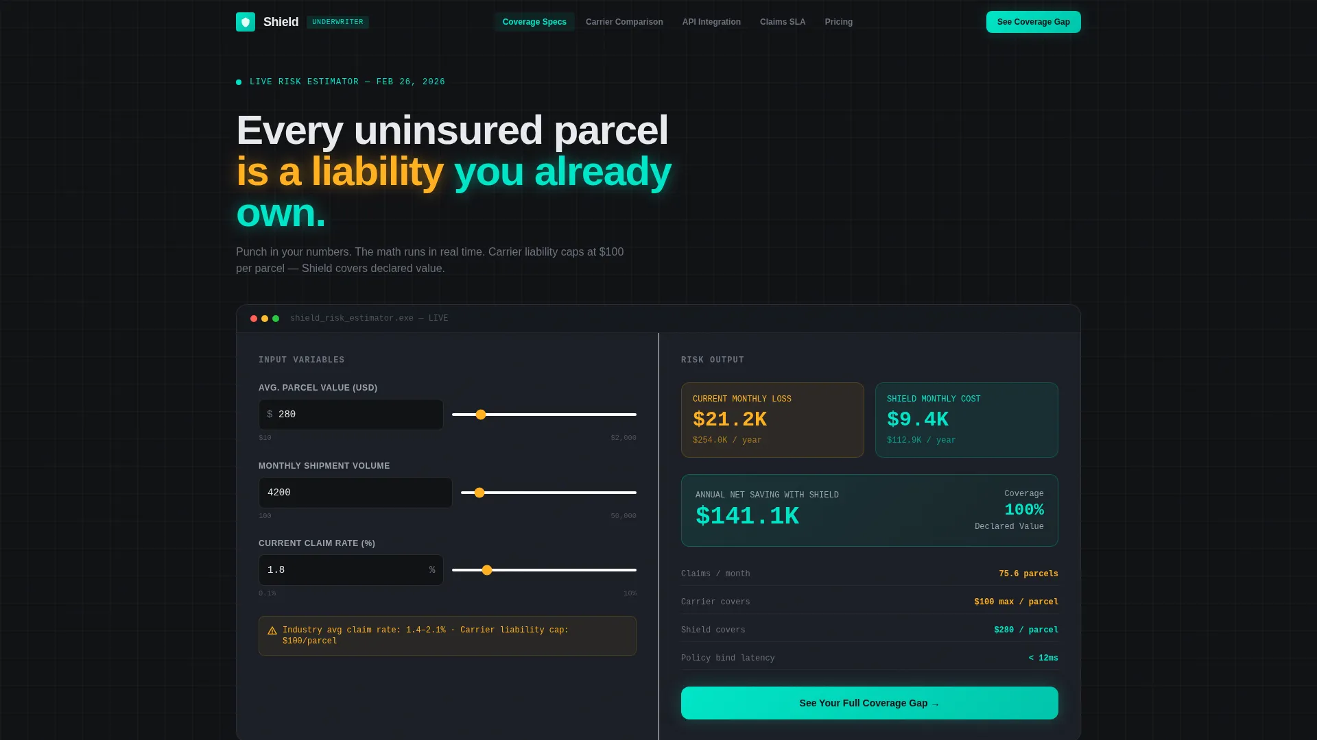
- A live hero calculator with animated, input-reactive outputs split across two columns: current loss in amber, coverage cost in teal
- Five anchor-navigated spoke sections covering coverage specs, carrier comparison, API integration, claims service-level details, and pricing tiers
- A persistent sticky bar with a primary call to action and a two-field signup form at the bottom of the comparison section
Feature list
The following features are built into the Shield template layout based on the design brief.
Live Hero Calculator
The above-the-fold calculator accepts three inputs: average parcel value, monthly shipment volume, and current claim rate. Outputs animate in real time as values change. The amber column shows current losses; the teal column shows the estimated coverage cost. The math does the persuading before the visitor reads a single line of copy.
Sticky Anchor Navigation
A persistent navigation bar anchors to five spoke sections: Coverage Specs, Carrier Comparison, API Integration, Claims SLA (service-level agreement), and Pricing Tiers. Visitors can jump to any section without losing context. The sticky bar also carries the persistent "See Your Coverage Gap" call-to-action button throughout the scroll.
Technical Spec Tables and Charts
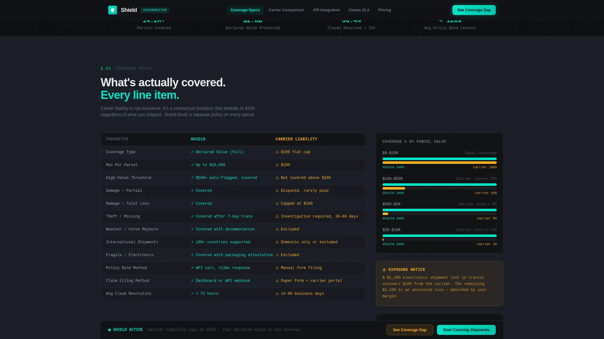
Each spoke section presents information as hard data. Coverage thresholds, carrier liability side-by-side comparisons, API latency figures, claims resolution timelines, and tier breakdowns all appear in structured tables and spec blocks. The format mirrors an engineering datasheet, every limit and edge case is visible.
API Integration Section
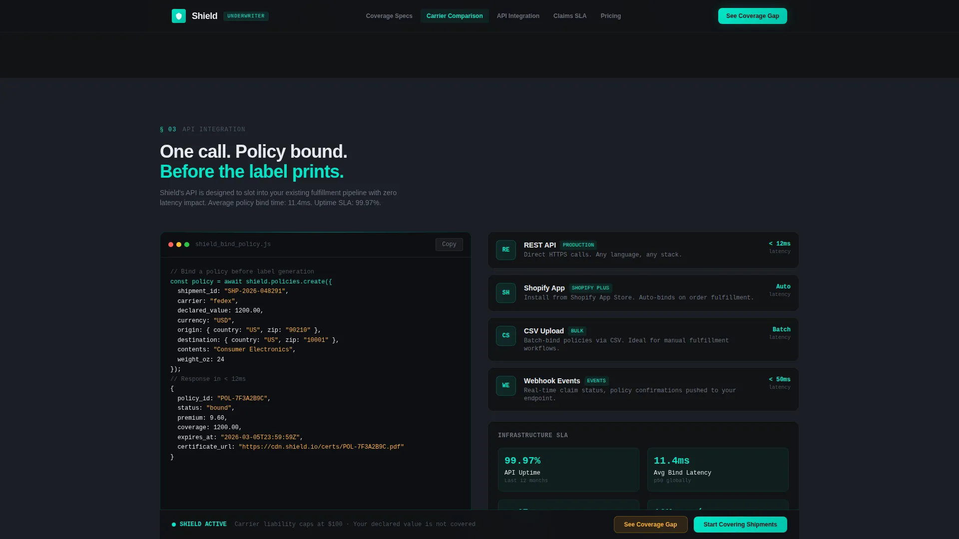
A dedicated section shows code snippets, supported integration methods (API, Shopify app, and CSV upload), and latency data. This section speaks directly to the technical evaluators on a fulfillment or engineering team who need to understand implementation before recommending the platform.
Pre-Populated Comparison Table
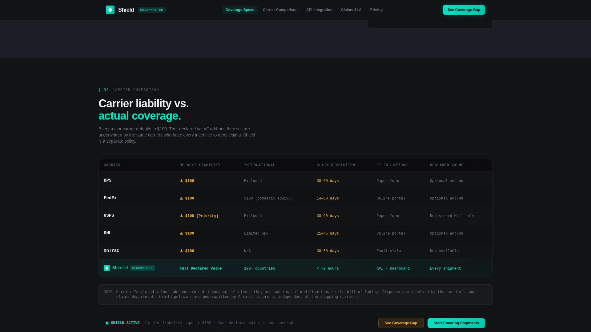
Below the sticky call to action, a detailed comparison table is pre-populated using the visitor's calculator inputs. It sets standard carrier liability against full declared-value coverage side by side. A secondary call to action, "Start Covering Shipments," leads directly to the two-field signup form.
Social Proof Metrics Block
Near the end of the page, platform performance metrics, including claim resolution rate, average payout time, and total parcels covered, appear as animated counters. Operator quotes follow, providing human validation after the data has already built the case.
Page sections overview
| Section | Purpose |
|---|---|
| Hero Calculator | Show current loss versus coverage cost in real time |
| Coverage Specs | Display technical coverage limits and thresholds |
| Carrier Comparison | Compare carrier liability against declared-value coverage |
| API Integration | Present integration methods, code snippets, and latency |
| Claims SLA | Show claims service-level timelines and resolution data |
| Pricing Tiers | Break down tier options with hard cost figures |
| Social Proof Block | Reinforce trust with metrics and operator quotes |
| Comparison Table | Pre-populate gap analysis using calculator inputs |
| Signup Form | Capture monthly volume and preferred integration method |
Design & branding system
The visual identity follows a Service Utility theme styled as a logistics control room interior. Color carries semantic meaning: every hue signals operational status rather than decoration.
- Carbon Fiber palette: deep cockpit black (#111215) as the primary background, woven graphite (#2A2D34) for card and section surfaces, status-light teal (#00E5C7) for covered states and confirmations, caution amber (#FFB020) for exposed or at-risk indicators, and cool matte slate (#1B1E25) as the page base
- Typography uses Plus Jakarta Sans at weights 400 and 800 for headlines and body text, with JetBrains Mono applied to all data fields, code snippets, and numeric outputs to reinforce the terminal aesthetic
- White (#E8EAED) text floats against dark surfaces like terminal output, high contrast, zero decorative elements, every visual decision earned by function
Mobile & speed optimization
The template is built desktop-first to match the primary use case: fulfillment managers reviewing coverage data on operations dashboards during working hours. Responsive scaling to tablet is included in the layout structure.
- Desktop-first layout with tablet-responsive breakpoints for operations teams reviewing data away from a primary workstation
- Static sections use server-side component patterns; interactive components including the live calculator and animated counters are handled client-side to keep the page responsive during input
- Scroll reveals and counter animations are structured to trigger on viewport entry, keeping the experience smooth as visitors move through data-heavy spoke sections
How this template helps you convert
The Shield template is designed around a single conversion goal: make the carrier liability gap feel too large and too costly to leave uncovered. Every structural decision moves toward that outcome.
- The hero calculator shows financial exposure in the visitor's own numbers before any copy asks for trust, turning abstract risk into a specific amber figure that sits next to a smaller teal coverage cost
- The sticky navigation and persistent "See Your Coverage Gap" call to action keep the primary decision point visible at every scroll depth, so no interested visitor has to search for the next step
- The pre-populated comparison table at the bottom of the page uses the visitor's own inputs to quantify the gap, making the case for signup feel personally relevant rather than generic
Other information about this template
Shield is categorized under Logistics & Supply Chain with a subcategory focus on e-commerce parcel logistics. It is built as a hub-and-spoke anchor-nav layout, meaning the sticky top navigation connects directly to each spoke section without navigating away from the page.
- The template is localized for English-language audiences using USD pricing and US date formatting throughout all data tables and metrics blocks
- Animation intensity is set to high throughout: counter animations, input-reactive number morphing, and scroll-triggered reveals are all included as part of the interactive layer
- The footer follows a linear single-row pattern, keeping the bottom of the page clean and consistent with the information-dense aesthetic above it
- The Spec Sheet creative direction means the page earns trust through data density rather than storytelling, making it well suited for evaluation-stage buyers who need to review every limit before committing
Theme
Service Utility
Creative direction
Spec Sheet
Color system
Carbon Fiber
Style
Hub & Spoke (Anchor Nav)
Direction
Comparison/Versus
Page Sections
Live Loss Versus. Coverage Calculator
Sticky Anchor Navigation Bar
Engineering-style Spec Tables
Pre-populated Comparison Table
API Integration Showcase
Metrics and Social Proof Block
Related questions
What kind of business is this template designed for?
Does the hero calculator require a backend connection to work?
What integration methods does the API section cover?
What does the signup form collect?
Can this template support a different visual identity?