Insurance Agency 404 Error Coverage Recovery Website Template
Shield is a modular card grid landing page template built for insurance agencies that want to turn a broken 404 page into a working coverage gateway. It opens with a glitching dashboard preview, leads every card with a bold stat, and guides visitors toward a free coverage scan without requiring a signup upfront.
by Rocket studio
Quick summary
Shield transforms a dead-end 404 error page into an active insurance discovery experience. The template uses a modular card grid layout, a stats-first visual approach, and a Dynamic Motion theme to keep visitors engaged rather than bouncing. A persistent bottom bar invites a free coverage scan with just a zip code, no account needed.
Who this template is for
This template is designed for digital insurance agencies that receive significant traffic to broken or missing URLs. It suits teams who want to recover lost visitors and convert frustration into meaningful policy interest.
- Small business owners who land on a broken policy URL and need fast coverage options
- Young renters comparing liability plans across multiple browser tabs
- Fleet managers whose saved claims portal URL stopped working after a site migration
What problem this template solves
A standard 404 page tells a visitor they are in the wrong place and offers nothing useful in return. For an insurance agency, that moment is a lost lead, a broken trust signal, and a missed quote opportunity all at once.
- Visitors who hit a dead-end URL have no reason to stay, so they leave
- A generic error page gives no path to the coverage or information they originally needed
- Without a recovery experience, the agency loses warm, intent-driven traffic that is difficult to recapture
What you get with this template
The template delivers a fully structured, single-page landing experience built around a modular card grid. Every visual and interactive element is designed around the specific context of a 404 recovery moment.
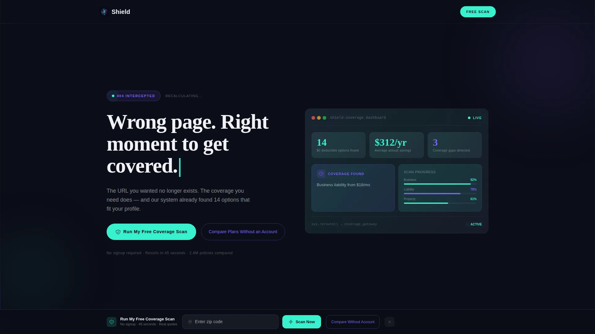
- A Dashboard Preview header with glitch animation, live-feel stats, and a self-typing headline
- A card grid where each module leads with a bold number before revealing its coverage content
- A persistent bottom call to action bar with a zip code input field and a secondary no-account comparison path
Feature list
This template includes a focused set of purpose-built features. Each one serves the specific goal of converting a broken URL visit into a coverage inquiry.
Animated Dashboard Header
The header opens as a half-rendered insurance dashboard in mid-load state. One card glitches softly to mark the 404 moment. Stats populate in real time feel: deductible options found, average savings per year, and coverage gaps detected. A micro-animation shows a broken link icon morphing into a shield, and the headline types itself in character by character.
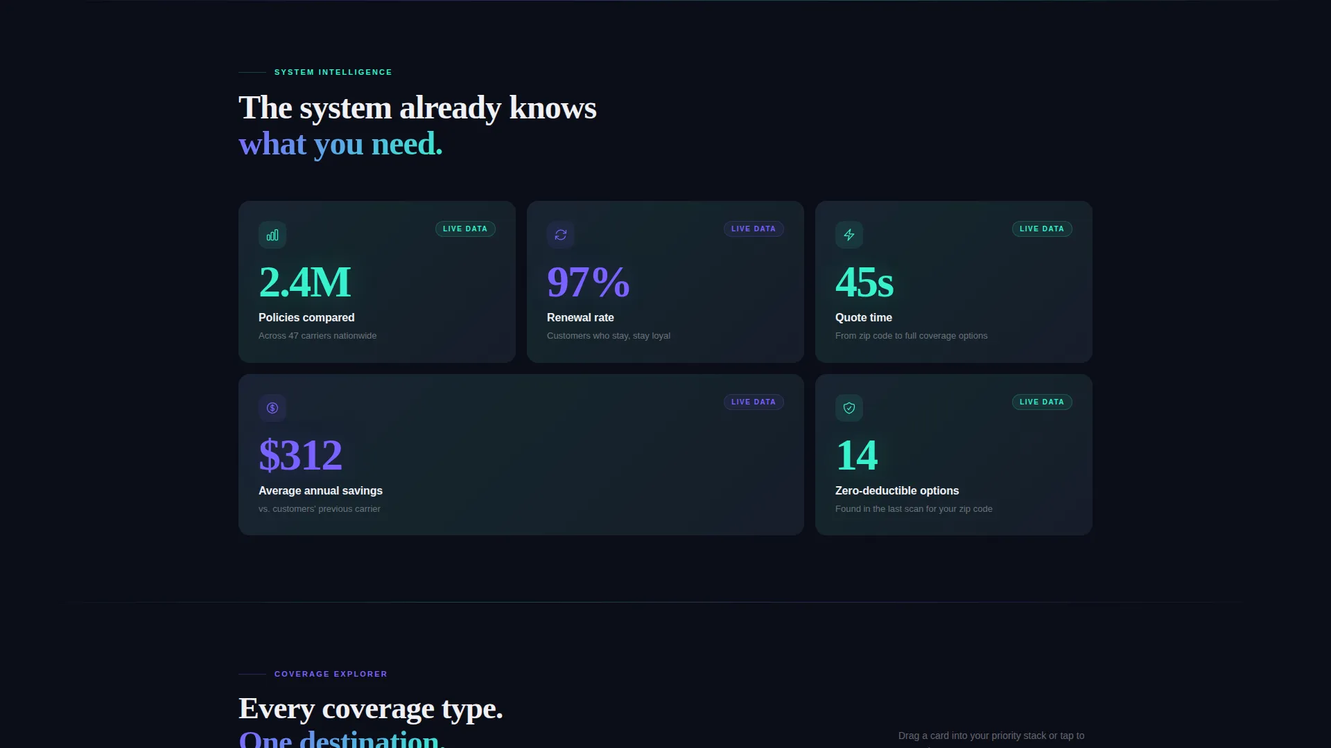
Stats-First Card Grid
Every card in the modular grid opens with a single bold number before its content appears. Examples include 2.4 million policies compared, a 97 percent renewal rate, and a 45-second quote time. Cards stagger into view using spring-physics easing, so each module feels like it arrives rather than simply fades in.
Dynamic Grid Scroll Behavior
The grid layout subtly reorganizes as the visitor scrolls. Cards sit tighter at the top of the page and grow more spacious further down. This creates a natural visual pull that draws the eye downward without requiring any additional prompts.
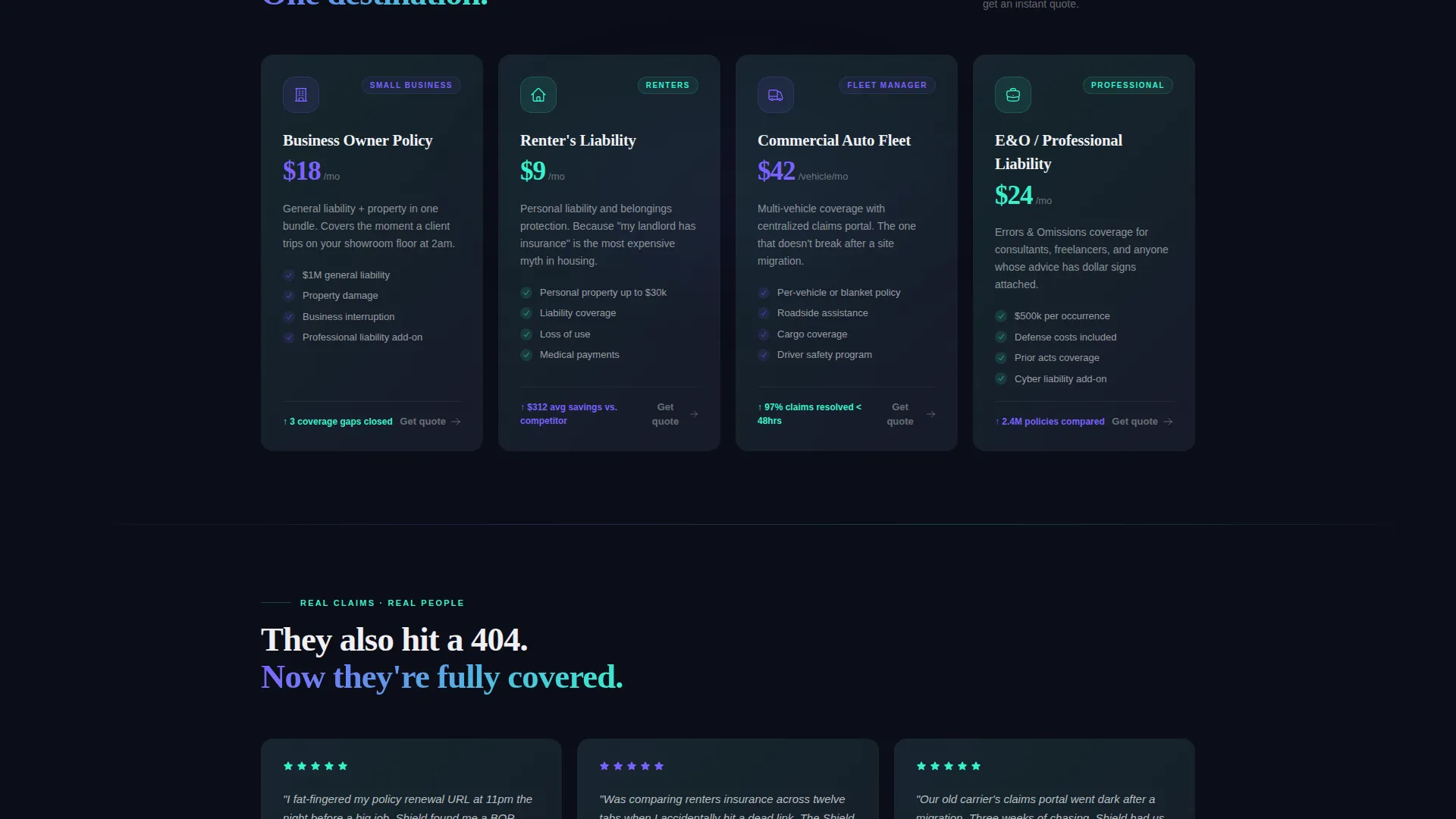
Coverage Module Cards
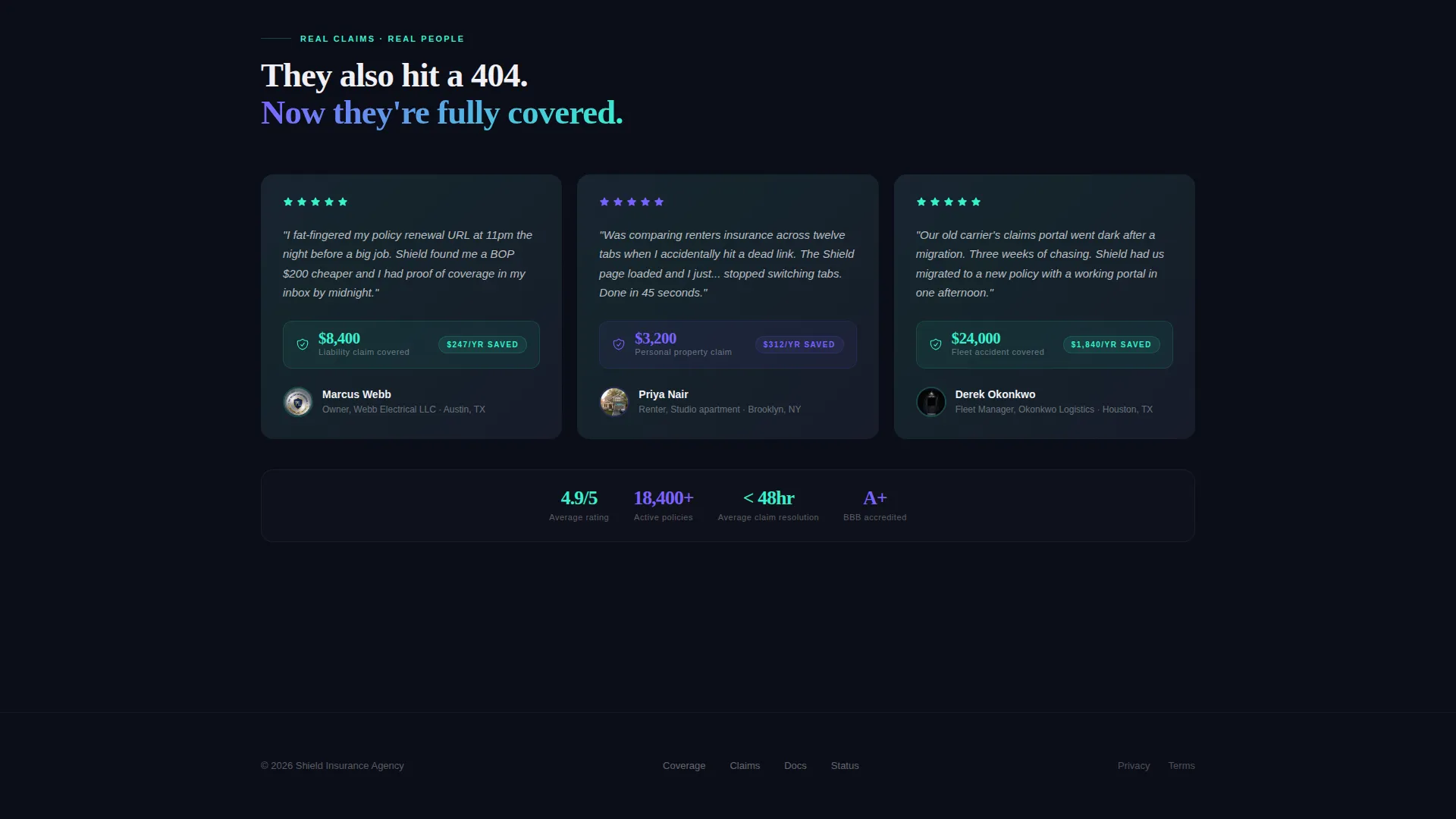
The grid includes self-contained coverage explorer cards, a savings calculator card, a risk assessment snapshot card, and a testimonial card that shows a real claim amount. Each card is a standalone module with its own purpose and call to action context.
Persistent Freemium call to action Bar
A bottom bar floats persistently as the visitor scrolls. It contains a single zip code input field and a pulsing teal button labeled "Run My Free Coverage Scan." No signup is required for the initial scan. Email capture appears only after results render, framed as saving the report.
Interactive Plan Comparison Tool
A secondary conversion path labeled "Compare Plans Without an Account" leads to a card-sorting interaction. Visitors drag coverage types into a priority stack to build a personalized comparison view. This path gives hesitant visitors a low-commitment way to engage before committing to the scan.
Page sections overview
| Section | Purpose |
|---|---|
| Dashboard Preview Header | Opens the 404 recovery experience with glitch animation and populating stats |
| Self-Typing Headline | Delivers the core message as animated text that types itself in |
| Stats Impact Row | Anchors trust immediately with bold policy and savings numbers |
| Coverage Explorer Card | Lets visitors browse available coverage types in a modular card |
| Savings Calculator Card | Shows estimated annual savings in an interactive card format |
| Risk Assessment Card | Provides a snapshot of coverage gaps to create urgency |
| Testimonial Claim Card | Builds social proof using a real claim amount as the lead stat |
| Plan Comparison Tool | Offers a drag-and-sort card interaction for no-account users |
| Persistent call to action Bar | Keeps the free scan offer visible at all times with zip code input |
Design & branding system
The template uses an AI Iridescent color system built on four core values. The palette creates a sense of a living, breathing interface rather than a static layout.
- Deep void black (#0B0D17) for all backgrounds, holographic violet (#7B61FF) and spectral teal (#36F1CD) for interactive pulses, and signal white (#F0F0F5) for card surfaces and body text
- Gradient borders on each card shift on hover, giving the grid a shimmer effect as if light is refracting through the surface
- Every interactive element pulses between violet and teal in a rhythm that signals system activity without overwhelming the visitor
Mobile & speed optimization
The card grid layout is built to adapt naturally across screen sizes. The modular structure means each card resizes and reflows independently without breaking the overall layout logic.
- Spring-physics animations are scoped to individual card modules, so motion stays smooth even on smaller viewports
- The persistent call to action bar is designed to remain usable and visible on mobile screens without obscuring primary content
- The zip code input and pulsing teal button maintain their visual weight and tap target clarity at smaller sizes
How this template helps you convert
The conversion structure is built around earning the click before asking for anything. Visitors see real numbers and useful tools before they encounter any form or commitment request.
- The dashboard header and stats row establish credibility in the first scroll viewport, so visitors immediately understand the agency has useful data for them
- Coverage and savings cards give visitors something interactive and informative to engage with before the call to action appears, lowering resistance to the free scan offer
- The two-path call to action structure serves both ready visitors who scan immediately and cautious visitors who prefer to compare plans without creating an account first
Other information about this template
This template is categorized under insurance agency website templates with a specific focus on the 404 error page recovery niche. It is a strong fit for agencies that invest in paid or organic traffic and want to protect every URL against bounce loss.
- The template style is Card Grid (Modular), making individual sections easy to reorder, remove, or duplicate to match your agency's specific coverage lineup
- The Dynamic Motion theme and AI Iridescent palette are production-ready visual choices that work well for technology-forward insurance brands
- The Freemium/Trial landing page direction means the conversion flow is designed around no-barrier entry, with email capture deferred until after value is already delivered
Theme
Dynamic Motion
Creative direction
Stats-First Impact
Color system
AI Iridescent
Style
Card Grid (Modular)
Direction
Freemium/Trial
Page Sections
Animated Glitch Dashboard Header
Stats-first Modular Card Grid
Dynamic Scroll Grid Reorganization
Persistent Freemium Call to Action Bar
Interactive Plan Comparison Tool
Self-contained Coverage Module Cards
Related questions
Does this template require visitors to create an account to use the coverage scan?
Can I customize the card modules to match my agency's coverage types?
What animations are included in this template?
Who is this template best suited for?
Is the plan comparison tool part of the same landing page?


