Micro-SaaS & Developer Tools Provider Directory Website Template
Shield is a single-page ad blocker landing page template built on a modular card grid layout. It uses a filterable feature matrix, dark glass panel header, and a freemium conversion flow to turn curious visitors into confident users. The Electric Indigo color system and Directory & Discovery theme create a focused, immersive browsing experience that earns trust before asking for a click.
by Rocket studio
Quick summary
Shield is a landing page template for browser-based ad blocker products. It uses a card grid layout organized around a filterable feature matrix. The dark glass header, void-black backgrounds, and Electric Indigo palette give it a focused, technical identity. The page guides visitors from curiosity to conversion through an interactive grid before surfacing any call to action.
Who this template is for
This template is built for founders and developers launching ad blocker extensions or privacy-focused browser tools. It suits products with layered feature sets that need to speak to both casual users and technical power users on the same page.
- Privacy tool creators who want a polished, single-page launch presence
- Developer-focused Micro-SaaS teams selling browser extensions on a freemium model
- Independent builders who need a clean, conversion-ready landing page without starting from scratch
What problem this template solves
Most landing pages for browser tools either oversimplify features for casual users or bury technical detail in documentation. Shield solves this by organizing capabilities into a scannable, filterable grid that rewards both audiences simultaneously.
- Casual users find value early through recognizable feature names like "Block YouTube Ads"
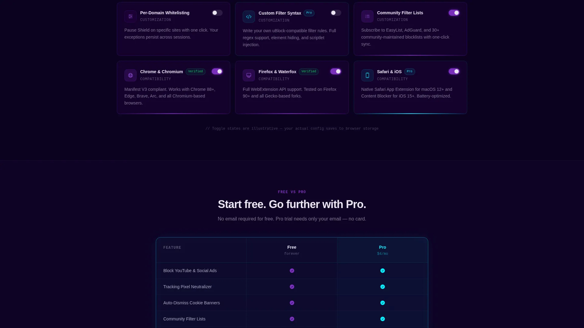
- Power users discover depth as they scroll into cards covering custom filter syntax and per-domain whitelisting
- The page earns conversion by letting visitors explore before presenting the upgrade path
What you get with this template
Shield delivers a complete, structured landing page with every section designed around the ad blocker use case. The layout is modular, meaning each card and section block can be adapted to your specific product.
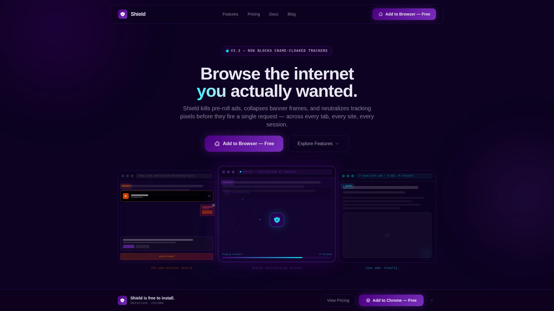
- Dark glass panel header triptych showing before, mid-purge, and after states of a web page
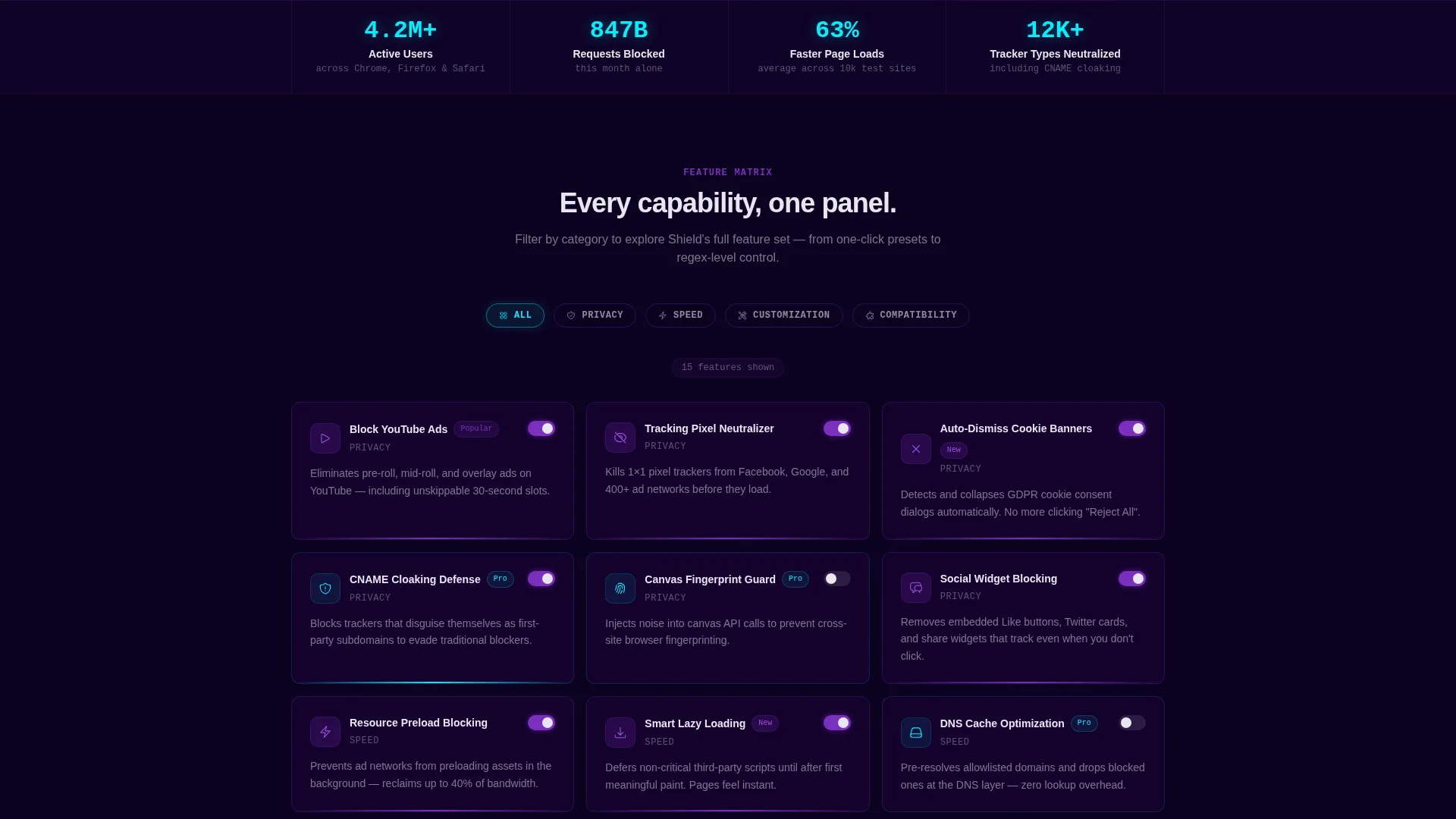
- Filterable feature matrix with category pills for Privacy, Speed, Customization, and Compatibility
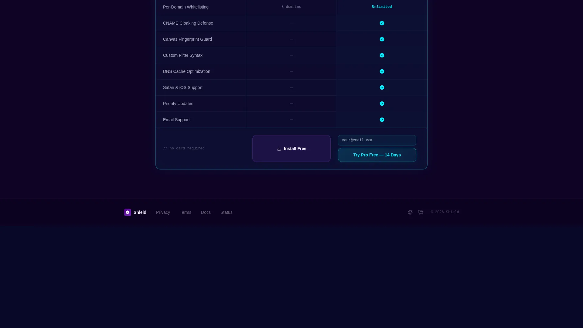
- Floating bottom bar with a primary call to action and a mid-grid comparison card for freemium conversion
Feature list
This template is built around a tightly defined set of components. Each one is grounded in the product story and contributes directly to the conversion flow.
Dark Glass Triptych Header
Three translucent, frosted-glass cards float against a void-black background. The left card shows a cluttered page with pop-ups and cookie banners. The center shows mid-purge with elements dissolving into indigo particles. The right shows the clean result. A single headline fades up beneath: "Browse the internet you actually wanted."
Filterable Feature Matrix
The core of the page is a card grid organized by category pills: Privacy, Speed, Customization, and Compatibility. Visitors click a pill to reorganize the grid in real time. Each card shows an icon, a feature name, a one-line description, and a toggle displaying on or off state.
Progressive Feature Depth
Cards are arranged so simpler features appear near the top and technical ones appear deeper in the scroll. This rewards casual users early and holds power users as they scroll deeper without splitting the page into separate sections.
Freemium Comparison Card
A mid-grid card styled identically to feature cards but glowing in cyan presents a Free versus Pro comparison in two columns. The call to action reads "Try Pro Free for 14 Days." The free tier requires no email; the Pro trial asks only for email and browser type.
Floating Conversion Bar
A sticky bottom bar appears after the first scroll and stays pinned throughout the page. It carries the primary call to action "Add to Browser, Free" and detects the visitor's browser to route them to the correct extension store.
Electric Indigo Visual System
The color palette uses deep void black, charged indigo, phosphor violet, and reactive cyan. Reactive cyan is reserved for interactive states such as toggles, hover effects, and active filter pills. Category pills glow in violet with cyan borders on selection.
Page sections overview
| Section | Purpose |
|---|---|
| Dark Glass Header | Communicates product value through a before, mid-purge, and after visual triptych |
| Feature Matrix Grid | Lets visitors browse and filter every product capability by category |
| Freemium Comparison Card | Presents Free versus. Pro tiers in a scannable two-column card |
| Floating Bottom Bar | Keeps the primary call to action visible throughout the scroll |
Design & branding system
The template's visual identity is built on the Electric Indigo color system. Every design decision supports a dark, focused atmosphere that feels technical without feeling cold.
- Color palette: deep void black (#0D0221), charged indigo (#4B0082), phosphor violet (#7B2FBE), and reactive cyan (#00F0FF)
- Text renders in cool white (#E8E6F0); card edges catch light like beveled glass against negative space
- Reactive cyan is strictly reserved for toggles, hover states, and active filter selections to prevent visual noise
Mobile & speed optimization
The modular card grid is built to reflow cleanly across screen sizes. The floating bottom bar and category pill navigation are sized for touch interaction, keeping the conversion path accessible on smaller devices.
- Card grid adapts from multi-column desktop layout to a single-column mobile stack
- Category pills are touch-friendly and maintain their glow and selection states on mobile viewports
- The static triptych header avoids load-blocking animations, keeping the initial view fast and immediate
How this template helps you convert
The conversion strategy is built into the page structure itself. Visitors interact with the product before they are ever asked to commit.
- The filterable feature grid lets visitors mentally configure their ideal setup, building investment in the product before any call to action appears.
- The mid-grid comparison card surfaces the Pro upgrade at the exact moment visitors are deepest in feature discovery, when intent is highest.
- The floating bottom bar keeps the free entry point visible at all times, removing friction for visitors ready to act at any scroll depth.
Other information about this template
Shield is categorized under Technology and Micro-SaaS & Developer Tools, making it a strong fit for the ad blocker niche and adjacent privacy product categories. The Directory & Discovery theme gives the page the browseable, curated feel of a software directory without losing its conversion focus.
- The template style is Card Grid (Modular), which means individual feature cards can be added, removed, or reordered to match your product's actual feature set
- The header concept (Dark Glass Panels) and Feature Matrix creative direction are matched intersection choices, meaning they are validated design pairings for this niche and conversion model
- The freemium and trial landing page direction is well suited for browser extension products where the free tier drives installation volume and the Pro trial converts engaged users
Theme
Directory & Discovery
Creative direction
Feature Matrix
Color system
Electric Indigo
Style
Card Grid (Modular)
Direction
Freemium/Trial
Page Sections
Dark Glass Triptych Header
Filterable Feature Matrix
Progressive Feature Depth
Freemium Comparison Card
Floating Conversion Bar
Electric Indigo Visual System
Related questions
Can I customize the feature cards to match my own product?
Does the template support both free and paid conversion flows?
Is the header triptych animated?
Who is this template best suited for?
Can I change the category filter pill labels?



