Cybersecurity Mobile App Landing Page Template
Shield is a scroll-reveal cybersecurity landing page template built for mobile app promotion. It uses a Carbon Fiber color system, a cinematic dark full-bleed header with a glowing phone mockup, and a progressive feature matrix that guides visitors from personal protection to enterprise-level security. No form fields. One clear call to action. Built to earn the click.
by Rocket studio
Quick summary
Shield is a single-page cybersecurity landing page template designed to promote a security mobile app. It opens with a full-bleed dark header, a typewriter headline, and a glowing device mockup. As visitors scroll, feature tiers reveal themselves one by one. The layout drives toward a single conversion point: a free scan click that routes to an app store or signup flow.
Who this template is for
This template is built for teams and individuals who need to communicate serious digital security in a way that feels immediate and credible. It speaks to people who already understand the threat landscape and want a presentation that matches their level.
- Remote founders who manage startup infrastructure while traveling and need a polished, fast-moving landing page for their security app
- IT managers at mid-size companies handling dozens of endpoints with a small team, looking for a template that reflects real operational stakes
- Privacy-conscious professionals and indie developers who want a launch page that signals depth and competence at first glance
What problem this template solves
Most app landing pages either look generic or bury the value proposition under vague marketing language. For a cybersecurity mobile app, that disconnect destroys trust before the visitor even reads the first headline. Shield fixes this by letting the design itself communicate authority.
- Visitors have no patience for cluttered layouts or weak visual hierarchy when evaluating a security product
- Generic templates fail to match the tone that security-minded buyers expect, causing early drop-off
- Without a clear, progressive structure, feature-rich apps look overwhelming rather than reassuring
What you get with this template
You get a fully structured, single-page layout built around scroll-reveal progressive disclosure. Every section is designed to build trust incrementally, from the first animated headline to the sticky conversion bar that locks to the bottom of the viewport.
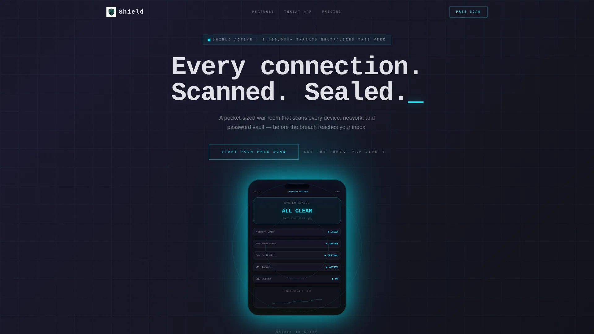
- A cinematic dark header with a centered phone mockup, a cyan reactor glow effect, and a typewriter headline animation
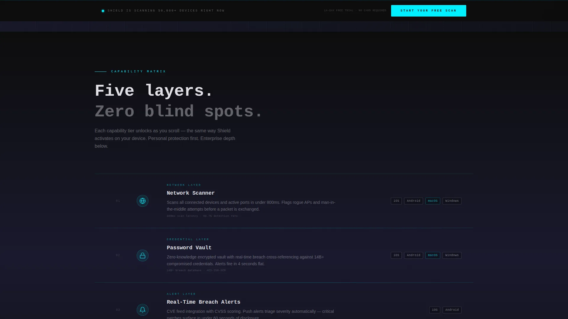
- A feature matrix with five tiered sections, scan-line animations between tiers, and compatibility badge strips for iOS, Android, macOS, and Windows
- Two conversion touchpoints: a ghost-outlined button in the header and a solid cyan sticky bar that appears after the second feature tier
Feature list
This template is built around a tightly coordinated set of visual and structural capabilities. Each one serves a specific role in moving a skeptical visitor toward a confident click.
Typewriter Headline Animation
The headline types itself character by character in monospaced type, reading "Every connection. Scanned. Sealed." A supporting subhead fades in two seconds later displaying a live-style stat. The effect immediately sets the tone: precise, controlled, and operating in real time.
Scroll-Reveal Feature Matrix
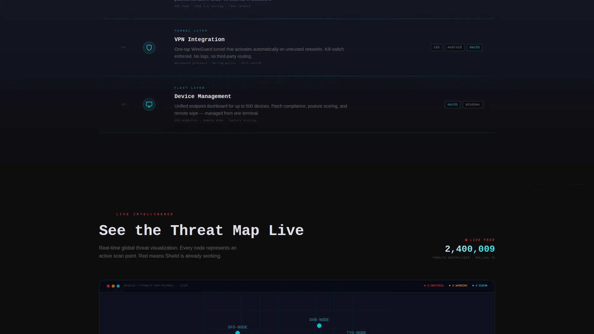
Five capability tiers unlock as the visitor scrolls: network scanner, password vault, real-time breach alerts, VPN (Virtual Private Network) integration, and device management. Each tier appears as a card row with a pulsing cyan icon, a short feature description, and a platform compatibility badge strip on the right side.
Animated Scan-Line Dividers
Between each feature tier, a thin horizontal scan-line animates across the full viewport width. It mimics the sweep of a security audit in motion, reinforcing the impression that the page itself is actively checking something.
Sticky Cyan Conversion Bar
Once the visitor scrolls past the second feature tier, a solid cyan call-to-action bar locks to the bottom of the viewport. It stays visible for the rest of the scroll journey without interrupting the reading flow. No form fields appear at any point.
Interactive Threat Map Teaser
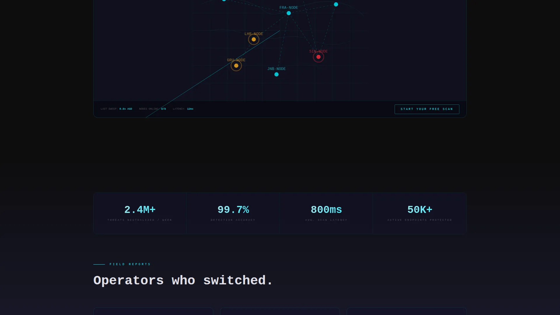
A mid-page section presents an embedded real-time dashboard teaser labeled "See the Threat Map Live." It gives visitors a preview of the app's capabilities before any commitment is required, building credibility through demonstration rather than claims.
Carbon Fiber Visual Identity System
The entire page uses a structured color system built on deep cockpit black, woven graphite, threat-pulse cyan, and incident-red reserved strictly for alert states. Terminal white handles body text. Cyan traces card edges, dividers, and active elements as they enter the viewport.
Page sections overview
| Section | Purpose |
|---|---|
| Dark Full-Bleed Header | Introduces the app with a glowing phone mockup, typewriter headline, and ghost call to action button |
| Network Scanner Tier | First feature reveal showing network scanning capability with icon, description, and platform badges |
| Password Vault Tier | Second feature tier highlighting the password vault with scan-line divider animation above |
| Breach Alerts Tier | Third tier covering real-time breach alert functionality and triggering the sticky call to action bar |
| VPN Integration Tier | Fourth feature level presenting VPN integration with compatibility badges |
| Device Management Tier | Fifth tier showing team and multi-device management, escalating toward enterprise context |
| Threat Map Teaser | Mid-page interactive embed previewing the live dashboard before asking for commitment |
| Sticky Conversion Bar | Viewport-locked cyan call to action bar that persists from tier two onward through the end of the page |
Design & branding system
The visual identity draws from a Carbon Fiber color system. Every color serves a specific functional role, and nothing decorative competes with the data-forward layout. The result feels engineered rather than styled.
- Core palette: cockpit black (#0D0D0D) for backgrounds, woven graphite (#1A1A2E) for layered surfaces, threat-pulse cyan (#00F0FF) for active elements and dividers, incident-red (#FF2E3A) reserved for alert states and critical badges only
- Typography uses monospaced characters for the headline and cool terminal white (#E0E0E6) for body text, maintaining a command-line aesthetic throughout
- Cyan acts as connective tissue across the layout, glowing along divider lines, illuminating active card edges as they enter the viewport, and tracing interactive toggles
Mobile & speed optimization
The template is built with a mobile-first context in mind, which makes sense given that it promotes a mobile security app. The layout adapts naturally to the scroll behavior and screen sizes that the core audience uses daily.
- The progressive scroll-reveal structure keeps the page feeling lightweight and controlled, with each section appearing only as the visitor reaches it
- The phone mockup in the header is centered and viewport-scaled, ensuring it reads clearly on both mobile and desktop screens without layout breakage
- Card rows and compatibility badge strips in the feature matrix are structured to reflow cleanly at smaller breakpoints
How this template helps you convert
The conversion architecture here is deliberate. There are no distractions, no form fields, and no premature asks. Every element builds toward a single high-confidence click.
- The header ghost button offers an early, low-pressure entry point for visitors who are already convinced, letting them act immediately without scrolling
- The progressive feature matrix self-qualifies the visitor as they scroll deeper, so by the time the sticky cyan bar appears, they have already seen the evidence that makes the click feel obvious
- The threat map teaser mid-page provides a moment of interactive proof before the final conversion request, reducing the leap of faith required to download or sign up
Other information about this template
This template is part of a broader Directory and Discovery theme family, which uses structured, card-based layouts to present dense information in a scannable way. The cybersecurity context makes this theme especially effective because visitors are already primed to process layered, hierarchical information.
- The template style is Scroll Reveal (Progressive), meaning each content layer appears only when the visitor reaches it, keeping the pacing deliberate and the interface free of visual noise
- The Feature Matrix creative direction is specifically designed for products with multiple capability tiers, allowing the page to serve personal users, small teams, and enterprise buyers from a single scroll path
- The lp direction is Click-Through, with no embedded forms, meaning the page is optimized for routing traffic to an external app store listing or a dedicated signup flow rather than capturing leads on-page
- The header concept is Dark Full-Bleed and Glow, a presentation style that works particularly well for technology and security products where the visual weight of the interface signals product sophistication
Theme
Directory & Discovery
Creative direction
Feature Matrix
Color system
Carbon Fiber
Style
Scroll Reveal (Progressive)
Direction
Click-Through
Page Sections
Typewriter Headline with Stat Fade-in
Progressive Scroll-reveal Feature Matrix
Animated Scan-line Dividers
Sticky Viewport-locked Call to Action Bar
Interactive Threat Map Teaser
Carbon Fiber Color Identity System
Related questions
Does this template include any form fields or lead capture components?
Can I update the feature tiers to match my own app's capabilities?
Is the incident-red color used throughout the design?
What type of product is this template best suited for?
When does the sticky call to action bar appear during the scroll?



