Security Guard Vertical SaaS Booking Website Template
Shield is a single-page security guard booking landing page template built for platforms that dispatch licensed personnel fast. It combines a live-dashboard product screenshot header, animated stats counters, and a head-to-head comparison table to turn hesitant visitors into qualified leads. The design runs on a dark command-center palette with teal and amber accents that make every key action impossible to miss.
by Rocket studio
Quick summary
Shield is a high-conversion landing page template for security guard booking platforms. It opens with a product screenshot that feels mid-session, accelerates through animated proof counters, and closes the argument with a side-by-side comparison table. A sticky amber call-to-action bar and a three-field intake form work together to turn visitor intent into scheduled deployments.
Who this template is for
Shield is built for teams that operate under real time pressure and need a booking platform landing page that communicates speed and authority instantly. If your audience measures reliability in minutes, this template speaks their language.
- Property managers and corporate facilities teams scaling guard coverage across multiple buildings
- Event coordinators and festival producers who need to fill entry points on short notice
- Logistics directors and warehouse operations managers covering overnight patrol gaps fast
What problem this template solves
Traditional agency booking is slow, opaque, and fragile. Visitors arriving at your platform already know this pain. Shield gives you a structured way to prove your platform solves it before a visitor ever touches a form field.
- Buyers cannot easily compare your platform to calling three separate agencies on their own
- No single page currently shows response time, pricing clarity, and guard vetting side by side
- Urgency is high but most booking pages do not reflect the operational stakes involved
What you get with this template
Shield delivers a complete single-page layout designed around lead generation for security deployment services. Every section is purpose-built to move a skeptical operations buyer from arrival to submission.
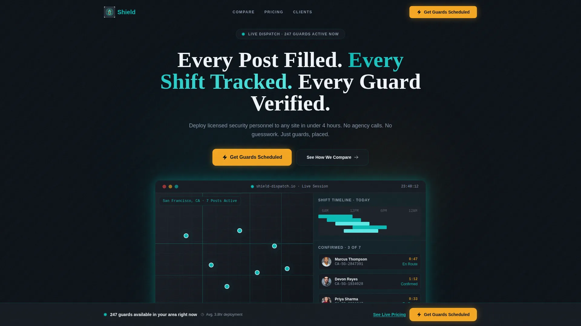
- A product screenshot hero with an isometric booking dashboard, guard pins on a city map, and live ETA countdowns
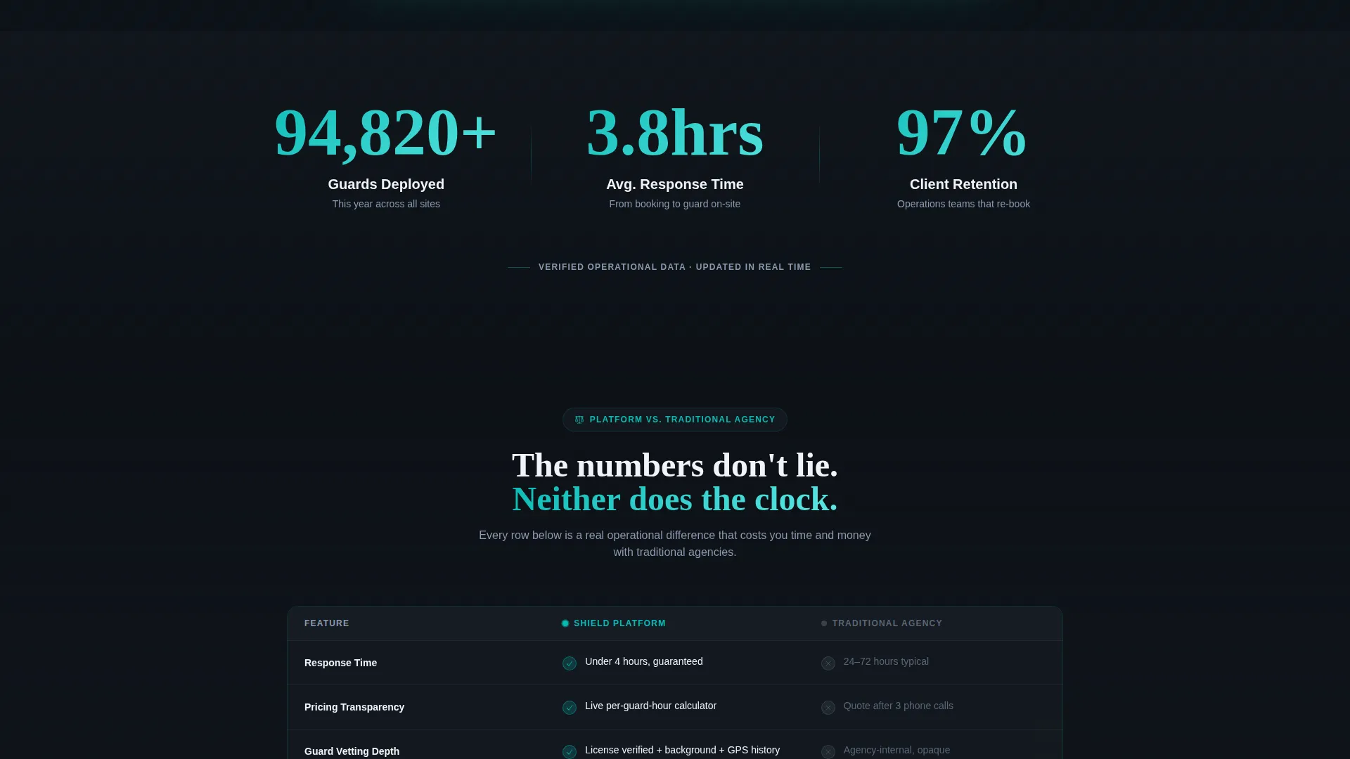
- Three animated stat counters showing guards deployed, average response time, and client retention
- A full eight-row comparison table, a testimonial carousel, client logo strip, and a three-field lead capture form with an inline pricing calculator
Feature list
Shield includes the following purpose-built sections and components drawn directly from its design brief.
Isometric Dashboard Hero
The header features a high-fidelity product screenshot angled at a slight isometric tilt. It shows a map view with seven guard pins, a staggered shift timeline, and a sidebar listing three confirmed guards with headshots, license numbers, and ETA countdowns. A soft ambient glow bleeds from the teal interface elements to make the screen feel live rather than static.
Animated Stats Counters
Three oversized counters open the scroll sequence simultaneously. Each number climbs to its final mark with a micro-bounce that gives physical weight to the data. The three metrics shown are total guards deployed this year, average booking response time in minutes, and client retention percentage.
Eight-Row Comparison Table
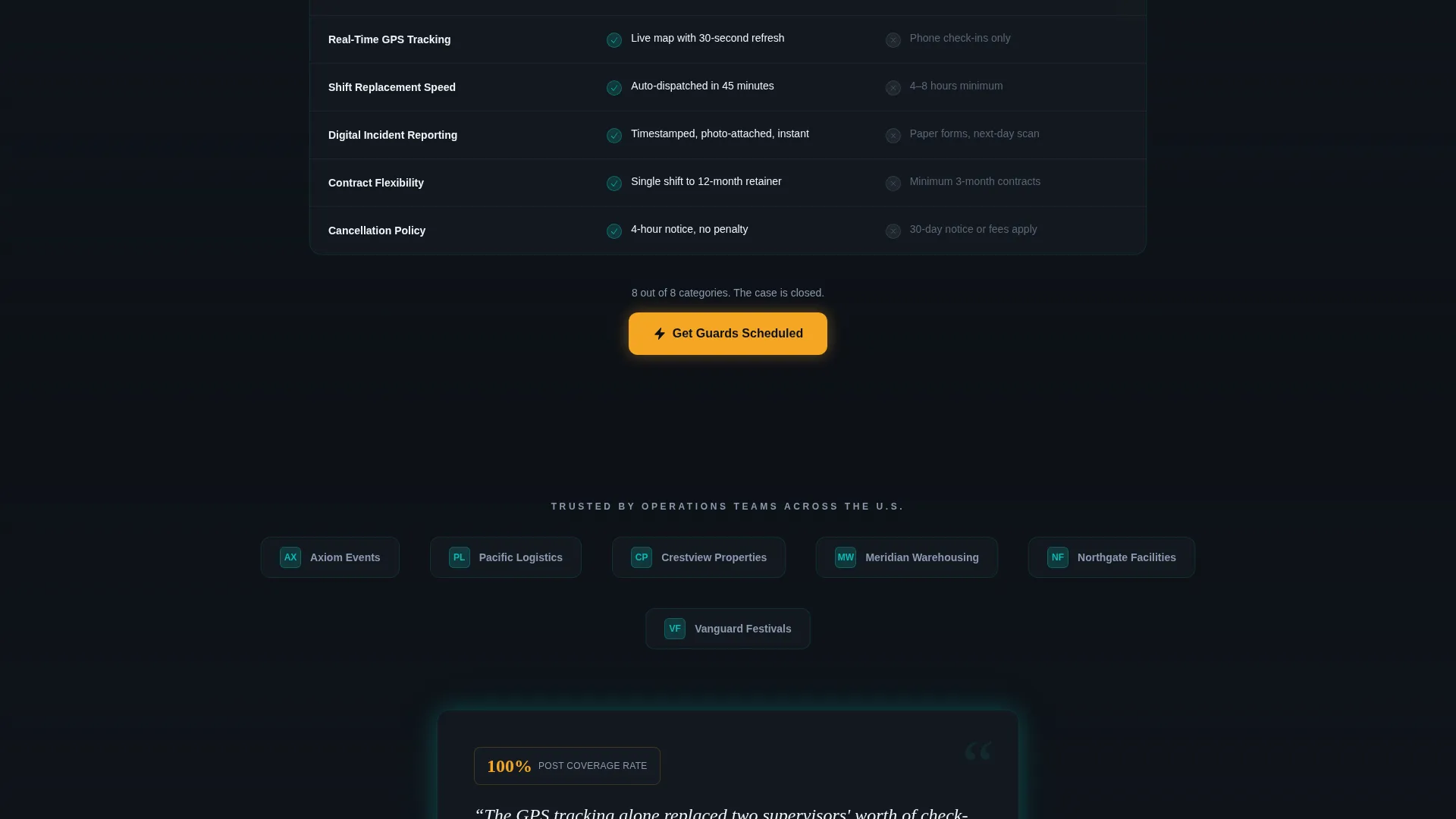
The comparison table is the page's central selling tool. It puts the platform head-to-head against traditional agency booking across eight rows: response time, pricing transparency, guard vetting depth, real-time GPS tracking, shift replacement speed, digital incident reporting, contract flexibility, and cancellation policy. Each row reveals on scroll, with the platform column lighting in teal and the agency column staying muted gray.
Sticky Lead Capture Bar
A signal amber sticky bar activates after the visitor scrolls past the comparison table. It anchors the primary call-to-action, "Get Guards Scheduled," at the bottom of the viewport from that point forward. The bar stays visible without interrupting reading flow.
Three-Field Intake Form
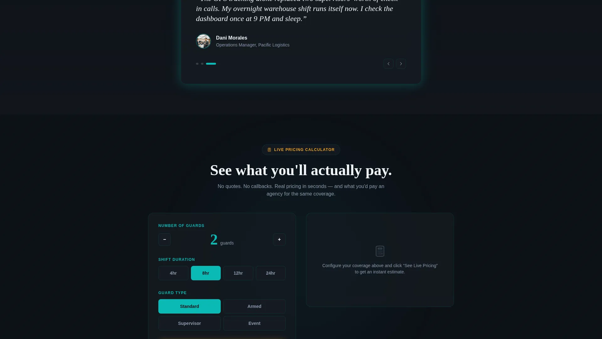
The lead form runs in sequence: number of guards needed, site location, and start date. The linear format keeps cognitive load low and completion rate high. A secondary path labeled "See Live Pricing" opens an inline calculator that estimates cost per guard-hour based on the visitor's own inputs.
Shift Calendar Closing Section
The final content section shows an empty shift calendar that visually fills itself in with a single click. This closing animation reinforces the core promise of the platform: every post covered, every shift tracked, before the visitor leaves the page.
Page sections overview
| Section | Purpose |
|---|---|
| Dashboard Hero Header | Show the platform live and in action to establish instant credibility |
| Animated Stats Block | Prove scale and speed with three counters landing simultaneously |
| Comparison Table | Outperform traditional agency booking across eight visible rows |
| Client Logo Strip | Add social proof from recognizable organizations |
| Testimonial Carousel | Surface real client voices in a looping, skimmable format |
| Shift Calendar Section | Demonstrate ease of coverage with a self-filling calendar animation |
| Sticky call to action Bar | Keep "Get Guards Scheduled" visible from comparison table onward |
| Inline Pricing Calculator | Convert pricing curiosity into qualified intent before form submission |
| Lead Capture Form | Collect guard count, site location, and start date in three steps |
Design & branding system
Shield uses the Teal Catalyst color system on a Dynamic Motion visual theme. The palette is built to feel like a monitoring dashboard running in a darkened operations room, where every color carries an operational meaning.
- Deep black (#0D1117) and charcoal gradients form all backgrounds, letting data and interface elements breathe clearly
- Command-center teal (#0ABAB5) traces every interactive edge, hover state, and section divider like a live circuit, while alert-state white (#F0F4F8) carries all body text
- Signal amber (#F5A623) is reserved exclusively for calls-to-action and urgent-state indicators, ensuring those elements always draw the eye first
Mobile & speed optimization
The layout is built with a section-by-section flow that translates cleanly to narrower viewports. Animated elements are designed to remain impactful at mobile screen sizes without overwhelming smaller displays.
- The sticky call to action bar is designed to remain anchored at the bottom of the screen on mobile, keeping the primary action reachable at all times
- The comparison table is structured for horizontal scrollability on small screens so no row data is clipped or hidden
- The three-field form sequence is optimized for one-thumb input, reducing friction on mobile booking flows
How this template helps you convert
Shield is designed around a single conversion goal: turning an operations manager's urgency into a submitted lead form. Every section earns the click before the call-to-action ever appears.
- The comparison table does the selling first by visually proving the platform outperforms traditional agency booking across eight measurable rows, so visitors arrive at the form already convinced.
- The inline pricing calculator converts passive pricing curiosity into active qualified intent, capturing a second engagement path for visitors who are not yet ready to submit the main form.
- The sticky amber call to action bar ensures the primary action is always one tap away from the moment a visitor finishes reading the comparison evidence onward.
Other information about this template
Shield is categorized under Technology, specifically within the Security Guard Vertical SaaS subcategory. It is designed for platforms operating in the security guard booking system niche where speed of deployment and trust signals are the primary conversion drivers.
- The template style is a Comparison Table layout, making it especially effective for platforms competing against legacy agency booking workflows
- The header concept follows a Product Screenshot approach, which is well-suited for software platforms that benefit from showing their interface in active use
- The creative direction is Stats-First Impact, meaning proof of scale and speed is placed before any persuasive copy or form interaction
- The lead generation direction shapes every structural decision, from the form field sequence to the sticky bar activation point after the comparison table
Theme
Dynamic Motion
Creative direction
Stats-First Impact
Color system
Teal Catalyst
Style
Comparison Table
Direction
Lead Generation
Page Sections
Isometric Dashboard Hero Section
Animated Stats-first Counters
Eight-row Comparison Table
Sticky Amber Call to Action Bar
Inline Pricing Calculator
Shift Calendar Closing Animation
Related questions
What types of businesses is this landing page template designed for?
Can I customize the comparison table rows for my platform?
How does the inline pricing calculator work within this template?
Does the sticky call to action bar appear immediately when the page loads?
Is this template suitable for platforms that book guards for large events?



