Insurance Digital Presence Reviews Website Template
Underwrite is a comparison table landing page built for independent insurance agents who need daily social content without the daily struggle. It delivers 200+ pre-written captions, compliance-reviewed disclaimers, and editable Canva templates across six insurance verticals. The page uses scroll-triggered stats, a phone-frame carousel, and a tiered plan comparison to move visitors straight into a free signup.
by Rocket studio
Quick summary
Underwrite is a digital content toolkit landing page designed to convert solo insurance agents into subscribers. It pairs a stats-first scroll experience with a tiered comparison table, six vertical preview cards, and a pinned "Browse 200+ Templates Free" call-to-action. Every section builds a data-backed case so visitors understand the value before they ever reach the sign-up screen.
Who this template is for
This landing page is built for independent insurance professionals who know their social presence matters but rarely have time to act on it. It speaks directly to agents posting zero to twice a week who need ready-made content they can trust in a regulated industry.
- Solo independent agents licensed across one to three insurance lines and active on Facebook or Instagram
- Small agency owners managing two to ten agents who need branded content produced at scale
- Any insurance company or agency ready to stop staring at a blank content calendar and start building a consistent posting habit
What problem this template solves
Most insurance landing pages focus on quoting or coverage. This one solves a different problem: agents have no time to create compliant social posts, so they post nothing and lose visibility to competitors who do. The landing page makes the cost of inaction feel real and the solution feel immediate.
- Agents waste evenings drafting captions instead of calling potential customers, and this page shows them there is a faster way
- Blank content calendars and compliance anxiety prevent consistent posting, and this template addresses both obstacles head-on
- Without a good insurance landing page built around the right value proposition, a toolkit like this never gets the attention it deserves
What you get with this template
You get a fully structured, single-page comparison table landing page ready to present a tiered subscription offer to insurance professionals. The page is organized into five primary content sections plus a footer and arrives with a complete color and type system baked in.
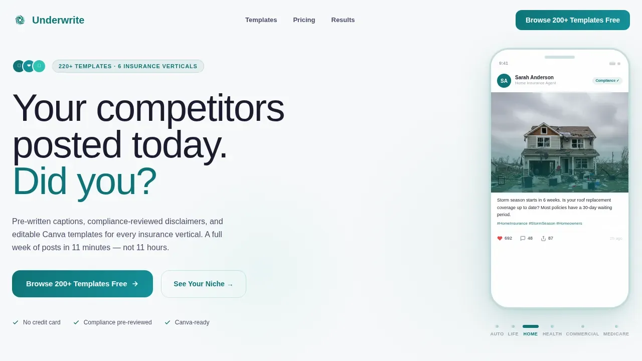
- A phone-frame hero carousel showing six real insurance vertical mockups with animated engagement counters
- A stats-impact section with scroll-triggered oversized numbers, a six-card vertical preview row with deep-link calls to action, and a three-tier comparison table with teal column highlighting
- A social proof section with agent testimonials, trust badges, and a footer built on a linear single-row pattern
Feature list
This landing page template is built around a set of deliberate, prompt-defined components. Each one exists to move visitors through a logical proof sequence and toward a free-tier signup.
Interactive Phone-Frame Hero Carousel
The hero section displays six real template mockups inside phone-screen frames, one per insurance vertical: auto, life, home, health, commercial, and Medicare. Visitors swipe or click through each frame. Like counts, comment threads, and share numbers animate upward in real time, showing agents what engagement looks like before they read a single word of copy. A single headline fades in below: "Your competitors posted today. Did you?" This is the hero image moment that sets the tone for the rest of the page.
Scroll-Triggered Stats Impact Section
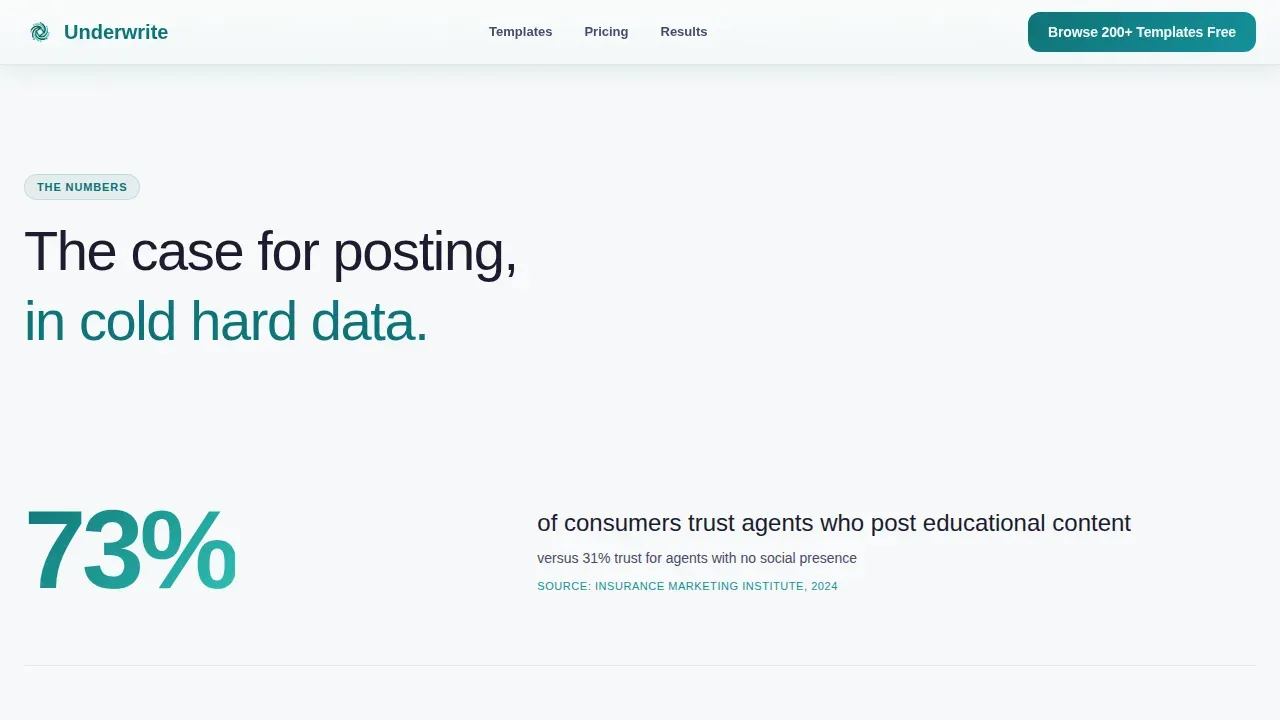
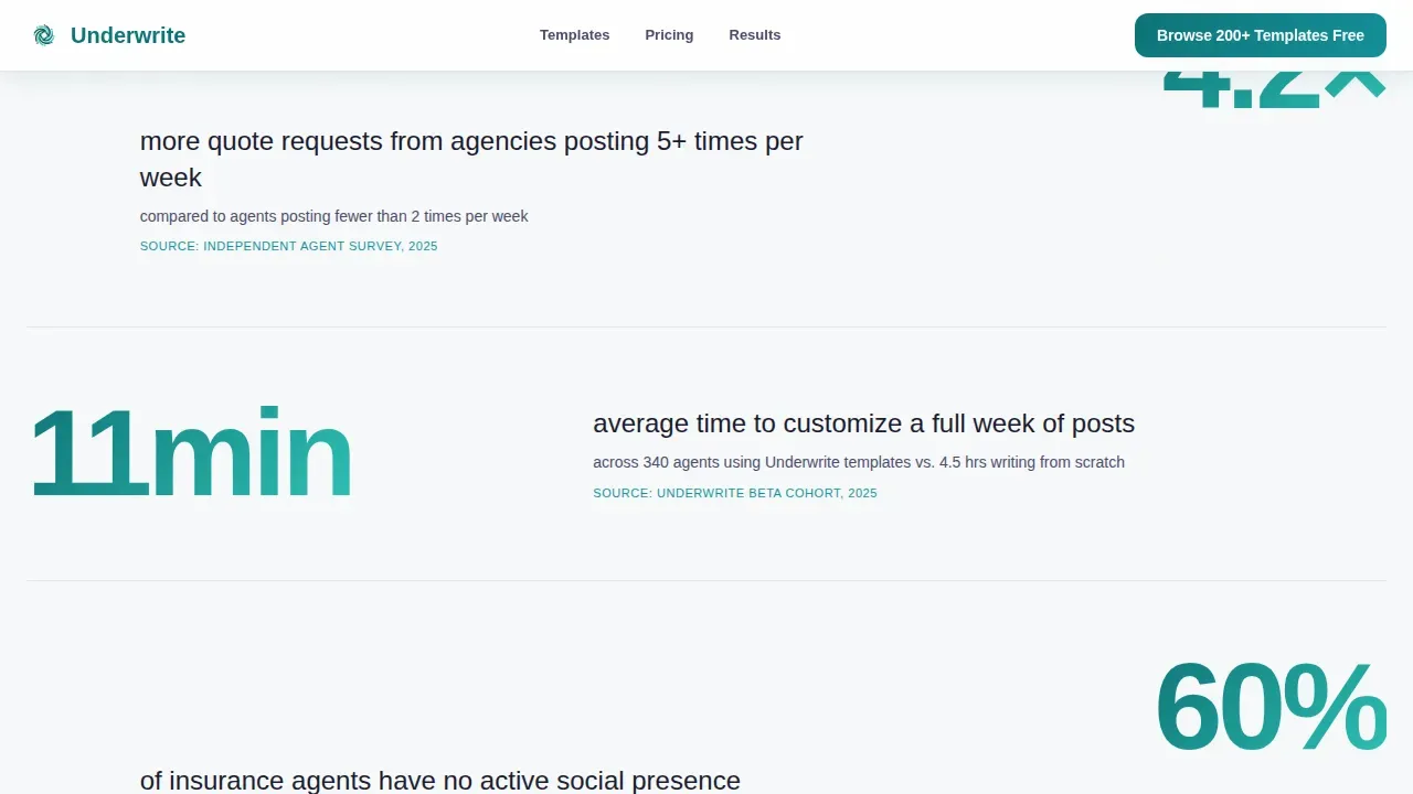
Every scroll transition in this section opens with a bold, oversized number before any explanation arrives. Examples built into the template include figures like "73% of consumers trust agents who post educational content" and "11 minutes average time to customize a full week of posts." This stats-first creative direction turns the page into a proof sequence. Each number is a catchy headline in its own right. The section keeps users engaged by making each scroll feel like a new discovery.
Six Vertical Preview Cards with Deep-Link Calls to Action
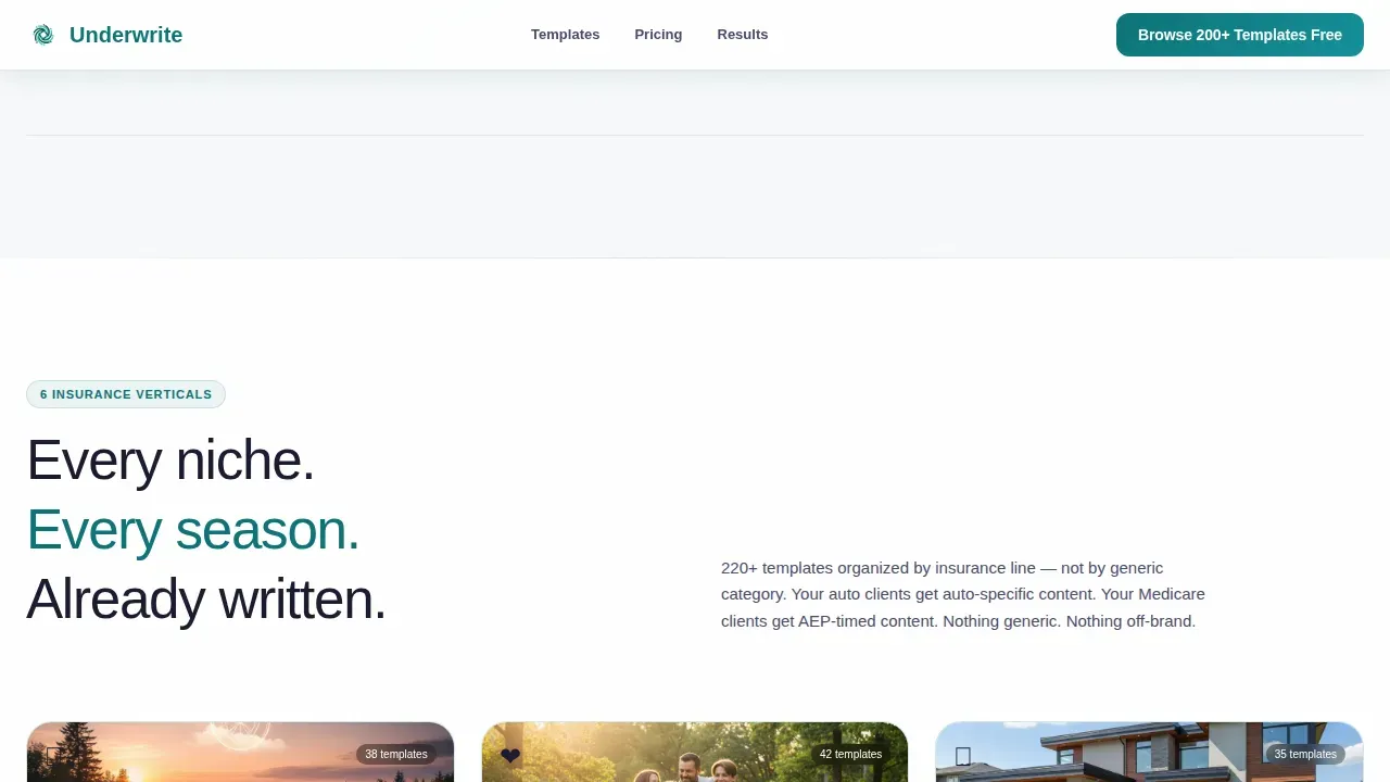
Six niche cards represent auto insurance, life, home insurance, health insurance, commercial, and Medicare. Each card carries a "See Your Niche" secondary call-to-action button that deep-links directly into that vertical's template gallery. This means visitors can move from a relevant preview to actual template examples in one click, without navigating a website menu or losing their place on the page.
Three-Tier Comparison Table with Teal Column Highlight
The comparison table stacks Free, Pro, and Agency plans across rows covering templates per month, compliance pre-review status, niche verticals included, and custom branding uploads. Teal cell shading draws the eye to the recommended plan column. The primary call-to-action, "Browse 200+ Templates Free," appears pinned inside the recommended column on desktop and fixed to the bottom of the viewport on mobile. No form fields appear on this page; clicking the call-to-action lands visitors on a two-field sign-up screen asking only for email and primary insurance line.
Social Proof and Trust Badge Section
Agent testimonials in this section include a photo, niche, state, and quantified results to give each review specificity and credibility. Trust signals such as compliance-reviewed badges and Canva-compatible markers appear alongside testimonials. Research shows three of the top five factors that build trust are reputation, reviews, and recommendations, and this section addresses all three. Star ratings placed near the call-to-action give visitors the social proof they need to sign with confidence.
Linear Single-Row Footer
The footer follows a clean, linear single-row pattern. It keeps the page from ending on a cluttered screen and preserves focus on the conversion path established throughout the scroll sequence.
Page sections overview
| Section | Purpose |
|---|---|
| Hero Carousel | Showcase six vertical mockups inside phone frames with animated engagement stats and a fade-in headline |
| Stats Impact | Deliver scroll-triggered oversized proof numbers before any supporting copy appears |
| Vertical Preview Cards | Present six insurance niche cards with deep-link secondary calls to action |
| Comparison Table | Stack Free, Pro, and Agency plan rows with teal column highlighting and a pinned primary call-to-action |
| Social Proof | Display agent testimonials with photo, niche, state, and results alongside trust badges |
| Linear Footer | Close the page with a minimal single-row footer pattern |
Design & branding system
The visual identity follows a Directory and Discovery theme powered by the Teal Catalyst color system. The palette is clinical enough to signal a regulated industry and energized enough to promise real engagement results. Design elements work together to create a dashboard feel on first load.
- Color roles: deep policy teal (#0D7377) dominates section backgrounds and card borders; bright activation cyan (#2EC4B6) fires on hover states and every call-to-action button; clean compliance white (#F7F9FA) provides white space between dense comparison rows; charcoal (#1A1A2E) grounds every stat so numbers hit hard
- Typography pairing: DM Sans handles all display text and headings for authority; Plus Jakarta Sans covers all body and interface text for readability across any screen size
- The overall style reads like a freshly redesigned app dashboard, with intentional background contrast between teal-heavy sections and white breathing room so visitors never feel they are reading a wall of text
Mobile & speed optimization
Mobile comes first on this page. Most people browse social media and follow links on their phones, making a mobile-first insurance landing page non-negotiable for this audience. The page is structured so agents using any device can access the full experience without horizontal scrolling or zooming.
- The primary call-to-action, "Browse 200+ Templates Free," is pinned to the bottom of the viewport on mobile so it is always within thumb reach regardless of scroll depth
- The phone-frame carousel is built for swipe interaction, matching how agents already navigate content on their devices
- Static sections use server components for reliable rendering while the carousel and scroll-triggered number counters run as client components, keeping the interactive experience smooth without slowing the page
How this template helps you convert
This landing page is structured as a proof sequence, not a pitch. Every section earns the next scroll before the offer appears. Insurance landing pages that focus on a single action consistently outperform cluttered pages, and this template is built around exactly one goal: a free-tier signup.
- The hero carousel and animated stats section keep users engaged and establish instant relevance, so visitors who clicked a social media ad land on a page that matches the promise of what brought them there
- The comparison table lays out plan differences with transparent row-by-row clarity, reducing the friction that causes bounce on insurance landing pages, while trust signals and agent testimonials near the call-to-action give visitors the confidence to sign up without hesitation
- Deep-link vertical cards guide visitors directly into relevant content within one click, shrinking the gap between curiosity and conversion and improving the overall conversion rate of the free-tier signup flow
Other information about this template
This template is a great example of a landing page built for a very specific insurance business use case: demonstrating social content volume and compliance safety to agents who need both. Below are additional practical details worth knowing before you start building.
- The template is relevant to agents offering auto insurance, life, home insurance, health insurance, commercial lines, travel insurance, and Medicare, covering the widest range of insurance options in one page
- The underwrite scroll stopping insurance social media landing page template is categorized under Technology and Insurance Digital Presence, making it appropriate for any insurance company or independent agency promoting a content toolkit
- Insurance landing page examples built with this template can reflect each type of coverage, since each vertical card deep-links to its own gallery, so a car insurance landing page view and a health insurance landing page view load distinct, relevant content
- A good insurance landing page built from this template follows best practices: a catchy headline above the fold, a clear call-to-action, short form fields on the signup screen, loads fast on mobile, and avoids overwhelming visitors with unnecessary choices
- Insurance landing pages that include social proof and trust signals generate 55% more leads than those that do not, and this template incorporates both through the testimonials section and trust badge placement
- Companies using high converting landing pages consistently outperform those using general website pages for lead capture, and the single-action focus of this template keeps that principle intact
- Recognizable trust signals such as compliance-reviewed badges and industry awards-style markers appear throughout the page to build trust with agents who operate in a regulated environment
- The comparison table rows cover insurance products across tier plans and are designed so the recommended column always feels like the obvious next step for the target audience
- Use bullet points in your own edits to highlight key plan benefits in each tier row, and use action verbs like Save or Protect in your own headline customizations to guide visitors toward the call-to-action with energy
Theme
Directory & Discovery
Creative direction
Stats-First Impact
Color system
Teal Catalyst
Style
Comparison Table
Direction
Click-Through
Page Sections
Phone-frame Hero Carousel with Live Counters
Scroll-triggered Stats Impact Section
Six Niche Vertical Preview Cards
Three-tier Comparison Table
Social Proof and Trust Badge Section
Sticky Mobile Call-to-action
Related questions
Does this landing page work for a specific insurance vertical or all of them?
Is there a form on this landing page?
Can I customize the color system and typography?
What plan tiers does the comparison table show?
Is this template suitable for a solo agent or only for larger agencies?



