Local Retail Software Professional Website Template
Roster is a dashboard-style landing page template built for retail volunteer management platforms. It follows a Problem→Solution Arc, opening with the chaos of missed shifts and frantic group texts before revealing a glowing data command interface. The single-page layout guides visitors toward a free app download, using real data cards and visual momentum instead of generic feature lists.
by Rocket studio
Quick summary
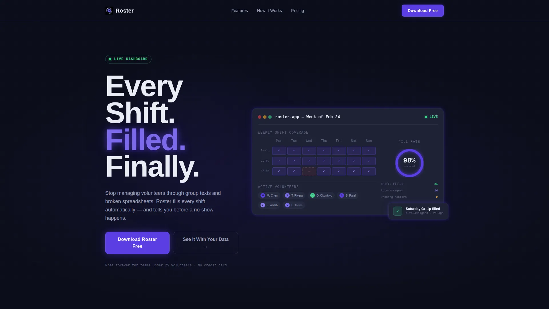
Roster is a single-page, dashboard-driven landing page template designed for retail volunteer management platforms. It opens in the pain of shift chaos and pivots hard into a glowing control-room interface. The layout builds emotional momentum from problem recognition to confident download, using live data cards, a fill-rate ring chart, and a weekly volunteer grid as the hero visual.
Who this template is for
This template is built for product teams and founders launching a volunteer scheduling platform aimed at retail nonprofit operations. If your users manage shifts in thrift stores, hospital gift shops, or museum retail spaces, this template speaks their language directly.
- Thrift store coordinators juggling large weekend volunteer rosters
- Hospital gift shop directors onboarding and retaining seasonal helpers
- Museum retail managers staffing holiday pop-ups with variable availability
What problem this template solves
Volunteer coordinators in retail nonprofits lose hours every week to manual scheduling. The chaos of group texts, no-show surprises, and conflicting spreadsheet entries creates real operational drag. This template makes that pain visible on screen before revealing the platform that eliminates it.
- Shift coverage gaps that surface only on the morning of an event
- Frantic back-and-forth messages trying to find last-minute replacements
- Spreadsheet conflicts that leave managers unsure who is actually confirmed
What you get with this template
You get a fully structured, single-page landing page with a clear narrative arc and a strong visual identity. Every section is purpose-built to move a skeptical coordinator from recognition to action.
- A dark, full-bleed hero section with an animated dashboard interface showing real shift data
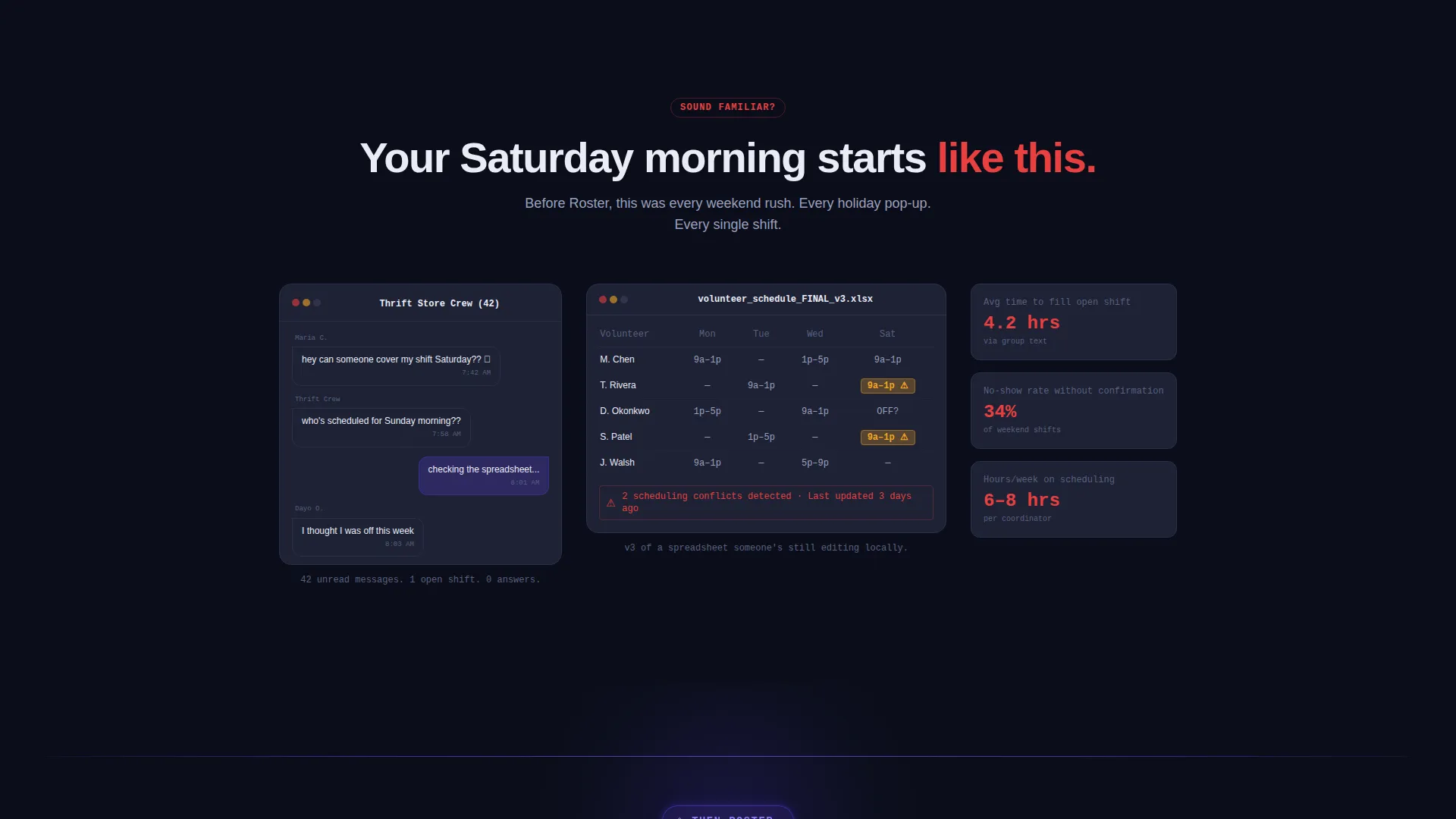
- A problem-first scroll sequence using a simulated text thread, a conflicting spreadsheet visual, and a missed-shift alert
- Two strategically placed call-to-action blocks driving toward a free app download and a quick-start web demo
Feature list
This template covers all the structural and visual components needed to launch a high-conviction retail volunteer management landing page.
Glowing Dashboard Hero Section
The header fills the entire screen in deep void black. A single dashboard interface emerges from center frame, with shift coverage percentages pulsing in electric indigo, volunteer names filling a weekly grid, and a fill-rate ring chart animating from 62% to 98% as avatar dots slide into open slots. The headline "Every Shift. Filled. Finally." fades in over the visual.
Problem Arc Opening Sequence
The first scroll section immerses visitors in recognizable pain. It includes a simulated chaotic text thread, a color-coded spreadsheet with conflicting entries, and a missed-shift alert with a red timestamp. The sequence is designed to make visitors feel their own situation before the solution appears.
Live Data Card Modules
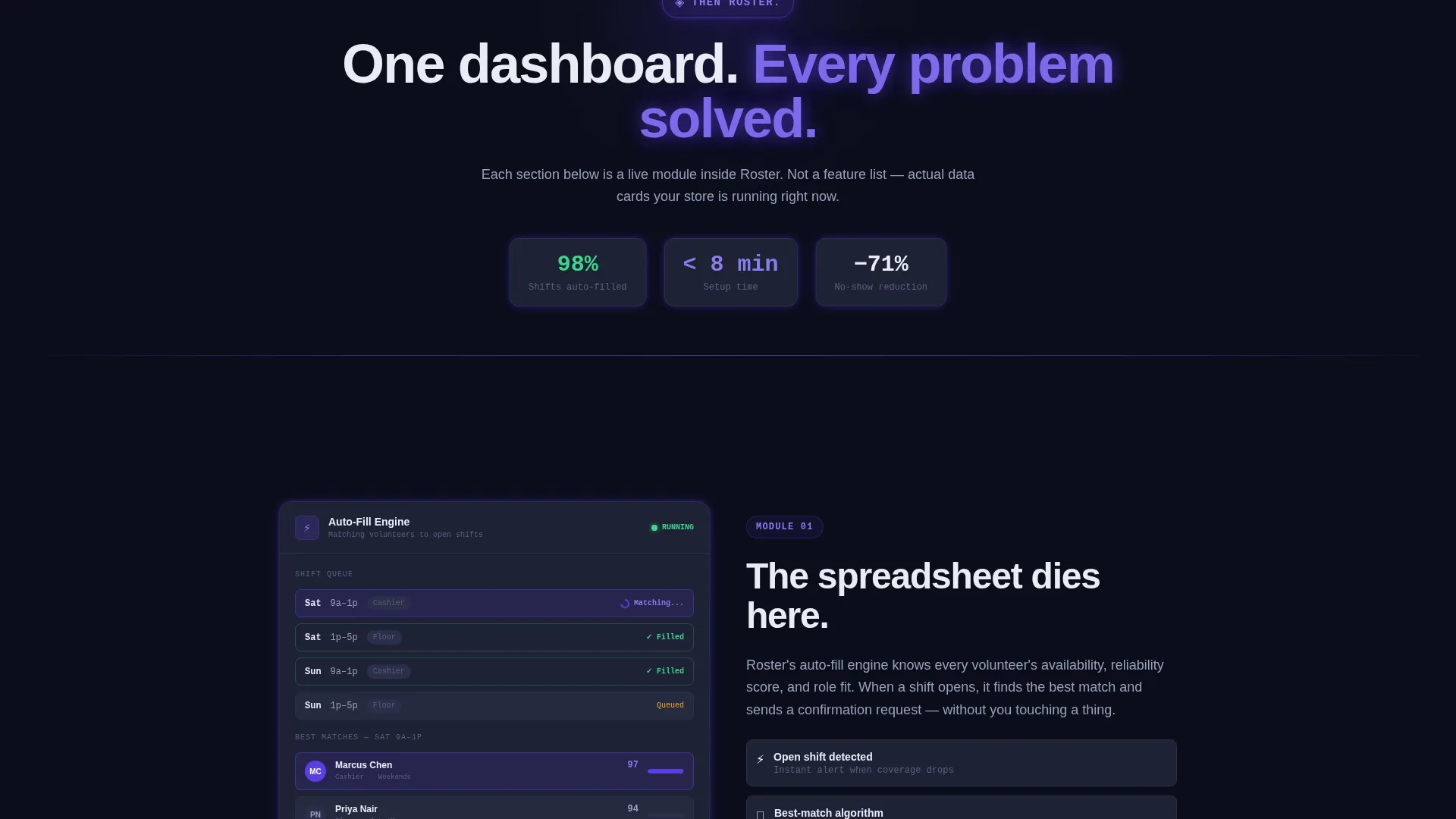
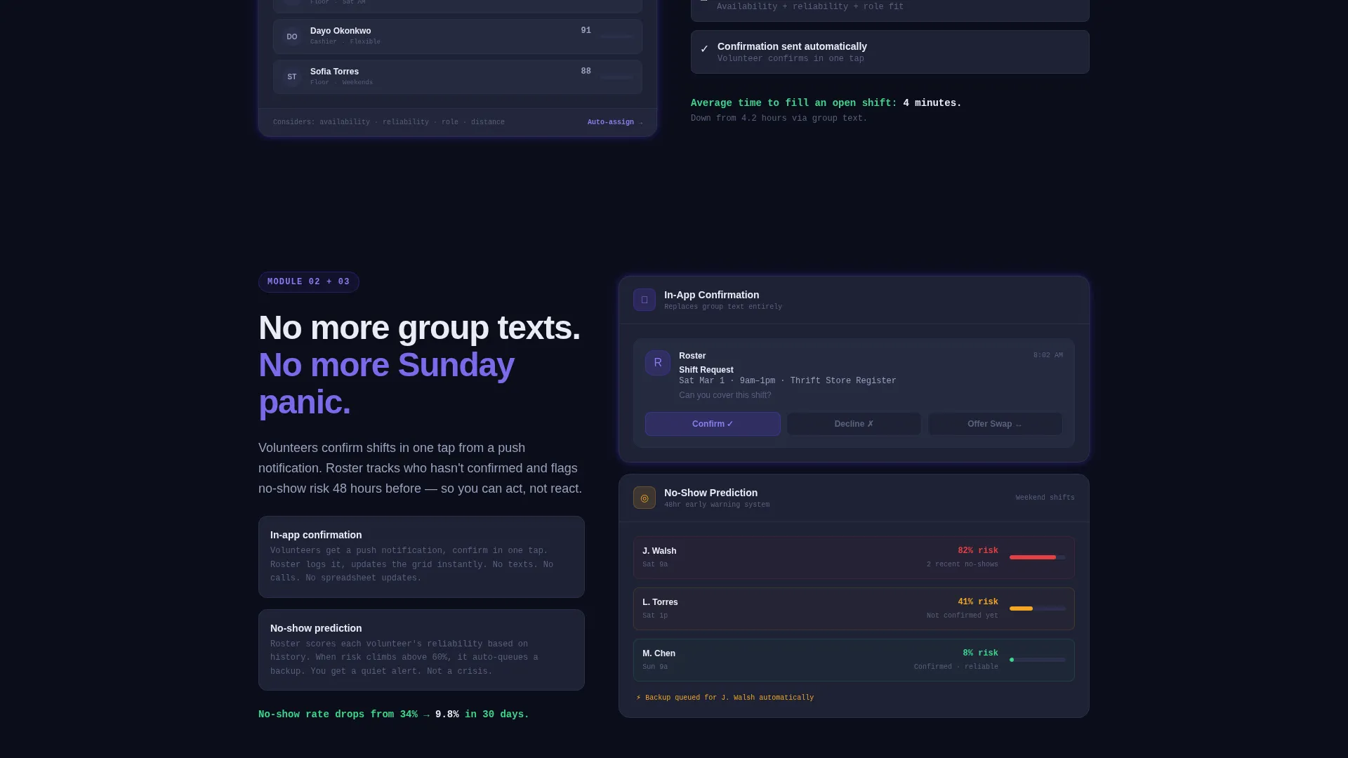
After the problem arc, a hard visual pivot introduces the solution. Each subsequent section presents one dashboard module as a live data card with real numbers. Auto-fill scheduling, in-app shift confirmations, and no-show prediction are each shown as specific, working interface components rather than bullet-point claims.
Dual Call-to-Action Placement
The primary call to action, "Download Roster Free", appears twice: once floating immediately after the pivot moment and once anchored at the bottom of the page beside a phone mockup of the app's home screen. A secondary path, "See It With Your Data", leads to a quick-start web demo requiring only an email and store name.
Phone Mockup Anchor Block
The bottom of the page pairs the final download call to action with a phone mockup showing the app's actual home screen. This grounds the abstract dashboard visuals in a tangible, holdable product moment just before the visitor commits.
Data Command Visual Identity
The entire template uses the Electric Indigo color system: deep void black for backgrounds, electric indigo for active glows and data highlights, cool slate for card surfaces, and phosphor white for typography and grid lines. Every element of light in the design signals that something is live and responding.
Page sections overview
| Section | Purpose |
|---|---|
| Full-Bleed Hero | Introduce platform with glowing dashboard and headline |
| Problem Arc Opening | Surface shift chaos pain through simulated real-world visuals |
| Visual Pivot Break | Signal transition from problem to solution with indigo glow intensification |
| Auto-Fill Module | Show scheduling solution as a live data card |
| Confirmation Module | Replace group texts with in-app confirmation data card |
| No-Show Prediction Module | Eliminate Sunday panic with predictive shift data card |
| Floating call to action Block | Capture early downloads after the pivot moment |
| Bottom Anchor call to action | Drive final download decision beside phone mockup |
Design & branding system
The template follows a Data Command theme, modeled on mission control aesthetics where every pixel of light carries meaning. The palette is intentionally dark, precise, and high-contrast so that glowing data elements read as urgent and alive.
- Deep void black (#0B0E1A) as the primary background across all sections
- Electric indigo (#5B3FE4) for active state glows, data highlights, and the fill-rate ring chart
- Cool slate (#1E2235) for card surfaces and secondary panels, with phosphor white (#EAECF5) for all typography and grid lines
Mobile & speed optimization
The template is structured with a single-page, section-led layout that keeps the visual narrative intact across screen sizes. The dashboard components and data cards are designed to remain legible and impactful on smaller displays.
- Dashboard hero and data card modules adapt to mobile viewports without losing the glow-driven visual hierarchy
- The dual call-to-action blocks remain prominent and tappable on mobile, keeping the download path clear at every scroll depth
How this template helps you convert
The entire page is engineered around a single emotional journey: from pain recognition to relief and action. The structure earns the download rather than asking for it cold.
- The problem arc section makes visitors recognize their own daily frustration, creating the emotional context that makes the solution feel necessary rather than optional.
- The live data card modules show the platform working with real numbers, replacing abstract feature claims with visible proof that the chaos is solved.
- The dual placement of the primary call to action ensures that ready visitors can convert early, while the phone mockup anchor block captures those who needed the full story first.
Other information about this template
This template is built as a single landing page optimized for app download conversions in the retail nonprofit software space. It is part of the Dashboard and Data Grid template style category within the Technology and Retail Software intersection.
- The quick-start secondary path requires only an email address and a store name, lowering the barrier for visitors who are not yet ready to download
- The template uses no stock photography; all visuals are product interface representations keeping the focus on platform capability
- The creative direction is a Problem→Solution Arc, meaning the emotional sequence of the page is as important as the individual section designs
- The template fits the Data Command theme and Electric Indigo color system, both of which can be adapted to match a specific platform's brand identity
Theme
Data Command
Creative direction
Problem→Solution Arc
Color system
Electric Indigo
Style
Dashboard/Data Grid
Direction
App Download
Page Sections
Glowing Dashboard Hero Section
Problem Arc Opening Sequence
Live Data Card Modules
Dual Call-to-action Placement
Phone Mockup Anchor Block
Data Command Visual Identity
Related questions
Who is the target visitor for this landing page?
Does this template include actual dashboard functionality?
Can I adapt the color system to match my own brand?
Where does the call to action appear on the page?
Is this template suitable for a SaaS product launch?



