Shift - High-Velocity Restaurant Landing Page Template
Shift is a high-velocity restaurant job board landing page built for operators who need staff now. The template uses a dark dashboard aesthetic, live-style metrics, and a Problem-to-Solution scroll arc to turn urgency into action. Two parallel calls to action guide restaurant owners and job seekers into separate onboarding flows without any on-page form.
by Rocket studio
Quick summary
Shift is a single-page restaurant job board landing page designed around speed and proof. It opens with a live-data header wall, moves through a gut-punch problem arc, and closes every section with dual calls to action built for two audiences: operators who need to fill shifts and kitchen workers who need to find them.
Who this template is for
This template is built for anyone launching or marketing a restaurant-focused job board platform. It speaks directly to the operational pain points of food service hiring.
- Independent restaurant owners who need to fill shifts fast and have no time for lengthy recruiting cycles
- Multi-unit general managers juggling turnover across several locations at once
- Culinary school graduates and kitchen workers looking for their first stage or next role without relying on personal connections
What problem this template solves
Restaurant hiring is uniquely chaotic. A line cook walks mid-service, a dishwasher no-shows at 2 AM, and the FOH manager needs three servers by Friday. Generic job board templates do not speak that language.
- Standard landing page designs fail to convey urgency or build trust with restaurant operators who need proof before they commit
- Job seekers in the industry have no clear, direct path to available kitchen work without knowing the right people
- Platforms lose conversions when they ask operators to fill out a form before they have seen any evidence the product works
What you get with this template
You get a complete, single-page landing page layout that translates hiring urgency into a compelling scroll experience. Every section is purposefully sequenced to build confidence and drive the click.
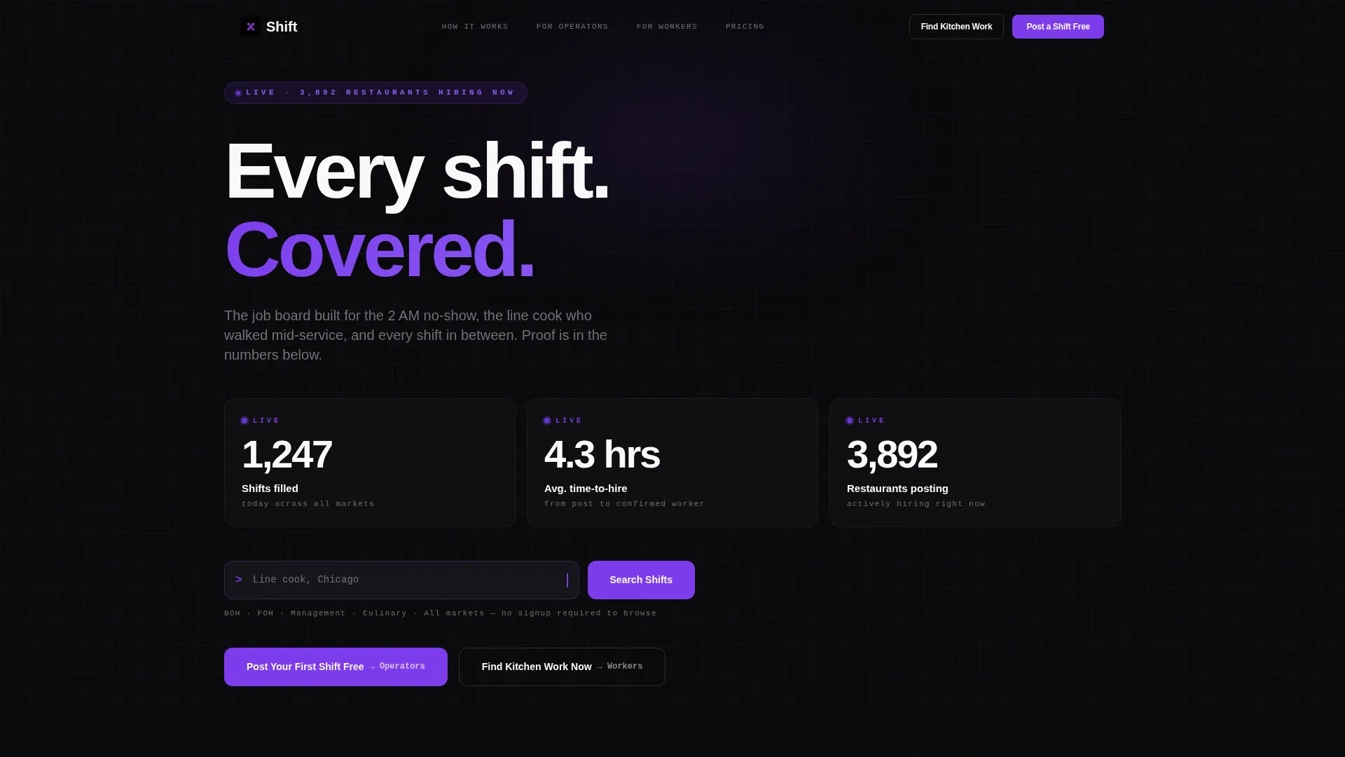
- A live-data header with animated counters, a command-line styled search bar, and zero stock photography
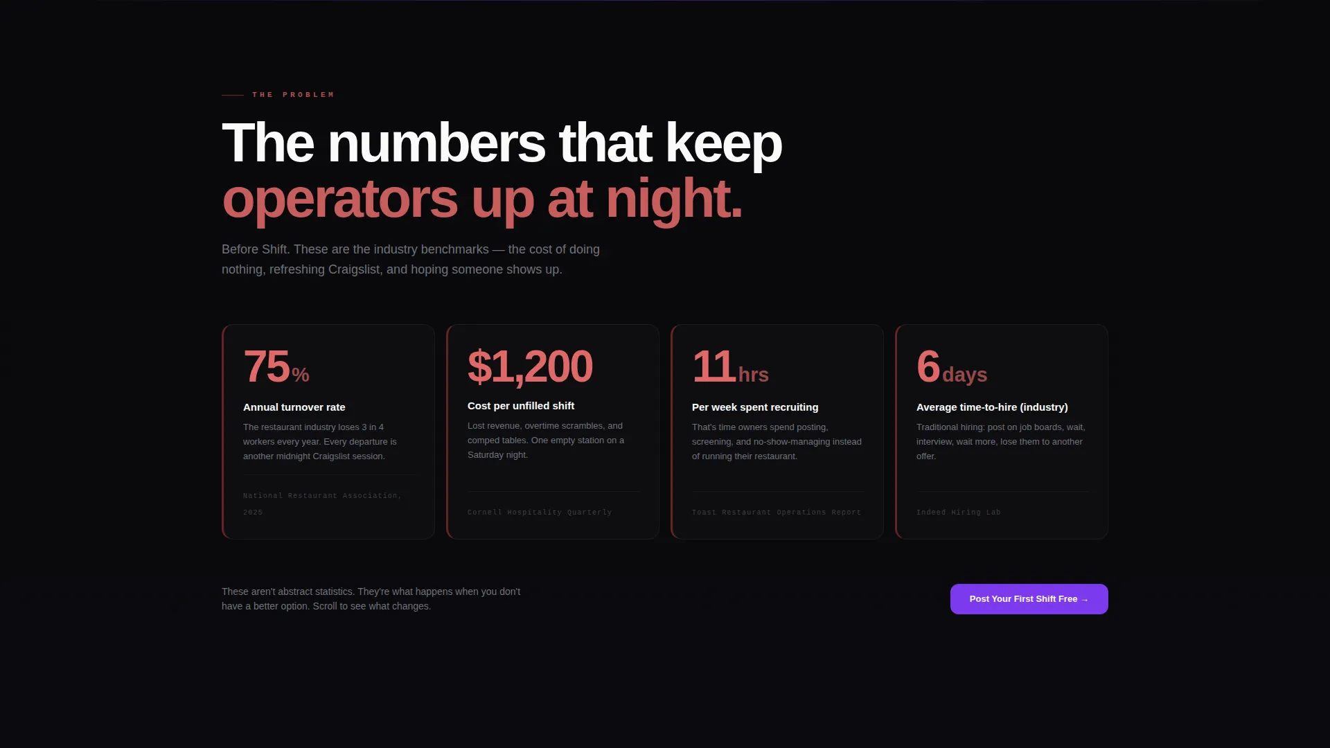
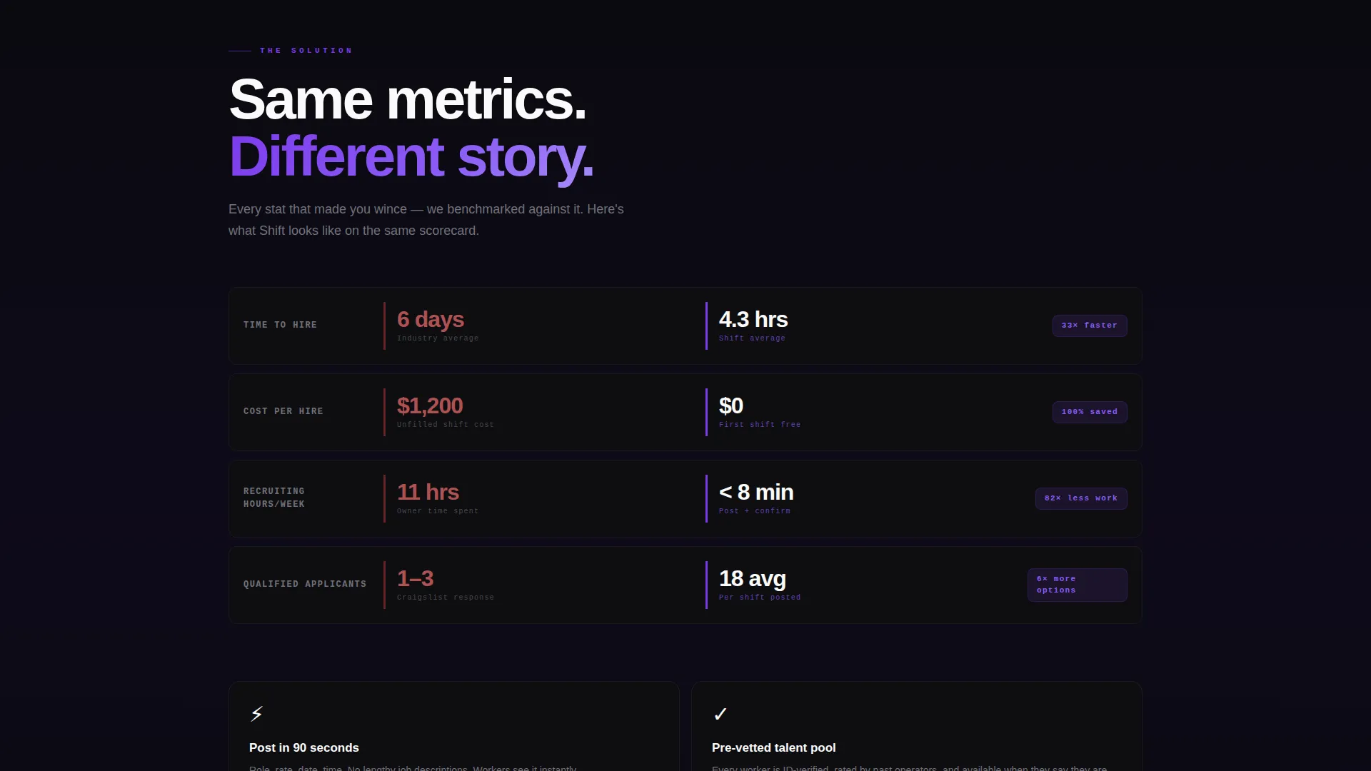
- A Problem-to-Solution scroll arc using oversized data cards that replace industry pain stats with platform performance metrics
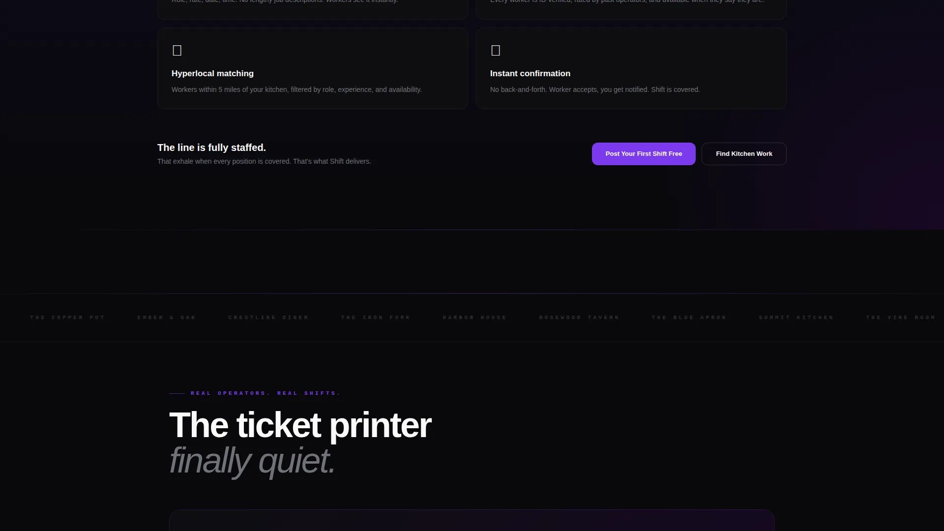
- Dual call to action paths ("Post Your First Shift Free" and "Find Kitchen Work Now") that repeat after each data section and carry role-specific context into the signup flow
Feature list
This template delivers a focused set of design and layout features grounded in the restaurant hiring context.
Animated Live-Data Header Wall
The header opens with a dark dashboard displaying metrics that animate on load. Counters tick upward like a stock ticker, showing stats such as shifts filled today, average time-to-hire, and active restaurant postings. The effect communicates platform activity without a single word of marketing copy.
Command-Line Search Bar
A search bar styled like a terminal command line sits below the counters. Ghost text reads "Line cook, Chicago" to immediately signal function and audience. There is no ambiguity about what the platform does or who it serves.
Problem-to-Solution Data Arc
The scroll experience is structured as a before-and-after arc. Oversized dashboard cards first display painful industry benchmarks: 75% turnover rate, $1,200 average cost of an unfilled shift, 11 hours spent recruiting per week. Subsequent cards replace each stat with a platform metric, shifting the emotional tone from dread to momentum.
Dual Audience call to action System
Two distinct calls to action run in parallel throughout the page. "Post Your First Shift Free" targets restaurant operators. "Find Kitchen Work Now" targets job seekers. Both appear in the header and repeat after each data section, keeping both audiences engaged without splitting the page into two separate flows.
Void and Violet Design System
The visual identity uses absolute void black, electric violet, deep purple shadow, and kitchen white. Violet highlights live counters, hover states, and call to action buttons. The palette creates a visual hierarchy that guides the eye without needing extra layout complexity.
No-Form Click-Through Flow
There is no sign-up form on the landing page itself. Every call to action click carries context from the chosen path into a role-specific onboarding flow. This removes friction from the first interaction and keeps the landing page focused on earning the click rather than processing it.
Page sections overview
| Section | Purpose |
|---|---|
| Live Data Header | Animate platform metrics on load and anchor trust immediately |
| Command Line Search | Signal platform function with a role-specific ghost-text prompt |
| Industry Pain Cards | Display quantified industry stats as oversized dashboard cards |
| Platform Proof Cards | Replace each pain stat with a competing platform metric |
| Operator call to action Block | Drive restaurant owners toward the shift-posting signup flow |
| Job Seeker call to action Block | Drive kitchen workers toward the job-finding signup flow |
| Repeating call to action Row | Reinforce both calls to action after every major data section |
Design & branding system
The template uses a Void and Violet color system designed to feel like a next-generation point-of-sale terminal. The darkness of a kitchen pass at night is the visual metaphor, lit by the glow of live data firing in violet.
- Core palette: absolute void black (#09090B), electric violet (#7C3AED), deep purple shadow (#3B0764), and kitchen white (#FAFAFA) for text and card surfaces
- Data cards use barely-there borders floating against the black background, with numbers rendered large and confident in white for maximum readability
- Violet is reserved for active elements: live counters, hover states, and call to action buttons to maintain clear visual priority
Mobile & speed optimization
The dashboard grid layout is designed to scale cleanly across screen sizes. Data cards restack naturally on smaller viewports without losing the visual weight that makes the stats feel impactful.
- Large number displays and card-based layouts translate well to mobile screens where vertical scrolling is the primary interaction
- The absence of hero images or stock photography keeps the page visually lean, reducing reliance on heavy media assets
- The click-through call to action model means no form rendering or validation logic is needed on the landing page itself
How this template helps you convert
Every design and layout decision points toward one outcome: earning the click that starts the signup flow.
- The animated header metrics establish platform credibility in the first few seconds, giving operators a reason to keep scrolling before reading a single feature description.
- The Problem-to-Solution arc reframes the visitor's existing pain as a solved problem. By the time a call to action appears, the visitor has already seen evidence that the platform outperforms the industry baseline.
- Repeating dual calls to action after each data section means neither audience has to scroll back to act. The moment a visitor is convinced, the next step is always within reach.
Other information about this template
This template sits at the intersection of restaurant digital presence and startup-velocity product design. It is suited for founders building in the hospitality technology space who want a landing page that looks credible to both investors and operators.
- The Startup Velocity theme draws from patterns common in high-growth B2B software products, applied here to the food service hiring niche
- The template style is classified as a Dashboard and Data Grid layout, which makes it adaptable for other data-driven service platforms beyond restaurant hiring
- The template requires no background in restaurant operations to customize. The data placeholders, card labels, and call to action text are all clearly structured for straightforward editing
- The design system is purpose-built for the restaurant job board niche but the Void and Violet palette and data-card structure transfer well to adjacent verticals in the hospitality technology space
Theme
Startup Velocity
Creative direction
Problem→Solution Arc
Color system
Void & Violet
Style
Dashboard/Data Grid
Direction
Click-Through
Page Sections
Animated Live-data Header Wall
Command-line Search Bar
Problem-to-solution Data Arc
Dual Audience Call to Action System
Void and Violet Design System
No-form Click-through Flow
Related questions
Can I use this template for a non-restaurant hiring platform?
Does this template include actual job board functionality?
How do the two call to action paths work?
Can I update the stats shown in the header and data cards?
Is this template a good fit for an early-stage platform without real metrics yet?



