AI for Restaurant Professional Website Template
Shift is a restaurant AI scheduling landing page template built for labor operations teams that have outgrown spreadsheets. It combines a code-snippet hero, an interactive drag-and-drop shift grid, a twelve-row comparison table, and a three-field lead capture form into one dark, data-driven single-page layout designed to turn skeptical restaurant operators into sign-ups.
by Rocket studio
Quick summary
Shift is a single-page landing page template for an AI-powered restaurant scheduling assistant. It opens with a syntax-highlighted code snippet, flows through an interactive shift grid and conflict-resolution demo, escalates into a glass-card intelligence showcase, and closes with a split-view comparison table and a frictionless three-field form. Every section is built to move a busy restaurant operator from curiosity to commitment.
Who this template is for
This template is designed for B2B SaaS products targeting the restaurant labor operations space. It speaks directly to operators who manage people, shifts, and compliance pressure every single week.
- Restaurant general managers and front-of-house managers who build schedules manually and want to show prospects a faster way
- Multi-unit operators running five or more locations from a single phone screen, where clarity and speed matter more than anything
- SaaS founders and product teams launching an AI scheduling tool and needing a conversion-focused landing page that demonstrates the product rather than just describing it
What problem this template solves
Most scheduling tools are invisible until someone has to sell them. A static features page does not show how the AI thinks. This template puts the product experience front and center so visitors understand the value before they ever sign up.
- Restaurant operators cannot picture how AI scheduling works from a bullet list alone, so the interactive explorer and cascading grid animation make the logic visible and tangible
- Generic landing page templates cannot handle the data-density that labor operations buyers expect, so this template uses a dashboard grid layout that feels native to the category
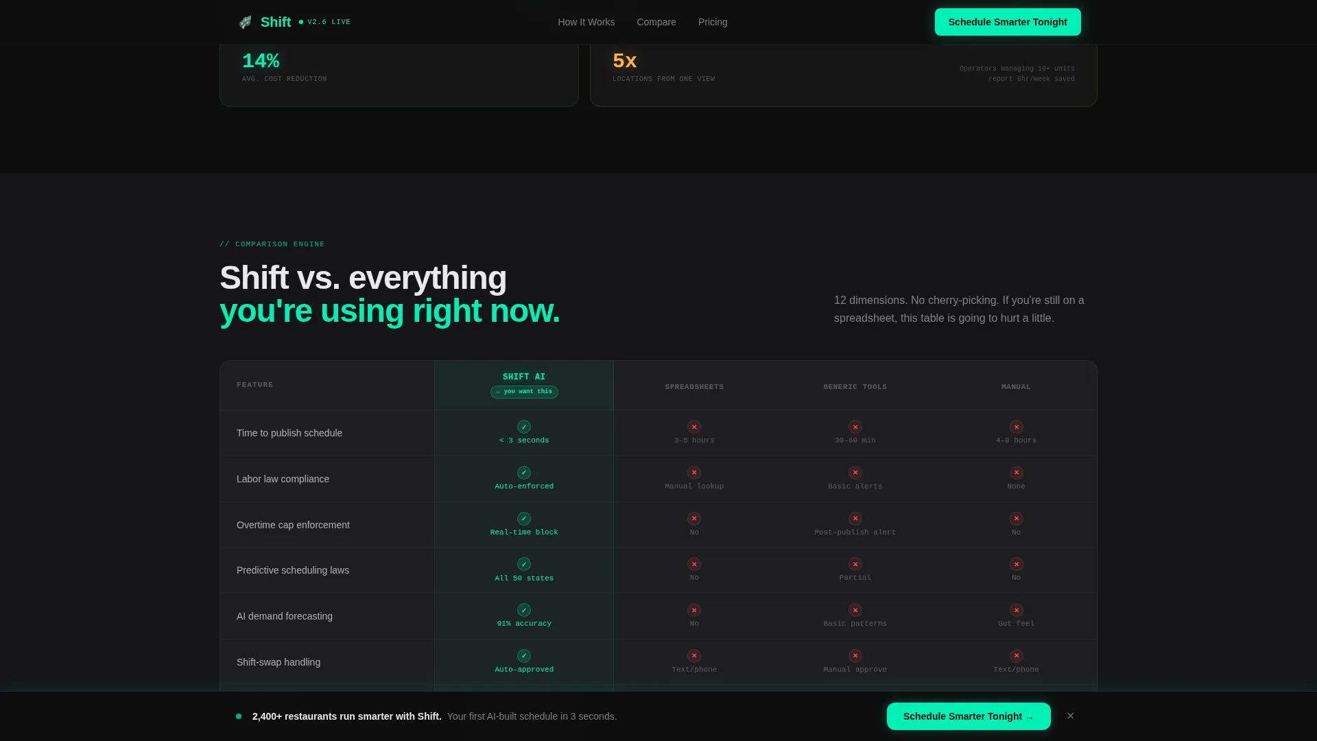
- Comparison shopping is real in this market, so the persistent twelve-row split-view table does the competitor work for the visitor before they leave the page
What you get with this template
This template delivers a complete, section-led single-page layout with high interactivity and a dark cockpit visual identity. Every component is prompt-specified and ready to customize.
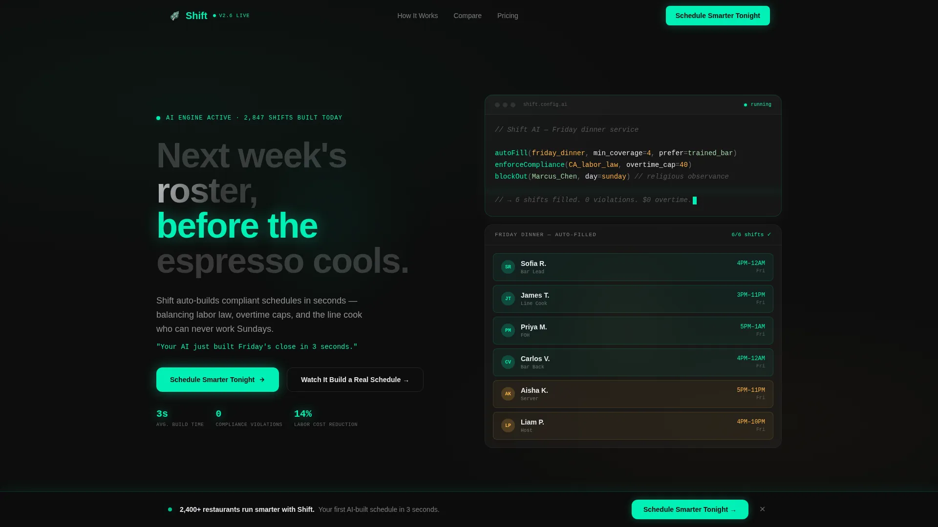
- A code-snippet hero with syntax highlighting, a cascading schedule grid animation, and a primary call-to-action above the fold
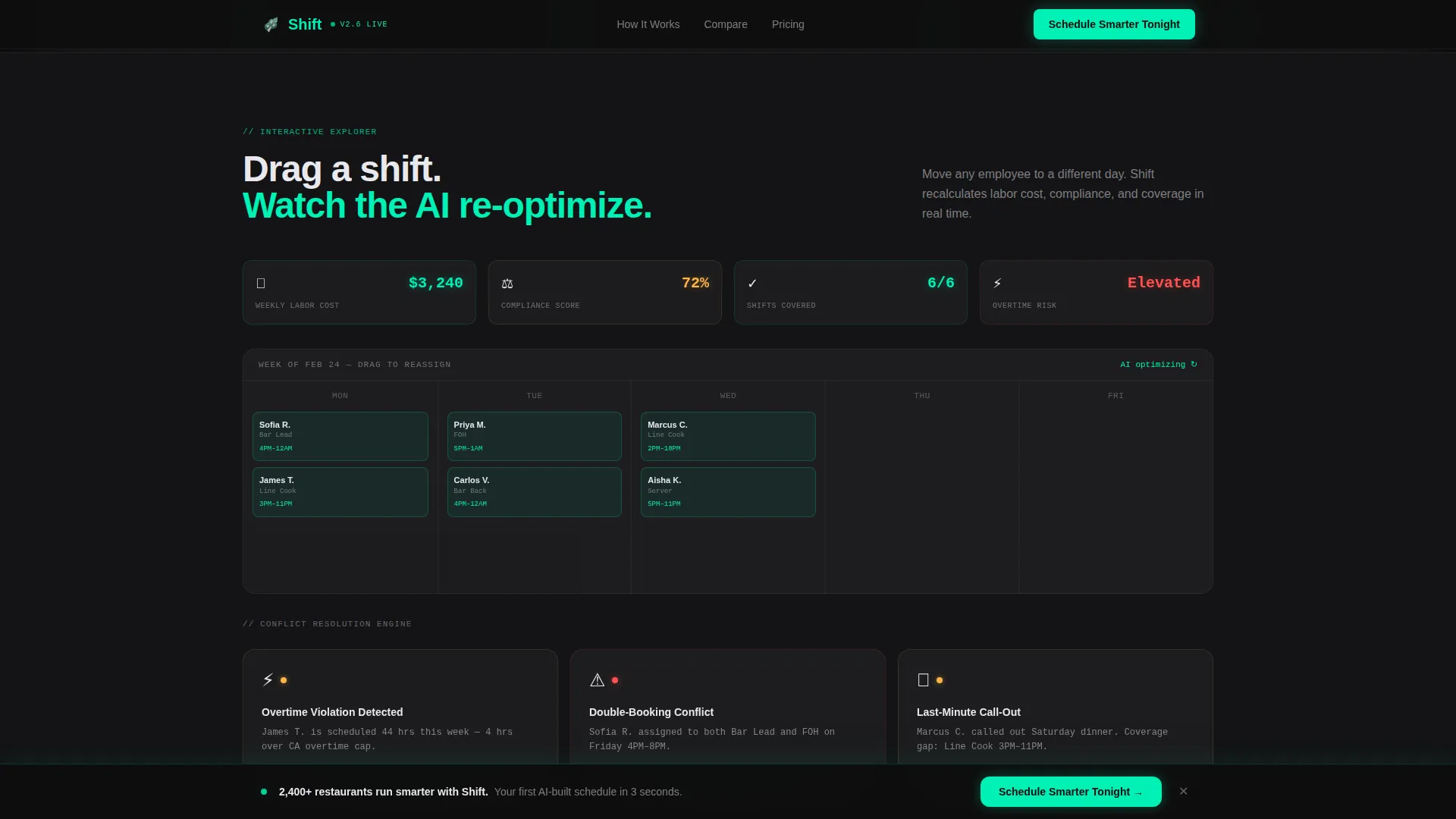
- An interactive explorer section with a draggable mock shift grid, real-time AI re-optimization simulation, conflict-resolution demo, and scroll-triggered glass-card intelligence modules
- A twelve-row comparison table pitting the product against spreadsheets and generic scheduling tools, a sticky call-to-action bar that activates at forty percent scroll depth, and a three-field lead capture form using a location toggle, a staff-size slider, and a work email field
Feature list
This template packages several purpose-built components that work together to demonstrate an AI scheduling product at the depth that restaurant operators need to trust it.
Code Snippet Hero with Cascading Grid Animation
The hero opens with a block of stylized scheduling logic rendered in JetBrains Mono, syntax-highlighted in electric mint and soft amber against carbon black. A single animated line fades in below it. Then the schedule grid assembles itself, cell by cell, populating names, roles, and shift times in a cascading sequence that makes the AI feel alive before a visitor has scrolled once.
Interactive Drag-and-Drop Shift Explorer
Section one of the page lets visitors drag employees between shifts on a mock schedule grid. As they interact, labor cost figures tick down and compliance badges turn green, showing the AI re-optimizing in real time. This is the core product demonstration, built directly into the scroll experience.
Conflict Resolution Demo Module
Section two surfaces a live conflict scenario: an overtime violation, a double-booking, or a call-out. The visitor taps to watch the AI resolve each one. The animation uses a conflict-pulse effect that makes the resolution feel immediate and precise.
Twelve-Row Comparison Table
A persistent split-view table anchors the middle of the page. It compares the product against spreadsheets, generic scheduling tools, and manual methods across twelve rows covering time-to-publish, labor law compliance, shift-swap handling, multi-location sync, and AI demand prediction. Competitor cells render in grayed text with red markers; the product column glows mint with checkmarks and live data figures.
Sticky Call-to-Action Bar with Three-Field Form
A sticky bar activates after forty percent scroll depth and stays visible as the visitor continues reading. The lead capture form uses three fields only: a location count toggle, a staff-size slider, and a work email input. A secondary path links to a ninety-second interactive demo for visitors who want to see the product before committing.
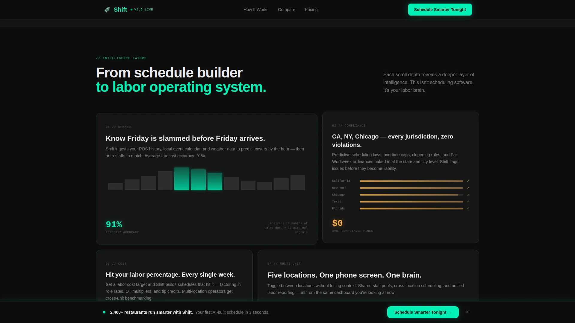
Glass-Card Intelligence Escalation Modules
A sequence of glass cards floats over the carbon background as the visitor scrolls deeper. Each card surfaces a new layer of product intelligence, moving from demand forecasting to labor cost modeling to the compliance engine. The escalation structure is intentional: it moves the visitor from "it makes schedules" to "it runs my labor operation."
Page sections overview
| Section | Purpose |
|---|---|
| Code Snippet Hero | Open with live scheduling logic and cascading grid animation to hook operators immediately |
| Interactive Shift Explorer | Let visitors drag shifts and watch AI re-optimize labor cost and compliance in real time |
| Conflict Resolution Demo | Show how the AI resolves overtime violations, double-bookings, and call-outs on tap |
| Intelligence Escalation Cards | Reveal demand forecasting, labor cost modeling, and compliance engine through scroll-triggered glass cards |
| Comparison Grid Table | Pit the product against spreadsheets and competitors across twelve rows to close objections |
| Lead Capture Form | Collect location count, staff size, and work email in three fields with minimal friction |
| Sticky call to action Bar | Activate after forty percent scroll to keep the primary call-to-action visible throughout |
| Single-Row Footer | Close the page with a clean linear footer following Pattern 1 layout |
Design & branding system
The visual identity follows a Tech Glass direction built on a Carbon Fiber color system. Every surface is dark, every active element glows, and the data is always the brightest thing on screen.
- Color palette: carbon black (#0D0D0D) for backgrounds, brushed graphite (#2A2A2E) for panel surfaces, translucent panel gray (white at low opacity over dark backgrounds) for glass cards, electric mint (#00F0B5) for live-state accents and interactive highlights, soft amber (#FFB347) for syntax highlights, and cool white (#E8E8EC) for body text
- Typography: JetBrains Mono for all code blocks, data cells, and scheduling logic displays; Manrope for headings and body copy throughout the rest of the page
- Interactive states: every button, toggle, active cell, and compliance badge pulses in electric mint, reinforcing the sense that something on the page is always thinking
Mobile & speed optimization
This template is built mobile-first because its primary audience, multi-unit operators, manages scheduling from a single phone screen. Desktop layouts optimize the data grid for wider viewports.
- The interactive explorer, draggable shift grid, and sticky call-to-action bar are built as client components so they handle animation and interactivity without blocking static content
- Static sections including the hero text, intelligence escalation cards, and comparison table copy are structured as server components to keep initial load light
- The three-field form uses a toggle and a slider instead of open text inputs, reducing friction and keeping the mobile experience fast and thumb-friendly
How this template helps you convert
Every section of this landing page is structured to reduce hesitation and move the visitor closer to submitting the form. The layout does not ask for trust upfront; it earns it through demonstration.
- The code-snippet hero and cascading grid animation create an immediate "I see how this works" moment before the visitor has read a single paragraph, lowering the cognitive barrier to engagement
- The interactive explorer and conflict-resolution demo let visitors experience the product logic firsthand, replacing skepticism with a felt sense of capability before the comparison table frames the competitive case
- The sticky call-to-action bar and three-field form remove every possible friction point at the moment of decision, while the secondary demo link catches visitors who need one more proof point before committing
Other information about this template
This template is category-specific to the restaurant AI scheduling space and carries design and interaction decisions that reflect that niche directly. It is not a general-purpose SaaS template adapted for food service.
- The template references California and New York City labor law contexts, predictive scheduling law, and overtime compliance as live visual elements, making it credible to compliance-anxious buyers in regulated markets
- Social proof is baked into the layout through live labor cost percentage metrics, compliance badge animations, and industry statistics such as a seventy-five percent annual staff turnover rate and a $1,056 per-employee replacement cost figure
- The page is localized for the United States market, with pricing and labor references in US dollars and regulatory language relevant to US restaurant operators
Theme
Tech Glass
Creative direction
Interactive Explorer
Color system
Carbon Fiber
Style
Dashboard/Data Grid
Direction
Comparison/Versus
Page Sections
Code Snippet Hero and Grid Animation
Interactive Drag-and-drop Shift Explorer
Conflict Resolution Demo Section
Twelve-row Competitor Comparison Table
Sticky Call to Action Bar and Frictionless Form
Glass-card Intelligence Escalation
Related questions
Who is this landing page template designed for?
Can I customize the comparison table rows and competitor labels?
Does the interactive shift grid require a real backend to work?
Is the sticky call-to-action bar included in the template?
What makes this template different from a general SaaS landing page?



