Healthcare Software & SaaS Specialist Cost Calculator Website Template
Shift is a high-impact healthcare staff scheduling landing page template built on a split-screen layout. It combines a live savings calculator, data-driven comparison sections, and a dual conversion path to help scheduling platforms turn visitor frustration into immediate action. Designed for healthcare SaaS founders and staffing agency owners, every section earns trust before it asks for a click.
by Rocket studio
Quick summary
Shift is a single-page landing page template for healthcare staff scheduling platforms. It opens with an interactive savings calculator that makes every visitor's current waste visible within seconds. A rolling evidence wall of stats, side-by-side comparisons, and two distinct conversion paths work together to move charge nurses, hospital operations directors, and staffing agency owners from skepticism to sign-up.
Who this template is for
This template is built for teams selling scheduling software or staffing technology into the healthcare market. It speaks the language of the people who live inside the problem every day.
- Charge nurses managing PRN (per diem and as-needed) staff across multiple units who need a faster way to fill open shifts
- Hospital operations directors tracking overtime costs and looking for a platform that makes the financial case instantly
- Staffing agency owners placing large volumes of clinicians each week who need a conversion page that matches the urgency of their work
What problem this template solves
Healthcare scheduling is still largely manual. Whiteboards, phone trees, and spreadsheets create gaps that cost facilities real money in overtime and agency fees. A generic software landing page cannot convey that urgency. This template closes that gap.
- Visitors arrive with skepticism; the calculator section personalizes the cost of inaction before any sales copy appears
- Comparison sections show the old way versus the platform view side by side, making the switch feel logical rather than risky
- Two conversion paths capture both demo-ready buyers and early-stage researchers, so no lead is lost to a single call-to-action
What you get with this template
The template delivers a fully structured, single-page layout ready to adapt for any healthcare scheduling or staffing platform. Every section is built around proof, not promise.
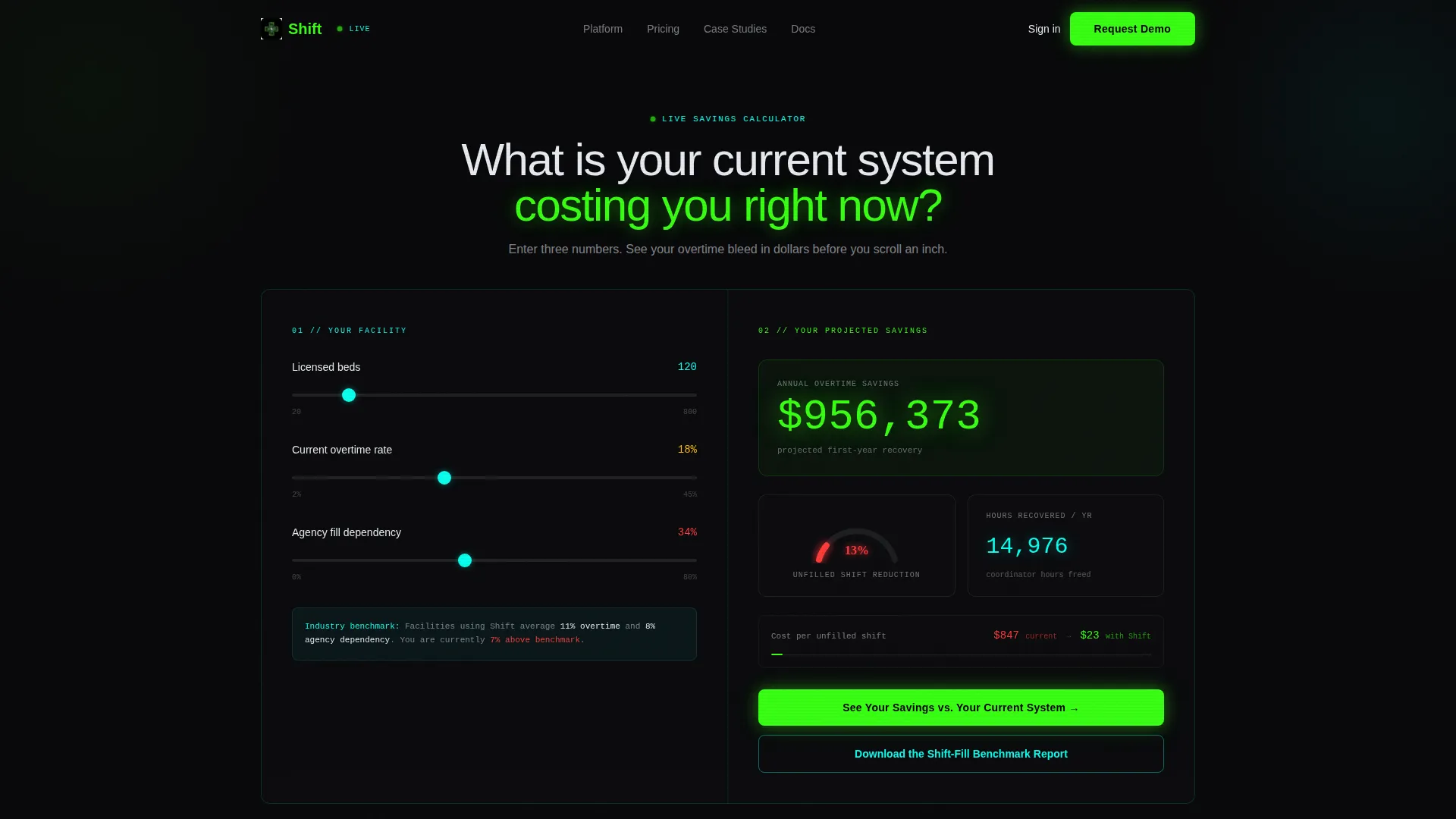
- A live calculator header with three inputs and real-time results panels showing projected savings, shift reduction, and hours recovered
- A split-screen comparison architecture that runs through the full page, pairing old-way evidence against platform outcomes in every section
- Dual conversion components including a primary demo-request form and a secondary benchmark report download path
Feature list
This template is built around a small set of high-impact sections. Each one does a specific job in moving the visitor toward a decision.
Interactive Savings Calculator Header
The page opens with a 50/50 split calculator. The left panel takes three inputs: number of beds, current overtime percentage, and average agency fill rate. The right panel renders projected overtime savings, an animated shift-gap gauge, and a stacking counter showing annual hours recovered. The visitor sees their own numbers before reading a single marketing sentence.
Stats-First Impact Scroll
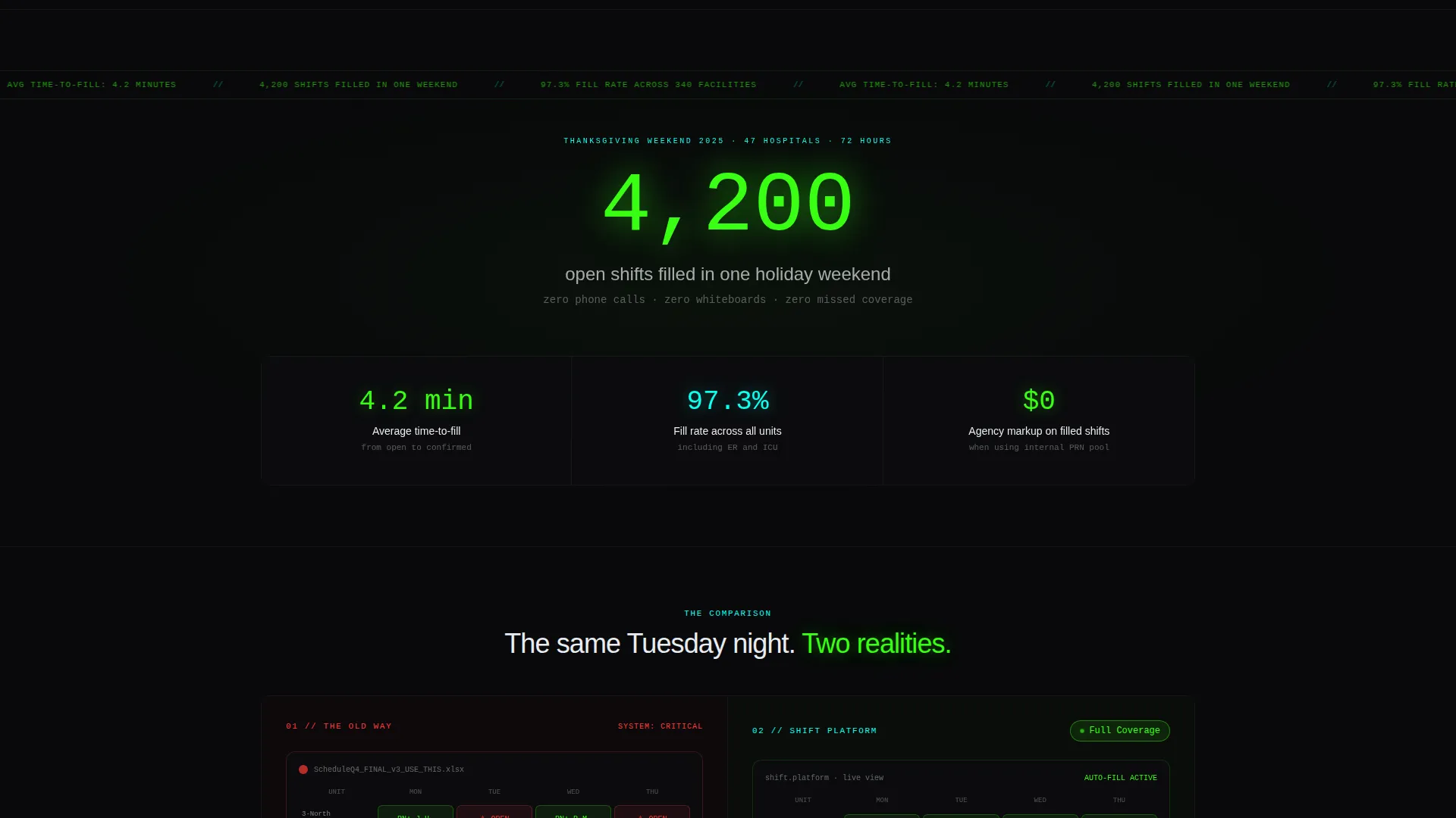
Immediately below the fold, a full-width stat lands in neon green on void black to establish immediate proof. The scroll rhythm then alternates between bold data headlines and split-screen comparisons, building an evidence wall that makes the decision feel mathematical by the time the visitor reaches the bottom.
Split-Screen Comparison Sections
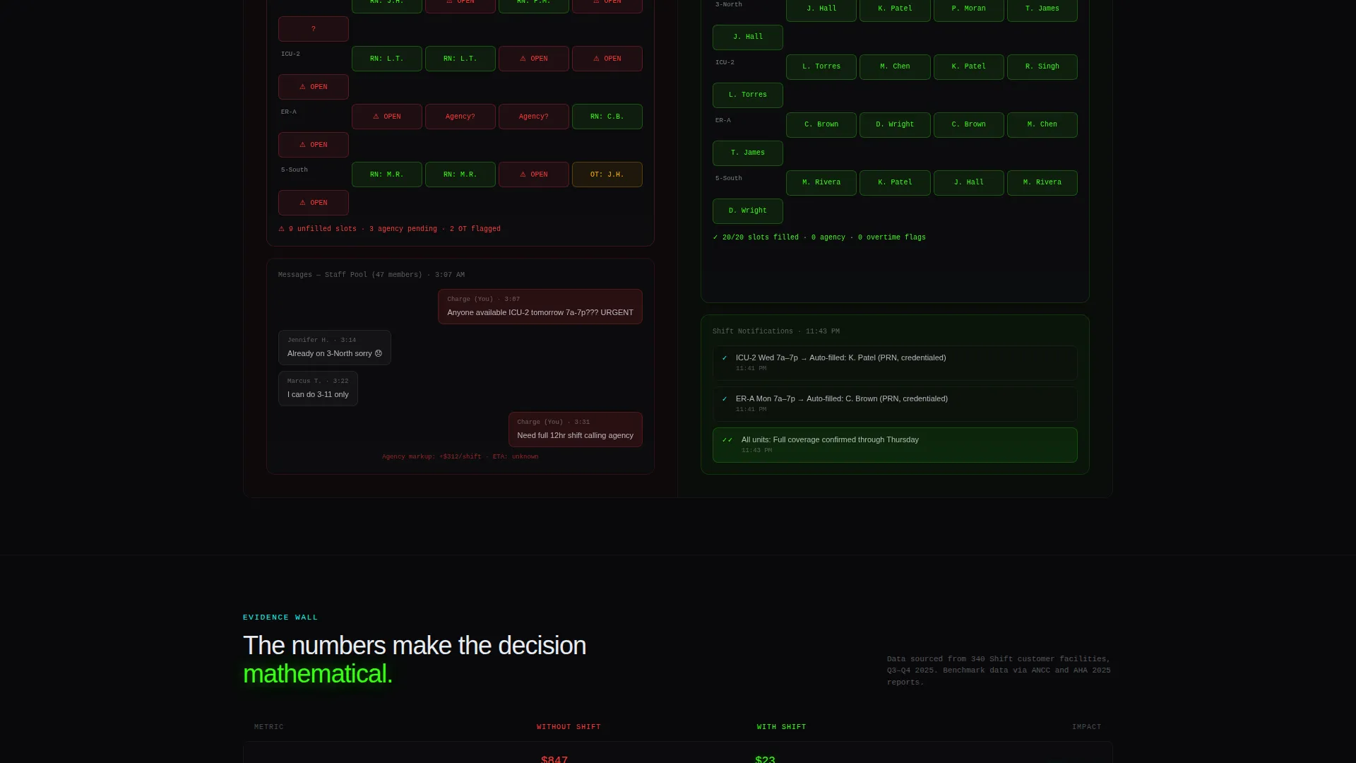
Every major proof section uses the 50/50 layout. The left side presents the old reality: spreadsheet screenshots, red-flagged gaps, and late-night message threads. The right side shows the platform view: a clean grid, auto-filled slots, and a single "Full Coverage" notification. The contrast is visual, immediate, and repeatable across multiple data points.
Dual Conversion Path Architecture
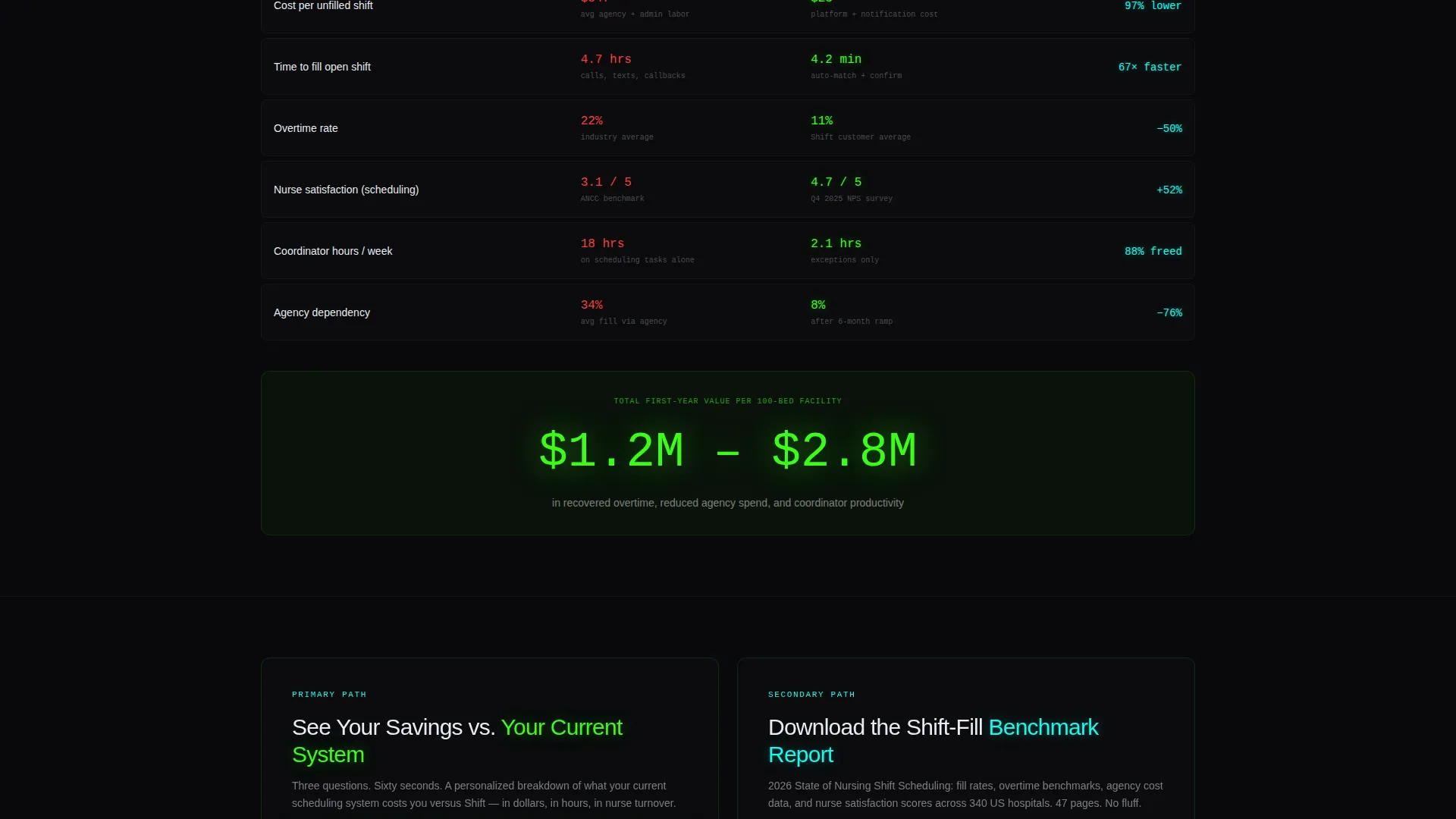
The primary call-to-action reads "See Your Savings versus. Your Current System" and appears first inside the calculator, then persists as a sticky button during scroll. A secondary path offers a downloadable benchmark report for visitors who want data before committing to a demo. Both paths feed into short progressive forms.
Tech Glass Visual System
The template uses a void black base with surgical neon green for calls-to-action and positive metrics, deep scrub teal for interactive elements and hover states, and cool-white glass for translucent card panels. The result feels like a vitals monitor in a darkened intensive care unit, where every glow carries weight.
Page sections overview
| Section | Purpose |
|---|---|
| Calculator Header | Personalizes visitor savings before scroll |
| Full-Width Stat | Establishes bold proof at fold break |
| Old versus. New Split | Shows spreadsheet chaos versus clean grid |
| Cost Comparison Split | Contrasts cost-per-fill data side by side |
| Time-to-Fill Split | Compares fill speed across both systems |
| Satisfaction Data Split | Places nurse satisfaction scores in contrast |
| Primary call to action Form | Captures demo-ready leads with progressive form |
| Benchmark Report call to action | Captures early-funnel leads via report download |
| Sticky call to action Button | Persists conversion access throughout scroll |
Design & branding system
The visual identity uses the Acid Digital color system layered over a Tech Glass theme. Every design choice references the tension and precision of a working clinical environment.
- Color palette: void black (#09090B) as base, surgical neon green (#39FF14) for calls to action and positive metrics, deep scrub teal (#0AFFEF) for interactive elements and hover states, and cool-white glass (#E8ECF1) for text and frosted card surfaces
- Card style: translucent frosted-acrylic panels float above the black background, giving the interface depth without using any stock photography or hero illustration
- No photography is used anywhere; the calculator, data counters, and comparison grids are the visual centerpiece throughout
Mobile & speed optimization
The template is structured for clean rendering across screen sizes. The 50/50 split-screen layout is designed to reflow gracefully without losing the side-by-side comparison intent on smaller displays.
- The split-screen sections stack vertically on mobile so old-way and new-way panels read in sequence rather than side by side
- The calculator inputs and results panels are laid out as stacked cards on smaller screens, keeping the interactive tool fully usable without horizontal scrolling
- The sticky call to action button remains accessible throughout the mobile scroll, keeping the conversion path visible at all times
How this template helps you convert
The page is engineered around a single principle: make the cost of not switching visible before asking for anything. Every section builds on that logic.
- The calculator header runs before any sales copy, so the visitor's first interaction is their own savings number. By the time they scroll, inaction already has a price tag attached to it.
- The evidence wall built through rolling stat-and-comparison sections removes objection after objection. Each data point answers a specific doubt: cost, time, coverage reliability, and staff satisfaction.
- Two conversion paths mean the page never loses a visitor who is not yet ready to book a demo. The benchmark report download captures that lead and keeps them inside the funnel.
Other information about this template
This template is category-specific and built for one niche: healthcare staff scheduling platforms. It is not a general SaaS or software template with healthcare colors applied.
- The page uses no stock photography or generic hero images; the tool and the data are the visual identity throughout
- The progressive form includes a scheduling tool dropdown with options such as "spreadsheets" and "paper," which signals immediate relevance to the visitor's current workflow
- The template suits platforms serving hospitals, health systems, and staffing agencies that place clinicians at scale
- The comparison model is repeatable; each split-screen section can be updated with real platform metrics to reflect accurate product positioning
- The design system is built for dark-mode-native presentation, consistent with the ICU vitals monitor aesthetic described in the brief
Theme
Tech Glass
Creative direction
Stats-First Impact
Color system
Acid Digital
Style
Split Screen (50/50)
Direction
Comparison/Versus
Page Sections
Interactive Savings Calculator Header
Stats-first Impact Scroll
Split-screen Comparison Sections
Dual Conversion Path Design
Tech Glass Visual Identity
Related questions
Who is this landing page template designed for?
Does this template include the calculator functionality pre-built?
Can I update the comparison stats with my own platform numbers?
What conversion paths does this template support?
Is this template suitable for a staffing agency as well as a hospital scheduling platform?



