AI Hospitality Scheduling Landing Page Template
Shift is a modular landing page template built for an AI-powered hospitality scheduling assistant. It combines dark-glass stat panels, animated metric cards, and a before/after roster comparison to turn hard numbers into instant trust. The freemium conversion flow keeps signup friction near zero, making it ideal for hotel, restaurant, and catering operators ready to close the spreadsheet for good.
by Rocket studio
Quick summary
Shift is a single-page, card-grid landing page template designed for an AI hospitality scheduling tool. It leads with live-formatted performance stats, walks visitors through a visual proof-point journey, and closes with a no-credit-card signup flow. Every design decision serves one idea: the floor is already covered, and you just need to sign up.
Who this template is for
This template is built for teams selling or promoting an AI scheduling assistant to hospitality operators. It speaks directly to the people who own the rota problem every week.
- Hotel front-office managers who need seamless 24/7 shift coverage without manual gap-filling
- Restaurant general managers who lose weekend mornings rebuilding next week's rota from scratch
- Catering operations leads staffing large-format events with a mix of full-time staff and agency temps
What problem this template solves
Hospitality scheduling is a daily source of friction. Double-bookings, no-shows, and last-minute swaps pile up fast, and most teams still manage them inside spreadsheets. This template gives an AI scheduling product a landing page that communicates the solution instantly and credibly.
- Visitors land on hard performance data before they read a single word of marketing copy
- The before/after roster visual makes the product's value tangible in seconds
- The low-friction signup removes every barrier between a curious manager and a first roster build
What you get with this template
You get a fully structured, modular landing page ready to represent an AI hospitality scheduling assistant. The layout is built around proof points, not promises.
- A Dark Glass Panels header with three live-formatted stat cards showing real scheduling metrics
- A staggered card-grid body with animated counters, a before/after comparison card, and integration logo cards
- A floating bottom bar with a primary call-to-action button and a secondary demo text link
Feature list
This template packages several distinct design and functional components into a single, cohesive page layout.
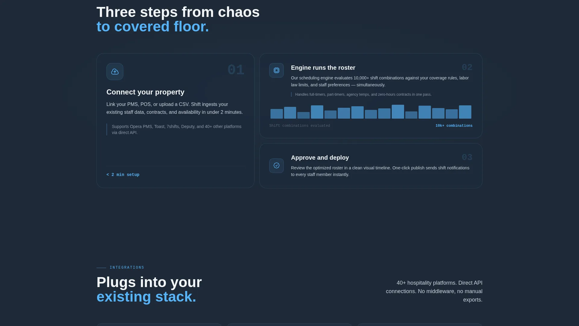
Dark Glass Panel Header
Three translucent, frosted-glass cards float on a near-black background. Each panel displays one key metric in large sky-blue numerals with quiet gray labels, creating a heads-up-display feel with no hero image required.
Animated Metric Counter Cards
The first card row renders three proof-point metrics with animated counters. Numbers count up on scroll entry, drawing the eye and reinforcing the product's measurable impact before the visitor reads further.
Before/After Roster Comparison Card
A wider card shows the scheduling problem and the solution side by side. The "before" state renders as a red-streaked spreadsheet view; the "after" state shows a clean, color-coded shift timeline. The contrast does the explaining.
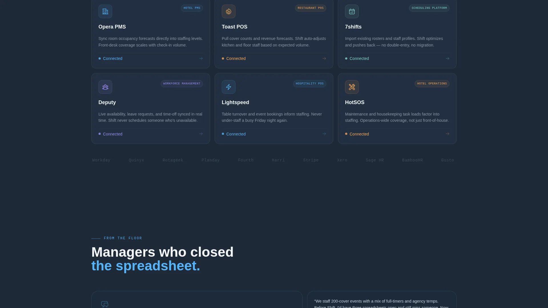
Integration Logo Card Row
A dedicated row of cards displays compatible platform logos alongside one-line connection descriptions. This row signals that the tool fits into existing hospitality workflows without requiring a platform switch.
Floating Conversion Bar
A bottom bar pins itself to the viewport after the visitor's second scroll. It carries the primary call-to-action button in sky blue and a secondary text link for visitors who want to watch the demo first.
Single-Step Signup Flow
Clicking the primary call-to-action opens a minimal signup: work email, property type dropdown, and team size slider. No credit card is required, keeping the path from interest to first roster build as short as possible.
Page sections overview
| Section | Purpose |
|---|---|
| Dark Glass Header | Leads with three live stat panels to anchor credibility immediately |
| Animated Metric Row | Three counter cards prove measurable scheduling impact on first scroll |
| Before/After Card | Side-by-side roster view makes the product's value visually obvious |
| Integration Logo Row | Shows platform compatibility with short connection descriptions |
| Floating call to action Bar | Keeps the primary signup action visible throughout the full page scroll |
| Single-Step Signup | Collects work email, property type, and team size with no card required |
Design & branding system
The visual identity channels Startup Velocity energy through a Slate & Sky color system. Every color choice evokes a hotel lobby at 5 a.m., still and dark underfoot, with dawn breaking blue through a wall of glass.
- Deep operations-room slate (#1E2A38) as the dominant background, cool corridor gray (#3B4A5C) for card borders and secondary surfaces, and open-sky blue (#56B4F9) on every interactive element and live metric
- Crisp linen white (#F4F6F8) for card faces and body typography, keeping text legible against dark backgrounds
- Frosted-glass depth blur on header panels to create a floating HUD aesthetic with no reliance on stock photography
Mobile & speed optimization
The modular card-grid structure is designed to reflow cleanly across screen sizes. Stacked cards maintain visual hierarchy on smaller viewports without losing the stats-first impact of the original layout.
- Each card is a self-contained unit, so the grid collapses into a single-column stack on mobile without breaking the proof-point rhythm
- The floating bottom bar remains pinned on mobile, keeping the primary call-to-action accessible at every scroll depth
- Lightweight stat panels with no hero imagery keep the initial render light and fast on slower connections
How this template helps you convert
The page is built around a Stats-First Impact creative direction. Every scroll beat adds a new layer of proof before asking for anything in return.
- The Dark Glass Panels header delivers three specific, credible metrics the moment the page loads, replacing vague benefit claims with numbers a hospitality manager can recognize from their own week.
- The staggered card-grid rhythm builds belief incrementally, moving from animated counters to a visual before/after comparison to integration proof, so by the time the floating call to action bar appears, trust is already earned.
- The no-credit-card, single-step signup removes every friction point between a convinced visitor and an active free-trial user, keeping drop-off at the form to a minimum.
Other information about this template
This template is categorized under Technology and the AI for Hospitality subcategory, making it well suited for marketplace discovery by buyers building or marketing tools in the hospitality scheduling space.
- The Freemium/Trial landing-page direction means the page is optimized for volume signups, not high-touch sales conversations
- The property type dropdown in the signup form covers hotel, restaurant, catering, and bar, matching the four core hospitality operator segments the brief identifies
- The secondary call-to-action, "Watch a 90-second demo," supports visitors who are not yet ready to sign up but are still in an active evaluation stage
- The template style is Card Grid (Modular), making individual sections straightforward to reorder, replace, or extend as the product evolves
- The theme is Startup Velocity, signaling a fast, data-forward visual identity suited to an early-growth AI product seeking rapid user adoption


Theme
Startup Velocity
Creative direction
Stats-First Impact
Color system
Slate & Sky
Style
Card Grid (Modular)
Direction
Freemium/Trial
Page Sections
Dark Glass Panel Header
Animated Metric Counter Cards
Before/after Roster Comparison
Integration Logo Card Row
Floating Bottom Conversion Bar
Low-friction Single-step Signup
Related questions
What type of business is this landing page template designed for?
Does the signup form require a credit card?
Can I customize the stat numbers in the Dark Glass Panels header?
How does the before/after roster card work visually?
Is this template suitable for a product that integrates with existing hospitality platforms?


