Changelog & Release Notes Professional Website Template
Shiplog is a brutalist changelog landing page template built for products that ship fast and want proof to match. It uses a hub-and-spoke anchor navigation structure, a void-black Midnight Blue palette, and inline comparison tables to turn your release history into a competitive argument. Built for developer advocates, CTOs, and power users who want receipts, not roadmaps.
by Rocket studio
Quick summary
Shiplog is a single-page changelog template designed around one idea: velocity as evidence. The Bold Brutalist design, monospaced typography, and anchor-nav structure make every release entry feel like a live deploy log. It is built for teams that ship constantly and want a public record that speaks louder than any product announcement.
Who this template is for
This template is built for technical teams and product-led companies that need their changelog to do real work. It speaks directly to the people who read release notes before making decisions.
- Developer advocates who are comparing tools during a platform migration
- CTOs evaluating whether a product actually ships or only makes promises
- Power users searching for the one update that unblocks a specific workflow
What problem this template solves
Most changelog pages are afterthoughts. They live on a subdomain nobody visits, formatted as a plain list with no context and no argument for why anyone should care. Shiplog flips that.
- A raw list of releases does not communicate shipping velocity or competitive advantage
- Visitors comparing products have no visual proof of momentum or release cadence
- Standard blog-style changelogs fail to convert curious visitors into committed users
What you get with this template
You get a fully structured, single-page changelog layout with anchor navigation, chronological release feeds, and built-in comparison components. Every section is designed to carry the weight of a sales argument without sounding like one.
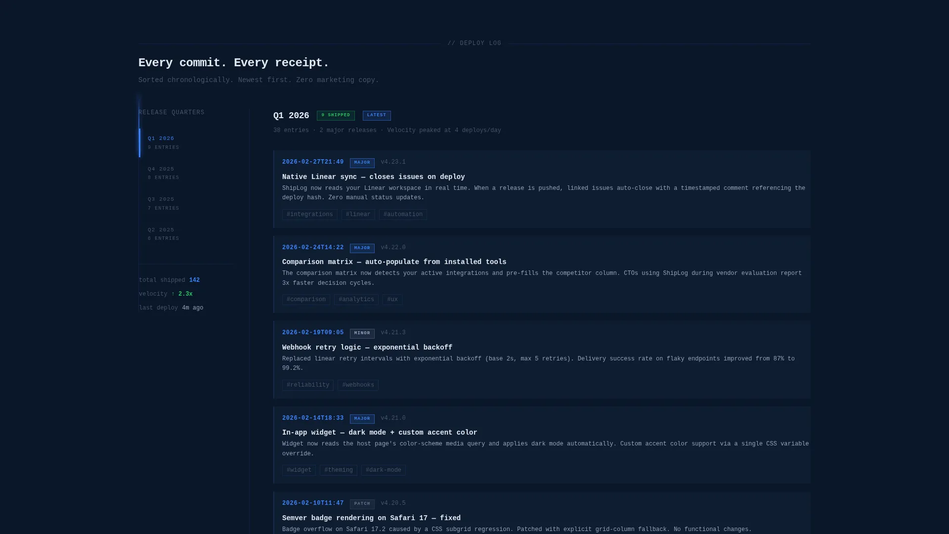
- A pinned left-rail anchor navigation organized by release quarter
- Chronological update feeds with severity badges for major, minor, and patch releases
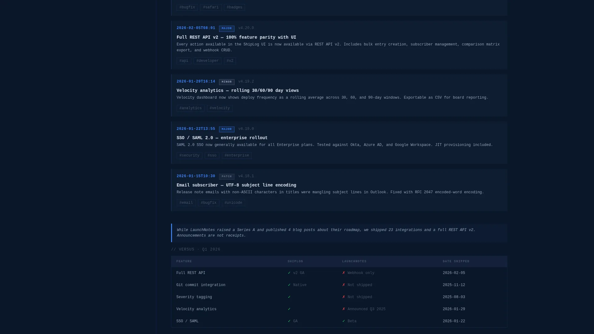
- Inline comparison callouts and per-quarter versus tables with feature-by-feature breakdowns
Feature list
This template ships with a focused set of components. Each one is built to serve a specific role in the page experience.
Dark Full-Bleed Header with Radial Glow
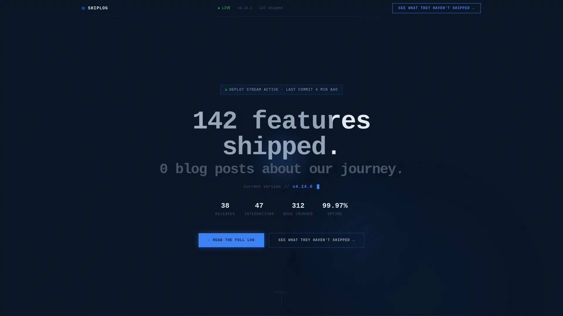
The header fills the entire viewport in void black (#0A1628). A soft radial glow in electric pulse blue (#3B82F6) pulses outward from the center. A single monospaced headline sits dead center, and a live-updating version number sits below it. No images, no illustrations.
Pinned Anchor Navigation Rail
The left-rail sidebar acts as a sticky table of contents. Each anchor link corresponds to a release quarter. Clicking any entry snaps the page to that section instantly. Active links are highlighted in electric pulse blue to show position at a glance.
Chronological Release Feed with Severity Badges
Each update entry is formatted as a dense, timestamped block. Entries carry brutalist pill badges labeled as major, minor, or patch. The feed is organized so that entries grow denser and more impactful as you scroll forward in time, visually communicating acceleration.
Inline Competitor Comparison Callouts
Short callout blocks are embedded directly inside the release feed. Each callout contrasts a specific shipped feature against a competitor action during the same period. These are written as factual, date-stamped statements, not marketing copy.
Per-Quarter Versus Tables
Each spoke in the anchor navigation ends with a structured comparison table. The table is feature-by-feature, date-stamped, and linked to the actual release note. It gives evaluators a clear, verifiable record to act on.
Dual call to action Conversion Block
The primary call to action leads visitors to a full interactive comparison matrix. A dropdown lets the visitor select their current tool. The secondary call to action is a minimal email subscription form. It promises raw release notes with no marketing content.
Page sections overview
| Section | Purpose |
|---|---|
| Full-Bleed Header | Establish velocity and product identity immediately |
| Live Version Ticker | Signal active development with a real-time version counter |
| Anchor Navigation Rail | Let visitors jump directly to any release quarter |
| Q1 Release Feed | Show timestamped entries for the first quarter spoke |
| Q1 Versus Table | Compare shipped features against competitors for Q1 |
| Q2 Release Feed | Continue the chronological feed for the second quarter |
| Q2 Versus Table | Feature-by-feature comparison block for Q2 |
| Q3 Release Feed | Dense release entries showing mid-year shipping cadence |
| Q3 Versus Table | Date-stamped competitive breakdown for Q3 |
| Q4 Release Feed | Final spoke showing the most recent and densest release cluster |
| Q4 Versus Table | Closing comparison table linking to live release notes |
| Primary call to action Block | Drive clicks to the interactive comparison matrix |
| Email Subscribe Block | Capture visitors with a minimal raw release-notes signup |
Design & branding system
The visual identity follows a Bold Brutalist theme built entirely on the Midnight Blue color system. Every design decision earns its place. There is no decoration that does not carry meaning.
- Void black (#0A1628) dominates as the background, creating the feel of a terminal at midnight
- Deep command-line navy (#1B2A4A) surfaces card backgrounds and entry containers
- Electric pulse blue (#3B82F6) marks timestamps, active nav items, and glow elements; raw white (#E2E8F0) renders all monospaced body text for maximum contrast
Mobile & speed optimization
The layout is structured to remain readable and functional across screen sizes. The anchor navigation and dense feed format are designed to adapt without losing their core purpose.
- The left-rail anchor nav collapses gracefully on smaller viewports so the feed remains the primary focus
- Monospaced typography and flat color blocks keep the visual weight low and the layout fast to render
How this template helps you convert
Shiplog turns your release history into a conversion argument. Visitors do not need to take your word for anything because every entry is a timestamped record.
- The comparison callouts and versus tables give evaluators a clear, factual basis for choosing your product over an alternative, directly inside the page they are already reading
- The dual call to action structure separates high-intent visitors (comparison matrix) from early-stage researchers (email feed), so both groups get a relevant next step without friction
Other information about this template
Shiplog is built for the Documentation and Support category, specifically targeting the product changelog and release notes niche. It is a strong fit for developer-focused companies that treat their changelog as a product surface in its own right.
- The template sits in the Changelog and Release Notes subcategory, making it directly relevant for teams building public-facing release documentation
- The hub-and-spoke anchor navigation structure supports long-form single-page layouts without sacrificing scannability
- The comparison matrix call to action and email subscribe form are designed as separate conversion paths to serve different visitor intent levels
- The Bold Brutalist theme and Midnight Blue color system give the page a deliberate, opinionated identity that signals technical credibility

Theme
Bold Brutalist
Creative direction
Launch Energy
Color system
Midnight Blue
Style
Hub & Spoke (Anchor Nav)
Direction
Comparison/Versus
Page Sections
Dark Full-bleed Header with Radial Glow
Pinned Left-rail Anchor Navigation
Chronological Release Feed with Severity Badges
Inline Competitor Comparison Callouts
Per-quarter Versus Tables
Dual Call to Action Conversion Block
Related questions
Who is this template designed for?
Can I customize the color palette and typography?
How does the anchor navigation work?
What makes the comparison tables different from a standard feature list?
Is this template suitable for a SaaS product changelog?



