Product Management Bootcamp Landing Page Template
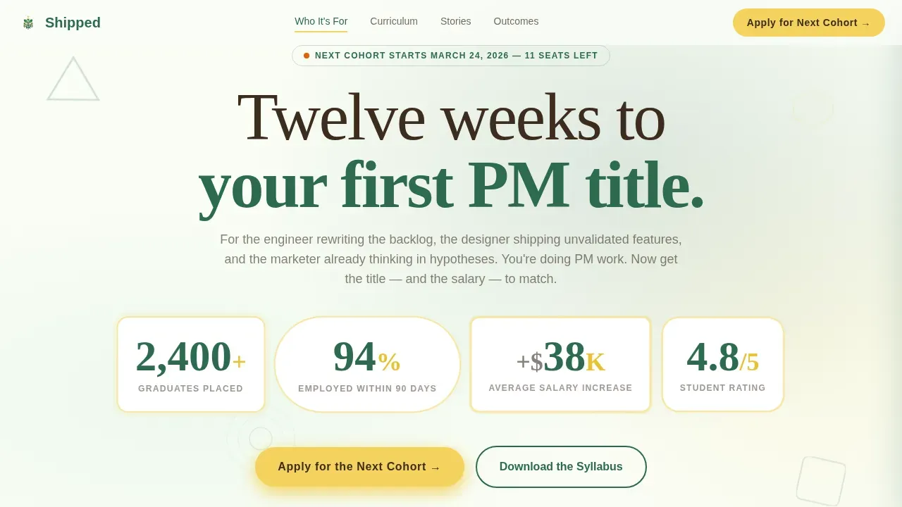
Shipped is a hub-and-spoke landing page template built for product management bootcamps targeting mid-career professionals. It pairs a Playful Geometric Botanical design with a Hero's Journey narrative flow, animated social-proof metrics, a sticky anchor nav, five curriculum spokes, student transformation cards, a salary calculator section, and a three-step progressive application form to convert visitors into applicants.
by Rocket studio
Quick summary
Shipped is a single-page landing page template purpose-built for intensive product management bootcamps. It opens with an animated stats wall, guides visitors through a structured narrative, and closes with a progressive lead-capture form. Every section deepens commitment and answers a specific objection from mid-career professionals ready to make their move.
Who this template is for
This template is designed for bootcamp founders, course creators, and edtech marketing teams who need landing pages that convert research-mode professionals into paying students. It fits businesses across education and adjacent industries where credibility and outcome clarity are essential.
- Mid-career bootcamp operators offering structured product management training
- Edtech businesses that need high-converting, lead-generation-focused landing pages
- Course creators who want a design-ready website without building from scratch
What problem this template solves
Most bootcamp landing pages bury the outcome and lead with curriculum details. Visitors leave before they feel the importance of making a change. This template flips that order. It leads with proof, speaks directly to the frustration of doing product manager work without the title, and makes the return on investment personal before a form ever appears.
- Prospective students do not see themselves in generic course pages
- Generic landing pages fail to stand out and rarely convert cold visitors
- Businesses promoting bootcamps struggle to communicate ROI clearly and quickly
What you get with this template
You get a fully structured, design-ready landing page template with every major section pre-built. No need to start from scratch or forget a critical conversion element. The layout is focused on one goal: turning a curious visitor into a qualified applicant.
- Animated stats hero, five curriculum spoke sections, and transformation story cards
- Interactive salary calculator section and a three-step progressive disclosure application form
- A secondary lead path to download the syllabus for cooler visitors not yet ready to apply
Feature list
This template includes a rich set of purpose-built product features that work together to promote the bootcamp offer and capture leads at every stage of the visitor's decision journey.
Animated Stats Wall Hero
The header opens with bold, oversized numerals that animate upward on load. Each metric sits inside a geometric container with a pollen yellow pulse. Visitors absorb the social proof before they decide whether to scroll, which means the credibility hit lands immediately.
Sticky Botanical Anchor Nav
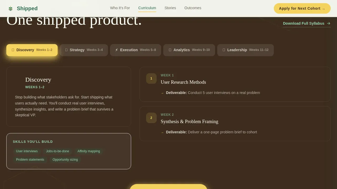
A sticky navigation bar links visitors directly to each of the five curriculum spokes: Discovery, Strategy, Execution, Analytics, and Leadership. This hub-and-spoke design lets visitors jump to the section that answers their specific objection without losing their place on the page.
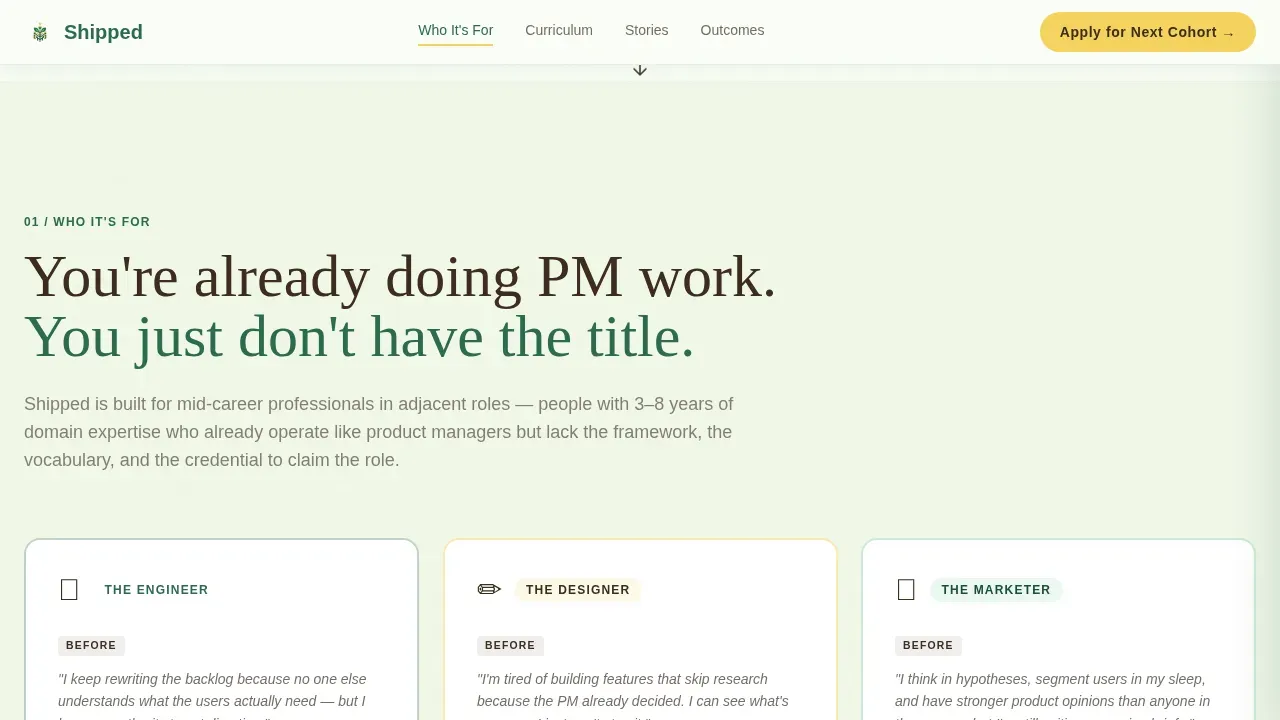
Persona Recognition Cards
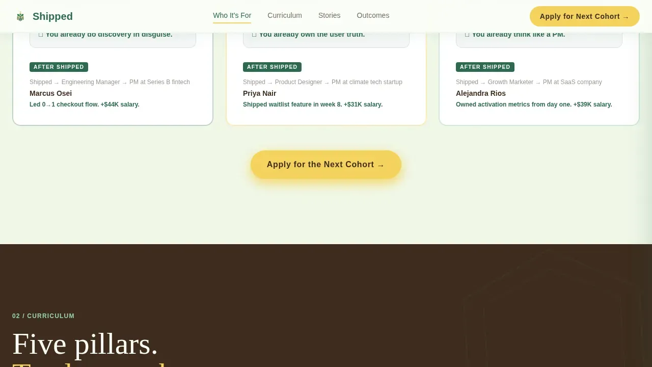
Three role cards reflect the engineer, the marketer, and the designer who are already doing the work. Each card names a specific frustration and creates immediate identity resonance. This section helps visitors self-select and feel seen before the curriculum is even introduced.
Salary Calculator Section
Visitors input their current role and see projected salary outcomes. This section earns the click by making the return on investment personal. It is one of the most effective tools for moving a hesitant visitor toward the application form.
Three-Step Progressive Application Form
The form uses progressive disclosure across three screens. The first screen asks only for name and email. The second asks for current role and years of experience. The third asks what is holding the visitor back, which doubles as a qualification signal for the team reviewing applications.
Cohort Calendar and Transformation Stories
Student before-and-after cards pair a specific frustration with a specific shipped product outcome. A live cohort calendar sits alongside them, making the next start date feel urgent and real. Together, these elements build the emotional momentum needed to push a visitor to apply.
Page sections overview
| Section | Purpose |
|---|---|
| Animated Stats Hero | Opens with social proof metrics |
| Sticky Anchor Nav | Links to each curriculum spoke |
| Persona Recognition Cards | Reflects visitor's current role |
| Discovery Spoke | Covers user research pillar |
| Strategy Spoke | Covers roadmap and alignment |
| Execution Spoke | Covers sprint and delivery |
| Analytics Spoke | Covers metrics and iteration |
| Leadership Spoke | Covers stakeholder communication |
| Transformation Story Cards | Shows before-and-after outcomes |
| Cohort Calendar | Creates urgency around start dates |
| Salary Calculator | Makes ROI personal and visible |
| Progressive Application Form | Captures and qualifies leads |
| Syllabus Download Path | Captures cooler, earlier-stage leads |
| Footer | Single-row linear footer |
Design & branding system
The design follows a Playful Geometric theme grounded in a Botanical color system. The palette feels structured and quietly optimistic, like a well-tended workspace built for focused creative thinking. Geometric illustrations, including triangles, hexagons, and nested circles, tile across section dividers and background patterns throughout the page.
- Colors: deep fern (#2D6A4F) primary, pollen yellow (#F4D35E) for buttons and highlights, rich soil brown (#3D2C1E) for body text, greenhouse white (#FAFDF6) background
- Typography: Fraunces serif display for headings, Manrope for body and user interface elements
- Visual elements include geometric illustrations, icon containers, and pattern overlays with no stock photography
Mobile & speed optimization
The template is desktop-first because career research typically happens at a computer, but it is built to deliver a solid experience on mobile screens as well. The design keeps pages clean and focused, with white space used deliberately to guide visitor attention toward calls to action.
- Responsive layout adapts across screen sizes without breaking the geometric design elements
- Static sections use server components while interactive elements such as the calculator, form, and animations load as client components
- Minimalist page structure helps keep the design lean and reduces distractions on smaller screens
How this template helps you convert
Good landing pages earn trust before they ask for anything. This template is built around that principle. It leads with proof, builds narrative tension, and places the primary call to action at the hub and at the end of every spoke so visitors always have a clear next step.
- The animated metrics hero gives visitors a reason to keep reading before they have finished deciding whether to scroll, which means the template converts passive attention into active interest from the first second.
- The salary calculator makes the return on investment concrete and personal, so visitors arrive at the application form already convinced the investment is worth it.
- Progressive form disclosure reduces friction by asking only for name and email first, then layering in qualification questions, which means more visitors start the form and more completions reach the team.
Other information about this template
This template is a great fit for edtech businesses and training programs across industries that need a high-output landing page without a lengthy build process. No-code platforms often provide design templates that simplify the process of creating landing pages, and this template is built to be used within that kind of environment. Users can easily edit copy, upload images or video, swap illustrations, and add or remove items to match their brand. No-code tools allow businesses to build a full website or landing pages without extensive programming knowledge, which means teams can get started today without a developer.
- Edit text, icons, illustrations, and color tokens directly to match your program's brand and share the page with your team for review
- Download assets such as PNG graphics or an ebook lead magnet and link them to the secondary syllabus capture path
- The template supports plenty of layout options, so you can organize sections, choose a different set of spoke pages, or promote a free trial session without rebuilding from scratch
- Remember that a clear call to action, white space, and focused copy are the most important pieces of any high-converting bootcamp page
- The history of successful product landing pages shows that minimalist design converts more visitors, and this template is built with that principle at its core
- Article-style transformation stories and video embed support give you additional ways to share student outcomes and build portfolio credibility across the page
Theme
Playful Geometric
Creative direction
Hero's Journey
Color system
Botanical
Style
Hub & Spoke (Anchor Nav)
Direction
Lead Generation
Page Sections
Animated Social Proof Stats Wall
Sticky Hub-and-spoke Anchor Nav
Persona Recognition Section
Interactive Salary Calculator Section
Three-step Progressive Disclosure Form
Cohort Calendar with Transformation Cards
Related questions
Can I edit the curriculum spokes to match my own bootcamp structure?
Does this template include the salary calculator functionality?
Can I use this template to promote a free information session or syllabus download?
Is this template suitable for bootcamps outside product management?
How do I get started with this template?



