Directory & Marketplace Platforms Careers & Recruitment Website Template
Shootdirectory is a bold brutalist photographer directory landing page template built for creative industry marketplaces. It organizes photographers by city, specialty, and availability, serving art directors, magazine editors, and brand managers who need to hire fast. The landing page layout combines raw brutalist design with iridescent color accents, anchor navigation, and dual conversion paths for both photographers and hiring clients.
by Rocket studio
Quick summary
Shootdirectory is a hub-and-spoke landing page template built for a dual-sided photographer directory. It turns raw industry data into a trust-building, conversion-ready experience. Art directors search for local talent. Photographers list their studios. The website design is bold brutalist in style, iridescent in color, and unapologetic in scale.
Who this template is for
This template is built for founders and product teams launching a creative industry marketplace. It suits anyone building a searchable directory for the photography, creative agency, or production world. The landing page speaks two languages at once: it sells to hirers and recruits photographers simultaneously.
- Creative agency operators and digital agency teams building a talent sourcing platform
- Photographers, studios, and editorial crews wanting a place to list their work and availability
- Brand managers, magazine editors, and art directors who need to find and book photographers fast
What problem this template solves
Finding a local photographer on a tight deadline is genuinely painful. Art directors scroll through social feeds and personal referrals instead of using a structured index. There is no industry-grade landing page that proves the market exists before asking anyone to sign up.
- Hiring-side visitors have no single source to filter photographers by city, specialty, and availability
- Photographers lack a credible, structured directory landing page that positions them as bookable professionals
- Directory operators have no ready-made website design that earns trust through data before asking for a conversion
What you get with this template
This is a one page, anchor-navigated landing page layout with high interactivity and a strong data-led structure. Every section is designed around a specific job: prove the market, explain the product, and collect the lead.
- A full brutalism landing page with slab-black backgrounds, iridescent hover accents, and oversized monospaced type
- Three anchor-linked spokes covering Search, Shortlist, and Book with dual call-to-action blocks at each spoke
- A Logo Bar header, industry stats section, anonymized case study block, and a linear single-row footer
Feature list
This landing page delivers a tightly scoped set of components. Each one is built for a specific conversion goal inside a bold brutalist creative design system.
Logo Bar Header with Punched-In Headline
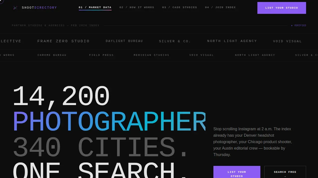
The header opens with a horizontal marquee scroll of photographer studio logos and agency partner marks rendered in grayscale on a slab-black field. After the logos establish credibility, bold white display type punches in with a stat headline. No hero image. No decorative filler. Just raw proof. The header is pure brutalist design: structure as statement.
Industry Stats Section with Heatmap Callouts
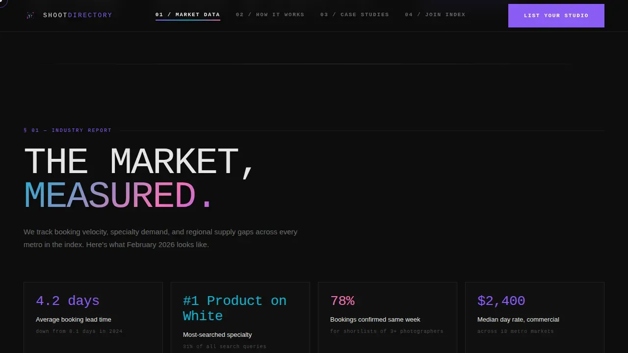
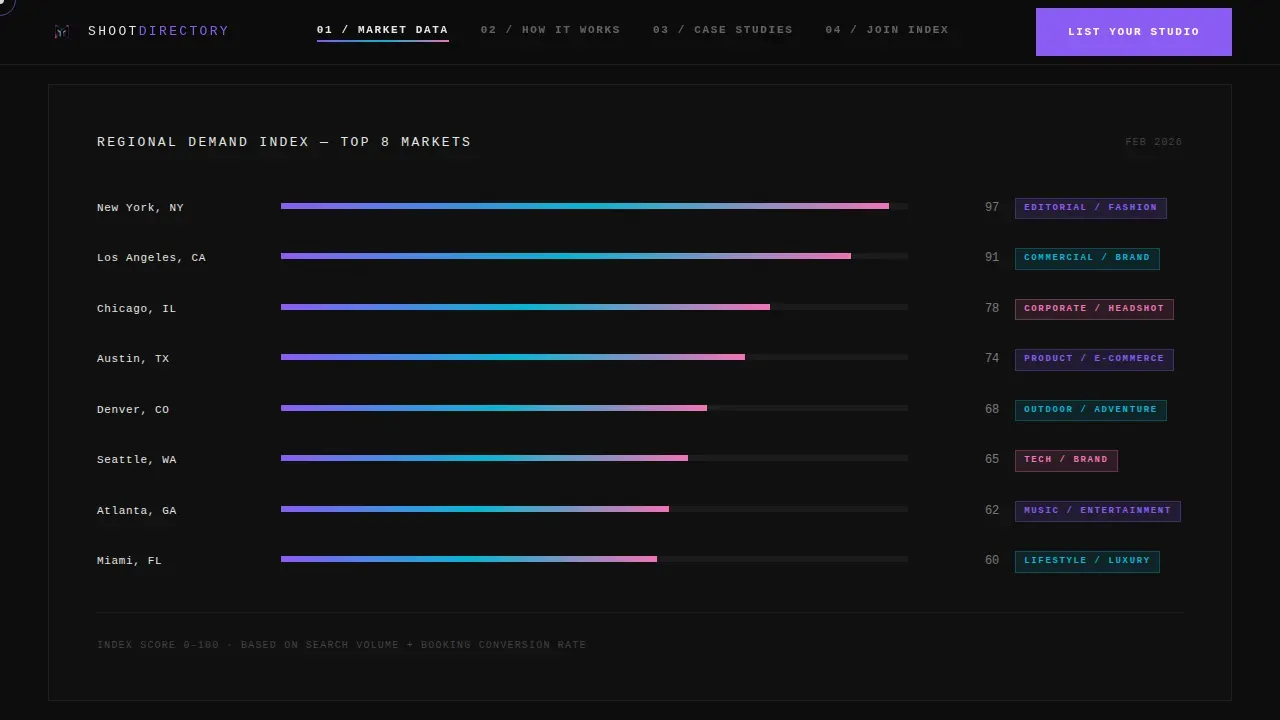
Section one of the landing page presents market data in a raw, report-style layout. Average booking lead times, top-requested specialties, and regional demand callouts are displayed as oversized stat blocks. The website ui is designed to feel like a state-of-the-industry briefing, data-first, design landing page logic that builds credibility before the first call to action.
Three-Spoke Anchor Navigation
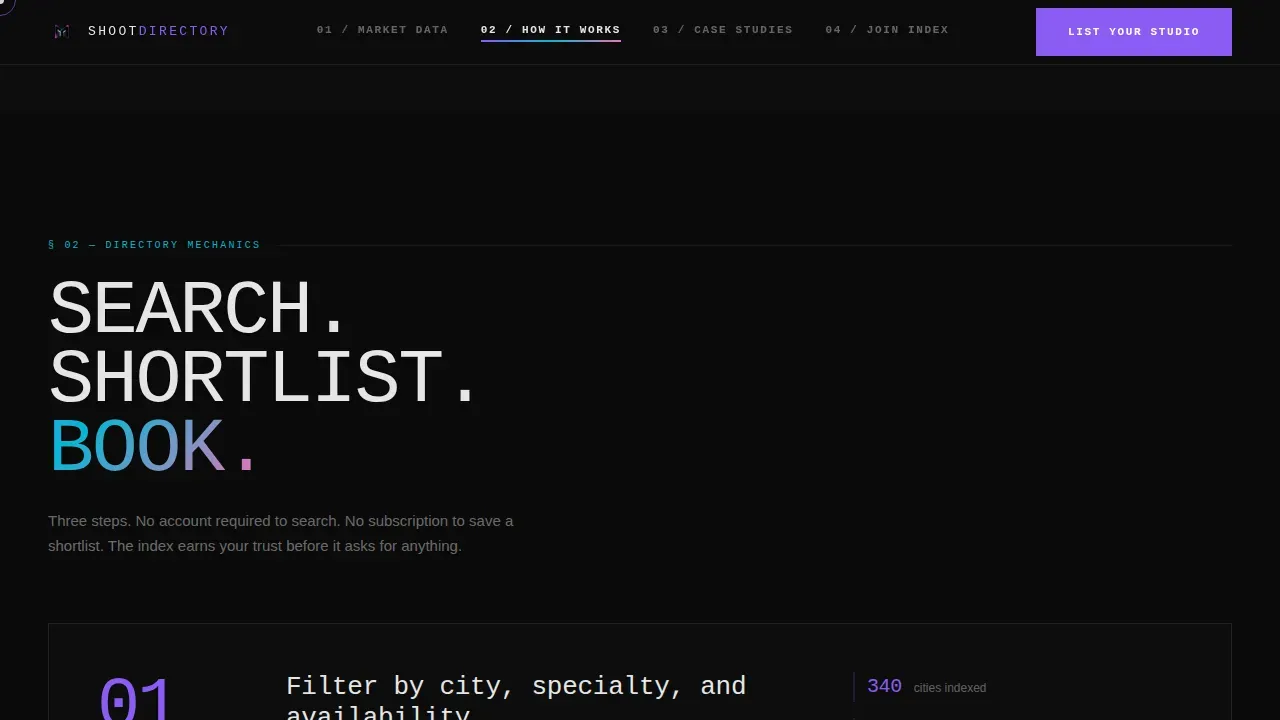
The hub-and-spoke landing page layout is organized around three anchor links: Search, Shortlist, and Book. Each spoke is a self-contained section with its own explanation, supporting data, and a repeated conversion prompt. The anchor nav is an iridescent-accented bar that stays contextually present as the visitor scrolls. This is the structural core of the ux design.
Anonymized Case Study Block
A brutalist case study creative section presents real hiring metrics in an anonymized format. Numbers, timelines, and outcomes are displayed in a stark grid. The section is stripped of decoration, placing all weight on the results. This is where the landing page earns the click, not through promises, but through proof.
Dual Call-to-Action Conversion Paths
The landing page runs two parallel conversion flows. "List Your Studio" targets photographers with a three-field form: name, city, and primary specialty. "Search Photographers Free" routes hiring-side visitors into the directory and captures their email on first shortlist save. Both calls to action repeat at each anchor spoke, so conversion opportunities are never more than one scroll away.
GSAP Animation and Iridescent Interactivity
The landing page motion system uses GSAP scroll reveals, a cursor follower, stat count-up animations, and iridescent hover bleeds across anchor nav links and data callouts. Marquee scrolling runs across the logo bar. Hover states shift through violet, cyan, and hot pink. The interactivity level is high and intentional, making the page feel alive without abandoning the raw brutalism brutalist structure underneath.
Page sections overview
| Section | Purpose |
|---|---|
| Logo Bar Header | Opens with studio logos and a stat headline to establish scale and credibility |
| Industry Stats Block | Displays booking lead times, top specialties, and regional demand callouts |
| Search Spoke | Explains the directory search experience with anchor nav and call to action |
| Shortlist Spoke | Shows how hirers save and compare photographers with embedded conversion |
| Book Spoke | Closes the workflow loop with booking context and repeated dual call to action |
| Case Study Section | Presents anonymized hiring metrics in a stark brutalist grid |
| Dual call to action Block | Hosts both conversion paths side by side for photographers and hirers |
| Single-Row Footer | Linear footer with minimal links and no decorative weight |
Design & branding system
The website design follows a bold brutalist visual language built on an AI Iridescent color system. Raw grid structure, oversized type, and synthetic color bleeds make this one of the most visually assertive landing page designs available for a directory product. Brutalist design emphasizes functionality over aesthetics, often resulting in a stark and unrefined appearance, and this template wears that proudly. The term Brutalism originates from the French word for "raw," used by architect Le Corbusier to describe his material béton brut, and the same logic drives every design decision here.
- Color palette: deep slab black (#0D0D0D) as the dominant background, shifting violet (#8B5CF6), electric cyan (#06B6D4), and hot iridescent pink (#F472B6) for hover states, accents, and nav markers; concrete white (#E5E5E5) for body text and card backgrounds
- Typography: JetBrains Mono for display headings and oversized callouts; Manrope for body copy and user interface elements, a deliberate contrast between machine-raw and human-readable
- Animation system: GSAP scroll reveals, marquee logo scroll, cursor follower, stat count-up on entry, and iridescent color bleeds on hover across all interactive elements
Mobile & speed optimization
This template is desktop-first by design intent. The core audience, art directors, campaign managers, and creative agency staff, works at a desk inside a campaign staffing workflow. Full mobile support is included so the landing page remains functional across all screen sizes. The website ui adapts cleanly to smaller viewports without losing the visual character of the brutalist design.
- Server Components handle static sections for leaner initial load; Client Components manage animations and interactive states
- Anchor navigation collapses gracefully on mobile so the three-spoke structure remains navigable on smaller screens
- All form fields and call to action buttons are touch-friendly, keeping both conversion paths fully accessible on mobile devices
How this template helps you convert
This landing page is built around a data-first conversion strategy. Brutalist websites typically prioritize content and usability over decorative elements, and this template applies that principle directly to lead generation. Every section either earns trust or asks for an action.
- The hero stat headline ("14,200 photographers. 340 cities. One search.") establishes scale immediately, giving both photographers and hirers a reason to stay on the page before any pitch begins.
- The industry stats section reframes the directory as infrastructure, not a listing site, but an index that already measured the market. This positions the conversion ask as a logical next step rather than a leap of faith.
- Dual calls to action repeat at every anchor spoke, so neither audience segment has to scroll back to convert. Photographers see "List Your Studio." Hirers see "Search Photographers Free." Each path captures a lead with minimal friction.
Other information about this template
This template sits at the intersection of brutalism website aesthetics and practical directory product design. It draws inspiration from the raw, uncomfortable playfulness that defines the best brutalism websites, where structure is the statement and every raw element earns its place on the grid. A curated collection of brutalism websites can provide inspiration and references for designers working in this space, and this template is designed to be a reference-grade example of that tradition applied to a real commercial project.
Brutalism can be seen as a reaction by a younger generation to the lightness and frivolity of today's web design. Brutalist web design is characterized by its ruggedness and lack of concern for comfort or ease, and this page embraces that fully. Brutalist website templates often display information in a raw and uncomfortable way, and this one channels that quality into a functional, conversion-oriented product. Brutalist design can be facilitated by using specific website templates and tools, and this template is built to be one of those tools. There are various tools available that help in creating brutalist-style websites, but few are purpose-built for a directory and marketplace product at this level of visual specificity. Brutalist website templates are often easy to use for non-technical users, and the same applies here, the structure is ready to customize with your own directory data, city names, and photographer categories.
This template is well-suited as a portfolio template reference for designers building agency bold brutalist creative work to show clients. It functions equally well as a portfolio website showcase piece and as a live product. The neo brutalism influence is visible in the iridescent color layer applied over the raw structural base, a quality that sets it apart from pure monochrome brutalist approaches. This page website also serves as strong graphic design illustration of what a creative agency website can achieve when the web design website strips away decoration and lets data carry the visual weight. Designers looking for ui uiux inspiration for a digital agency project, a creative agency design pitch, or a directory-style e commerce store will find this template a practical and visually strong starting point.
The Shootdirectory bold brutalist photographer directory landing page template is the named reference for this design system, and it is the foundation for the entire project. Webflow website builds and similar no-code platforms can use this template as a structural and visual guide. The landing page ui, landing page motion system, and overall website typography ui web decisions are all documented in the design system for easy handoff.
- This is a one page landing page, not a multi-page website
- The template style is Hub and Spoke with anchor navigation
- The creative direction follows an Industry Report structure
- The header concept is a Logo Bar with no traditional hero image
- The landing page direction is Lead Generation with a dual conversion path
- The color system is AI Iridescent, applied over a bold brutalist structural base
Theme
Bold Brutalist
Creative direction
Industry Report
Color system
AI Iridescent
Style
Hub & Spoke (Anchor Nav)
Direction
Lead Generation
Page Sections
Logo Bar Header with Stat Headline
Industry Stats and Market Data Section
Three-spoke Anchor Navigation
Anonymized Case Study Block
Dual Call-to-action Conversion Paths
GSAP Animation and Iridescent Interactivity
Related questions
Who is this landing page template designed for?
Can I customize the city names, specialties, and photographer categories?
What makes this different from a standard agency landing page template?
Does this template include the actual directory search functionality?
Is this template suitable for a portfolio or design showcase project?



