E-Commerce Store Homepage Data-Driven Website Template
Shop is a modular, card grid landing page template built for e-commerce store homepages. It uses a Dynamic Motion visual theme, a Slate and Sky color system, and a data-driven Industry Report layout to show visitors exactly why this storefront outperforms the competition. Drag, drop, and launch a polished homepage before your next coffee break.
by Rocket studio
Quick summary
Shop is a single-page e-commerce homepage template built on a card grid layout with animated, motion-triggered sections. It follows an Industry Report creative direction, comparing your storefront's performance anatomy against competitor wireframes so visitors understand the value before they even reach the call to action.
Who this template is for
This template is made for merchants and marketers who need a high-performing storefront homepage without waiting on a developer. It suits people who understand data, care about conversion, and want a launch-ready page today.
- Direct-to-consumer brand operators running established online stores who need fast, polished homepage updates without a development queue
- Sellers moving from marketplace platforms to their own domain and needing a credible, professional first impression
- Marketing directors at mid-size retailers who want to move banners, test layouts, and ship changes independently
What problem this template solves
Most e-commerce homepages underperform because they take too long to build, look generic, and never clearly prove their value to a hesitant visitor. This template removes that friction entirely.
- The drag-and-drop modular structure means layout changes happen in minutes, not in three-week dev sprints
- The built-in comparison card design shows visitors data-backed proof of performance before the primary call to action
- The animated header and motion-triggered sections communicate quality and speed visually, without needing a single word of technical explanation
What you get with this template
You get a fully structured, single-page e-commerce homepage template with every section pre-built and ready to populate. The layout ships with a cohesive visual identity, conversion-focused section order, and interactive motion elements baked in.
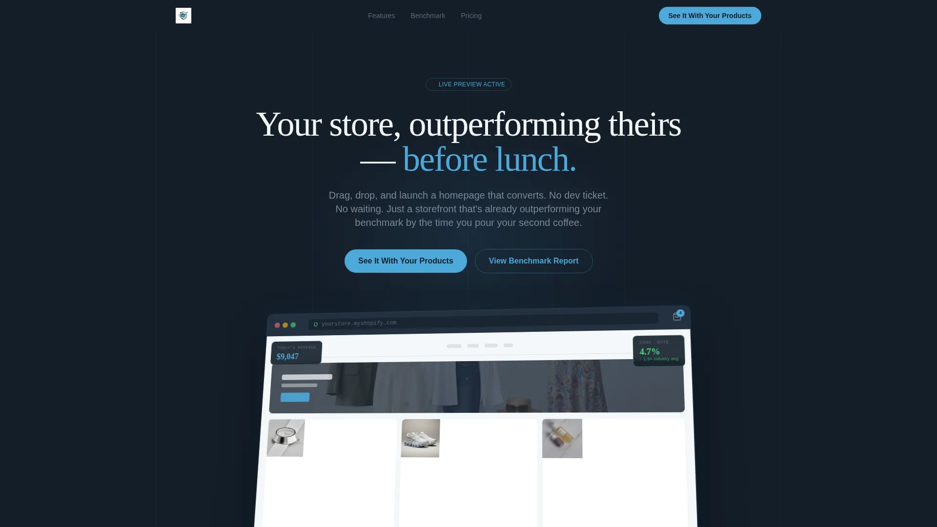
- A Dashboard Preview header featuring a browser-chrome mockup at an isometric tilt, complete with animated product cards, a pulsing conversion-rate badge, and a looping revenue graph
- A modular card grid body built around the Industry Report creative direction, including stat cards, competitor comparison panels, and motion-triggered card animations
- A dual call-to-action conversion system with a primary live preview generator and a secondary email-gated benchmark report download path
Feature list
This template ships with a focused set of design and layout features drawn directly from the brief. Each one serves a specific role in the storefront homepage experience.
Animated Dashboard Preview Header
The header places a browser-chrome mockup at a slight isometric tilt, showing a fully populated storefront with real-looking product cards. On load, cards shuffle into position, a cart icon bounces, and a heatmap overlay briefly appears then fades. The headline "Your store, outperforming theirs, before lunch" fades in beneath the mockup.
Motion-Triggered Card Grid Layout
Each section card animates into view as the visitor scrolls. Cards flip or slide in on scroll trigger, making the page itself a live demonstration of the Dynamic Motion theme promise. The modular grid makes it simple to rearrange, add, or remove cards without breaking the layout.
Competitor Comparison Panels
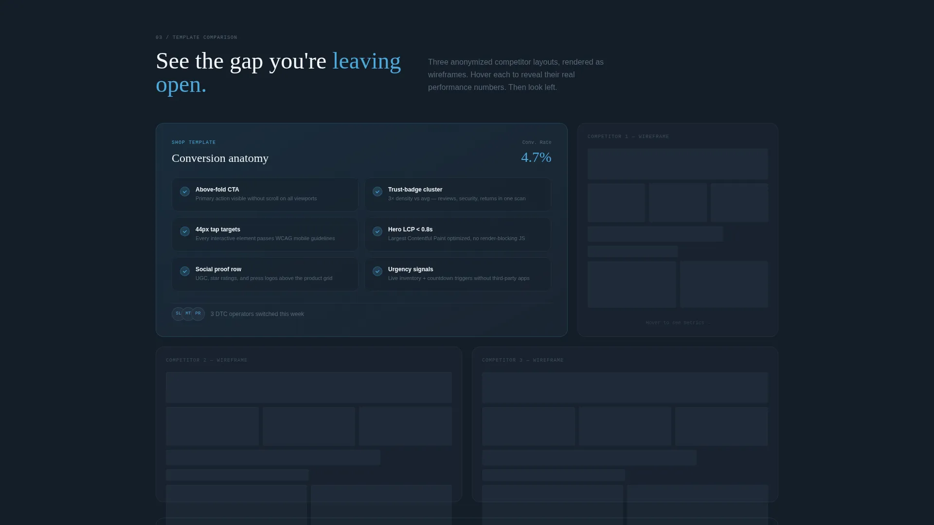
Section two fans out a visual grid comparing the template's conversion anatomy against three anonymized competitor layouts. Each competitor is shown as a muted wireframe beside the full-color template, highlighting differences in hero placement, trust-badge density, and mobile tap target sizing.
Dual Conversion Path System
The primary call to action reads "See It With Your Products" and opens a live preview generator where visitors paste a store URL or upload a logo to preview the template in their brand colors. A secondary path offers a downloadable benchmark report behind an email gate for visitors still in research mode.
Slate and Sky Color System
The palette uses deep graphite slate for primary backgrounds, mid-tone pewter for secondary surfaces, open-sky blue on every interactive element and hover state, and cirrus white for card faces. The result is a cool, precise visual tone that makes every clickable element feel distinct and inviting.
Performance Stat Cards
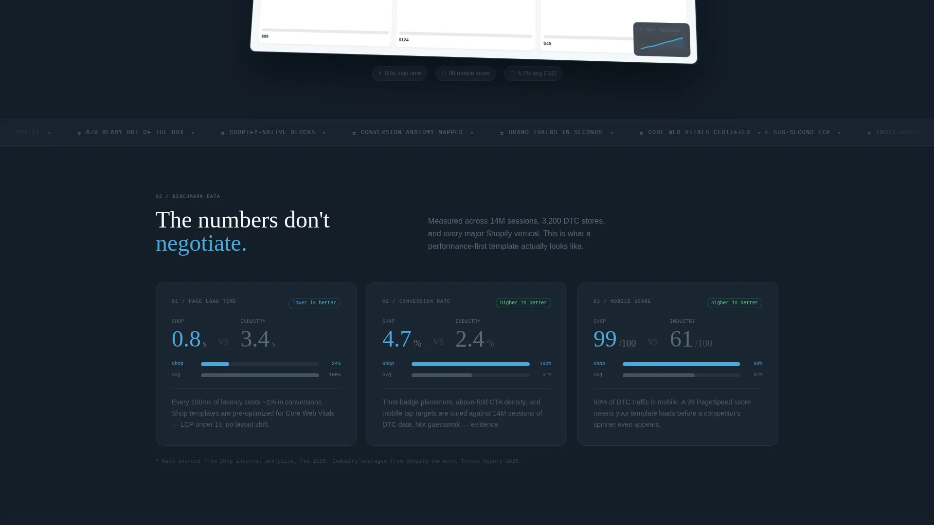
Section one opens with a bold stat card showing average load time against an industry benchmark. The data briefing tone escalates through the page: first the stat, then the proof, then the gap between a visitor's current store and what this template delivers.
Page sections overview
| Section | Purpose |
|---|---|
| Dashboard Preview Header | Hooks visitors with an animated storefront mockup and a bold headline |
| Performance Stat Card | Opens the data story with a load-time comparison against industry benchmarks |
| Conversion Anatomy Grid | Compares hero placement, trust badges, and tap targets across template and competitors |
| Competitor Wireframe Panel | Shows three anonymized rival layouts beside the full-color template |
| Primary call to action Block | Drives visitors to the live preview generator with their own branding |
| Email Gate Section | Captures research-phase visitors with a benchmark report download offer |
Design & branding system
The visual identity follows a Dynamic Motion theme built on the Slate and Sky color palette. Every color choice has a functional role, keeping the layout readable, the data prominent, and the interactive elements unmistakably actionable.
- Deep graphite slate (#1E2A38) anchors primary backgrounds, giving the page a grounded, data-forward feel that keeps stats and cards easy to read
- Open-sky blue (#4DA8DA) marks every interactive element and hover state, making buttons, links, and clickable cards immediately recognizable without extra labels
- Cirrus white (#F4F7FA) fills card faces and spacing zones, providing the visual breathing room that separates data panels and prevents layout fatigue
Mobile & speed optimization
The template is built with a modular card grid structure that adapts naturally to smaller screens. Mobile tap target sizing is explicitly part of the comparison anatomy shown in the template's own content, signaling that the layout was designed with touch interaction in mind from the start.
- The card grid reflows cleanly for mobile viewports, keeping product cards, stat panels, and call to action blocks legible without horizontal scrolling
- Tap target sizing is highlighted as a key differentiator in the competitor comparison section, reinforcing mobile-first thinking throughout the layout
How this template helps you convert
The page is built around a Comparison and Versus conversion model that guides visitors from curiosity to confidence in a single scroll. Every section adds one more layer of proof before the call to action appears.
- The animated Dashboard Preview header creates an immediate strong first impression, using live-looking data visuals to signal that this template is performance-focused from the very first second
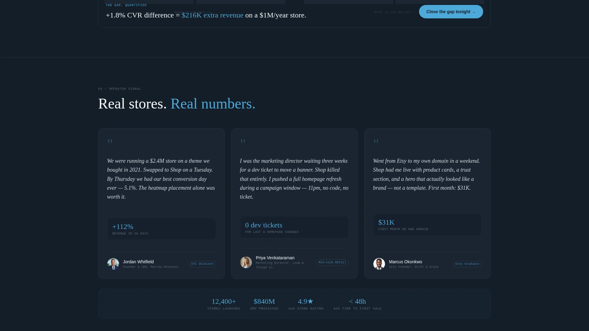
- The Industry Report scroll structure escalates tension naturally, visitors see a benchmark stat, then see competitor layouts lose the comparison, so by the time the primary call to action appears the decision feels obvious
Other information about this template
This template sits in the E-Commerce Store Homepage Template niche within the broader E-Commerce Store Website Templates subcategory. It is well suited for technology-forward commerce teams who want a homepage that looks as capable as the stack behind it.
- The template style is Card Grid (Modular), making it easy to reorder sections or swap cards without redesigning the full layout
- The Industry Report creative direction gives the page a unique editorial tone that stands out from typical storefront hero-plus-grid homepage designs
- The Comparison and Versus landing-page direction is a proven model for communicating differentiated value quickly, and this template uses it as its core structural logic
Theme
Dynamic Motion
Creative direction
Industry Report
Color system
Slate & Sky
Style
Card Grid (Modular)
Direction
Comparison/Versus
Page Sections
Animated Dashboard Preview Header
Motion-triggered Card Grid
Competitor Comparison Panels
Dual Conversion Path System
Slate and Sky Color System
Performance Stat Card Section
Related questions
Can I use this template without design experience?
What does the live preview generator do?
Does the template include the animated header effects?
Who is the secondary email-gate path designed for?
Is this a single page or a multi-page website?



