Onboarding & User Guide Portfolio Website Template
Tourcommand is a dark-themed, mission-control-style comparison landing page built for interactive product demo platforms. It blends a Dashboard Pro visual system with an Industry Report narrative to turn prospects into qualified leads. Comparison tables, stat callouts, and a progressive two-step form work together to showcase interactive demos and move visitors from curious to converted.
by Rocket studio
Quick summary
This template is a single-page, high-conversion landing page built for teams that sell or promote interactive product demos. It opens with a live-style dashboard hero, escalates through evidence-driven comparison tables, and closes with a two-step lead capture form. The Void and Violet color system gives it a premium, dark-IDE aesthetic that enterprise buyers immediately recognize as serious.
Who this template is for
This template is built for SaaS teams that need to showcase interactive product demos without relying on engineering resources or fragile sandbox environments. It speaks directly to the people who live at the intersection of product, sales, and revenue.
- Product marketing managers shipping demo environments for enterprise deals who need a page that works as hard as their pitch deck.
- Sales engineers tired of live demo calls that break mid-screen-share, who want prospects to arrive already qualified.
- Growth leads who embed product tours on pricing pages and need a structured, conversion-optimized layout to capture leads and close more deals.
What problem this template solves
Traditional product demos create friction at every stage. Recorded videos do not allow interaction. A live demo requires a sales rep to be present and performs unpredictably. Free trials dump potential customers into a product before they understand the value. The result is information overload, low completion rates, and prospects who disengage before they ever reach a decision.
- Static screenshots and passive videos fail to guide users through complex features, leaving demo viewers confused and unconverted.
- Spinning up sandbox environments for every sales call wastes engineering time and creates demo calls that break at the worst moment.
- Without a self guided walkthrough, website visitors cannot qualify themselves, so the sales team spends time on low-intent leads.
What you get with this template
You get a complete, ready-to-customize landing page structured around the logic of an analyst briefing. Every section is purpose-built to move prospects from skeptical to sold, using interactive product demos as the proof point rather than marketing copy alone.
- A full-page layout including a dashboard hero section, stat block, four comparison tables, a metrics bento grid, and a two-step lead generation form.
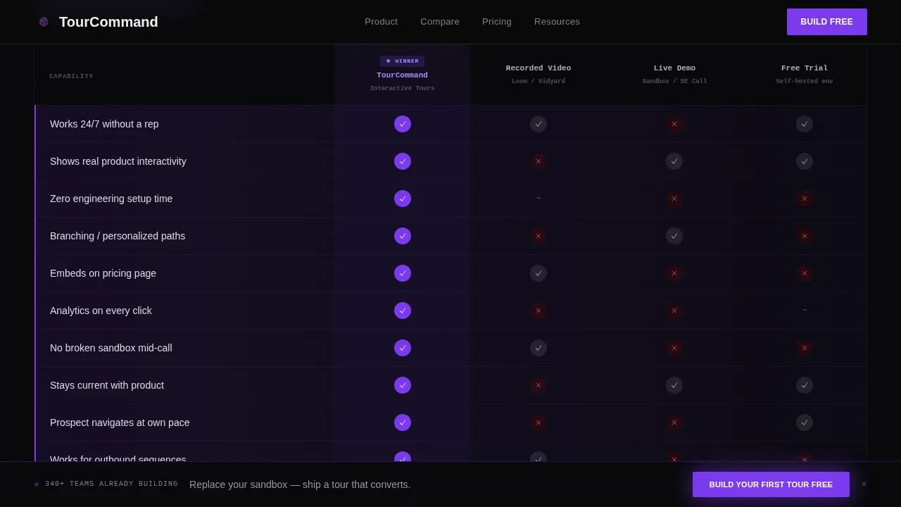
- A feature comparison table block that places interactive demos head-to-head against recorded videos, live demos, and free trials with checkmarks and violet-highlighted winner rows.
- A progressive two-step form that captures work email first, then company size and primary use case, plus a secondary gated PDF offer for prospects who are not yet ready to build.
Feature list
This template ships with a focused set of built-in components. Each one is grounded in what the brief describes as delivered and functional.
Dashboard-Style Hero with Typewriter Headline
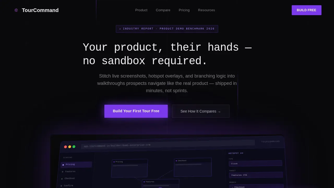
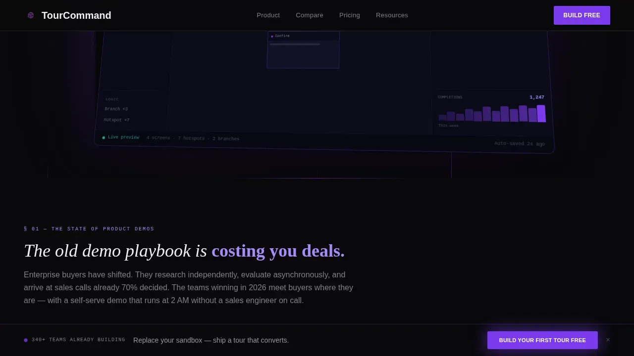
The hero renders an isometric-angled screenshot of a tour builder interface at full pixel fidelity. A branching flow canvas with three connected screens is visible, alongside a hotspot properties panel and an analytics sparkline showing real completion data. The monospace headline types itself above the preview, and a cursor animation clicks a hotspot to hint at the interactivity waiting inside every interactive product demo.
Industry Report Stat Block
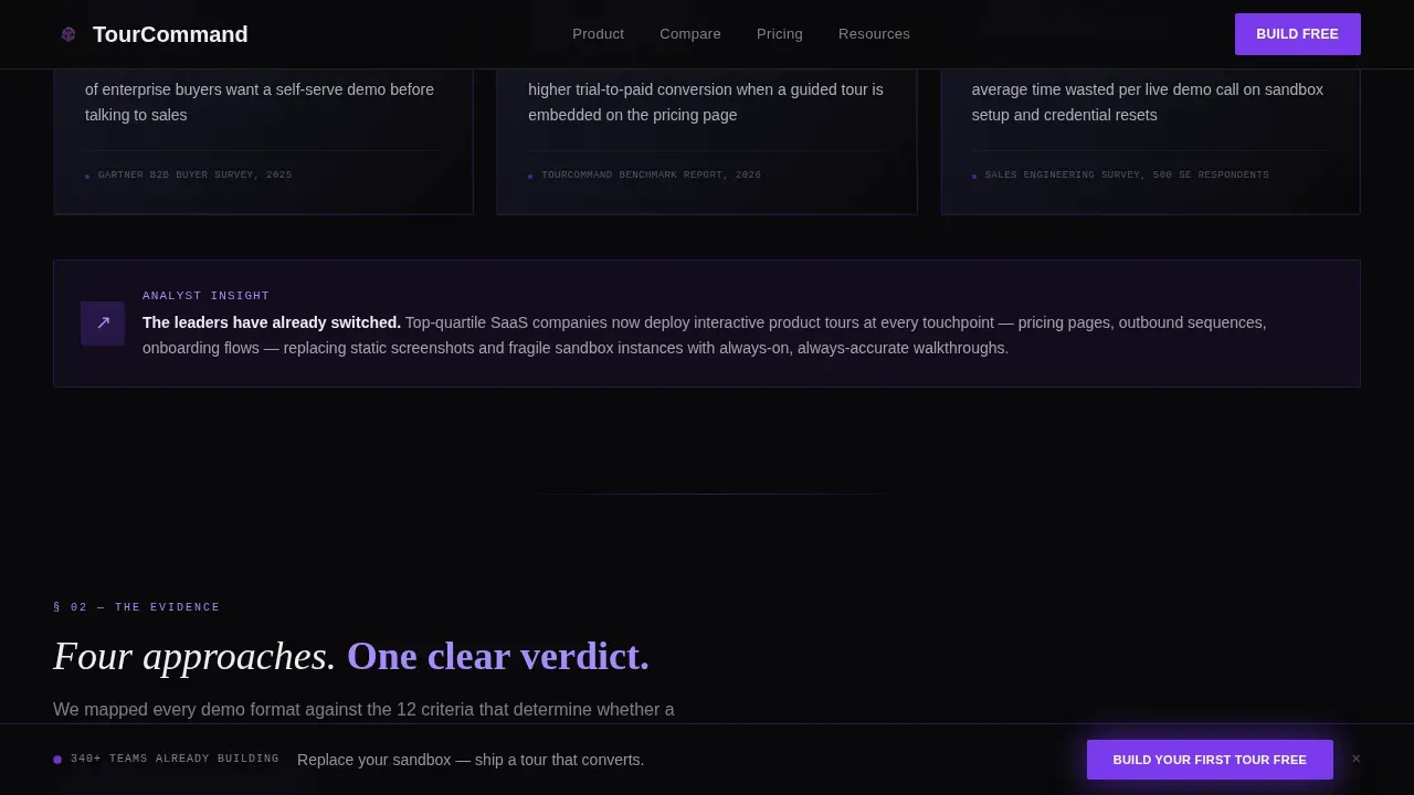
Three stat callout cards open the evidence section, styled as dashboard widgets. The opening stat frames the problem as a market shift: 68 percent of enterprise buyers want a self-serve demo before talking to sales. This framing positions interactive demos as an industry response, not just a product feature, which helps the sales team anchor every follow-up conversation.
Four-Table Demo Comparison Section
The heart of the page is a dedicated section with four side-by-side feature comparison table blocks. Interactive demos are measured against recorded videos, live demos, and free trials across key functionalities like personalization, load reliability, and the ability to guide users through complex products without a sales rep. Violet-highlighted winner rows make the verdict immediate for demo viewers scanning quickly.
Metrics Bento Grid
Social proof lives in a bento-style grid of dashboard-widget cards. The layout can showcase completion rates, sign-up lift data, and pipeline metrics in a format that enterprise buyers find credible. Each card uses phosphor white data labels against graphite panels, so the numbers float forward visually and anchor the narrative with evidence rather than claims.
Two-Step Progressive Lead Form
The primary call to action button appears after the first comparison table and persists as a sticky bar on scroll. Step one captures a work email. Step two, which expands inline after the click, asks for company size and primary use case: sales enablement, marketing, or onboarding. A secondary conversion path offers a gated benchmark PDF to capture leads who want additional resources before committing to build their first demo.
Sticky Call to Action Bar
A violet-glow button reading "Build Your First Tour Free" follows the user down the page after the first comparison block appears. This persistent call to action reduces the chance that prospects scroll past the conversion moment without acting, and it keeps the primary goal visible even as users explore more demos and more features deeper in the page.
Page sections overview
| Section | Purpose |
|---|---|
| Dashboard Hero | Open with live builder preview and typewriter headline |
| Stat Block Cards | Frame the problem with three industry-data callouts |
| Comparison Table One | Interactive demos versus. recorded videos |
| Comparison Table Two | Interactive demos versus. live demo delivery |
| Comparison Table Three | Interactive demos versus. free trial onboarding |
| Comparison Table Four | Interactive demos versus. no-touch product tours |
| Metrics Bento Grid | Showcase social proof via dashboard-widget data cards |
| Features + Lead Form | Two-step form with benchmark PDF secondary offer |
| Sticky call to action Bar | Persistent "Build Your First Tour Free" scroll bar |
| Footer | Vercel-horizontal pattern with navigation and legal links |
Design & branding system
The visual language draws from a premium dark IDE running at midnight. Every surface recedes into depth so that data, labels, and interactive elements float forward. The palette is exact and intentional, not decorative.
- Colors: absolute void black (#09090B) for backgrounds, deep interstellar violet (#7C3AED) for primary accents and call to action buttons, muted graphite panel (#1A1A2E) for card surfaces, and phosphor white (#EEEEF0) for all text and data labels.
- Typography: JetBrains Mono for monospace headlines and code-style elements, Fraunces as the display serif for section titles, and DM Sans for body copy and form labels, creating a layered type system that feels technical and editorial at the same time.
- Animation: high-intensity scroll reveals, beam drop effects, spotlight mouse tracking on cards, and a cursor click animation inside the hero dashboard preview that simulates the interactive product experience before the visitor ever clicks a real button.
Mobile & speed optimization
Even though this template is desktop-first by design, enterprise SaaS buyers also review pages on mobile. Approximately 79 percent of landing page visits come from mobile devices, so the layout is built to respond without losing the visual impact that makes the dark dashboard theme effective.
- GPU-accelerated transforms handle scroll-reveal animations and beam effects without forcing layout reflows, keeping motion smooth across devices.
- Intersection Observer controls when elements animate into view, so the browser only runs transitions for visible content rather than loading everything at once.
- The bento grid and comparison tables reflow into single-column stacks on smaller screens, preserving readability for demo viewers who encounter the page on phones or tablets.
How this template helps you convert
The page is structured to guide users through a deliberate decision arc. It does not ask for a commitment until it has already made the case with data and comparison evidence. Each conversion mechanism is placed precisely.
- The feature comparison table blocks create a visceral verdict early in the scroll. Prospects self-qualify by seeing exactly where interactive demos outperform the alternatives, which means the sales team receives higher-intent leads and can close more deals in fewer demo calls.
- The two-step progressive form reduces friction by splitting the ask. Capturing only a work email at step one lowers the barrier to entry, then the inline expansion collects richer data without feeling intrusive, allowing the sales team and growth leads to segment and send prospects into the right follow-up sequence.
- The gated benchmark PDF offer creates a second conversion path for prospects who are doing research. It lets the page capture leads who are not ready to build yet but are actively in decision making mode, turning passive website visitors into warm contacts before they leave.
Other information about this template
This template is particularly relevant for teams evaluating the wider interactive demo platform landscape. Understanding where different tools fit helps buyers choose the right solution for their specific context.
- The tourcommand interactive product demo comparison landing page template is designed to centralize interactive product demos and product tours under one platform, so prospects and customers can explore all demo examples in one place rather than hunting across a fragmented website.
- Interactive demo software options vary significantly in pricing and features. For context: Supademo offers a free tier starting at $27 per month per user for static screenshot demos. Arcade also offers a free tier with access to basic features and up to 3 static screenshot demos. Storylane demos start at $40 per month per user for screenshot tiers and $500 per month for an HTML demo environment. HowdyGo offers unlimited HTML demos and users starting at $159 per month. Navattic starts at $500 per month targeting enterprise customers. Reprise starts at around $1,000 per month paid annually. Walnut.io starts at $9,200 annually for sales teams. Demostack starts at $55,000 per year and is the most expensive interactive demo platform, designed primarily for sales teams giving live demos rather than self-serve tours.
- Storylane integrates with a range of analytics tools and storylane demos are appreciated by users for their pricing flexibility at the screenshot tier.
- Google Analytics can be connected alongside other analytics tools to track demo page behavior and user engagement across the funnel.
- The template supports customization options including the company's brand colors, fonts, and logo placement, so teams can match the dark-IDE aesthetic to their own visual identity without rebuilding from scratch.
- Embed product tours directly into the page or send prospects a shareable link so internal champions can showcase the product without needing a live environment.
- The page supports multiple languages through localization-ready text blocks, and add ons such as a benchmark PDF download gate can be configured without additional development work.
- Effective communication of complex products is handled through the self guided walkthrough structure, allowing users to navigate the actual product experience at their own pace and skip to the features most relevant to them.
- The template is particularly strong for SaaS companies and SaaS products that need to communicate unique features and different features to distinct buyer personas on the same page without causing information overload.
- Teams that create interactive demos using this layout often encourage visitors to explore more demos from a centralized demo page or demo library, turning a single landing page into a portfolio of interactive product examples.
Theme
Dashboard Pro
Creative direction
Industry Report
Color system
Void & Violet
Style
Comparison Table
Direction
Lead Generation
Page Sections
Dashboard Hero with Animated Builder Preview
Industry Report Stat Block
Four Demo Comparison Tables
Metrics Bento Grid with Social Proof
Two-step Progressive Lead Capture Form
Sticky Conversion Bar on Scroll
Related questions
What types of teams benefit most from this template?
How does this template handle lead capture?
Can I customize the design to match my own branding?
How do interactive demos differ from recorded videos or live demos?
Does this template work for platforms beyond the tour-builder niche?



