Real Estate Scheduling Landing Page Template
Showings is a split-screen real estate appointment scheduling landing page template built on a Dashboard Pro theme. It targets listing agents, team leads, and brokerage ops managers who need a single synchronized calendar for showings, open houses, and broker walkthroughs. The data-first design leads with arresting stats and drives visitors toward an app download.
by Rocket studio
Quick summary
Showings is a precision scheduling landing page template designed for real estate professionals. It uses a split-screen layout and a stats-first visual approach to show visitors that missed appointments and double-bookings are a solved problem. Every section opens with a standout number before revealing the feature behind it, building trust through proof before persuasion.
Who this template is for
This template is built for real estate professionals who manage high volumes of property visits and cannot afford scheduling mistakes. It speaks directly to people whose day is measured in confirmed appointments, not just listed properties.
- Solo listing agents juggling twenty or more active properties at once
- Team leads coordinating multiple buyer's agents across a metro area
- Brokerage operations managers losing deals to double-booked showings
What problem this template solves
Scheduling showings across multiple properties, agents, and time slots creates constant friction. Confirmations get missed, calendars conflict, and drive-time gaps go uncalculated. This landing page template positions a scheduling platform as the fix for all of that.
- Scattered showing requests that never reach a single organized calendar
- Double-bookings that cost deals and damage client trust
- Slow confirmation flows that leave buyers and sellers waiting
What you get with this template
You get a fully structured single-page layout ready to present a real estate scheduling platform with confidence. The design system, content hierarchy, and conversion flow are already built in.
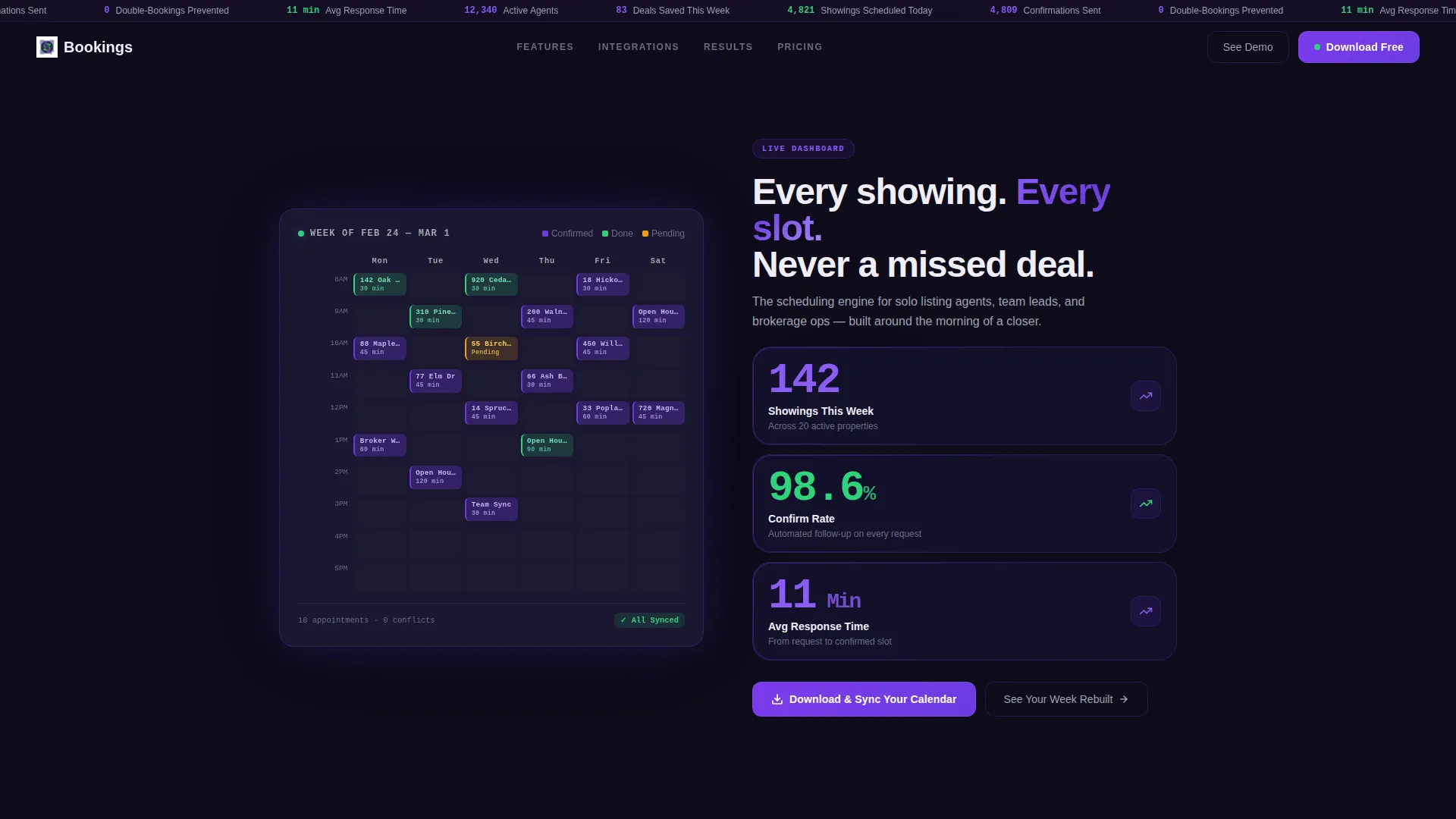
- A split-screen hero with a live-style calendar grid on one side and oversized stat cards on the other
- Scroll sections that each open with a single arresting metric before revealing the feature behind it
- A sticky navigation bar with a persistent stat ticker keeping community-wide numbers visible at all times
- Primary and secondary call-to-action placements driving toward app download and interactive demo
Feature list
This template includes a focused set of design and content features drawn directly from the brief.
Stats-First Hero Section
The header splits 50/50 between a color-coded calendar grid and three hero-scale metrics. Stats like "142 Showings This Week," "98.6% Confirm Rate," and "11 Min Avg Response Time" are set in monospace type against a deep screen-dark background. The data IS the visual centerpiece, with no stock photography.
Color-Coded Calendar Grid
The left panel of the hero displays a live-style weekly calendar with color-coded showing blocks. Purple marks confirmed slots, green marks completed visits, and a single amber block signals a pending appointment. This visual language immediately communicates control and clarity.
Metric-Led Scroll Sections
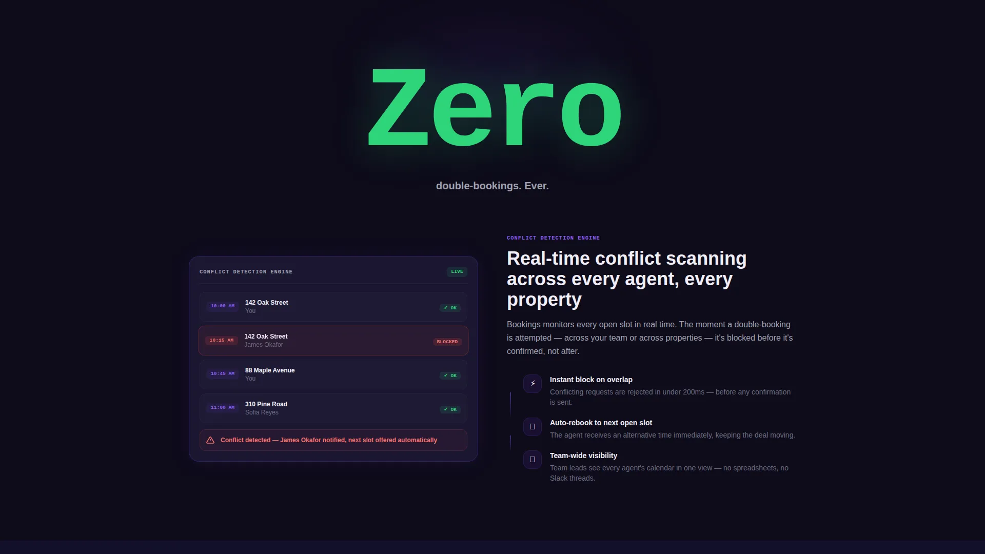
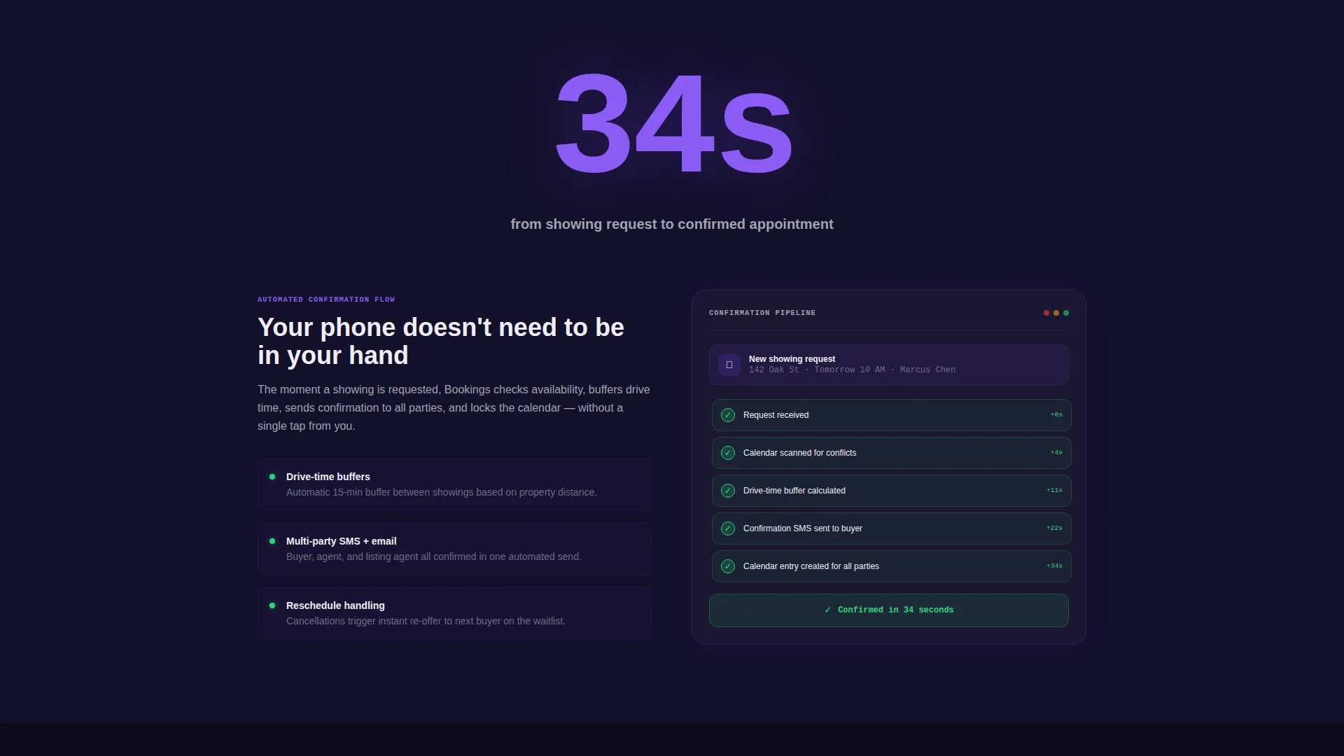
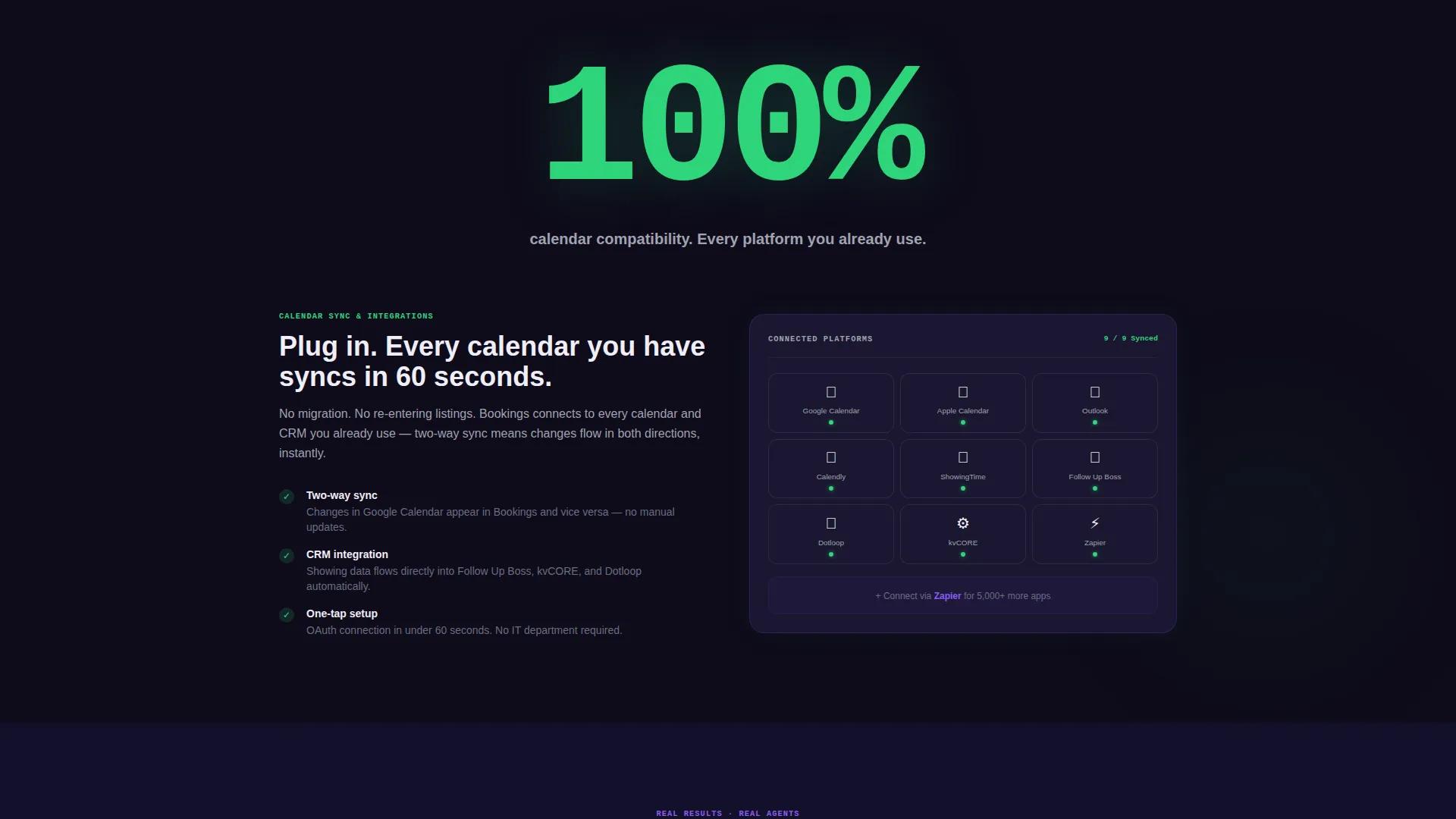
Each scroll section opens with one large, arresting number before explaining the feature it represents. "Zero double-bookings" introduces conflict detection. "34 seconds" introduces the automated confirmation flow. "100%" introduces calendar sync compatibility. Visitors absorb proof before they read a product description.
Persistent Stat Ticker in Sticky Nav
The sticky navigation bar carries a live-style community stat ticker. As visitors scroll, they see platform-wide numbers updating in real time. This keeps the value proposition present throughout the entire page experience.
App Download Call-to-Action Block
The primary call-to-action reads "Download and Sync Your Calendar" with paired app store badges that glow indigo on hover. A secondary path offers "See Your Week Rebuilt," linking to an interactive demo that imports a sample calendar.
Interface Walkthrough Section
After the metric-led proof sections, the page delivers a visual walkthrough of the scheduling interface. By the time visitors reach this section, the numbers have already done the persuasion work. The walkthrough confirms what the stats implied.
Page sections overview
| Section | Purpose |
|---|---|
| Split-Screen Hero | Pair calendar grid with stat cards to open with impact |
| Sticky Nav Ticker | Keep live community stats visible during scroll |
| Conflict Detection Stat | Lead with "Zero double-bookings" before feature reveal |
| Confirmation Flow Stat | Open with "34 seconds" to frame automation speed |
| Calendar Sync Stat | Use "100%" to set expectations before sync detail |
| Interface Walkthrough | Show product screens after proof sections build trust |
| App Download call to action | Drive to download with store badges and demo link |
Design & branding system
The template uses an Electric Indigo color system that feels like a premium trading app crossed with a luxury brokerage environment. Every color choice is intentional and functional.
- Deep screen-dark (#0E0B1A) as the primary background, creating a high-contrast dark canvas
- Vivid indigo (#6C3CE1) as the accent color on interactive elements, glow effects, and card borders
- Cool slate (#A0A3B1) for secondary text, dividers, and supporting labels
- Bright confirm-green (#2ED47A) reserved for success states, completed calendar blocks, and call-to-action buttons
Mobile & speed optimization
The split-screen layout is designed to adapt cleanly to smaller screens without losing the visual weight of the stats-first approach. The template keeps the data hierarchy intact across device sizes.
- Oversized monospace stat figures remain readable and prominent on mobile viewports
- The sticky nav ticker stays accessible during scroll on both desktop and mobile layouts
- Color-coded calendar blocks retain their meaning across screen sizes without requiring additional labels
How this template helps you convert
Every structural decision in this template is designed to reduce hesitation and move visitors toward downloading the app.
- The stats-first scroll order means visitors encounter proof of value before they reach any feature description, so trust is established early.
- The persistent stat ticker in the sticky nav maintains buying momentum throughout the entire scroll experience, not just at the hero.
- The dual call-to-action setup gives visitors two clear paths: a direct download for the ready buyer and an interactive demo for the cautious one.
Other information about this template
This template is part of a broader set of real estate software templates designed for the property technology space. It is a strong fit for teams building or marketing a real estate appointment scheduling platform.
- The Dashboard Pro theme works well for real estate software products that need a data-forward, professional presentation
- The template style is a split-screen 50/50 layout, making it easy to pair visual proof with contextual copy
- The creative direction is Stats-First Impact, meaning numbers lead every section before feature copy follows
- The header concept is a Stats and Metrics dashboard, built to communicate reliability at a glance
- The landing page direction is App Download, optimized to guide visitors from awareness to install
Theme
Dashboard Pro
Creative direction
Stats-First Impact
Color system
Electric Indigo
Style
Split Screen (50/50)
Direction
App Download
Page Sections
Stats-first Hero with Calendar Grid
Color-coded Showing Blocks
Metric-led Scroll Sections
Persistent Stat Ticker
Dual Call-to-action Setup
Interface Walkthrough Section
Related questions
Who is this landing page template designed for?
Can I customize the stat numbers shown in the template?
Does the template include both a primary and secondary call to action?
What does the split-screen layout mean for the hero design?
What color system does this template use?



