Showroom - Powerful Automotive Landing Page Template
Showroom is a scroll-reveal automotive digital menu landing page built for dealerships ready to ditch printed price sheets. It guides visitors through hard industry stats, then answers each one with a live platform feature. The result is a dark, amber-lit single page that earns the app install before it ever asks for the tap.
by Rocket studio
Quick summary
Showroom is a single-page automotive digital menu platform built to replace printed inventory sheets and whiteboard pricing at dealerships. It uses a progressive scroll-reveal structure, each section surfaces an industry data point, then slides the matching product feature into view beneath it. The design runs on a Carbon Fiber palette and drives visitors toward one clear action: installing the digital menu.
Who this template is for
This landing page was designed for automotive businesses that manage inventory or service pricing and want customers to self-serve before stepping onto the lot.
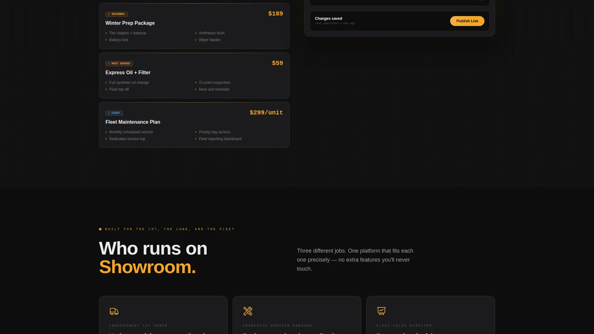
- Independent used-car lot owners who update stock between auctions and need a clean, phone-ready display
- Franchise service managers promoting seasonal maintenance packages without printing new materials
- Fleet sales directors presenting tiered pricing to procurement teams in a professional, paper-free format
What problem this template solves
Most dealerships still rely on laminated sheets, cluttered whiteboards, and verbal explanations to communicate pricing and inventory. That approach slows down every customer interaction and costs real time on the floor.
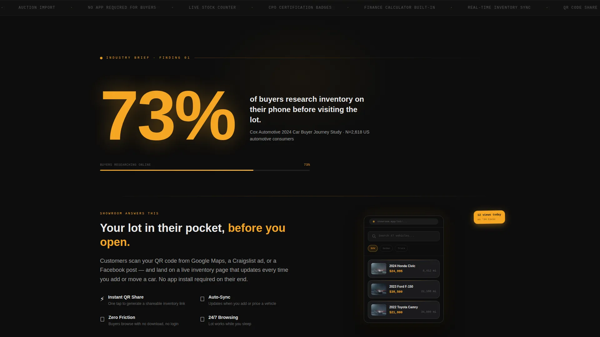
- 73% of buyers research inventory on their phone before visiting the lot, yet most dealership pages are not built for that moment
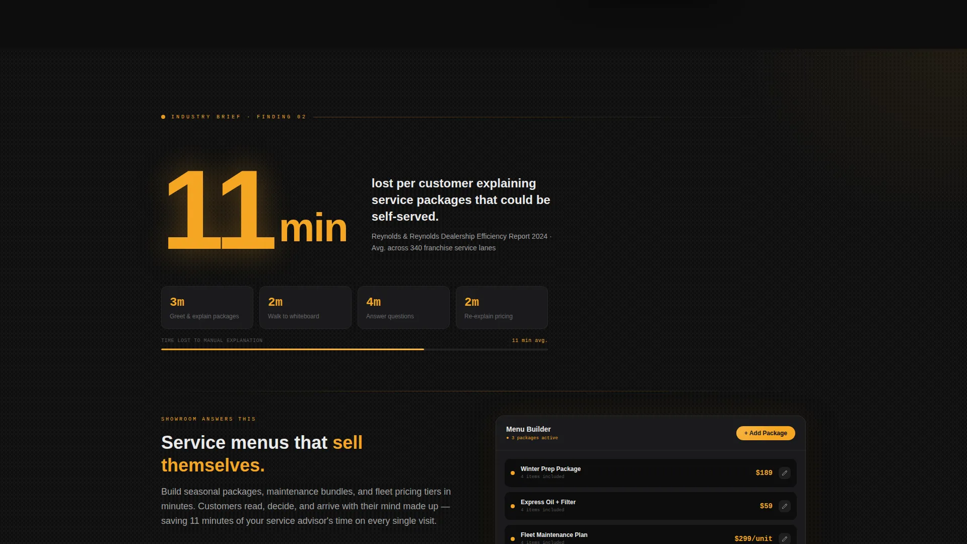
- Dealerships lose roughly 11 minutes per customer explaining packages that a well-built digital menu could handle automatically
- Without a dedicated display, staff spend valuable time repeating information instead of closing deals
What you get with this template
You get a fully structured, single-page layout that moves like a confidential industry brief, every scroll reveal drops a hard stat, then answers it with a product feature. The page is engineered to build the case for your digital menu before asking visitors to act.
- A dark, Carbon Fiber visual identity with amber interactive highlights and headlamp-white body text
- A sticky app-download call-to-action pill that appears after the second scroll reveal, plus a full-width close section with platform badges for iOS and Android
- A secondary conversion path offering a 60-second demo pre-loaded with sample vehicle cards
Feature list
This section covers the core capabilities built into the Showroom landing page template.
Scroll-Reveal Progressive Structure
Each section animates into view as the visitor scrolls. A hard industry statistic fades in first, then the matching platform feature slides up beneath it. This cadence builds a logical, data-backed case for the product with every new screen.
Dark Full-Bleed Hero with Amber Glow
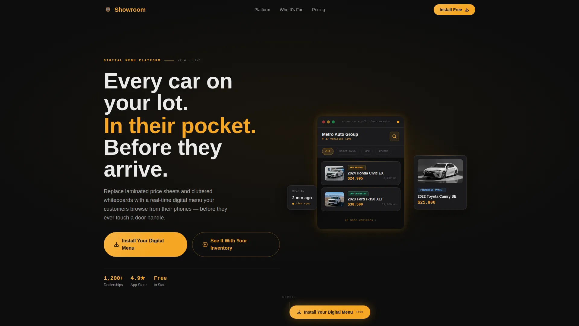
The header fills the entire viewport with pitch-black background. A single automotive digital menu interface materializes from the darkness, its edges traced by a soft amber glow. Real inventory cards, including sample year, model, mileage, and financing badge details, float in staggered depth inside the hero.
Sticky App-Download Call to Action
A pill-shaped download prompt appears after the second scroll reveal and stays accessible as the visitor continues reading. It removes friction by keeping the primary action visible without interrupting the content flow.
Dual Conversion Paths
The primary call to action reads "Install Your Digital Menu" and is supported by iOS and Android platform badges side by side. A secondary path labeled "See It With Your Inventory" links to a 60-second demo pre-loaded with sample vehicle cards, giving hesitant visitors a low-commitment next step.
Industry Report Creative Direction
The page follows a structured stat-then-solution rhythm. Each data callout is styled with amber highlights, visually mimicking a gauge climbing toward redline. The effect feels like reading a findings brief where every problem is immediately answered by a feature.
Service Menu Builder Section
A dedicated section previews the service-menu builder with a demo sequence. It is timed to appear after the stat about dealerships losing 11 minutes per customer on package explanations, making the feature feel like a direct answer to a proven operational problem.
Page sections overview
| Section | Purpose |
|---|---|
| Dark Hero Header | Introduces the platform with a full-bleed, amber-glowing inventory user interface preview |
| Stat Reveal One | Surfaces the mobile research statistic before showing the mobile browse feature |
| Mobile Browse Feature | Demonstrates phone-ready inventory display as the answer to stat one |
| Stat Reveal Two | Presents the 11-minute customer time-loss finding |
| Service Menu Builder | Shows the self-serve package display that solves the time-loss problem |
| Sticky call to action Pill | Persistent download prompt active from the second reveal onward |
| Demo Preview Section | Introduces the 60-second sample-inventory demo as a secondary path |
| Full-Width Close | Final app-download section with iOS and Android badges side by side |
Design & branding system
The visual identity follows a Directory & Discovery theme executed through a Carbon Fiber color system. Every color has a specific role, nothing is decorative for its own sake.
- Deep cockpit black (#0D0D0D) dominates all backgrounds; brushed gunmetal (#3A3A3C) defines card surfaces and section dividers
- Instrument-cluster amber (#F5A623) activates on every interactive element, data callout, and call to action highlight to draw the eye precisely where action is needed
- Headlamp white (#EAEAEA) is reserved for body typography, keeping text razor-legible against the dark field at every scroll depth
Mobile & speed optimization
The landing page is designed around the reality that most automotive shoppers arrive on a phone. The hero layout, inventory card previews, and call to action elements are all built to read cleanly on smaller screens.
- Inventory cards displaying vehicle details render in a stacked, thumb-friendly format on mobile viewports
- The sticky call to action pill is sized and positioned to remain tappable without obscuring content on phone screens
- Platform badges for iOS and Android are placed side by side in both the sticky prompt and the full-width close section for immediate recognition
How this template helps you convert
The page is structured to earn the download before asking for it. Every design decision moves the visitor one step closer to the install without pressure.
- The Industry Report scroll rhythm means visitors absorb a real problem and its solution together, so by the time the call to action appears they already understand the value
- The sticky pill keeps the primary download action visible throughout the page without forcing a decision before the case has been made
- The 60-second demo path gives visitors who are not yet ready to install a meaningful next step, keeping them engaged rather than bounced
Other information about this template
This template is built as a single-page scroll experience, not a multi-page site. It is designed for dealership operators who want a fast, self-contained digital presence for their inventory or service menu platform.
- The template style is Scroll Reveal (Progressive), meaning sections animate into view sequentially as the visitor moves down the page
- It fits the Automotive Digital Presence subcategory and is specifically designed around the automotive digital menu use case
- The page structure supports both direct app-install campaigns and short-window demo previews, making it flexible for different stages of a launch
- No lifestyle photography or stock imagery is used in the design; the product interface is the only visual hero throughout the page
Theme
Directory & Discovery
Creative direction
Industry Report
Color system
Carbon Fiber
Style
Scroll Reveal (Progressive)
Direction
App Download
Page Sections
Scroll-reveal Progressive Layout
Dark Full-bleed Hero with Glow Effect
Sticky App-download Call to Action Pill
Dual Conversion Path Design
Industry Report Creative Direction
Service Menu Builder Demo Section
Related questions
Who is this landing page template designed for?
What is the primary call to action on this page?
Does the template include a demo or preview option?
Can I update the inventory stats and data callouts in this template?
What does the hero section look like?



