Showrunner - Powerful Entertainment Landing Page Template
Showrunner is a split-screen entertainment ERP landing page template built for studios managing episodic productions. It combines a glassmorphic dark-user interface aesthetic with a high-stakes control-room atmosphere. Line producers, post supervisors, and studio ops leads get a visually compelling, app-download-focused page that communicates platform power before a single scroll.
by Rocket studio
Quick summary
Showrunner is a single-page landing page template designed for an entertainment ERP platform. It uses a 50/50 split-screen layout, a near-black glassmorphic visual system, and a launch-energy scroll rhythm to position the product as the calm command center for chaotic production environments.
Who this template is for
This template speaks directly to production professionals who live inside spreadsheets and missed deadlines. It is built for teams that manage large-scale episodic content and need a credible, high-density product page to drive app downloads.
- Line producers managing eight-figure episodic budgets across multiple departments
- Post supervisors tracking vendor deliverables and visual effects approval workflows
- Studio operations leads who need one system to replace fragmented production tools
What problem this template solves
Production teams lose time and money when budgets, call sheets, talent contracts, and post-production timelines live in separate tools. A product page for a platform this complex needs to earn trust fast and remove friction from the download decision.
- Shows real interface density above the fold so visitors believe the product before they scroll
- Escalates stakes section by section, answering the unspoken question of what breaks without the platform
- Reduces sign-up friction to near zero with a single app-download call to action and no pricing gate
What you get with this template
You get a fully structured, single-page landing page with alternating split-screen sections, a sticky download bar, and a glassmorphic dark user interface built around a production control-room feel. Every section is designed to move a skeptical professional closer to tapping the download button.
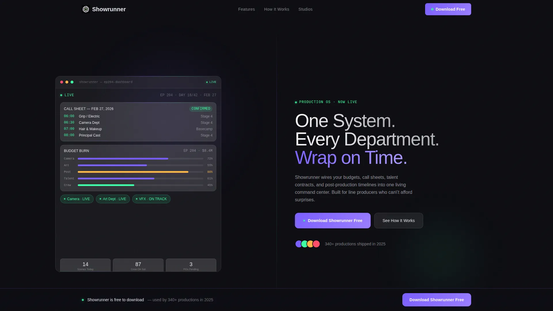
- A header with two dark glass panels: a live dashboard preview on the left and a bold headline with a download button on the right
- Four alternating content sections covering scheduling, budget tracking, vendor deliverables, and project wrap summary
- A rolling studio logo banner, a named testimonial block, and a sticky bottom bar that resurfaces the primary call to action
Feature list
This template delivers a focused set of design and structural components drawn directly from the production brief.
Split-Screen Header with Live Dashboard Preview
The header splits edge to edge into two frosted glass panels. The left panel shows a production dashboard with a real call sheet date, a budget burn-down graph mid-arc, and three department status pills glowing in signal green. The right panel carries the headline and the primary download button on an obsidian background.
Alternating Section Layout with Parallax Snap
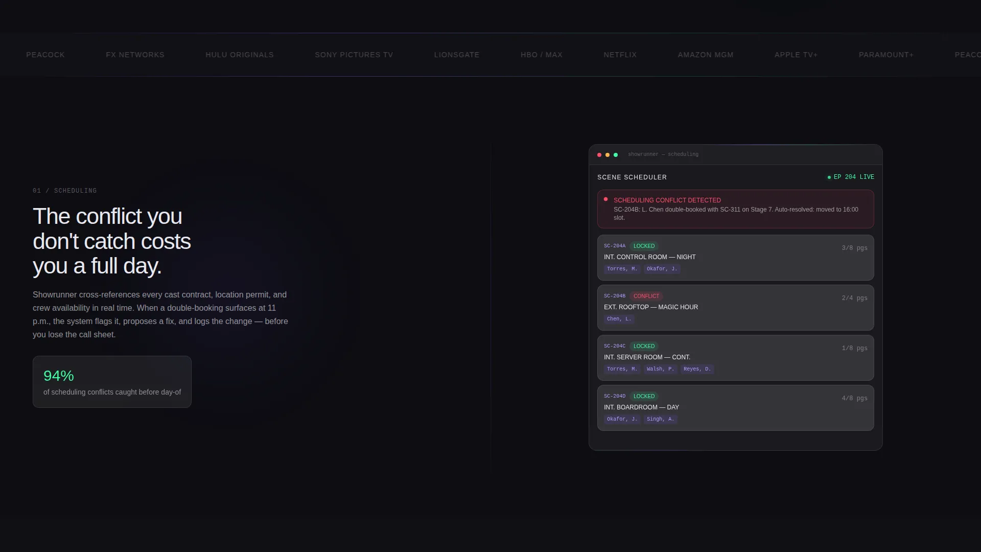
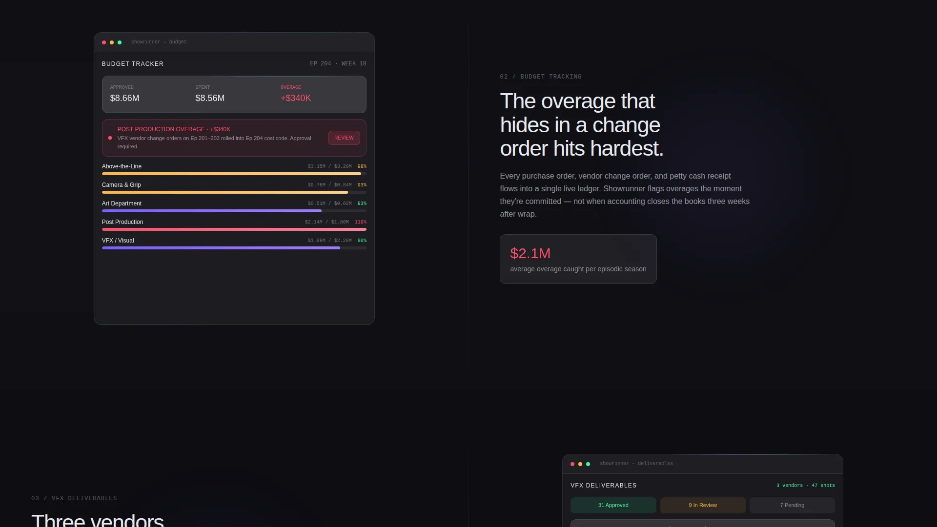
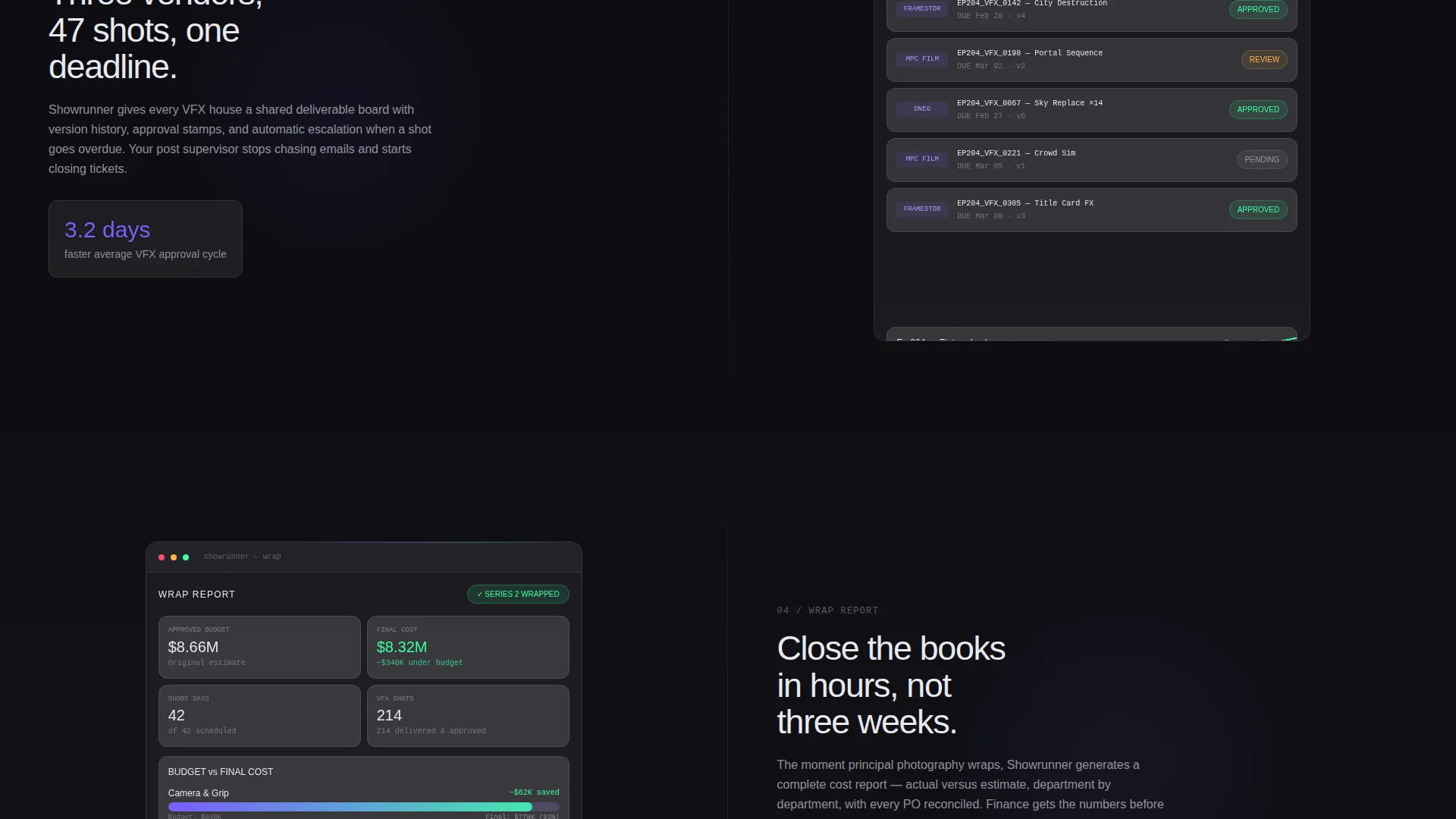
Below the header, each content section alternates which side holds the interface preview and which holds the copy. Sections snap in with a quick parallax shift that mimics swiping between app screens. The four sections cover scheduling, budget overage alerts, vendor deliverable approvals, and a final wrapped-project cost summary.
Violet Glass Primary Call-to-Action Button
The main call to action is rendered as a violet glass button labeled "Download Showrunner Free." It appears in the header and then reappears as a sticky bottom bar after the visitor passes the second scroll section. Tapping opens a minimal modal with two app-store badges and a single email field for desktop visitors.
Animated Border Light Refraction
The glass panels carry a faint animated light refraction along their borders. The motion mimics a phone screen catching overhead light. It is subtle enough to stay out of the way while reinforcing the living-dashboard atmosphere.
Hover Micro-Interactions on Glass Cards
Each glass card responds to hover with a lift effect and a glow pulse. These micro-interactions reward exploration and reinforce the sense that every element on the page is active and data-aware.
Studio Logo Banner and Testimonial Block
A rolling horizontal banner of studio logos runs mid-page to build social proof. A single testimonial quote from a named line producer, with their show title visible, follows immediately to ground the credibility claim in a real production context.
Page sections overview
| Section | Purpose |
|---|---|
| Split Header Panels | Introduce the platform with a live dashboard preview and primary download call to action |
| Scheduling Section | Show the app managing call sheets and production schedules with copy explaining stakes |
| Budget Tracking Section | Highlight budget burn and overage flags with a red alert indicator in the interface preview |
| Vendor Deliverables Section | Display approval stamps and vendor tracking with copy focused on post-production control |
| Project Wrap Summary | Present final cost versus estimate data to close the value argument before social proof |
| Studio Logo Banner | Reinforce credibility with a rolling display of recognizable studio names |
| Testimonial Block | Build trust with a named line producer quote and visible show title |
| Sticky Download Bar | Resurface the primary call to action persistently after the second scroll section |
Design & branding system
The visual identity is built on a Dashboard Pro theme using a glassmorphic color system that feels like smoked glass held up to a neon city skyline. Every color has a specific job, and the hierarchy is strict.
- Deep obsidian (#0D0D12) fills all backgrounds; frosted panel white at 12% opacity (#FFFFFF1F) floats cards and modules above it with a subtle backdrop blur
- Electric violet (#7B5EFF) drives every interactive element including buttons, toggles, and hover states, creating a consistent action layer across the page
- Signal green (#3DFFA2) appears only on live-status indicators and healthy-status pills, giving the eye an instant read on what is active and moving
Mobile & speed optimization
The template is structured with a single-page scroll flow that keeps the layout focused and the asset count intentional. The split-screen sections are designed to restack cleanly on smaller viewports.
- The sticky bottom bar keeps the download call to action accessible at any scroll depth on mobile without interrupting the reading flow
- The modal triggered by the download button is minimal by design, containing only two app-store badges and one email field, which keeps the tap-to-convert path short on any screen size
How this template helps you convert
The entire page is engineered around one conversion goal: getting a production professional to download the app with as little friction as possible.
- Trust is established above the fold by showing real interface density in the left panel, so visitors assess the product visually before reading a single line of copy
- Scroll momentum escalates the stakes across four content sections, each one answering a harder version of the same question, then showing the platform catching the problem before it compounds
Other information about this template
This template is a strong fit for entertainment software and SaaS products that need to communicate platform depth to a technically literate, time-pressured audience. The Dashboard Pro theme and glassmorphic color system make it well suited to any dark-user interface product in the entertainment technology space.
- The template style is Split Screen (50/50), meaning layout decisions are already made and the focus during customization is copy, real interface screenshots, and brand color tuning
- The creative direction is Launch Energy, which means the scroll feel is deliberate and fast-paced rather than editorial or magazine-style
- The header concept is Dark Glass Panels, a pairing that works for any SaaS product where showing the actual interface is the fastest path to credibility
Theme
Dashboard Pro
Creative direction
Launch Energy
Color system
Glassmorphic
Style
Split Screen (50/50)
Direction
App Download
Page Sections
Split-screen Header with Dashboard Preview
Alternating Parallax Scroll Sections
Violet Glass Download Button with Modal
Animated Light Refraction on Panel Borders
Hover Lift and Glow Pulse on Cards
Rolling Logo Banner and Named Testimonial
Related questions
Who is this landing page template designed for?
Can I adapt the color system to fit a different brand?
Does the template include app-store badge assets?
Is this template usable for a SaaS product outside of entertainment?
What triggers the sticky bottom bar on this landing page?



