Showtime - Powerful Scheduling Landing Page Template
Showtime is a split-screen landing page template built for entertainment staff scheduling platforms. It combines a product screenshot header, interactive scroll-through explorer sections, and a focused lead generation form into one cohesive page. The Tech Glass visual identity and Carbon Fiber color palette give it the authority and precision that line producers, festival operations managers, and venue GMs expect.
by Rocket studio
Quick summary
Showtime is a single-page template designed for entertainment staff scheduling software. It uses a 50/50 split-screen layout to pair product user interface screenshots with plain-language explanations of each workflow. The result is a page that feels less like a brochure and more like a live product walkthrough, built to earn a demo booking from serious production professionals.
Who this template is for
This template speaks directly to scheduling platform founders and marketing teams serving high-pressure production environments. If your product replaces spreadsheets, paper call sheets, or patchwork communication tools for crew management, this page is built for your audience.
- Line producers managing fast-turnaround episodic television schedules
- Festival operations managers coordinating staff across dozens of simultaneous stages
- Venue general managers who need every crew position confirmed before doors open
What problem this template solves
Scheduling software for entertainment is genuinely complex to explain. A generic SaaS landing page template does not carry the weight of union compliance, crew conflicts, or last-minute reassignments. Buyers in this space are skeptical and time-poor. They need to see the product working, not just read about it.
- Generic templates fail to communicate operational urgency or industry-specific workflows
- Feature lists alone do not build trust with experienced production professionals
- A page without a clear, frictionless demo path loses high-intent visitors before they convert
What you get with this template
You get a fully structured single-page layout with every section pre-designed and ready to populate with your platform's real content. The page moves visitors from first impression through product understanding to a demo request in a single, guided flow.
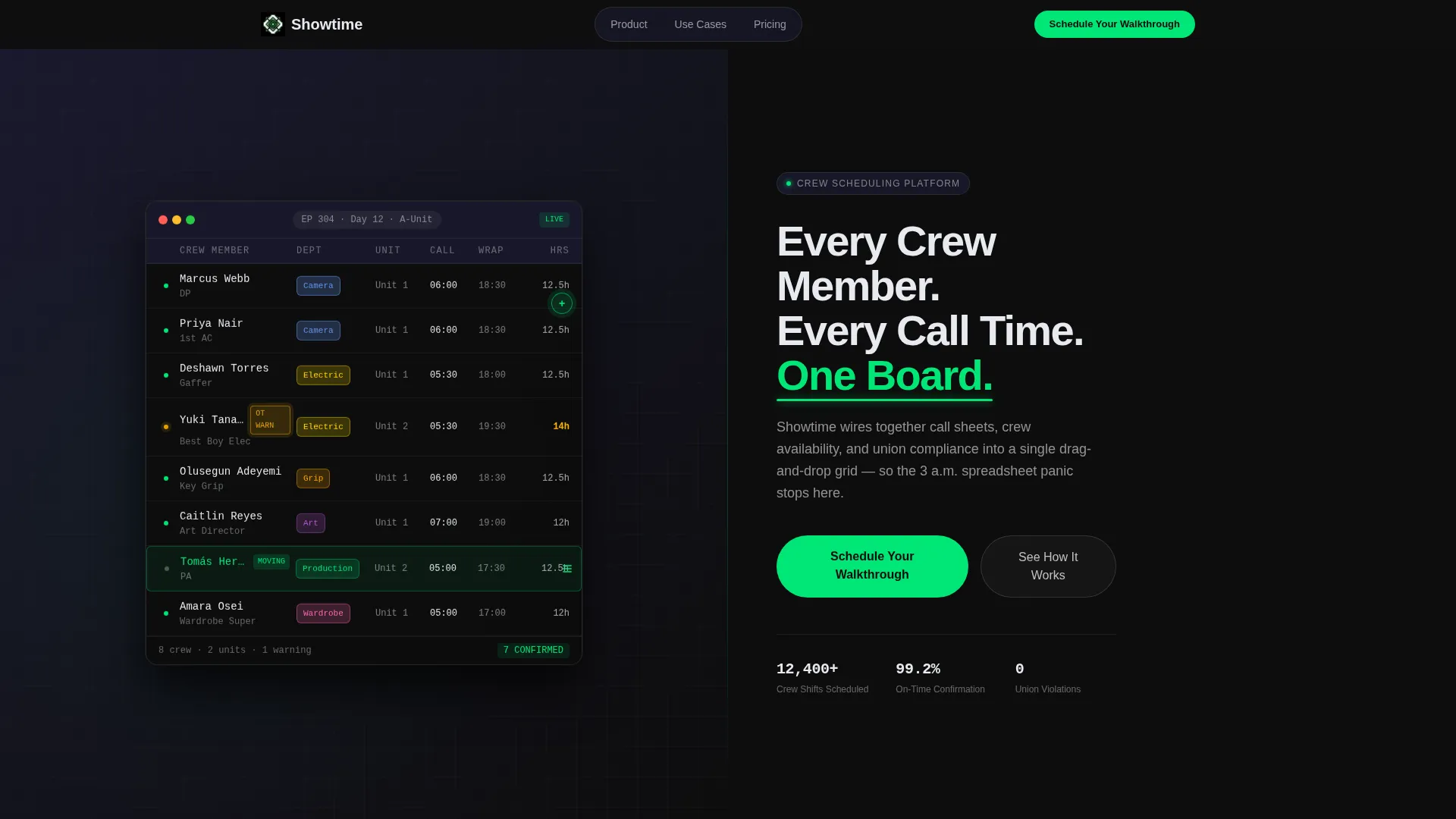
- A product screenshot hero section with a parallax-depth left panel and a headline-driven right panel
- Four interactive explorer split-screen sections, each isolating a distinct scheduling workflow
- A lead generation section with a three-field form and a trust-anchoring subline beneath the submit button
Feature list
This section describes the core design and layout capabilities built into the Showtime template.
Split-Screen Parallax Hero
The header divides the viewport evenly. The left half displays a pixel-perfect scheduling grid screenshot floating against a carbon-dark background with a subtle parallax depth effect. The right half holds the primary headline and a floating call-to-action pill. The composition immediately signals product maturity.
Interactive Scroll Explorer Sections
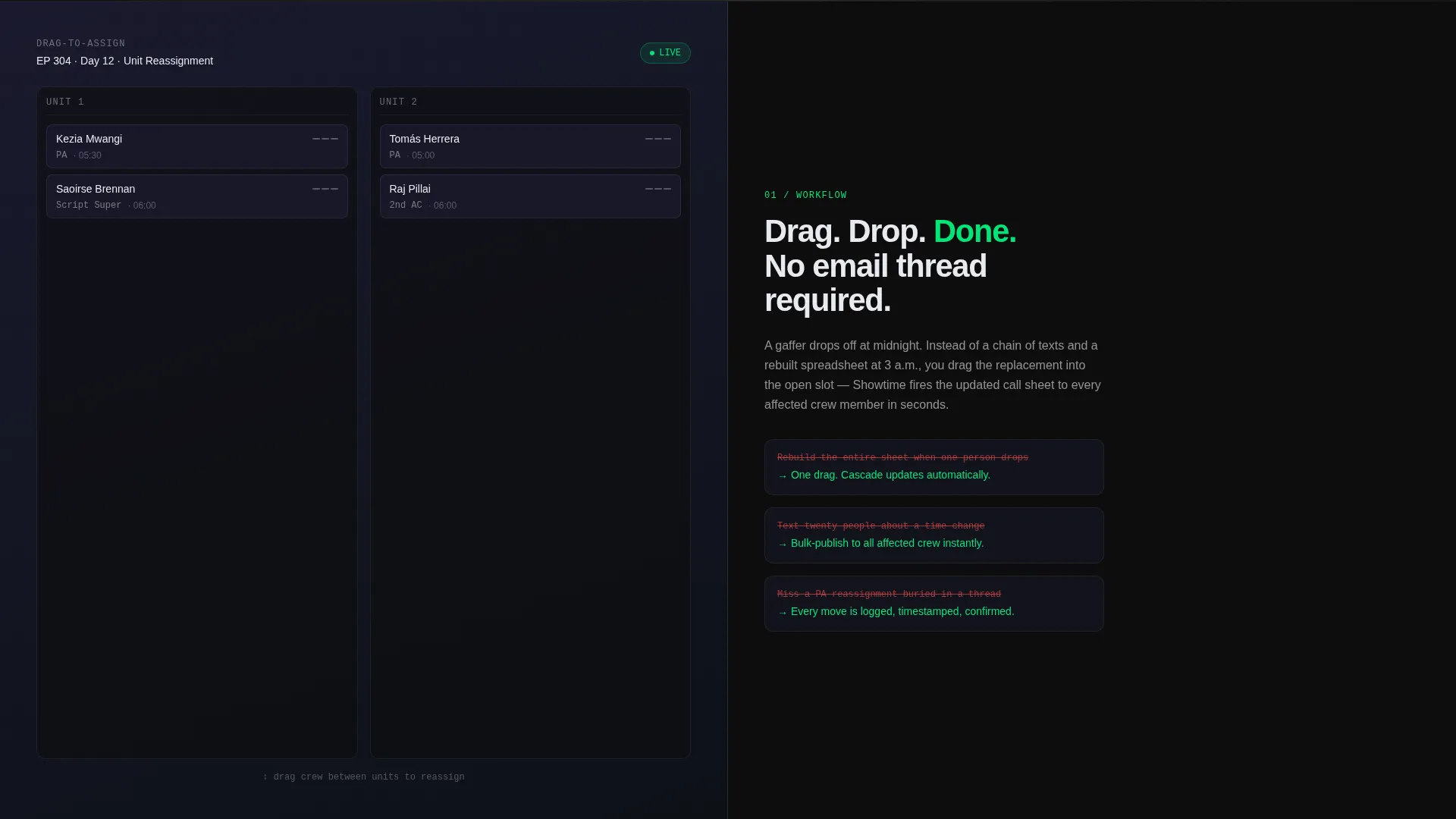
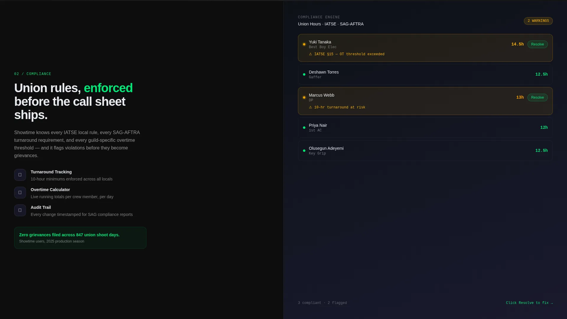
Each scroll section pairs a user interface state on the left with a pain-point narrative on the right. Visitors encounter drag-to-assign, conflict detection, overtime calculation, and bulk-publish confirmation states in sequence. Hotspot click zones on each screenshot trigger micro-animations, such as a shift block snapping into place or a compliance flag resolving from red to green.
Escalating Workflow Narrative
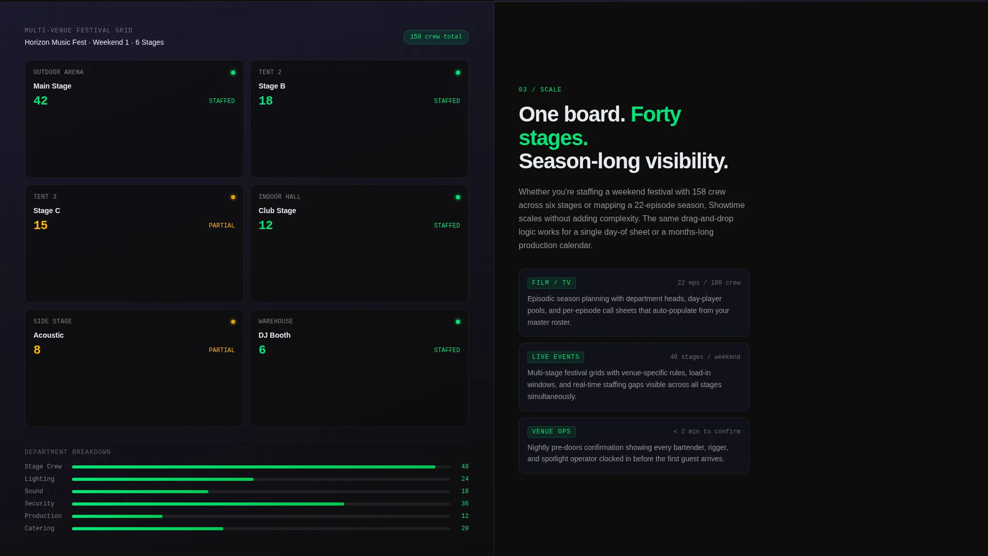
The explorer sections are ordered deliberately. The page opens with a single day-of schedule, then expands to multi-venue festival grids, then to season-long episodic planning. Each level reveals deeper capability naturally, without turning the page into a feature catalogue.
Lead Generation Form Module
The conversion section contains a three-field form: production type, average crew size per shift, and work email. Below the submit button, a single line reads "See your own schedule built live in 15 minutes," reframing the demo request as proof rather than a sales pitch.
Tech Glass Visual System
The entire page is built on a blacked-out control-booth aesthetic. Deep cockpit black and woven carbon gray form the background layers. Translucent card surfaces use a panel white at 60% opacity. Electric call-sheet green appears exclusively on active states, confirmations, and call-to-action elements, keeping the visual hierarchy sharp and purposeful.
Floating call to action Pill Header
A persistent floating pill button sits in the header and reads "Schedule Your Walkthrough." It stays visible as visitors scroll into the explorer sections, maintaining a low-friction conversion path without interrupting the guided product tour.
Page sections overview
| Section | Purpose |
|---|---|
| Header Hero | Introduce the product with a split-screen screenshot and headline |
| Floating call to action Pill | Keep the demo booking action accessible from the top of the page |
| Explorer: Drag-to-Assign | Show crew reassignment workflow with a live user interface state and micro-animation |
| Explorer: Conflict Detection | Demonstrate real-time scheduling conflict flags resolving on screen |
| Explorer: Overtime Calculator | Illustrate live union-hours tracking updating as shifts are adjusted |
| Explorer: Bulk Publish | Present the confirmation state for publishing a completed call sheet |
| Full-Width call to action Form | Capture leads with a three-field form and a proof-oriented subline |
Design & branding system
The Showtime template uses a Tech Glass theme built on a Carbon Fiber color system. Every color decision reinforces the control-booth atmosphere: dark backgrounds push content to recede while green signals demand attention.
- Core palette: deep cockpit black (#0D0D0D), woven carbon gray (#1A1A2E), translucent panel white (#E8EAF0 at 60% opacity on card surfaces), and electric call-sheet green (#00E676) for active states and calls to action
- Typography: a clean, wide sans-serif typeface with the green accent used as an underline on the primary headline phrase "One Board"
- user interface detail language: color-coded shift blocks, an amber-pulsing union-hours warning badge, and a drag handle mid-motion on the hero screenshot all reinforce authentic product storytelling
Mobile & speed optimization
The split-screen layout is designed to reflow cleanly on smaller viewports. Each 50/50 section collapses to a stacked single-column layout so product screenshots remain legible and narrative text stays directly beneath the relevant user interface state.
- Screenshot panels maintain their focal crop on mobile so the scheduling grid details stay visible
- The floating call to action pill repositions to a fixed bottom bar on narrow screens, keeping the conversion action within thumb reach
- The three-field lead form is touch-friendly and straightforward to complete on a mobile device
How this template helps you convert
The page is structured to move a skeptical production professional from curiosity to a booked demo without a single moment of confusion.
- The hero screenshot establishes product credibility immediately, showing a real-looking call sheet mid-build rather than an abstract illustration, so visitors trust the platform before reading a single word of copy.
- The interactive explorer sections replace passive reading with active discovery, letting visitors click hotspots to trigger micro-animations that prove the product handles real scheduling problems.
- The lead form reframes the demo as a live proof session, not a sales call, and the "See your own schedule built live in 15 minutes" subline answers the visitor's unstated objection before they reach the submit button.
Other information about this template
Showtime is categorized under Technology, specifically Entertainment Software and SaaS, with a niche focus on entertainment staff scheduling. It is designed as a single landing page, not a multi-page site, and its scope is intentionally narrow: one product, one audience, one conversion goal.
- The template style is Split Screen (50/50), meaning every section is built around paired left-right panels
- The creative direction is Interactive Explorer, so the scroll experience is designed to feel like guided product use rather than passive marketing content
- The header concept is Product Screenshot, grounding the first impression in a realistic, detail-rich user interface capture rather than a lifestyle image or abstract graphic
- The lead generation direction means every design and copy decision on the page points toward a single outcome: a walkthrough booking
Theme
Tech Glass
Creative direction
Interactive Explorer
Color system
Carbon Fiber
Style
Split Screen (50/50)
Direction
Lead Generation
Page Sections
Split-screen Parallax Hero
Interactive Scroll Explorer
Escalating Capability Narrative
Three-field Lead Generation Form
Tech Glass Visual Identity
Floating Call to Action Pill
Related questions
Who is this template designed for?
Can I replace the screenshots with my own product interface?
Does the template include the hotspot micro-animations?
What is the single conversion goal of this landing page?
Is this template useful for live events companies, not just film and television?



