Advanced Photography Digital Presence Professional Website Template
Shutter is a data-driven photography landing page template built for photographers who back their work with real numbers. It combines an animated analytics dashboard header, stats-first section reveals, and a fixed anchor navigation rail to guide visitors through proof points covering speed, conversions, search visibility, and client management. One click leads straight to a live demo.
by Rocket studio
Quick summary
Shutter is a single-page, hub-and-spoke photography landing page template designed around live metrics and bold data storytelling. Every section opens with an oversized statistic before revealing the feature behind it. The anchor navigation sits fixed on the left rail, letting visitors jump to the proof that matters most to them. It is built for photographers who want evidence, not adjectives.
Who this template is for
This template is made for photographers who treat their business like a data-driven operation. If you track inquiry rates, session values, or gallery engagement, Shutter was designed with you in mind.
- Wedding photographers who monitor seasonal inquiry spikes and booking conversion rates
- Commercial photographers proving return on investment to agency partners and creative directors
- Portrait studio owners benchmarking average order values against industry standards
What problem this template solves
Most photography landing pages rely on mood and imagery alone to win clients. That approach leaves measurable business performance invisible. Shutter puts the numbers front and center so visitors understand the real value of your work before they ever fill out a contact form.
- Visitors leave before seeing your strongest proof because there is no clear path to it
- Conversion metrics, gallery performance, and session values are buried or never shown at all
- Photographers lack a structured way to present data without sacrificing visual quality
What you get with this template
Shutter delivers a fully structured, single-page landing experience with a strong visual identity and interactive data-forward components. Everything in the template is purposefully laid out to move a visitor from curiosity to a demo click.
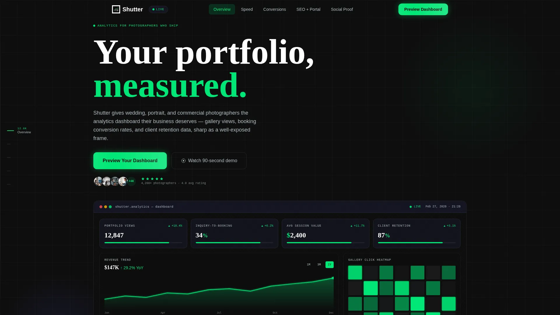
- An animated dashboard header showing live-style photographer metrics with counter animations and a self-drawing revenue trend line
- A fixed left-rail anchor navigation linking to Speed, Conversions, SEO, and Client Portal sections
- Two distinct calls to action: a glowing "Preview Your Dashboard" button embedded in the header user interface and a "See It With Your Data" sandbox link at the final section
Feature list
This section covers the core components built into the Shutter template and what each one does for you.
Animated Dashboard Header
The full-viewport header renders a live-style analytics panel showing metrics such as 12,847 portfolio views, a 34% inquiry-to-booking rate, an average session value of $2,400, and a heatmap of most-clicked gallery images. Numbers animate upward on page load like counters spinning to their final value. Green KPI indicators pulse subtly and the revenue trend line draws itself left to right.
Stats-First Section Reveals
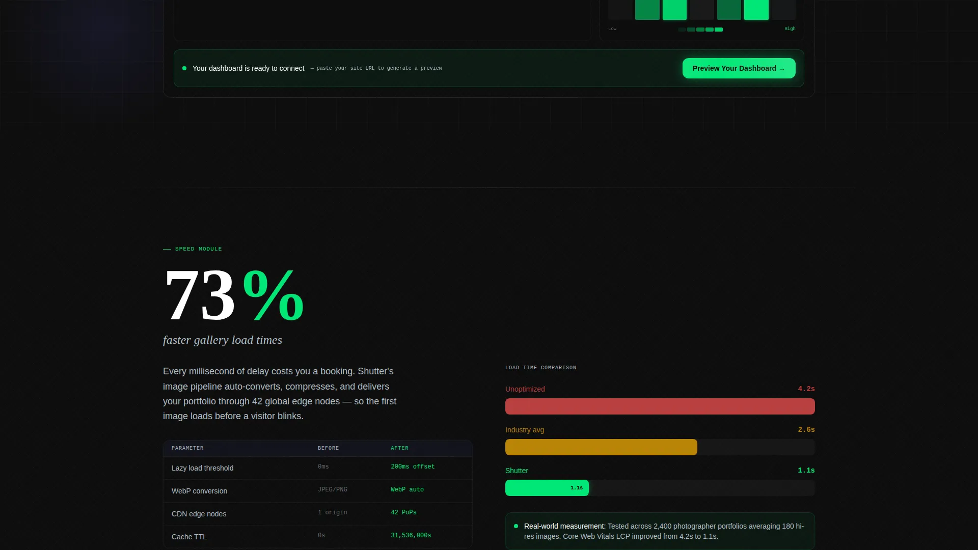
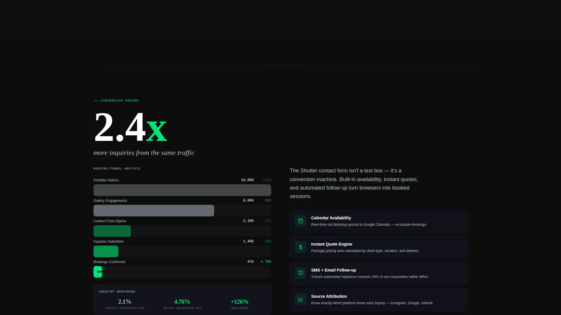
Each section the visitor scrolls to opens with a single oversized statistic before the feature behind it is revealed. For example, "73% faster load times" introduces the image optimization engine, and "2.4x more inquiries" introduces the smart contact form. This approach turns every scroll event into a moment of evidence delivery.
Fixed Anchor Navigation Rail
The anchor navigation is fixed on the left rail of the page throughout the entire scroll. Each spoke is labeled with a metric category: Speed, Conversions, SEO, and Client Portal. Visitors can jump directly to the section most relevant to them without scrolling through unrelated content.
Embedded Primary Call to Action
The primary call to action, "Preview Your Dashboard," is a glowing green button placed inside the dashboard header user interface itself. It feels like part of the product rather than a separate promotional element. This placement captures intent at the moment of first impression.
Sandbox Secondary Call to Action
The final section anchors a secondary call to action: "See It With Your Data." Visitors paste their own site URL to generate a simulated analytics comparison. There are no form fields and no friction, just one click into the experience.
Carbon Fiber Visual Identity
The design uses a dark, engineered color system built around deep cockpit black, woven graphite, sensor-green accents, and cool aluminum. Green pulses on live data points and hover states. Aluminum traces section borders and metadata. Graphite separates content layers like recessed panels in a flight deck.
Page sections overview
| Section | Purpose |
|---|---|
| Dashboard Header | Opens with animated live-metric panel and primary call to action |
| Speed Section | Reveals load time stat before image optimization feature |
| Conversions Section | Leads with inquiry uplift stat before smart contact form |
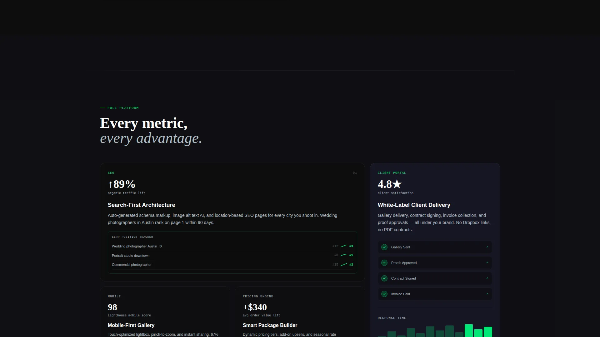
| SEO Section | Surfaces search visibility metric before SEO feature detail |
| Client Portal Section | Introduces client retention stat before portal feature |
| Final call to action Section | Anchors sandbox link with "See It With Your Data" prompt |
Design & branding system
The template follows a Data Command theme built on the Carbon Fiber color system. Every design decision reinforces precision, focus, and the feeling of a professional analytics environment.
- Color palette: deep cockpit black (#0D0D0D) dominates backgrounds, woven graphite (#1A1A2E) separates content layers, sensor-green (#00E676) pulses on data points and hover states, and cool aluminum (#B0BEC5) handles secondary text and dividers
- Visual texture: the palette evokes the back panel of a high-end cinema camera, matte, tactile, and engineered rather than decorative or soft
Mobile & speed optimization
The template is structured as a single-page layout, which keeps the asset footprint focused. The stats-first content hierarchy ensures the most impactful content loads and reads well at any viewport width.
- The fixed anchor navigation is designed to serve as a persistent orientation tool, helping mobile visitors locate sections without excessive scrolling
- Animated counter elements and the trend line micro-animation are built into the header to load as part of the initial viewport experience rather than as deferred heavy assets
How this template helps you convert
Shutter is designed as a click-through landing page with a single conversion goal: getting photographers into the live demo. Every structural choice supports that goal.
- The primary call to action is embedded inside the dashboard mock itself, so it feels native to the product and catches attention at the exact moment the visitor is most engaged with the live metrics display
- The anchor navigation removes scroll fatigue by letting each visitor self-select their priority, whether that is speed, conversions, search performance, or client management, and jump straight to the proof that closes the deal for them
- The sandbox call to action at the bottom removes all remaining friction by letting visitors generate a simulated comparison with their own URL, replacing persuasion copy with a personalized interactive moment
Other information about this template
Shutter sits at the intersection of the photography digital presence category and the broader technology template niche. It is built for a specific operator type: the analytically minded photographer who needs a landing page that matches how they already think about their business.
- Template style: hub and spoke with anchor navigation, a single-page format where each spoke represents a metric category
- Creative direction: Stats-First Impact, meaning data leads every section reveal and adjectives are replaced by evidence
- Header concept: Dashboard Preview, a full-viewport animated panel showing real-style photographer metrics on load
- Landing page direction: click-through, optimized to move visitors from the page directly into a demo experience
- Theme: Data Command, a design philosophy where every visual and layout choice reinforces precision and analytical confidence
- Color system: Carbon Fiber, using a four-tone dark palette engineered to feel like professional-grade equipment rather than a decorative photography portfolio
Theme
Data Command
Creative direction
Stats-First Impact
Color system
Carbon Fiber
Style
Hub & Spoke (Anchor Nav)
Direction
Click-Through
Page Sections
Animated Analytics Dashboard Header
Stats-first Section Architecture
Fixed Anchor Navigation Rail
Embedded Primary Call to Action
Sandbox Secondary Call to Action
Carbon Fiber Color System
Related questions
Who is the Shutter template best suited for?
Does the template include the animated counter and trend line effects?
What are the two calls to action and where do they appear?
Can visitors navigate directly to specific metric sections?
What makes the design feel different from a typical photography template?



