Commercial Photography Studio Problem-to-Solution Website Template
Shutter is a single-page photography studio landing page template built around a Problem→Solution Arc. It opens with a cinematic dark header, moves visitors through a side-by-side comparison table, and closes with an amber call-to-action that links to a booking calendar. The Carbon Fiber color system and Dashboard Pro theme give it a matte, high-end camera-body aesthetic.
by Rocket studio
Quick summary
Shutter is a photography studio landing page template designed to convert hesitant visitors into booked clients. It uses a darkroom-inspired visual flow, a stark comparison table, and a single amber call-to-action to carry visitors from recognizing a problem straight to scheduling a session.
Who this template is for
This template is built for photography studios that serve multiple client types under one roof. It works especially well when the studio needs to address different audiences on a single page without losing the visual thread.
- Photographers offering editorial engagement shoots for couples who want something beyond standard portraits
- Corporate coordinators booking executive headshot sessions in volume
- Small brand owners replacing stock imagery with styled product photography
What problem this template solves
Most photography studio pages either look like a portfolio dump or a generic service menu. Neither format creates urgency or helps potential clients feel the gap between what they have now and what they could have. Visitors leave without booking because nothing made them uncomfortable enough to act.
- Clients cannot visualize the difference between their current photos and professional studio work
- Studio pages rarely guide visitors through a logical journey from problem recognition to booking
- A single page that mixes all client types often loses focus and reads as generic
What you get with this template
This template delivers a complete single-page layout that follows a clear narrative arc from tension to relief. Every section is designed to do one job, and the sections connect into a scroll experience that builds a convincing case before asking for anything.
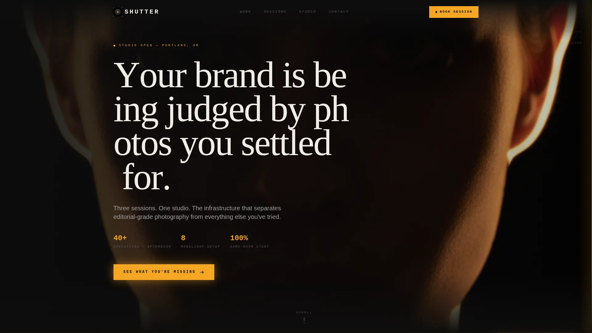
- A cinematic dark full-bleed header with a rim-lit portrait and a headline that surfaces letter by letter
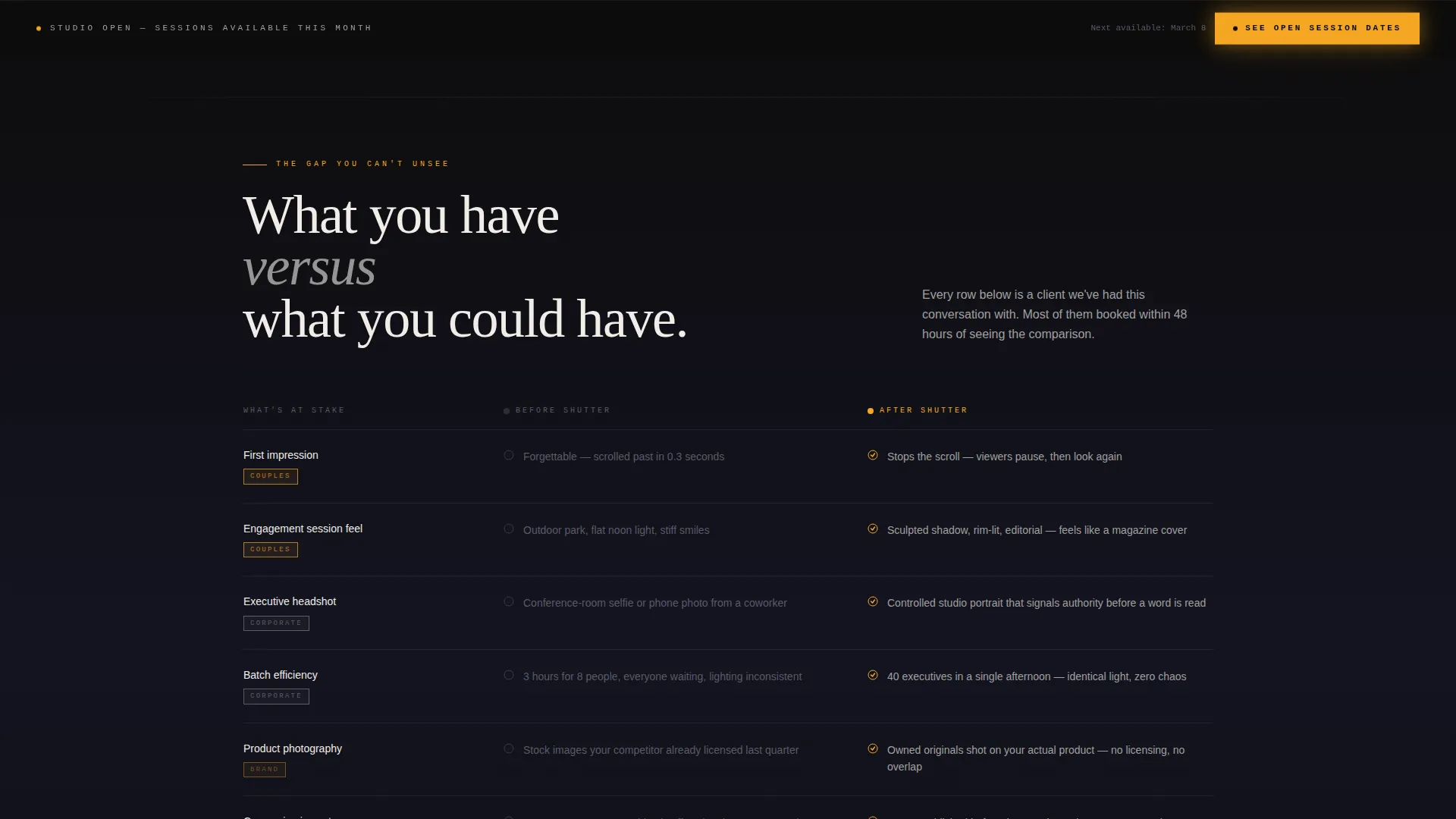
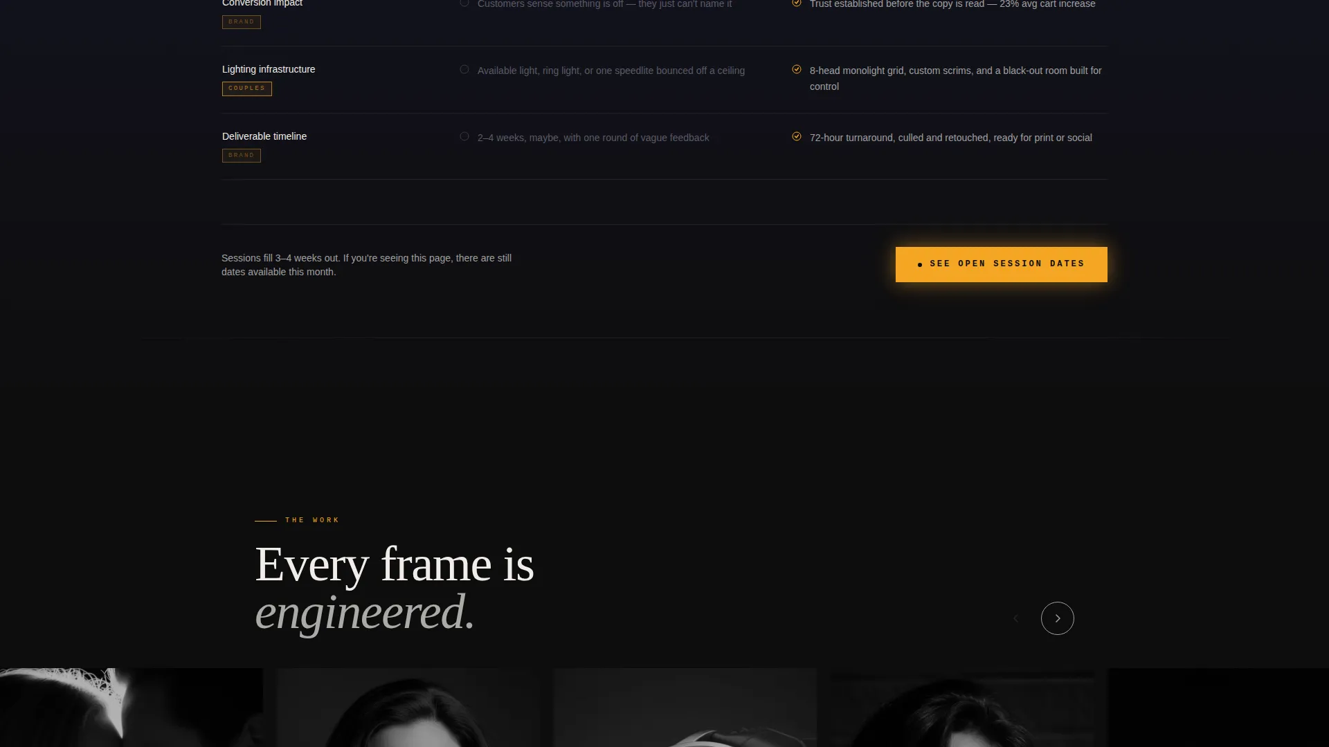
- A side-by-side comparison table contrasting current client reality against studio results
- A sticky amber call-to-action bar that reappears after the portfolio section to catch visitors who kept scrolling
Feature list
This template packs its persuasive work into a focused set of purposeful components. Each one is drawn directly from the brief and designed to serve a specific moment in the visitor's decision journey.
Dark Full-Bleed Header with Glow Effect
The header fills the entire viewport with black. A single portrait slowly resolves from shadow, traced by a thin amber rim light along the jawline and shoulder. The headline materializes in titanium type letter by letter, setting a cinematic tone before a single feature is mentioned.
Side-by-Side Comparison Table
The comparison table is the page's central persuasion tool. Each row places the visitor's current situation against what the studio delivers, comparing not just outputs but emotional weight. Labels like "forgettable" sit across from "stops the scroll" to make the gap feel real and personal.
Problem-to-Solution Scroll Arc
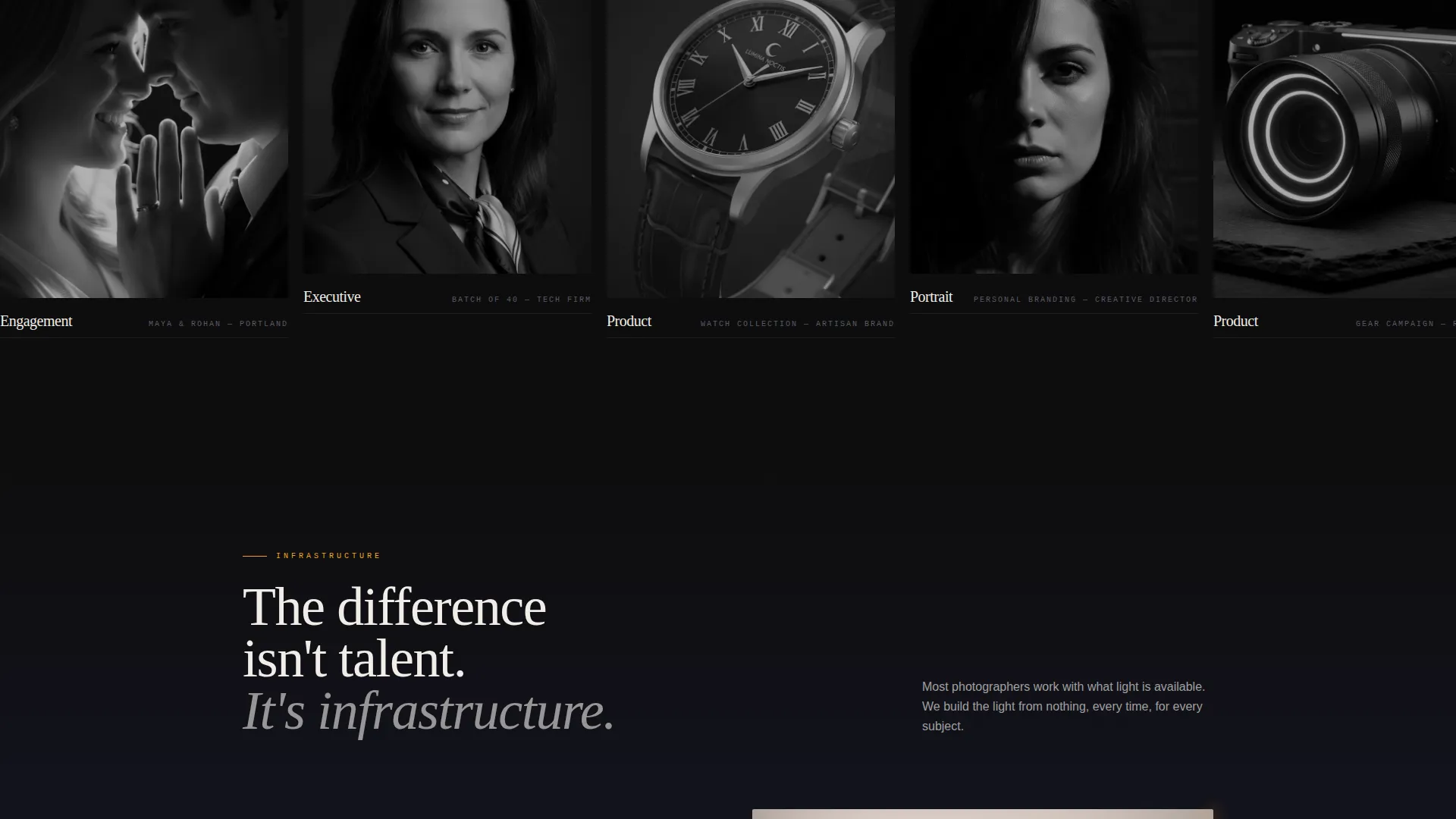
Sections are sequenced to escalate stakes before offering relief. The page moves from exposing the photography gap, through demonstrating studio process and gear, to the booking call-to-action. Each section is designed to feel slightly brighter than the last, like a long exposure gradually developing.
Dual-Placement Amber Call-to-Action
The primary call-to-action, labeled "See Open Session Dates," appears first at the base of the comparison table. It returns as a sticky bar after the portfolio section. Both placements link to a booking calendar rather than a form, keeping friction low.
Carbon Fiber Color System
The palette uses deep cockpit black for backgrounds, woven graphite to separate sections, brushed titanium for body text and table borders, and luminous accent amber for hover states, active selections, and call-to-action buttons. The result reads like the back panel of a high-end camera body.
Multi-Audience Section Structure
The page is structured to speak to three distinct client types without fragmenting. Engaged couples, corporate headshot coordinators, and product photography clients each find their context within a single cohesive scroll, so no visitor feels the page was built for someone else.
Page sections overview
| Section | Purpose |
|---|---|
| Dark Full-Bleed Header | Establishes cinematic mood and surfaces the headline |
| Comparison Table | Exposes the gap between current photos and studio results |
| Amber call to action Block | First call-to-action placed below the comparison table |
| Process and Gear | Demonstrates studio infrastructure and lighting approach |
| Portfolio Section | Shows signature work to validate the studio's claims |
| Sticky call to action Bar | Recaptures scrollers after the portfolio with a persistent booking prompt |
Design & branding system
The visual identity follows a Dashboard Pro theme built on a Carbon Fiber color system. The palette is deliberately minimal and tactile, referencing the engineered surfaces of professional camera equipment rather than the bright whites common in photography websites.
- Background surfaces use deep cockpit black (#0D0D0D) and woven graphite (#1A1A2E) to keep focus on imagery
- Brushed titanium (#A0A0A0) carries body text and table borders, maintaining legibility without competing with photos
- Luminous accent amber (#F5A623) is used sparingly on hover states, active selections, and call-to-action elements, functioning like a camera's autofocus point locking on in darkness
Mobile & speed optimization
The template is built with a single-page scroll layout that keeps the structure lean and the visual hierarchy clear at any screen size. The dark background system is particularly effective on mobile because it reduces visual noise and keeps the subject matter prominent.
- Full-bleed sections and the comparison table are designed to reflow cleanly on smaller screens
- The sticky call-to-action bar is formatted to remain visible and tappable without obscuring content on mobile viewports
How this template helps you convert
This template converts by making the visitor feel the cost of inaction before presenting a solution. No price is shown until the visitor has already felt uncomfortable with their current photography. The booking calendar is offered as the natural next step, not a hard sell.
- The comparison table creates emotional contrast early in the scroll, making the visitor aware of what their current photos cost them in credibility and attention
- The dual-placement call-to-action catches visitors at two distinct decision moments, at the end of the comparison and after the portfolio, so no motivated visitor reaches the bottom without a clear path to book
Other information about this template
Shutter is categorized under Photography Studio Website Templates and is built specifically for the photography studio homepage use case. It is a click-through landing page, meaning no form appears on the page itself. The single call-to-action leads directly to an external booking calendar, keeping the conversion path clean and the page purpose singular.
- Template style: Comparison Table within a Problem→Solution Arc creative direction
- Theme: Dashboard Pro with a Carbon Fiber color system
- Suitable for studios that offer portrait, headshot, and product photography under one brand
Theme
Dashboard Pro
Creative direction
Problem→Solution Arc
Color system
Carbon Fiber
Style
Comparison Table
Direction
Click-Through
Page Sections
Dark Full-bleed Header with Glow
Side-by-side Comparison Table
Problem-to-solution Scroll Arc
Dual-placement Amber Call-to-action
Carbon Fiber Color System
Multi-audience Page Structure
Related questions
Does this template include a contact form?
Can I use this template for a studio that serves multiple client types?
Is the comparison table editable?
What does the amber call-to-action link to?
Who is this template not a good fit for?



