Photography Milestone Email Landing Page Template
Shutter is a hub-and-spoke landing page template built for a photography milestone email service. It opens with a live-styled revenue comparison dashboard, flows directly into an interactive calculator, and uses anchor navigation to guide visitors through objection-answering spoke sections. The design runs on a deep Midnight Blue palette with amber accents reserved for calls to action.
by Rocket studio
Quick summary
Shutter is a single-page, anchor-navigated landing page template for a photography milestone email service. It leads with a stats dashboard that visualizes rebooking revenue before and after the service, feeds visitors into a personalized revenue calculator, and walks them through comparison sections that answer every objection in sequence.
Who this template is for
This template is designed for photographers who know repeat clients exist but struggle to reconnect with them systematically. It is equally useful for the product team or founder building the service itself and needing a high-converting landing page to acquire early users.
- Portrait photographers who lose rebooking revenue while buried in editing queues
- Wedding photographers who deliver galleries and then go quiet instead of following up
- Mini-session photographers whose rebooking rate is lower than it should be
What problem this template solves
Photographers consistently lose repeat revenue not because clients lose interest, but because no one reaches out at the right moment. Silence after a gallery delivery is the single most common reason a one-time client never books again. This template gives the milestone email service a page that communicates the cost of that silence clearly and immediately.
- Visitors arrive and see their own revenue gap before reading a single paragraph of copy
- The calculator makes the cost of inaction personal, not hypothetical
- Each spoke section dissolves a specific objection so nothing blocks the signup decision
What you get with this template
You get a fully structured, single-page landing page that combines a data-led header, an interactive revenue calculator, anchor navigation, spoke content sections, and a feature comparison table into one cohesive flow.
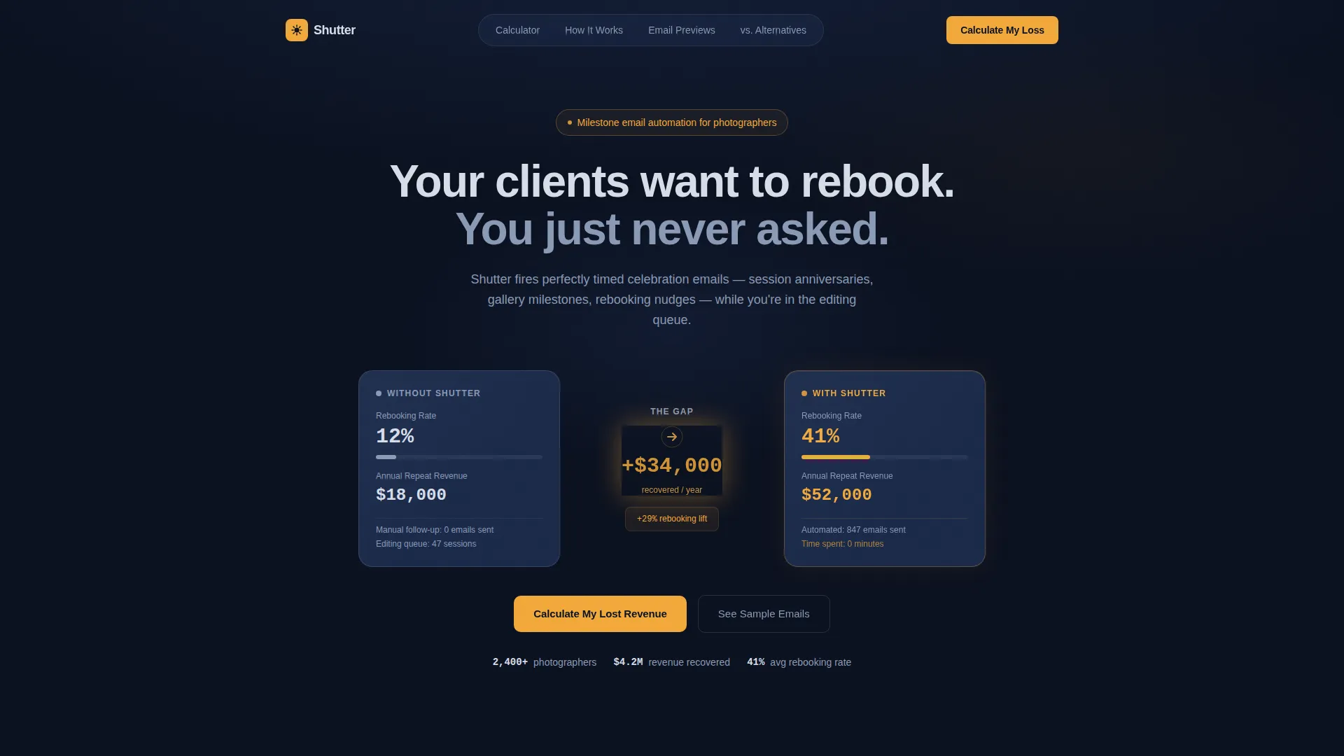
- A stats dashboard header with two photographer profiles and animated revenue figures
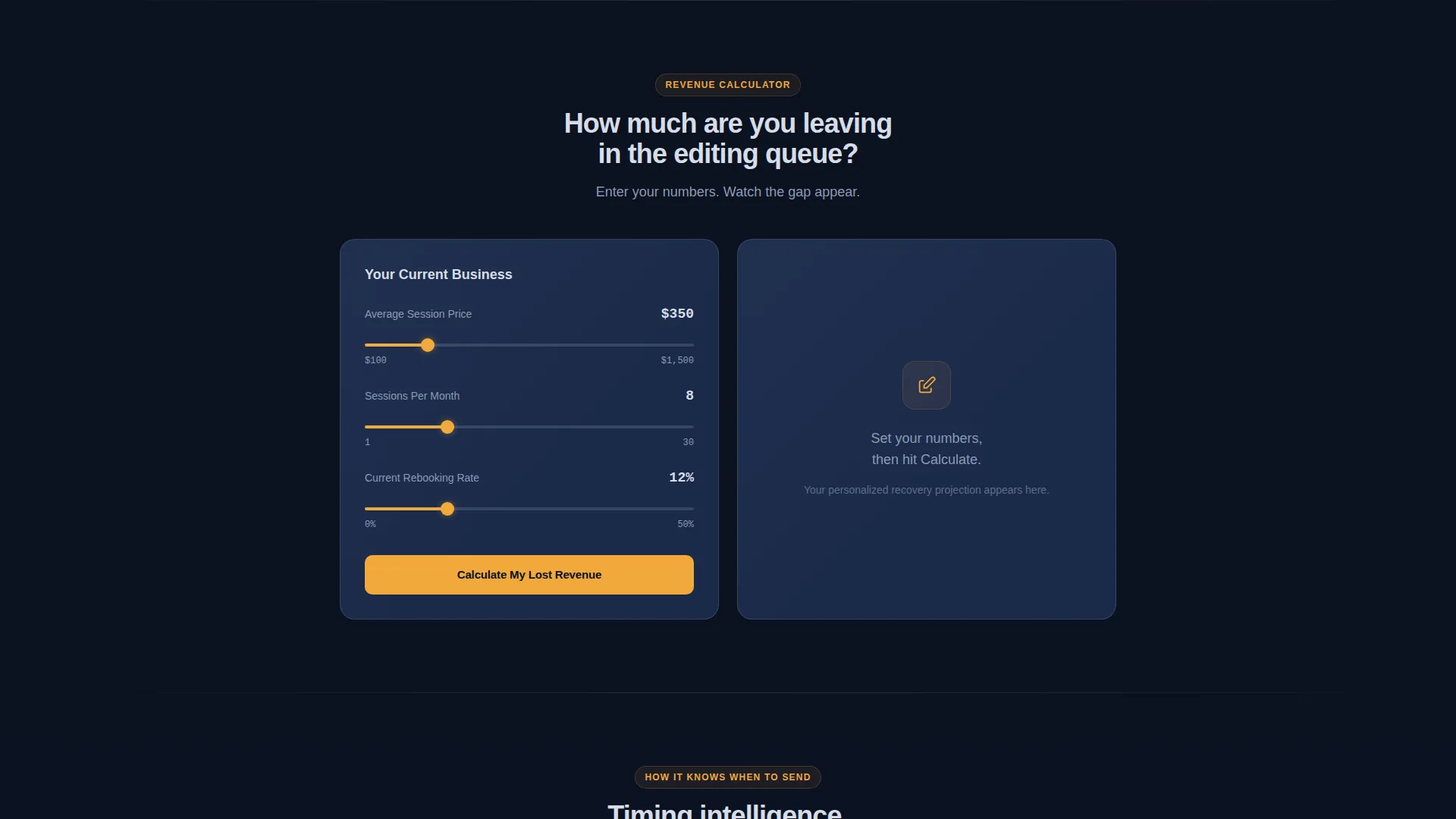
- An interactive calculator section with session price, volume, and rebooking rate inputs
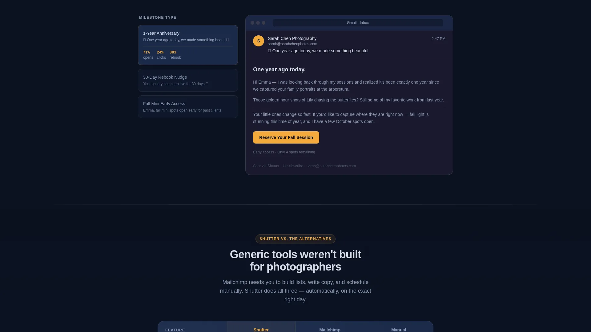
- Anchor-navigated spoke sections covering timing, email previews, and head-to-head comparisons
Feature list
This template delivers six distinct functional zones, each designed to move a skeptical photographer closer to signing up.
Animated Revenue Comparison Dashboard
The header opens with two side-by-side photographer profiles. One shows a 12% rebooking rate and $18K in annual repeat revenue. The other shows 41% and $52K. The numbers animate upward with easing, and an amber accent pulses on the gap between them. No stock photography is used, just the math in motion.
Interactive Revenue Calculator
Placed directly below the header, this calculator prompts visitors to enter their average session price, sessions per month, and current rebooking rate. It instantly projects lost repeat revenue and the income recovered with automated milestone emails. The primary call-to-action label reads "Calculate My Lost Revenue" and updates to "Start Recovering Rebookings" once results appear.
Hub and Spoke Anchor Navigation
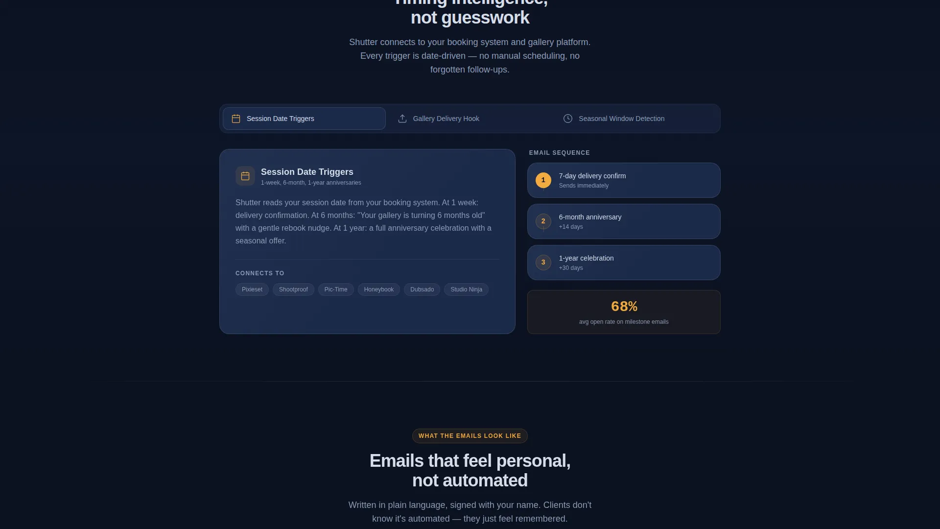
A persistent anchor navigation bar links to each spoke section. The sections are structured to answer objections in order: how the service knows when to send, what the emails look like, how it compares to manual follow-up, and how it compares to generic email platforms. Transitions between spokes animate like a camera on a dolly track.
Feature Comparison Table
A dedicated comparison section pins the service against generic email platforms and manual follow-up workflows. Checkmarks appear in amber for supported features and gaps appear in muted navy for what competitors lack. This visual contrast makes the value difference impossible to ignore.
Dual Conversion Path Design
Two signup paths run in parallel throughout the page. The primary path uses an email-only signup field. The secondary path offers a "See Sample Milestone Sequence" option that delivers a preview email directly to the visitor's inbox, letting the product prove itself before a commitment is made.
Dynamic Motion Visual System
Every transition, animation, and state change is built around the Dynamic Motion theme. The amber shutter-fire accent is used exclusively for calls to action and active navigation states. Everything else recedes into deep blue-black so that interactive moments and conversion triggers hit with maximum contrast.
Page sections overview
| Section | Purpose |
|---|---|
| Stats Dashboard Header | Show revenue gap with animated before-and-after photographer profiles |
| Revenue Calculator Tool | Personalize lost income using visitor's own session and booking data |
| Anchor Navigation Bar | Link persistently to each spoke section for non-linear exploration |
| Timing Spoke Section | Explain how the service determines when to send each milestone email |
| Email Preview Spoke | Display what milestone emails actually look and feel like |
| Manual Follow-Up Comparison | Contrast the service against doing follow-up by hand |
| Platform Comparison Spoke | Compare the service against generic email marketing tools |
| Feature Comparison Table | Visual checkmark table showing gaps in competing approaches |
| Primary call to action Block | Capture email signups with a focused single-field form |
| Sample Sequence Path | Offer a proof-of-product preview email as a secondary conversion |
Design & branding system
The visual identity follows a Dynamic Motion theme built entirely on a Midnight Blue color system. The palette is inspired by working under a safelight in a film darkroom, where deep tones make every bright moment stand out sharply.
- Core colors: deep darkroom navy (#0B1120) as the base, developer-tray indigo (#1B2A4A) for layered surfaces, and silver gelatin highlight (#D6DDE8) for readable text and borders
- Amber accent (#F2A93B) is reserved exclusively for calls to action, active navigation states, and the pulsing delta between the two dashboard profiles
- No stock photography or portraits are used anywhere; the visual language is data, motion, and contrast
Mobile & speed optimization
The hub-and-spoke layout is structured to remain navigable and readable at any screen width. The anchor navigation and calculator are key interactive zones that need to function clearly on smaller viewports.
- The anchor nav collapses gracefully so spoke sections remain accessible on mobile screens
- The calculator inputs and results display are sized for easy thumb interaction on touchscreen devices
- Animated elements use easing transitions designed to feel intentional without overwhelming smaller screens
How this template helps you convert
Every structural decision in this template is built around one goal: turning a skeptical photographer into a signed-up user by the time they reach the bottom of the page.
- The animated dashboard opens with a specific, believable revenue gap ($18K versus $52K) that creates immediate curiosity before the visitor reads a single word of sales copy.
- The calculator converts that curiosity into a personal number, making inaction feel costly in a way that generic benefit claims never could.
- Each spoke section then removes the next logical objection in sequence, so by the time the visitor reaches the call-to-action block, trust has already been built layer by layer.
Other information about this template
This template is built for the Photography Email Templates subcategory under the broader Technology category. It is designed as a hub-and-spoke, anchor-navigated single page, which means all content lives on one scrollable surface with the anchor bar providing structure.
- The template style is classified as Hub and Spoke with Anchor Navigation, making it well suited for services that have multiple comparison angles to address
- The creative direction is Calculator and Tool First, meaning the interactive element is the primary engagement hook rather than a secondary feature
- The header concept is Stats and Metrics, with no lifestyle imagery, relying entirely on animated numbers to communicate value
- The landing page direction is Comparison and Versus, making it especially effective for a service entering a market where photographers already use manual follow-up or generic platforms like Mailchimp
Theme
Dynamic Motion
Creative direction
Calculator/Tool First
Color system
Midnight Blue
Style
Hub & Spoke (Anchor Nav)
Direction
Comparison/Versus
Page Sections
Animated Revenue Comparison Dashboard
Interactive Revenue Calculator
Hub and Spoke Anchor Navigation
Feature Comparison Table
Dual Conversion Path Design
Related questions
What type of photographer is this template designed for?
Does the template include the revenue calculator functionality?
How does the two-path conversion design work?
What makes the comparison table section useful?
Can this template work for a service in early access or pre-launch?



