Photography Digital Presence Professional Website Template
Shutter is a bento grid landing page template built for photography-led digital menu platforms. It blends a Tech Glass visual identity with a Problem→Solution scroll arc, guiding restaurant owners from pain point to app download. The design uses void black, frosted glass panels, and electric violet accents to make food photography the undeniable hero of every screen.
by Rocket studio
Quick summary
Shutter is a single-page bento grid landing page template designed for photography-driven digital menu platforms. It opens with a live-metrics header, walks visitors through a clear problem-to-solution story, and closes with a frictionless app download call to action. Every section is built to make food photography the star and restaurant owners the hero.
Who this template is for
This template is built for restaurant businesses and digital menu platform operators who want a high-impact landing page that sells the product before a visitor reads a single sentence. It speaks directly to people who know their food looks good and want a page that proves it.
- Independent restaurant owners who want to escape expensive third-party delivery commissions and paper menu costs
- Fast-casual chains that rotate seasonal menus every few weeks and need real-time publishing
- Food truck operators who update their offerings daily and need a digital board that keeps up
What problem this template solves
Most restaurant menu pages look like they were designed to inform, not to sell. Laminated photo cards age poorly, reprinting costs add up, and there is no way to know which dishes customers actually linger on. This template addresses that gap visually and structurally.
- Static menus cannot show which dishes drive upsells or where customer attention drops off
- Reprinting costs and missed seasonal updates create a slow, expensive update cycle
- Existing landing pages for menu tools bury the product behind text instead of leading with the food
What you get with this template
You get a fully structured bento grid landing page that follows a deliberate Problem→Solution scroll arc. The layout is designed to guide a visitor from recognizing the pain of outdated menus to tapping a single button that downloads the app.
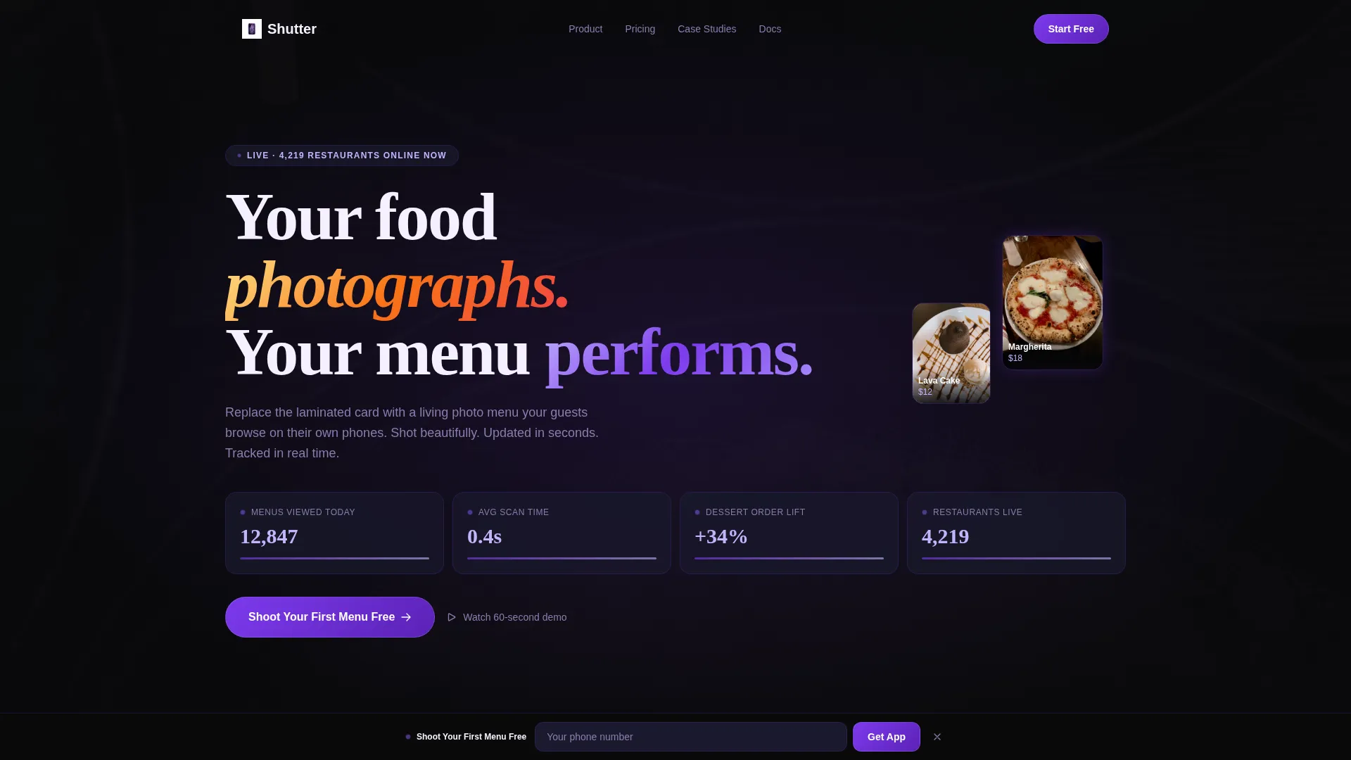
- A Stats/Metrics header bento with live-counter-style display, blurred hero food photography, and a fade-in headline
- A mid-page live demo menu card that visitors can swipe through before committing to any action
- Two strategically placed call-to-action moments, including a sticky bottom bar that appears after 40 percent scroll depth
Feature list
This template ships with a focused set of design and layout features that work together to drive app downloads for digital menu platforms.
Stats-Driven Metrics Header
The header arranges key performance numbers, including menus viewed, average table scan time, and a dessert order uplift callout, inside frosted glass bento cards. A blurred ramen bowl hero image glows warm behind the data, grounding the metrics in real food photography from the very first frame.
Problem-to-Solution Bento Grid Arc
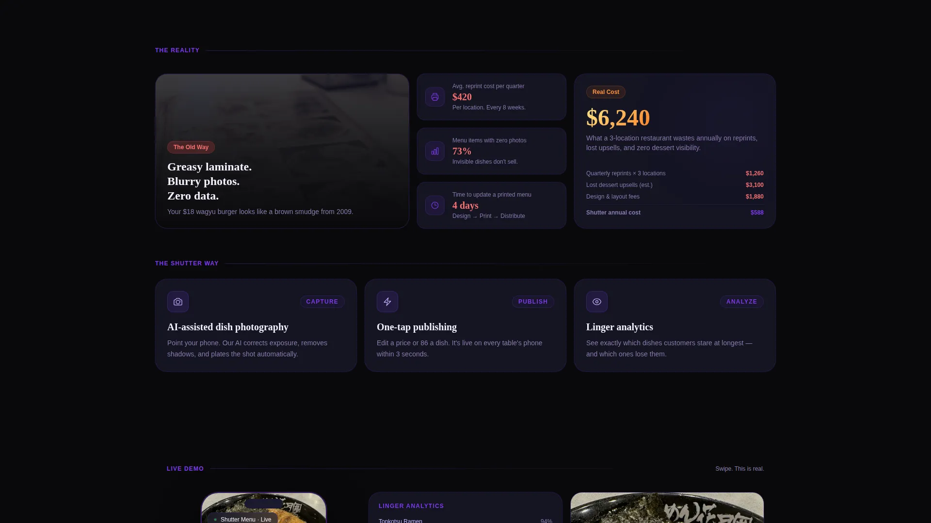
The scroll begins with a bento card showing the problem: a yellowed laminated menu under flat fluorescent light. Paired cards surface the real cost of static menus, reprinting expenses and zero analytics. As the visitor scrolls, solution tiles replace the pain cards, introducing photography tools, one-tap publishing, and real-time dish-level analytics.
Swipeable Live Demo Menu Card
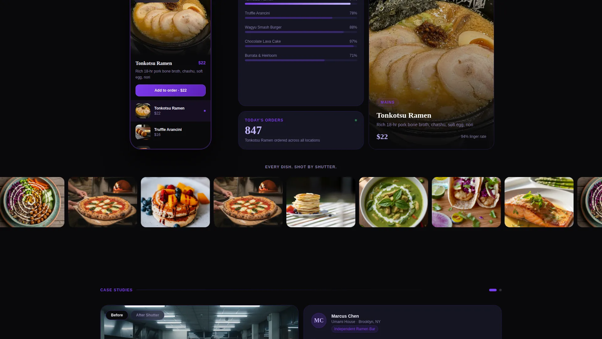
A functional demo menu is embedded directly inside a bento card. Visitors can swipe through actual dish photography before the page asks for anything. This removes the need to imagine the product because it demonstrates itself in context.
Dual Call-to-Action Placement
The primary call to action, "Shoot Your First Menu Free," appears once mid-scroll after the photography demo tile and once in a sticky bottom bar. The sticky bar slides up after 40 percent scroll depth so it arrives only after the visitor has seen the value.
SMS Download Flow with Desktop Fallback
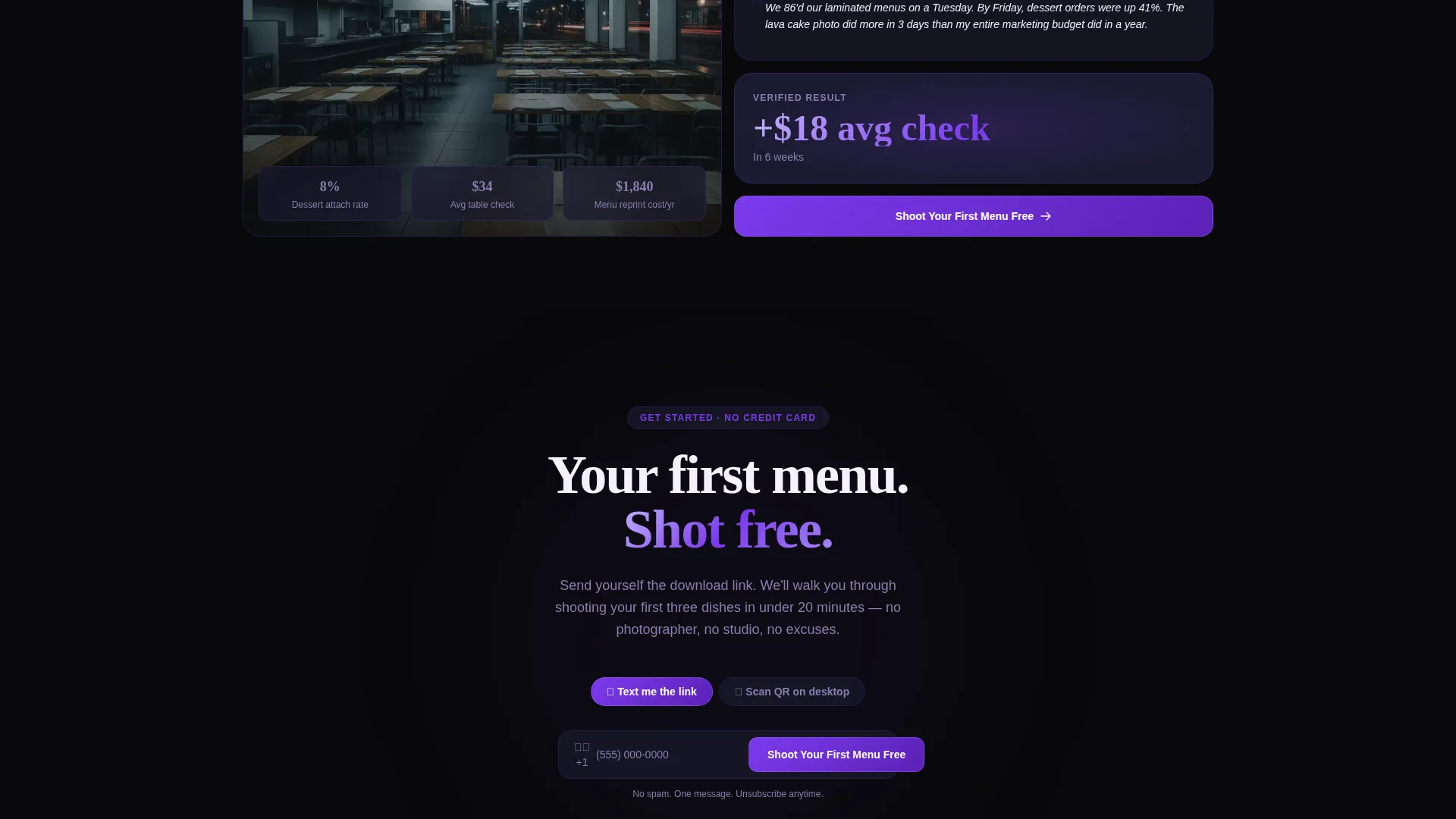
Tapping the primary call to action opens a phone number input that sends an SMS download link directly. Visitors already on a desktop see a QR code as a secondary path. Both flows avoid app store friction entirely.
Before-and-After Case Study Panels
Wider merged bento panels display real restaurant case studies showing before-and-after results. A full-width scrolling row of sharp dish photography follows, designed to stop a thumb mid-scroll and make the quality of the visual product undeniable.
Page sections overview
| Section | Purpose |
|---|---|
| Metrics Header Bento | Opens with live counters, blurred hero food photo, and fade-in headline |
| Pain Point Cards | Shows yellowed static menu and reprinting cost data side by side |
| Solution Tile Row | Introduces AI-assisted photography, one-tap publishing, and analytics |
| Live Demo Card | Lets visitors swipe a real menu before any commitment is requested |
| Mid-Page call to action | Places "Shoot Your First Menu Free" after the demo tile |
| Case Study Panels | Wider merged bento panels with before-and-after restaurant results |
| Full-Width Photo Row | Scrolling strip of sharp dish photography to anchor product quality |
| Sticky Bottom Bar | Slides up at 40 percent scroll depth with the primary call to action |
Design & branding system
The visual identity runs on a Void and Violet color system built to make food photography punch through a dark interface. Every color choice exists to keep the food as the brightest element on the screen.
- Backgrounds stay in the void range using absolute void black (#09090B) and frosted glass panels (#1A1A2E) so dish photography always reads as the brightest element
- Electric violet (#7C3AED) defines borders, accents, and data highlights, while phosphor lilac (#C4B5FD) handles hover states and secondary typographic moments
- Typography runs phosphor lilac on dark surfaces, creating high contrast without competing with the food imagery
Mobile & speed optimization
The bento grid layout is designed around the experience of a phone screen in a dim restaurant. The entire visual system assumes a mobile-first visitor who is already holding their phone at a dinner table.
- Bento cards are sized and spaced for thumb-friendly scrolling on small screens, with a sticky call-to-action bar that remains reachable without disrupting the content flow
- The SMS download path removes app store steps entirely, reducing the number of taps between interest and install
- Full-width photo rows and swipeable demo cards are built to render food imagery cleanly at mobile viewport widths
How this template helps you convert
The page earns every tap before it asks for one. Conversion is built into the scroll arc, not bolted onto a generic layout.
- The live demo menu card lets visitors experience the actual product inside the page, eliminating doubt before the first call to action appears
- The sticky bottom bar with the primary call to action appears only after 40 percent scroll depth, targeting visitors who have already engaged with the value proposition
- The SMS input flow removes app store friction so the gap between tapping and receiving the download link stays as short as possible
Other information about this template
Shutter is built as a single landing page using the Bento Grid template style under the Tech Glass theme. It sits within the Photography Digital Presence subcategory and is designed specifically for the Photography Digital Menu niche inside the Technology category.
- The template supports the full Void and Violet color system and can be adapted to match a specific restaurant brand palette within that dark-background framework
- The creative direction follows a deliberate Problem→Solution Arc, meaning each section row has a defined role in the visitor journey and should not be reordered without reviewing narrative continuity
- The header concept is a Stats/Metrics dashboard layout, which works best when populated with real platform data or realistic placeholder numbers that reflect actual product performance
- The landing page direction targets App Download as the single conversion goal, making it unsuitable as a general restaurant website or multi-page brand hub without significant restructuring
Theme
Tech Glass
Creative direction
Problem→Solution Arc
Color system
Void & Violet
Style
Bento Grid
Direction
App Download
Page Sections
Stats-driven Metrics Header
Problem-to-solution Scroll Arc
Swipeable Live Demo Menu Card
Dual Call to Action with Sticky Bottom Bar
SMS Download with QR Fallback
Before-and-after Case Study Panels
Related questions
Who is this landing page template designed for?
Can I use this template without real analytics data in the header?
Does the swipeable demo menu card require a backend integration?
Can the template handle both mobile and desktop visitors?
Is this template suitable for a multi-page restaurant website?



