Bakery & Café Professional Website Template
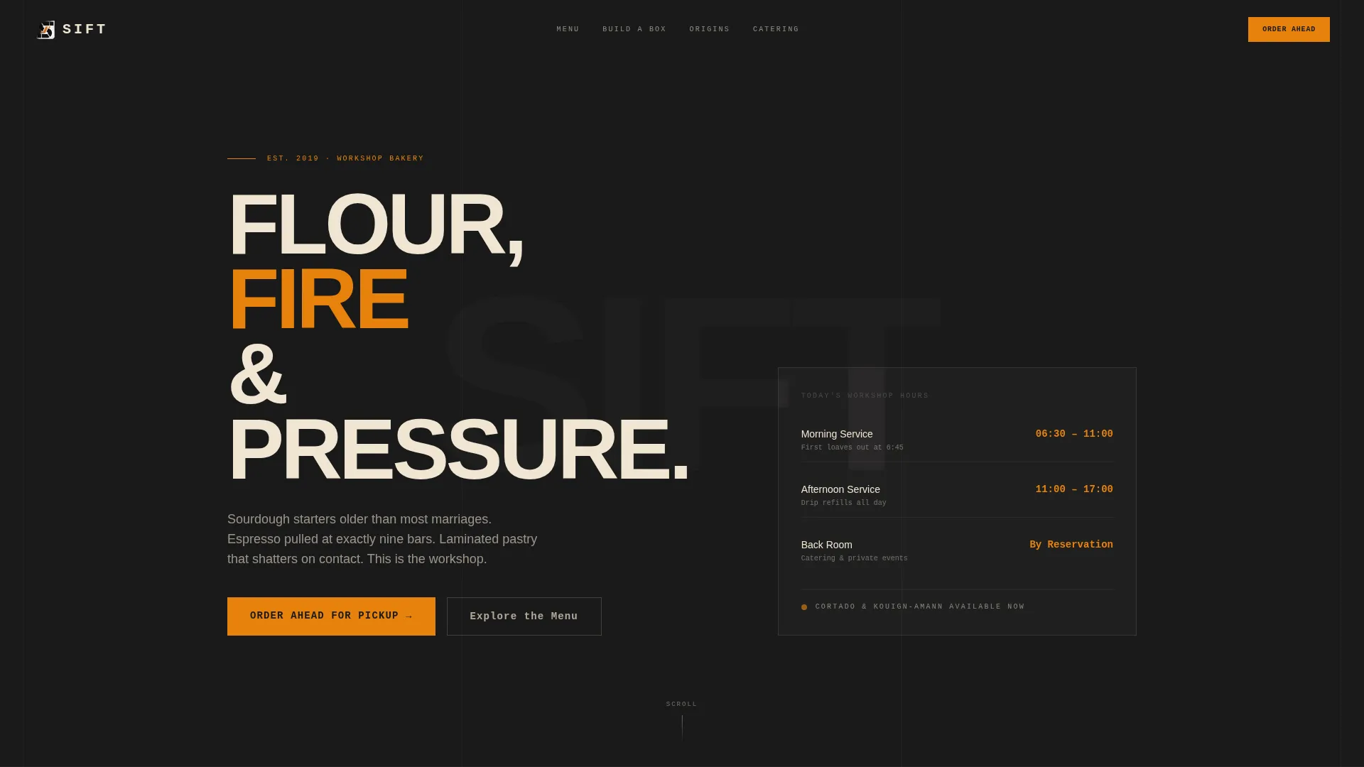
Sift is a bold brutalist landing page template built for artisan bakeries and cafés. It combines a stamped-type logo bar, an animated comparison table with menu toggles, a build-your-own pastry box, and a roastery origin map into a single click-through page. Every detail is designed to make visitors hungry and ready to order before they reach the bottom.
by Rocket studio
Quick summary
Sift is a single-page landing page template for artisan bakeries and cafés that want to stand out. It uses a bold brutalist design, a carbon fiber color system, and interactive comparison tables to turn casual browsers into hungry, committed customers. The page flows from a stamped-type header animation down to a full-width order prompt at the end.
Who this template is for
This template suits café and bakery owners who take their craft seriously and want a page that reflects it. It works equally well for a solo operator running a neighborhood spot and a small team managing catering alongside a daily menu.
- Morning-rush café owners who need an online presence that converts quickly
- Artisan bakeries offering viennoiserie, sourdough, and specialty coffee
- Food businesses looking to capture catering leads alongside their retail orders
What problem this template solves
Most bakery and café pages are either too plain or too slow to communicate what makes a place worth visiting. They bury the menu, skip the craft story, and lose the visitor before the page even loads its first image. Sift solves that by leading with typography and interaction instead of photography.
- Visitors never have to hunt for the menu or the order button
- The comparison table structure organizes a complex offering into a clear, scannable format
- Interactive elements build appetite and product familiarity before the call to action ever appears
What you get with this template
Sift delivers a fully structured, single-page layout built around an interactive comparison table that toggles between Morning Menu, Afternoon Menu, and Catering Packages. Every component is designed for a bakery or café context, from the animated header bar to the sticky order button.
- An animated logo bar, three-tab comparison table, build-your-own pastry box section, and a roastery origin map
- Two conversion paths: a primary sticky call-to-action pill and a secondary catering inquiry line
- A carbon fiber color system with charred black backgrounds, parchment body text, and amber interactive states
Feature list
This template is built around interactive discovery. Each feature below comes directly from the page structure described in the brief.
Animated Logo Bar Header
The page opens with oversized, monospaced wordmarks cycling through the café's core offerings: SOURDOUGH, ESPRESSO, LAMINATION, COLD BREW, and VIENNOISERIE. Each word stamps onto the screen in a brutalist type animation against a deep charred black background. The bar then compresses upward and the full page drops in beneath it.
Toggled Comparison Table
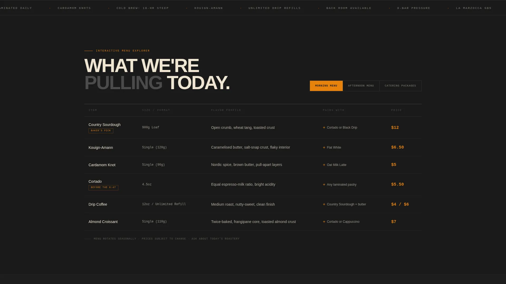
Visitors switch between Morning Menu, Afternoon Menu, and Catering Packages using a three-tab toggle. Each click restructures the table with animated row swaps. Columns display item, size, flavor profile, and a paired recommendation so visitors understand every offering at a glance.
Build-Your-Own Pastry Box
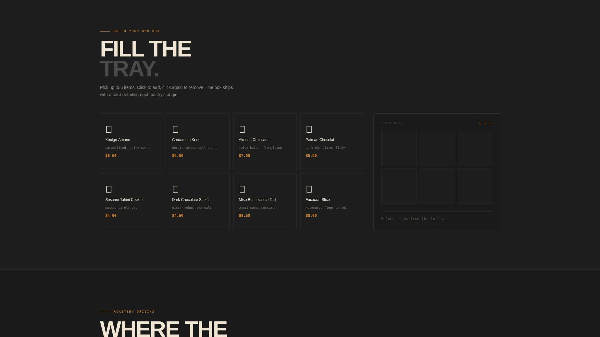
Scrolling past the comparison table reveals an interactive tray. Visitors click pastry icons to add items, building a visual box of their selections. The interaction makes the ordering decision feel personal and deliberate rather than transactional.
Roastery Origin Map
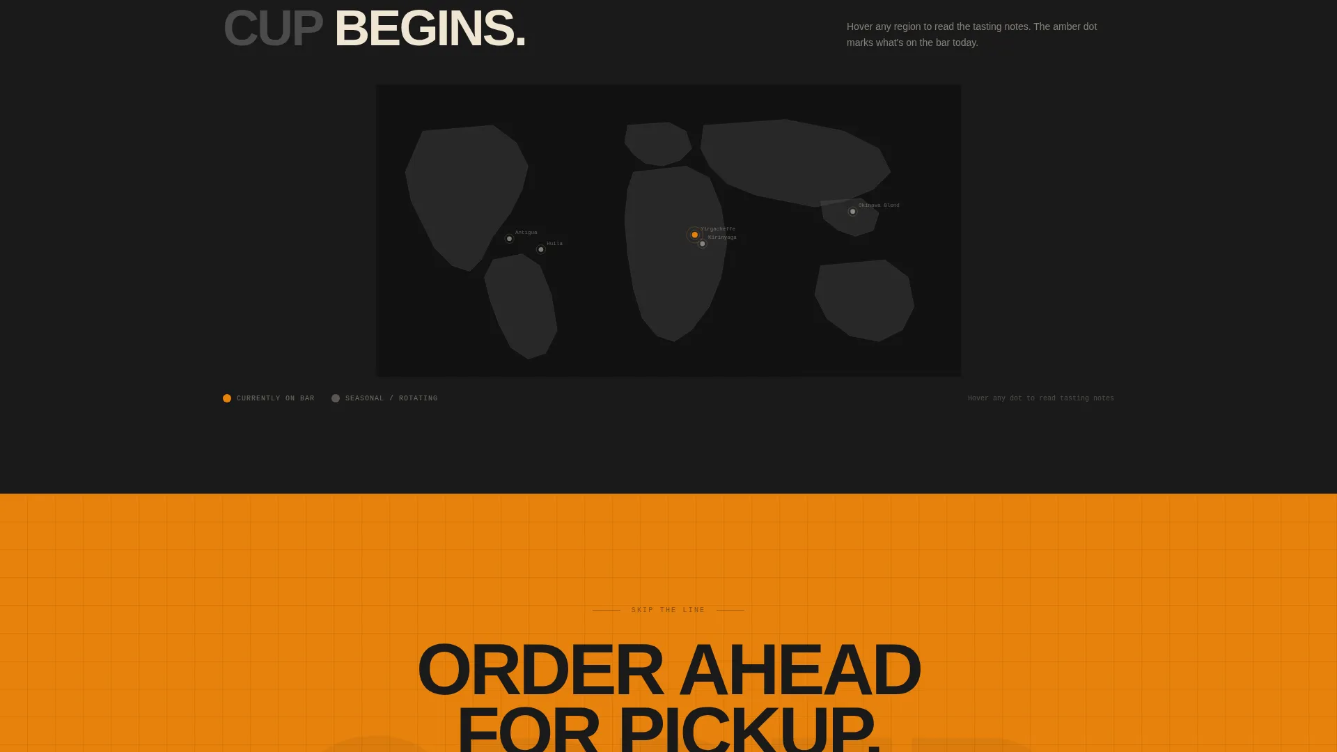
Hovering over coffee regions on an illustrated map reveals tasting notes for each single-origin offering. This section teaches visitors the vocabulary of specialty coffee and deepens their connection to the product before they reach the order prompt.
Sticky Order-Ahead Call to Action
After the second scroll, an amber pill button labeled "Order Ahead for Pickup" locks to the viewport and travels with the visitor down the page. It appears again as a full-width brutalist block at the very end, ensuring the conversion path is always visible.
Secondary Catering Path
A single line of concrete-gray text beneath the primary call to action reads "Book the Back Room." This gives catering leads a clear, low-friction path without cluttering the main conversion flow or adding a form to the page.
Page sections overview
| Section | Purpose |
|---|---|
| Animated Logo Bar | Opens the page with stamped-type wordmarks cycling through core offerings |
| Comparison Table | Lets visitors toggle menus and compare items by size, flavor, and pairing |
| Build-Your-Own Box | Invites visitors to assemble a custom pastry selection interactively |
| Roastery Origin Map | Reveals single-origin tasting notes on hover by coffee region |
| Sticky Order Pill | Keeps the primary call to action visible throughout the scroll journey |
| Full-Width call to action Block | Closes the page with a bold, unavoidable order-ahead prompt |
Design & branding system
The visual identity follows a bold brutalist theme. No photography is used anywhere on the page. Typography does the work of both imagery and atmosphere, set in a condensed grotesque at display weight so every word feels stamped rather than printed.
- Color system uses charred espresso black (#1A1A1A) for backgrounds, poured-concrete gray (#4A4A4A) for section dividers, unbleached parchment (#F0E6D3) for body text, and proving-oven amber (#E8820C) for buttons, price highlights, and hover states
- Amber is used exclusively for interactive and clickable elements, functioning like a pilot light against the dark backgrounds
- All type is condensed grotesque at display weight, giving the page the visual weight of a stamped letterpress poster
Mobile & speed optimization
The template is designed so its interactive components translate clearly to smaller screens. The toggle tabs, pastry icon tray, and sticky call-to-action pill are all sized for touch interaction without requiring pinch or zoom.
- The sticky amber pill scales correctly across screen widths and remains tappable on mobile viewports
- The comparison table restructures cleanly on narrow screens so column labels remain readable
- The build-your-own tray and origin map interactions are designed for pointer and touch input alike
How this template helps you convert
The page is structured as a click-through landing page with no forms. Every interaction moves the visitor closer to the order platform, building appetite and familiarity along the way.
- The comparison table toggle and pastry box turn passive browsing into active decision-making, so visitors arrive at the call to action already knowing what they want
- The sticky order pill appears early and stays present, removing the need to scroll back to find the conversion point
- The secondary "Book the Back Room" line captures catering intent without interrupting the primary order flow
Other information about this template
Sift is categorized under bakery and café website templates with a specific focus on lead capture for artisan food businesses. The template style is a comparison table layout, the creative direction is Interactive Explorer, and the header concept is a Logo Bar. The theme is bold brutalist and the color system is Carbon Fiber.
- The landing page direction is Click-Through, meaning no contact form is present and all calls to action route visitors directly to an external ordering platform
- This template sits within the technology subcategory of bakery and café website templates, making it well suited for operators who want a modern, code-forward aesthetic
- The intersection match reflects a niche focus: artisan cafés and bakeries that need a single, high-impact landing page rather than a full multi-page website
Theme
Bold Brutalist
Creative direction
Interactive Explorer
Color system
Carbon Fiber
Style
Comparison Table
Direction
Click-Through
Page Sections
Animated Brutalist Logo Bar
Three-tab Comparison Table
Interactive Pastry Box Builder
Roastery Origin Map
Sticky Amber Order Pill
Dual Conversion Paths
Related questions
Does this template include a contact form or ordering system?
Can I change the menu items in the comparison table?
Is this template suitable if I only offer a morning menu?
Do I need to use the roastery origin map if I do not serve specialty coffee?
What makes this different from a standard café website template?



