Micro-SaaS & Developer Tools Comparison Website Template
Sigblock is a dark-themed, comparison table landing page built for an email signature generator tool. It puts a live signature builder front and center, lets visitors create a real signature before asking for anything, and then presents a Free versus. Pro versus. Team comparison that makes upgrading feel obvious. The design runs on void black, terminal charcoal, and electric lime.
by Rocket studio
Quick summary
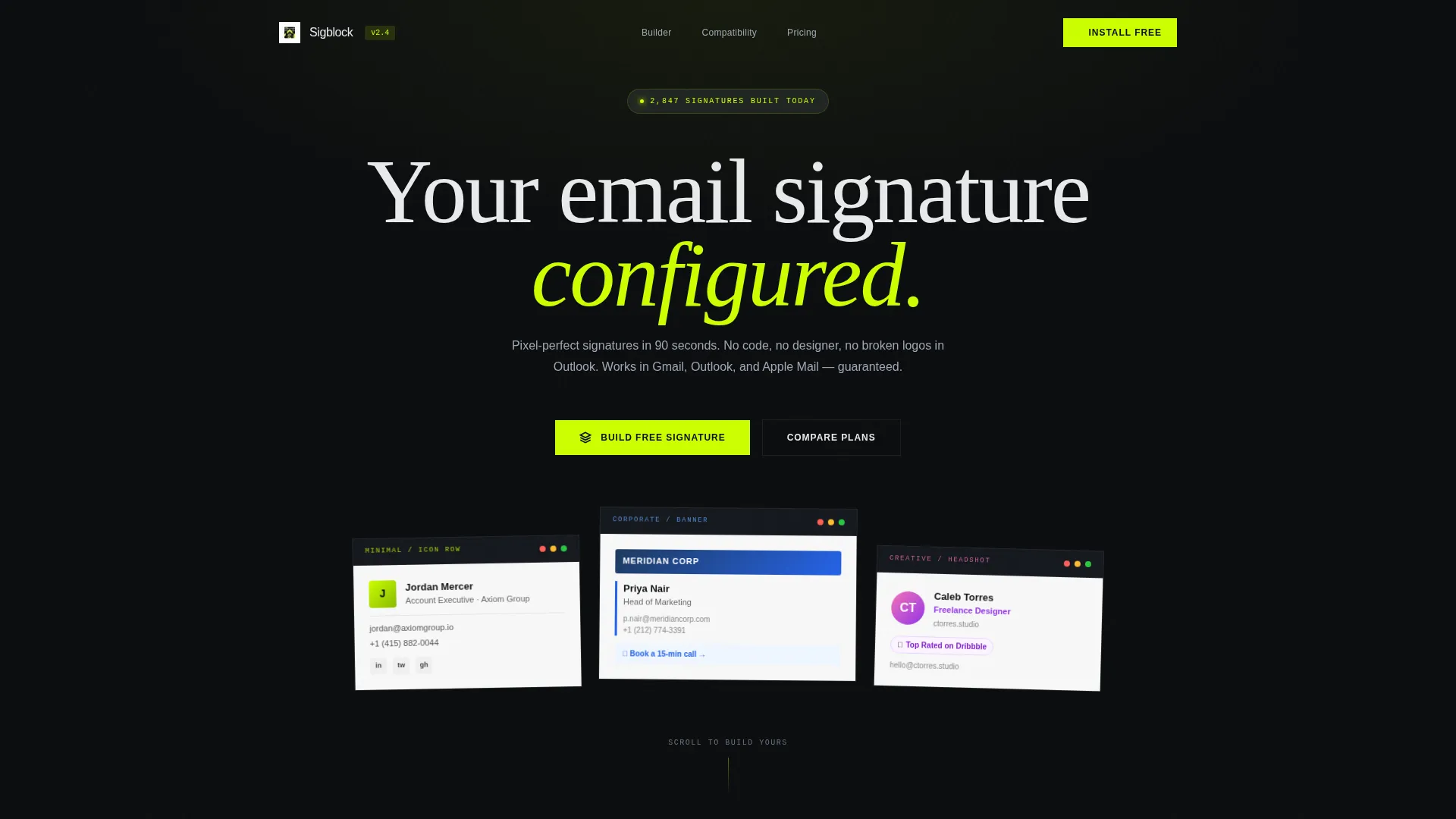
Sigblock is a single-page template for an email signature generator tool. It opens with three frosted Dark Glass Panel header cards showing real signature styles, drops visitors straight into a live builder, and closes the argument with a feature comparison table. The palette is dark and immediate. The flow earns trust through interaction before it asks for a download.
Who this template is for
This template is built for founders, marketers, and developers who are selling or launching a browser-based signature tool. It speaks directly to people who want a high-conversion page without writing it from scratch.
- Sales teams who need consistent, branded signatures across every rep in their org
- Marketing managers rolling out a signature standard for a large team
- Freelancers who want a polished email presence without hiring a designer or touching code
What problem this template solves
Most product landing pages ask visitors to trust first and experience second. That approach stalls conversions for tool-based products, especially ones where the value is obvious the moment someone uses the feature.
- Visitors leave before they see what the tool actually does
- Feature comparison tables appear too early, before the visitor is invested
- Generic layouts fail to communicate the speed and simplicity of a no-code signature tool
What you get with this template
You get a fully structured, single-page layout that sequences interaction before persuasion. Every section is designed to do a specific job, and the visual system is applied consistently throughout.
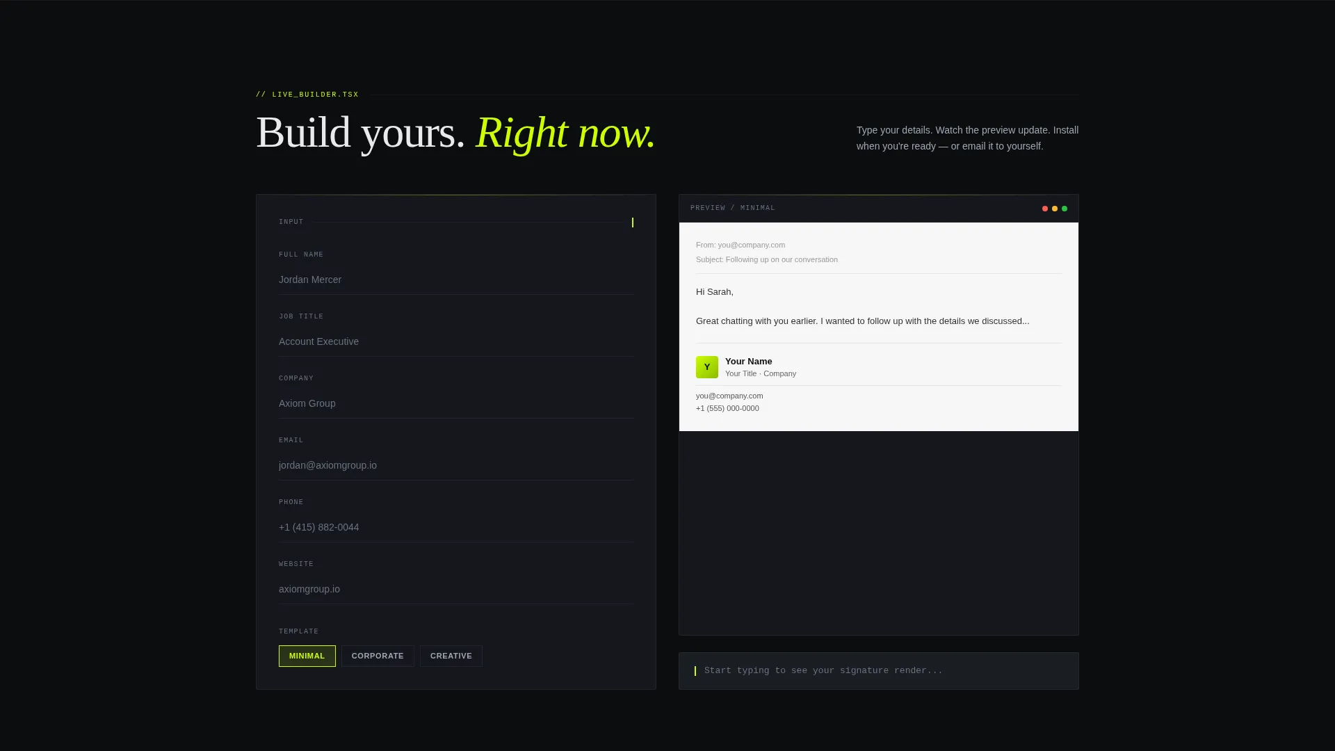
- A live signature builder section with real-time preview, positioned above the fold
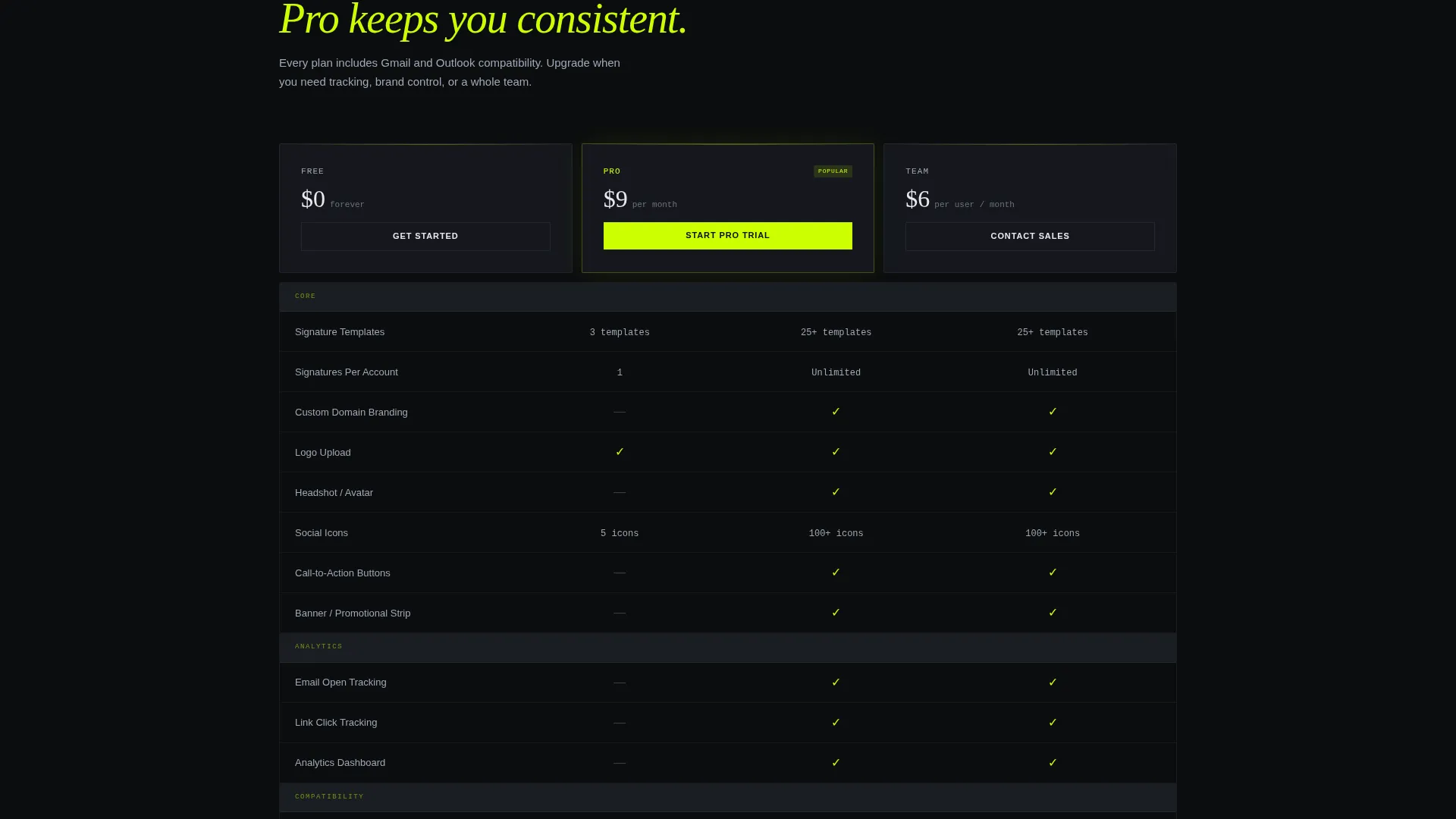
- A Free versus. Pro versus. Team comparison table with lime checkmarks against a dark field
- Dual call-to-action placements for browser extension and add-in installs, plus a secondary email capture path
Feature list
This template is built around a small number of high-impact components, each doing deliberate work in the conversion sequence.
Dark Glass Panel Header
Three frosted, translucent cards float on a pure black background. Each card displays a different signature style: minimal with an icon row, corporate with a banner, and creative with a headshot and social proof. Edges catch a thin lime-green light leak, making the product feel real before the visitor reads a single word.
Live Signature Builder
A functional builder sits directly below the header. It includes fields for name, title, phone number, logo upload, and a template selector. As the visitor types, a signature preview renders in real time on the right side of the screen. The visitor builds something real before any install is requested.
Comparison Table Section
The comparison table appears after the builder, not before it. It contrasts Free, Pro, and Team plans across signature limits, custom domains, analytics tracking, and mail client compatibility. Lime checkmarks against the dark field make feature gaps easy to read at a glance.
Dual Install Call to Action
The primary call to action, "Install the Extension," appears with paired buttons for the browser extension and the desktop mail add-in. These buttons are placed inside the live builder section and again pinned at the comparison table footer. No single scroll position misses the offer.
Secondary Email Capture Path
Visitors who are not ready to install can choose "Email My Signature" instead. This captures their email address and signature preferences in one step. It lets the tool deliver value without requiring an immediate commitment from the visitor.
Acid Digital Color System
Every interactive element and hover state uses electric lime (#CCFF00) against a void black (#0B0D0F) and terminal charcoal (#1A1D23) background. Secondary text runs in cool zinc (#A0A7B5). The palette is consistent and purposeful, not decorative.
Page sections overview
| Section | Purpose |
|---|---|
| Dark Glass Header | Showcase three real signature styles as frosted panel artifacts |
| Live Signature Builder | Let visitors create a real signature before any ask is made |
| Real-Time Preview | Render the signature output instantly as fields are filled |
| Comparison Table | Contrast Free, Pro, and Team plans with lime-checked feature rows |
| Install call to action Block | Drive browser extension and mail add-in downloads |
| Email Capture Path | Offer a no-install output option that captures lead details |
Design & branding system
The visual identity follows a Data Command theme. The overall feel is a code editor running late at night: dark backgrounds, a single bright accent, and nothing competing for attention.
- Background layers use void black (#0B0D0F) and terminal charcoal (#1A1D23) to create depth without brightness
- Electric lime (#CCFF00) handles every interactive element, hover state, checkmark, and cursor-style accent throughout the page
- Cool zinc (#A0A7B5) keeps body copy and secondary labels legible without pulling focus from the lime highlights
Mobile & speed optimization
The template is structured so that the most important interaction, the live builder, appears immediately on load without requiring the visitor to scroll past heavy media or hero imagery.
- The header uses rendered signature artifacts behind glass panels rather than stock images or illustrations, keeping visual weight low
- Section sequencing is linear and purposeful, reducing layout complexity on smaller screens
- Call-to-action buttons are placed at two points in the page flow so mobile visitors never have to scroll back to find the install prompt
How this template helps you convert
The conversion logic here is built around a simple principle: let the visitor experience the product before asking them to commit to it.
- The live builder delivers a completed, real-looking signature before any install prompt appears, which makes the value concrete and personal to each visitor.
- The comparison table arrives after the visitor is already invested, so the Free versus. Pro versus. Team rows feel like an upgrade decision rather than a cold sales pitch.
- The dual call-to-action placement and the secondary email capture path mean the page offers two different commitment levels, catching both ready-to-install visitors and those who need a lower-friction first step.
Other information about this template
This template is categorized under Technology, specifically within the Micro-SaaS and Developer Tools subcategory. It is designed to match the intent of an email signature generator product page and is compatible with the Calculator or Tool First creative direction pattern.
- The template style is a Comparison Table layout, meaning the feature grid is a core structural element and not an optional add-on
- The App Download landing page direction means all primary calls to action point toward installing a browser extension or a desktop mail client add-in
- The header concept is Dark Glass Panels, a specific visual treatment using frosted translucent cards with refraction blur and lime-green light leak edges
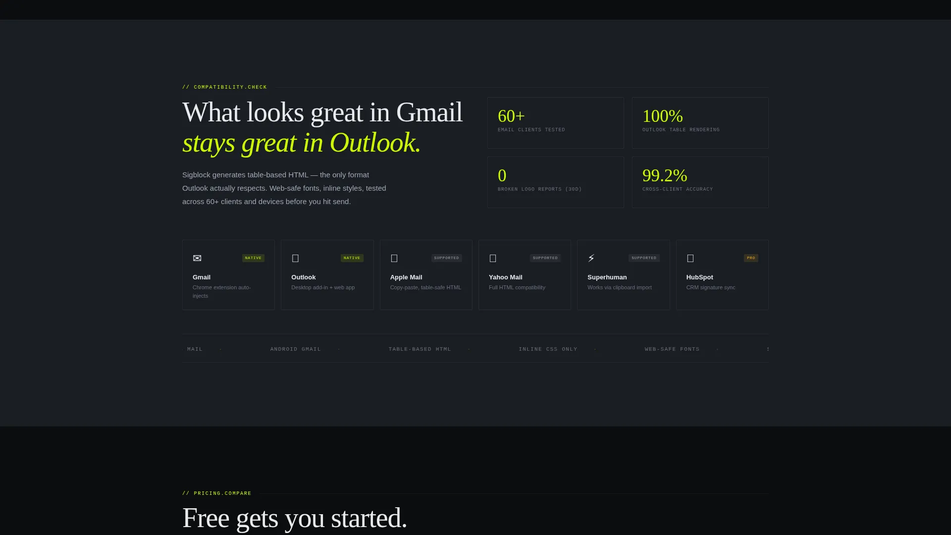
- This template fits teams using tools like Sigblock to manage signature consistency across large groups, including scenarios involving Outlook, Gmail, and Apple Mail compatibility
Theme
Data Command
Creative direction
Calculator/Tool First
Color system
Acid Digital
Style
Comparison Table
Direction
App Download
Page Sections
Dark Glass Panel Header
Live Signature Builder with Preview
Free Versus. Pro Versus. Team Comparison Table
Dual Call-to-action Placement
Secondary Email Capture Path
Acid Digital Color System
Related questions
Does this template include the actual signature builder functionality?
Can I change the color scheme to match a different brand?
Who is the comparison table section designed for?
Where do the primary call-to-action buttons point?
Is this template suitable for a solo freelancer launching a signature tool?



