AI & Machine Learning Reviews Website Template
Perceive is a bento grid landing page template built for computer vision platforms. It opens with a live-rendered interactive preview, then guides visitors through a problem-to-solution arc that transforms raw footage statistics into annotated wins. The Void & Violet color system and Data Command theme give every section a precise, technical authority that earns trust before asking for a click.
by Rocket studio
Quick summary
Perceive is a single-page bento grid template for AI-powered computer vision platforms. It combines an interactive video preview header, a high-contrast Void & Violet design system, and a tightly sequenced problem-to-solution scroll flow. The page builds toward one action: getting visitors into a free sandbox environment, with an enterprise path surfaced only at the end.
Who this template is for
This template is built for teams who need to communicate complex machine-vision capabilities to a technically literate but time-pressured audience. It suits product marketers and developers who want proof before promise.
- Computer vision platform teams targeting manufacturing quality engineers and autonomous vehicle developers
- AI and machine learning product leads selling to retail operations managers who need shrinkage analytics
- Developer-focused companies that want a technical, data-forward landing page with a clear free-trial call to action
What problem this template solves
Most AI platform pages describe capabilities in abstract terms. They list bullet points about accuracy without showing the system at work. Visitors leave before they trust the product.
- Generic AI landing pages fail to demonstrate real-time processing speed or live detection results
- Enterprise buyers in manufacturing and logistics need concrete metrics before engaging sales teams
- Technical audiences dismiss pages that look marketing-heavy and light on deployment specifics
What you get with this template
You get a fully structured bento grid layout that moves from emotional pain to technical proof in a single scroll. Every tile, row, and call-to-action block is designed to do specific persuasive work.
- An interactive header viewport with toggleable detection modes and a live object-count ticker
- A two-row problem-and-solution bento arc with overlaid statistics that flip from pain to win
- Progressive technical depth in later grid rows, including architecture diagrams, latency gauges, integration cards, and API response samples
Feature list
This template ships with layout blocks and interactive states that map directly to the platform's core selling points.
Interactive Detection Preview Header
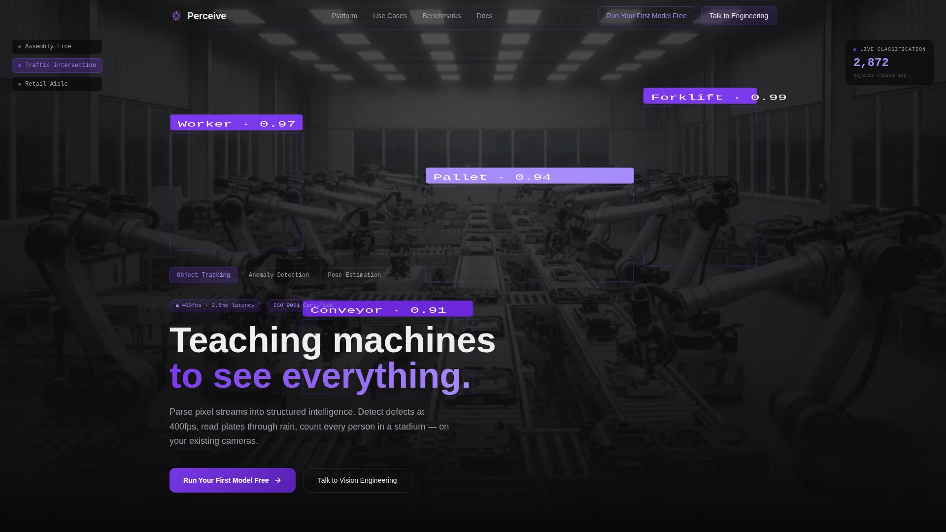
The header renders a live-style video viewport showing warehouse, traffic, or retail footage. Visitors toggle between object tracking, anomaly detection, and pose estimation modes. Violet annotation layers shift instantly on toggle, making the AI's work the visual centerpiece.
Problem-to-Solution Bento Arc
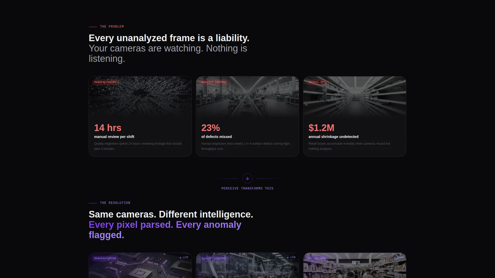
The first bento row presents three pain-state tiles with raw footage and hard statistics: manual review hours, missed defect rates, and undetected shrinkage costs. The next row replays the same scenes with live annotations and inverted metrics, creating a before-and-after structure that needs no explanation.
Progressive Technical Depth Grid
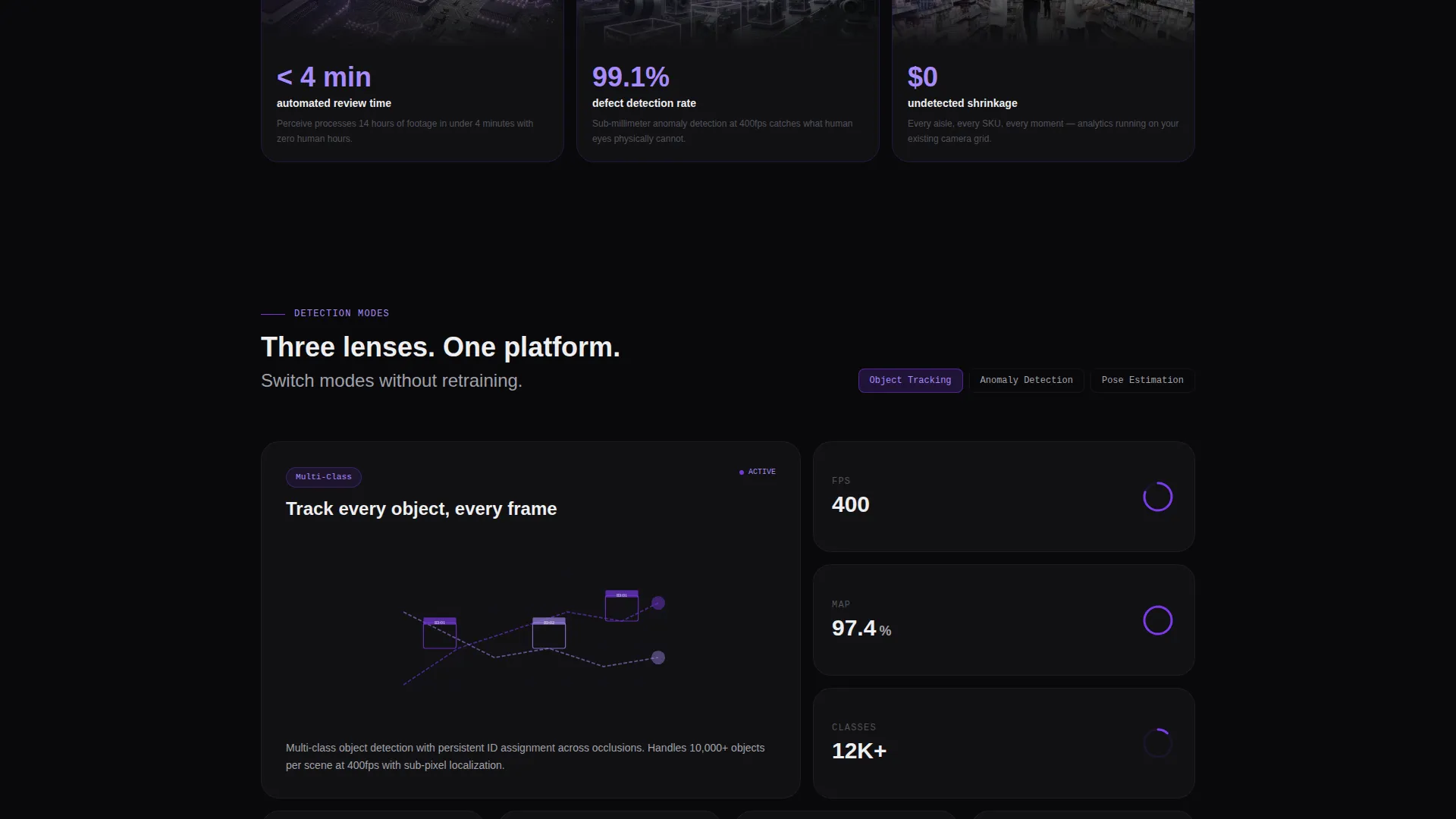
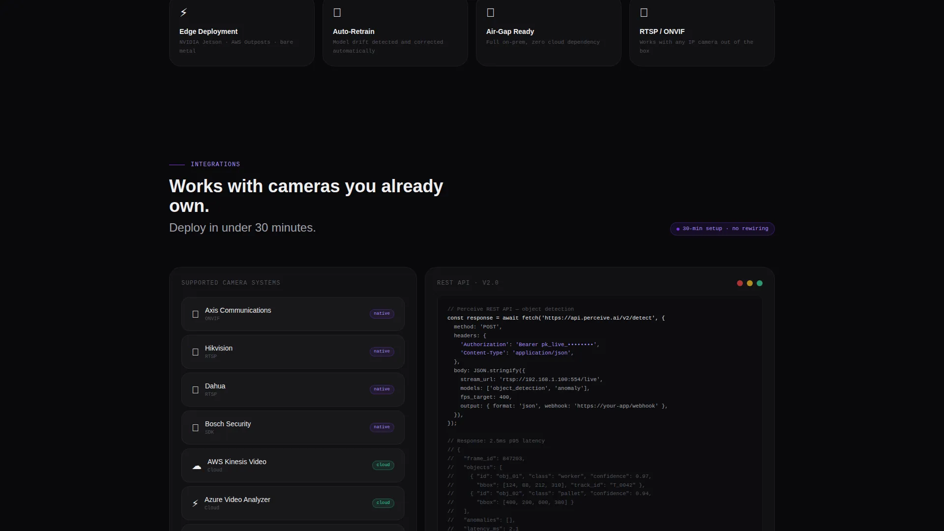
Lower bento rows reward engineers who scroll further. Architecture diagrams expand on hover, latency benchmarks appear as real-time gauges, and integration cards show one-click connectors for existing camera systems. Tiles grow smaller and denser as the page descends, signaling increasing technical specificity.
Tiered Call-to-Action System
The primary call to action, "Run Your First Model Free," appears three times: as a ghost button in the header, as a full-width violet bar after the solution reveal, and as a closing anchor tile. No form appears on the page itself. The click routes visitors to a sign-up flow where they upload footage or select a demo feed.
Enterprise Secondary Path
A secondary call to action, "Talk to Vision Engineering," appears only in the final bento row. It is positioned alongside a latency guarantee badge and addresses enterprise buyers who need service-level agreements and on-premises deployment options.
Desaturated Feed with Violet Annotation Layer
The video feed throughout the header is intentionally desaturated. The platform's bounding boxes, segmentation masks, and confidence scores are the only color on screen. This visual choice makes the AI's output the hero and keeps the annotation layer immediately readable against dark backgrounds.
Page sections overview
| Section | Purpose |
|---|---|
| Interactive Header Viewport | Demonstrates live detection modes with toggleable violet annotation layers and a ticking object counter |
| Pain State Row | Shows three raw-footage tiles with heavy statistics to establish the cost of doing nothing |
| Solution Reveal Row | Replays the same scenes with annotations active and metrics inverted into measurable wins |
| Architecture Diagram Block | Expands on hover to show platform structure and processing pipeline |
| Latency Benchmark Gauges | Renders real-time speed indicators to validate 400-frames-per-second processing claims |
| Integration Cards Row | Displays one-click connectors for existing camera infrastructure |
| API Response Samples | Gives technical buyers deployment specs in a dense, engineer-readable tile format |
| Primary call to action Bar | Full-width violet block anchoring the free sandbox call to action after the solution reveal |
| Enterprise Closing Row | Surfaces the secondary enterprise path and latency badge for high-intent buyer conversion |
Design & branding system
The Void & Violet color system creates a Data Command aesthetic that reads as clinical, intelligent, and precise. No warmth is introduced; every design decision reinforces the idea that something is processing.
- Color palette: absolute void black (#09090B) dominates all backgrounds, deep ultraviolet (#2D1B69) provides mid-depth, electric violet (#7C3AED) marks interactive states and data highlights, and phosphor white (#EEEEF0) handles all typography and diagram strokes
- Violet graduates from deep to electric as elements become interactive, creating a built-in visual hierarchy without extra components
- White text is described as surgical: never warm, never decorative, just legible and absolute against the void black ground
Mobile & speed optimization
The bento grid layout adapts naturally to narrower viewports by reflowing tile columns. The interactive header and annotation layers are designed to remain functional as the grid restructures.
- Bento tiles reflow from multi-column desktop rows into stacked single-column mobile blocks
- Interactive toggle states and the live object-count ticker are preserved across viewport sizes
- Dense technical tiles in lower rows condense without losing their data hierarchy on smaller screens
How this template helps you convert
Every scroll decision in this template is structured to reduce hesitation and build enough confidence for one specific click.
- The interactive preview lets visitors watch the platform annotate real footage before reading a single marketing claim, establishing proof before promise at the very first scroll position.
- The problem-to-solution bento arc makes the cost of inaction concrete with dollar figures, missed-defect percentages, and manual-review hours, then immediately resolves that tension with annotated wins in the next row.
- The tiered call-to-action system meets visitors at three different trust levels, from curious header reader to convinced technical buyer, without ever placing a friction-adding form on the page itself.
Other information about this template
This template is well suited for positioning a computer vision platform in competitive AI and machine learning markets where differentiation depends on demonstrating capability rather than describing it.
- The template style is bento grid, and the creative direction follows a Problem to Solution Arc as defined in the intersection context
- The header concept is an Interactive Preview, and the landing-page direction is Click-Through, both drawn from the matched intersection row
- The theme is Data Command and the color system is Void & Violet, making this template visually distinct from standard SaaS light-mode templates
- This template can support use cases spanning manufacturing quality inspection, autonomous vehicle perception stack training, and retail loss-prevention analytics
Theme
Data Command
Creative direction
Problem→Solution Arc
Color system
Void & Violet
Style
Bento Grid
Direction
Click-Through
Page Sections
Interactive Detection Preview Header
Problem-to-solution Bento Arc
Progressive Technical Depth Tiles
Tiered Call-to-action System
Enterprise Closing Path
Desaturated Feed with Annotation Layer
Related questions
Who is this template built for?
Does the template include a live video feed and annotation logic?
How does the call-to-action system work across the page?
Is this template suitable for enterprise sales alongside a self-serve motion?
Can the bento grid layout be adapted for different computer vision use cases?



