Statistics Online Course Landing Page Template
Sigma is a statistics online course landing page template built for platforms that teach real-world data reasoning. It opens with a provocative diagnostic quiz, then reorganizes its zigzag content sections around each visitor's identified gaps. The result is a personalized scroll that feels like a syllabus written in real time, guiding career-switchers, grad students, and analysts straight toward cohort registration.
by Rocket studio
Quick summary
Sigma is a single-page statistics education template with a quiz-driven personalization engine at its core. Visitors answer five rapid diagnostic questions, and the page reshapes itself to address their specific weak spots. The design carries an Institutional Authority visual identity, combining deep navy, electric indigo, chalk-dust white, and a citrine accent into a palette that feels as serious and electric as a university building at night.
Who this template is for
This template is built for statistics education platforms that serve working adults with real skill gaps. It speaks directly to learners who need more than a generic course landing page.
- Career-switching analysts brushing up on Bayesian inference before job interviews
- Graduate students overwhelmed by software output who need plain-language explanations of concepts like interaction effects
- Marketing managers handed an A/B testing dashboard they cannot yet read confidently
What problem this template solves
Generic course pages treat every visitor the same. Sigma solves the problem of relevance by letting the quiz do the diagnostic work before the pitch begins.
- Visitors often leave course pages because the content feels either too basic or too advanced for their current level
- Static landing pages cannot distinguish between a probability novice and someone who just needs a refresher on regression coefficients
- Without a trust mechanism, asking someone to reserve a seat in a live cohort feels like a leap rather than a logical next step
What you get with this template
You get a fully structured single-page layout where the quiz result drives the entire visitor experience. Every element from the header to the registration form has a clear job to do.
- A half-page photo-and-text hero header with a provocative question and a quiz entry button
- Zigzag alternating content sections that surface or collapse based on the visitor's identified knowledge gap
- A dual conversion path: cohort seat reservation with a sticky bar, and a downloadable diagnostic report for visitors not yet ready to commit
Feature list
This section covers the core functional and design capabilities built into the Sigma template.
Diagnostic Quiz Engine
The five-question quiz at the top of the page covers probability intuition, hypothesis framing, and regression interpretation. Results are immediate, and the page uses them to reorganize subsequent content sections around the visitor's specific gaps.
Zigzag Alternating Sections
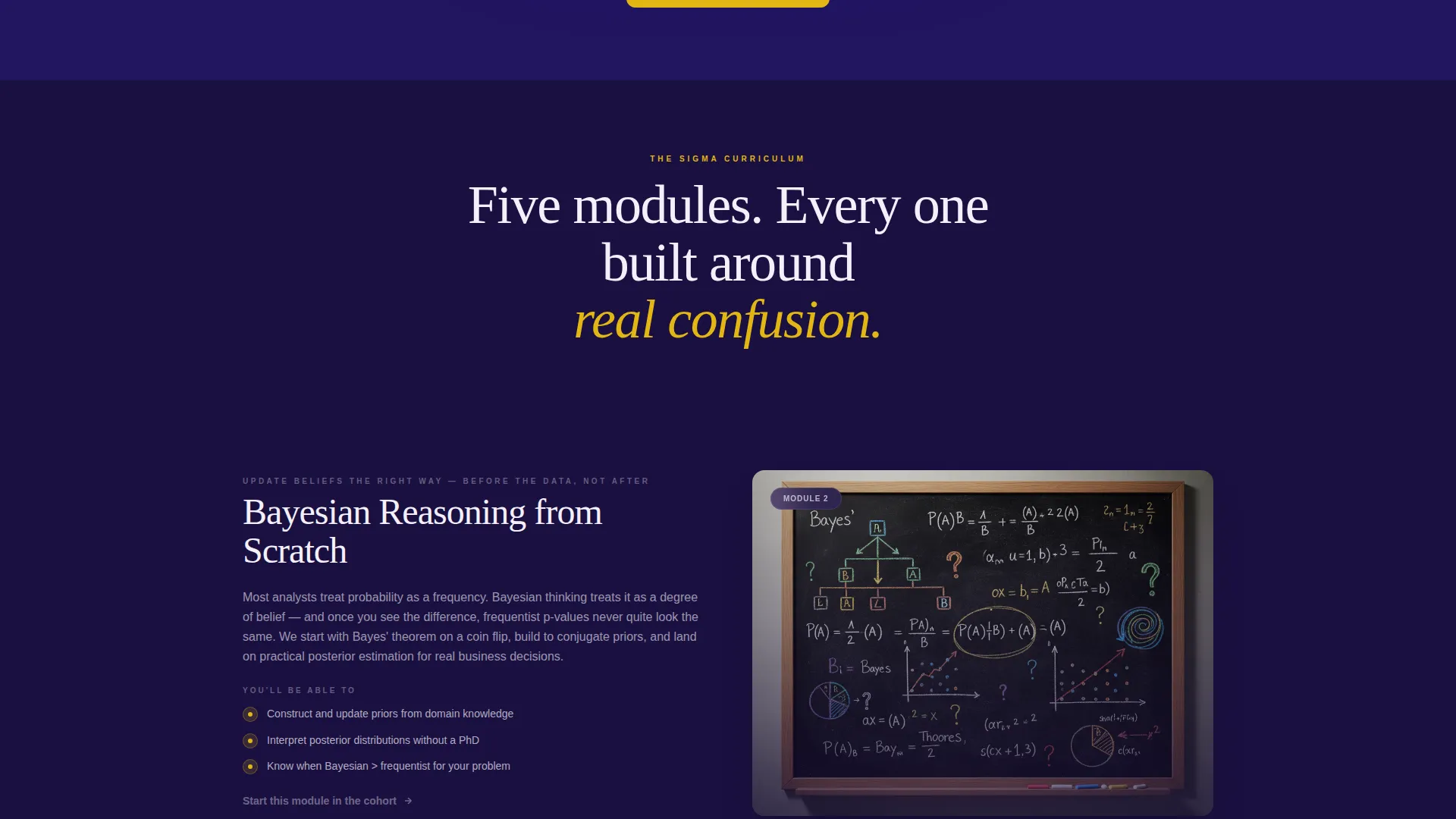
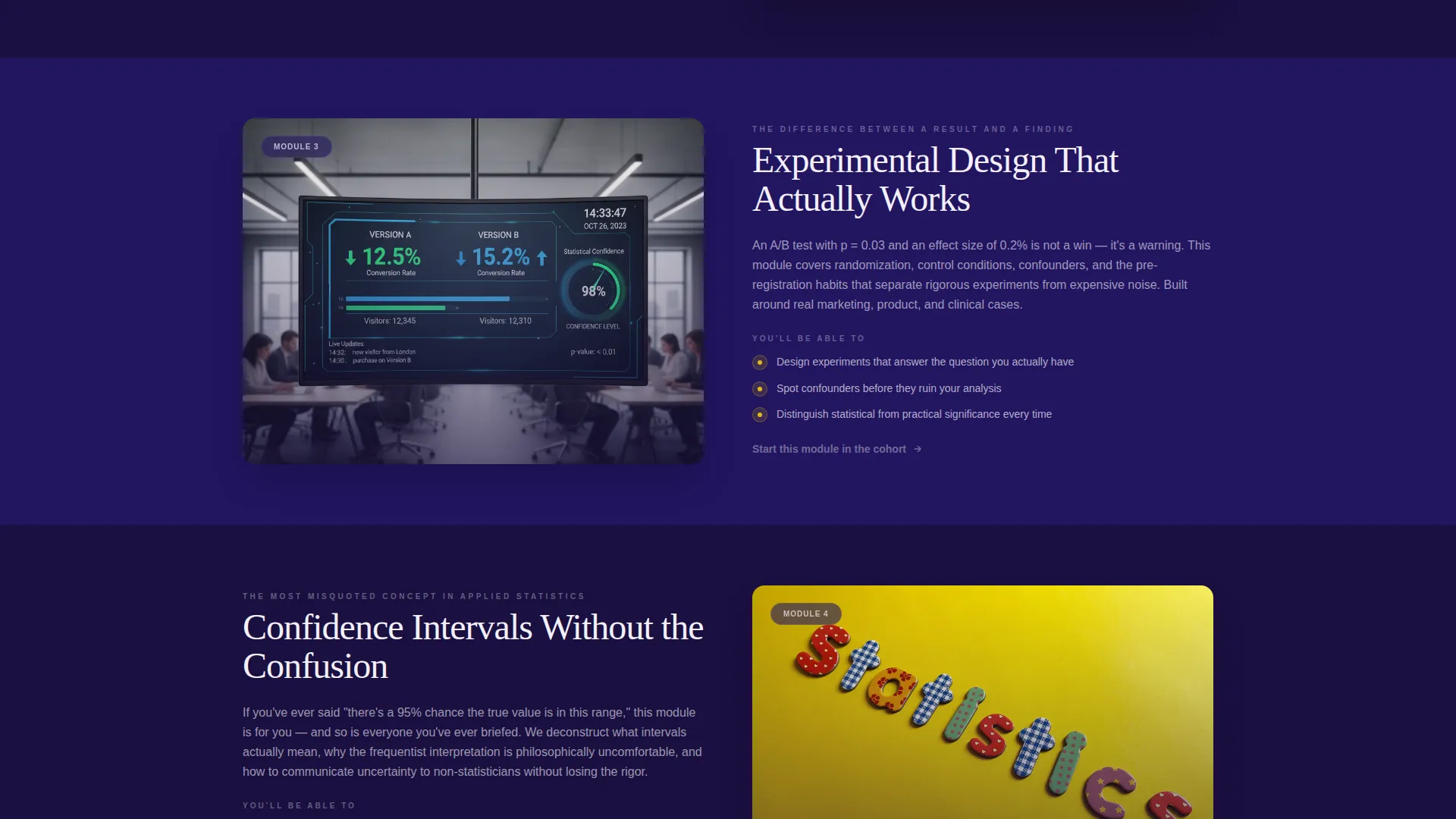
Content panels alternate between left-image/right-text and right-image/left-text layouts. Each block targets a specific knowledge gap, such as Bayesian reasoning or experimental design, making the scroll feel like a live curriculum rather than a static sales page.
Pre-filled Registration Form
The cohort registration form captures name, email, and experience level. The visitor's quiz-identified focus area is pre-filled automatically, reducing friction and reinforcing the sense that the platform already understands what they need.
Sticky Conversion Bar
After the quiz results appear, a sticky bar anchored to a specific upcoming session date stays visible as the visitor scrolls. It keeps the primary call to action, reserving a seat in the live cohort, consistently within reach without interrupting the reading flow.
Secondary Lead Capture Path
Visitors who are not ready to register can download a personalized diagnostic report as a PDF. The download is gated behind a simple email capture, giving the platform a warm lead while giving the visitor something genuinely useful.
Institutional Authority Visual Identity
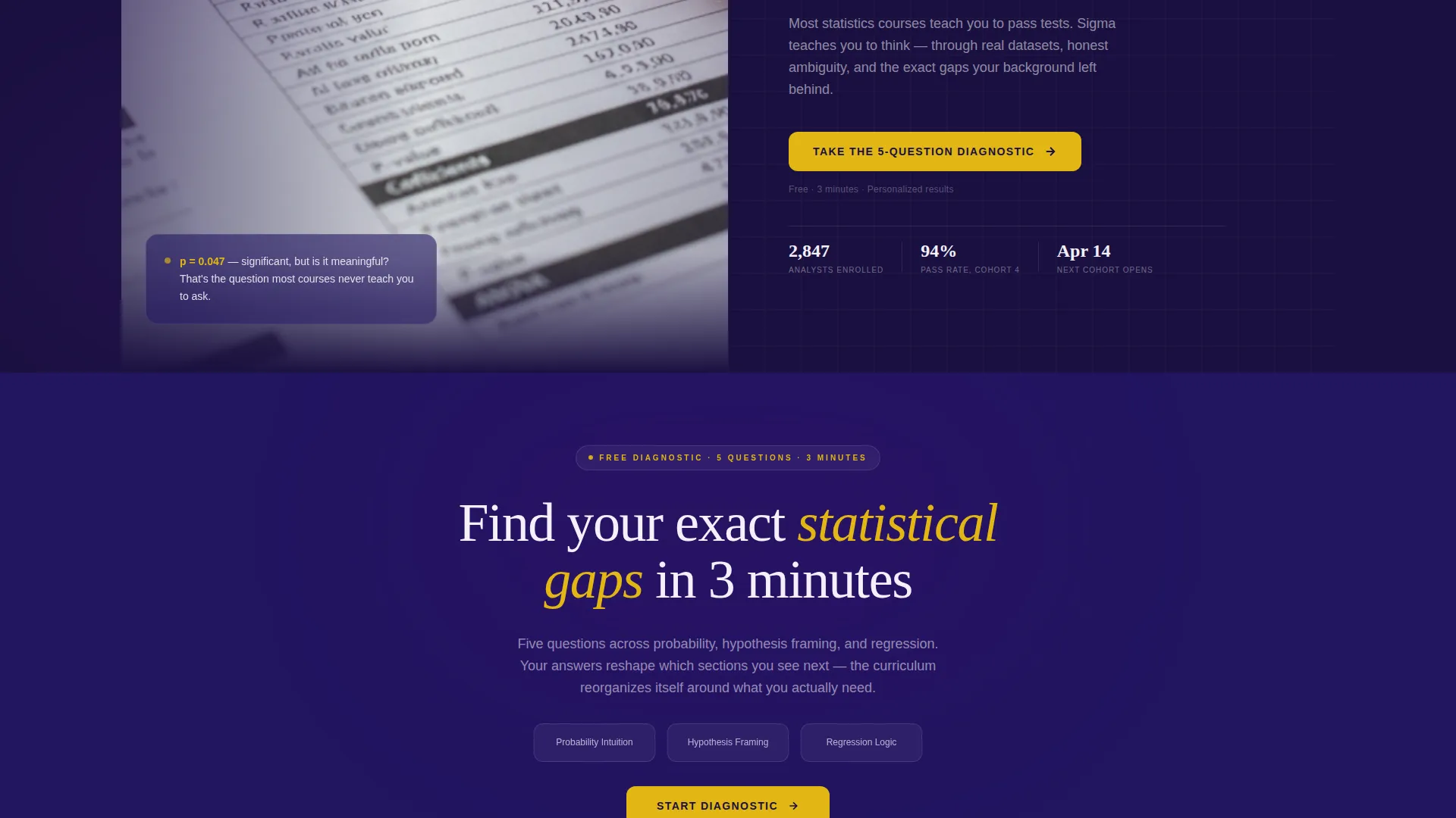
The color system uses deep lecture-hall navy, electric indigo, chalk-dust white for content panels, and a citrine accent on interactive elements and quiz prompts. The header photograph shows a hand annotating a printed regression output with a red pen, setting a tone of serious, engaged scholarship.
Page sections overview
| Section | Purpose |
|---|---|
| Hero Header | Presents the provocative question and quiz entry button in a half-page photo-and-text split |
| Diagnostic Quiz | Captures five rapid answers to assess probability intuition, hypothesis framing, and regression skills |
| Quiz Results Display | Summarizes the visitor's identified gaps and triggers the personalized section layout |
| Bayesian Reasoning Block | Left-image/right-text panel surfaced for visitors who scored weak on prior probability |
| Experimental Design Block | Right-image/left-text panel surfaced for visitors shaky on controls and test structure |
| Cohort Registration Form | Collects name, email, pre-filled focus area, and experience level for live session signup |
| Sticky Cohort Bar | Anchors the primary call to action with the upcoming session date after quiz completion |
| Diagnostic Report Offer | Secondary conversion block offering the personalized PDF download in exchange for email |
Design & branding system
The Sigma template uses an Electric Indigo color system built around the visual metaphor of a university building at night. The palette pairs serious depth with high-contrast energy.
- Deep lecture-hall navy (#1A1040) forms the primary background, electric indigo (#4B0082) anchors formula-forward user interface elements, and chalk-dust white (#F4F0FB) keeps content panels readable
- Citrine (#E2B714) is used exclusively on interactive elements such as quiz prompts and call-to-action buttons, creating a sharp visual signal without disrupting the academic tone
- The header photograph, a hand mid-annotation on a printed regression output with a coffee ring visible at the page edge, establishes credibility and signals that the platform deals with real, messy data work
Mobile & speed optimization
The template is structured for a clean mobile experience. The zigzag layout and quiz flow are both designed to adapt to narrower screens without losing their logic or visual hierarchy.
- Alternating image-and-text columns stack vertically on small screens, keeping each content block self-contained and easy to read in sequence
- The sticky conversion bar is sized to remain visible on mobile viewports without covering key content, maintaining conversion opportunity across device sizes
How this template helps you convert
The entire page is built around a single insight: a visitor who has just received an accurate diagnosis of their own knowledge gaps is far more likely to take the next step.
- The quiz creates a moment of honest self-assessment early in the scroll, which builds trust before any course pitch is made. A visitor who sees their own gaps reflected accurately feels understood rather than sold to.
- The pre-filled registration form and anchored session date reduce the mental effort required to commit. The sticky bar keeps the cohort offer visible so the decision is never more than a glance away.
- The diagnostic report download gives undecided visitors a genuinely useful takeaway. This secondary path captures contact details from people who are interested but not yet ready, keeping them in reach for follow-up outreach.
Other information about this template
The Sigma template is part of a broader set of education-focused landing page templates designed for course platforms with structured cohort-based delivery. A few additional details worth noting before you get started.
- The template style is Zigzag/Alternating, a format well suited to presenting multiple distinct subject areas without the page feeling like a long list
- The header concept follows the Half-Page Photo+Text pattern, giving the visual side editorial weight while keeping the text side sharp and question-led
- The creative direction is Quiz and Personalize, meaning the quiz is not decorative; it is the structural engine the entire scroll depends on
- The primary landing page direction is Event Registration, so the template is optimized around a specific upcoming date rather than a generic evergreen signup
- This template fits naturally within a statistics online course platform context where learner segmentation matters and a one-size-fits-all pitch would underperform

Theme
Institutional Authority
Creative direction
Quiz & Personalize
Color system
Electric Indigo
Style
Zigzag/Alternating
Direction
Event Registration
Page Sections
Diagnostic Quiz Engine
Zigzag Alternating Content Sections
Pre-filled Registration Form
Sticky Cohort Conversion Bar
Secondary Diagnostic Report Download
Institutional Authority Visual Identity
Related questions
Can I adapt the quiz questions to match my specific course curriculum?
What happens to the zigzag sections if a visitor skips the quiz?
Is the diagnostic report download a separate page?
Can this template work for a self-paced course rather than a live cohort?
How does the sticky bar know when to appear?



