Statistics Practice Quiz App Landing Page Template
Sigma is a single-column statistics practice landing page template built for a daily quiz app. It guides visitors through a live ten-question diagnostic before asking for an email, earning trust through immediate value. The botanical color system and warm serif typography create a calm, studious atmosphere that makes probability and hypothesis testing feel approachable rather than stressful.
by Rocket studio
Quick summary
Sigma is a statistics practice and quiz app landing page template. It uses a step-by-step walkthrough layout to show visitors exactly how the app teaches before asking them to sign up. The botanical palette and warm serif typography replace sterile math-tool aesthetics with a calm, studious feel that builds confidence from the first scroll.
Who this template is for
This template is designed for teams and creators building statistics education products. It speaks directly to the audiences those products serve.
- College students preparing for midterms or final exams in introductory statistics courses
- Graduate students brushing up on probability and inference before qualifying exams
- Self-taught data analysts who want to understand the reasoning behind concepts like p-values and hypothesis tests
What problem this template solves
Most statistics tools feel cold and clinical. They present formulas without context, which increases anxiety instead of building confidence. This template reframes the experience from the very first headline.
- Visitors arrive feeling uncertain and leave having already completed a real quiz, which proves the app works
- The hint-first, answer-second structure models the learning loop before any sign-up commitment is required
- The email gate appears only after the visitor sees their personalized score card, removing friction at the moment of highest motivation
What you get with this template
You get a fully structured single-column landing page built around a quiz-first conversion flow. Every section serves a specific role in moving the visitor from curious to committed.
- A giant centered headline and single subline header that sets a confident tone without imagery
- A four-step scrollable walkthrough showing how learning happens inside the app, from question to hint to answer to weekly progress
- An embedded ten-question diagnostic quiz that runs directly on the page, followed by a personalized score card and a post-quiz sign-up form
Feature list
This template is built around purposeful components that work together to earn visitor trust and drive sign-ups.
Giant Headline Hero Section
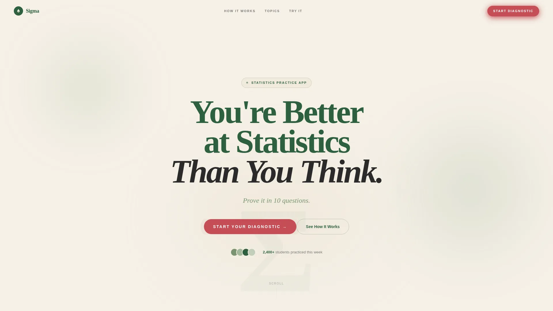
The header presents one bold serif headline centered on a warm parchment background. There are no images, no illustrations, and no dashboard screenshots. The typography alone carries the confidence. A single berry-colored call-to-action button pulses softly beneath the subline, making the next step obvious without pressure.
Four-Step Learning Walkthrough
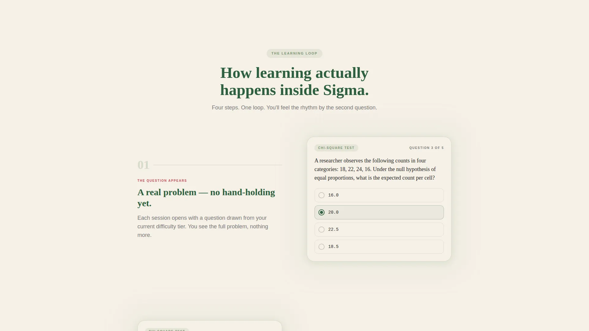
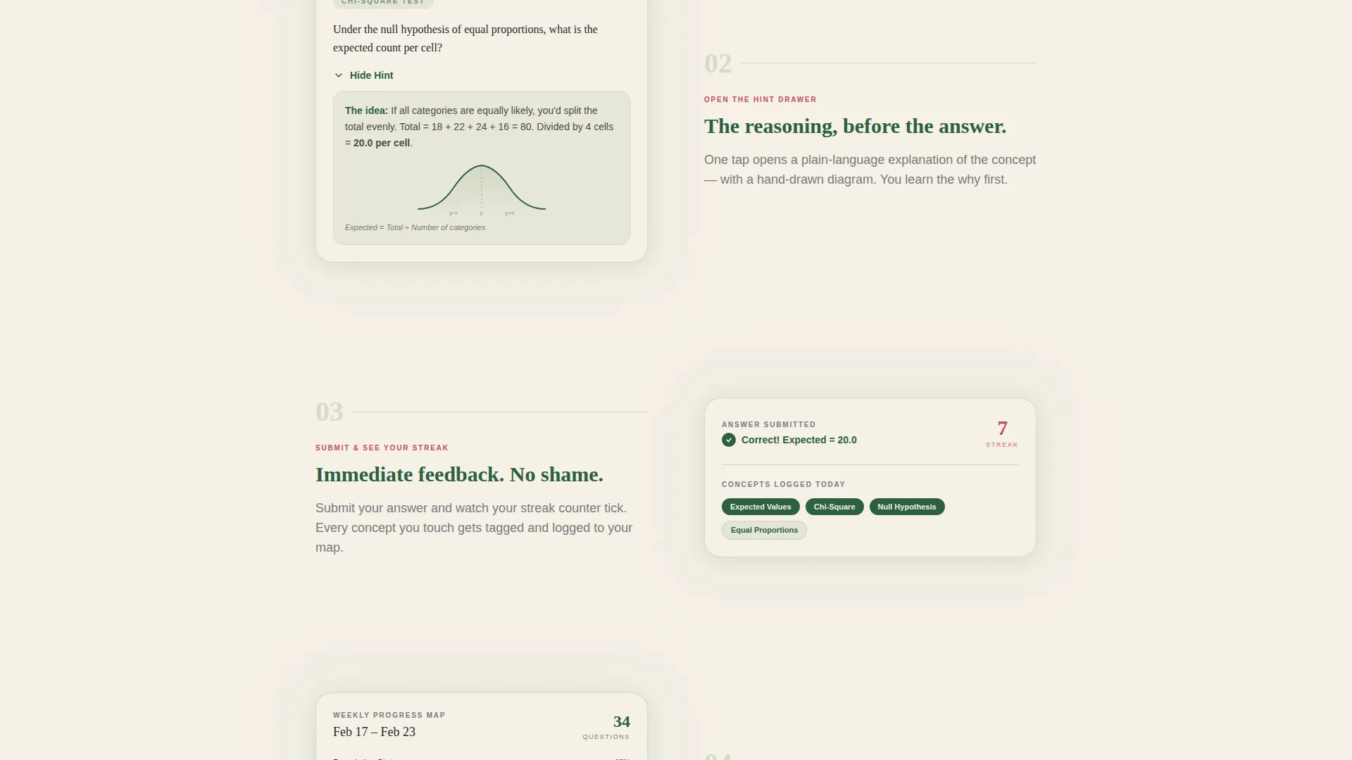
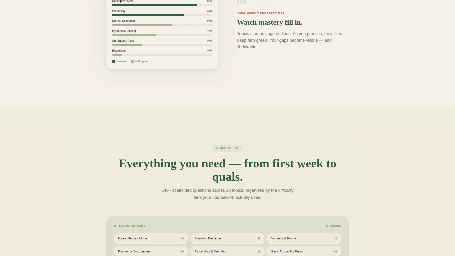
A descending step-by-step guide section walks visitors through the actual learning loop. Step one shows a real sample question with the hint drawer closed. Step two opens the hint drawer to reveal a plain-language explanation alongside a hand-drawn-style bell curve. Step three shows the answer submitted and the streak counter updating. Step four reveals a weekly progress map where mastered topics shift from sage outlines to filled fern green.
Embedded Diagnostic Quiz
The ten-question diagnostic quiz runs directly on the page without redirecting the visitor. Questions cover descriptive statistics, probability, and inference at increasing difficulty. No account is required to start. The visitor experiences the app's scaffolded learning approach before any commitment is asked of them.
Personalized Score Card Display
After quiz submission, the page displays a score card showing the visitor's strength areas and knowledge gaps. This moment of personalized feedback is what makes the subsequent sign-up form feel worthwhile rather than intrusive. The score card is the template's primary trust-building device.
Post-Quiz Sign-Up Form
The sign-up form appears only after the visitor has completed the quiz and reviewed their score card. It collects two fields: email address and current course level, which is described as introductory, intermediate, or advanced. This sequenced placement means the form arrives at the point of highest engagement and relevance.
Botanical Color and Typography System
The template uses a four-color botanical palette applied with clear purpose. Parchment dominates backgrounds, fern green anchors headings, sage fills progress indicators and secondary containers, and berry appears on buttons and error states. Warm serif fonts at chapter-title scale reinforce the studious, encouraging tone throughout.
Page sections overview
| Section | Purpose |
|---|---|
| Hero Headline Header | Sets confident tone, presents primary call-to-action button |
| Step One: Sample Question | Shows a real chi-square question with hint drawer closed |
| Step Two: Hint Drawer Open | Reveals plain-language explanation and bell curve illustration |
| Step Three: Answer Submitted | Demonstrates streak counter update and concept tagging |
| Step Four: Weekly Progress Map | Shows mastered topics filling from sage to fern green |
| Embedded Diagnostic Quiz | Delivers ten questions across descriptive stats and inference |
| Personalized Score Card | Displays strength and gap areas after quiz submission |
| Post-Quiz Sign-Up Form | Collects email and course level at peak engagement |
Design & branding system
The design language is built around the Educational Guide theme and a botanical color system. Every color choice has a specific functional role, and nothing feels arbitrary or decorative for its own sake.
- Warm parchment (#F5F0E6) covers primary backgrounds, fern green (#2D5F3E) anchors headings and navigation, and soft sage (#A3B899) fills progress indicators and secondary containers
- Berry (#C44D56) is reserved for call-to-action buttons, error states, and streak counters, so it only appears where immediate attention is needed
- Warm serif typography is used at chapter-title scale for headings, creating a textbook-in-a-sunlit-room atmosphere rather than a sterile dashboard aesthetic
Mobile & speed optimization
The single-column flow structure adapts naturally to smaller screens. There are no complex grid layouts to restack or wide tables to compress.
- The centered headline and single-button layout scale cleanly from desktop to mobile without restructuring
- The step-by-step walkthrough sections stack vertically by default, meaning the mobile reading experience matches the intended scroll narrative
- The embedded quiz and post-quiz form are built as focused, narrow-width components that work comfortably on touch screens
How this template helps you convert
This template is built around the principle that proof of value must come before the ask. Every structural decision supports that sequence.
- The embedded diagnostic quiz delivers a real learning experience before the sign-up form appears, so visitors arrive at the form already trusting the product
- The personalized score card creates a moment of specific, relevant feedback that makes leaving an email address feel like a natural next step rather than a cold transaction
Other information about this template
This template is a strong fit for statistics education products that need to demonstrate their teaching method, not just describe it. A few additional notes for teams evaluating it.
- The template is categorized under Education and Training, with a specific focus on the statistics education niche
- The quiz-first, form-second conversion structure is well suited to any self-paced learning tool where the product experience is the most persuasive sales argument
- The botanical palette and warm serif typography were chosen to contrast directly with the sterile, anxiety-inducing aesthetic common in math and data tools
- Teams using platforms such as Framer will find the single-column flow and component structure straightforward to customize with their own question sets and brand adjustments
Theme
Educational Guide
Creative direction
Step-by-Step Guide
Color system
Botanical
Style
Single Column Flow
Direction
Quiz/Assessment
Page Sections
Giant Headline Hero Section
Four-step Learning Walkthrough
Embedded Diagnostic Quiz
Personalized Score Card Display
Post-quiz Sign-up Form
Botanical Color and Typography System
Related questions
Does the quiz run on the page or redirect to another site?
What does the sign-up form collect?
Can I adapt this template for a learning product outside of statistics?
What are the four colors in the botanical palette?
Why does the call-to-action button appear twice on the page?



