Advanced Network Monitoring Landing Page Template
Pulse is a split-screen analytics landing page template built for enterprise telco and network operations teams. The left panel hosts a live ROI calculator with subscriber sliders and feature toggles. The right panel renders an animated dashboard preview. The full page escalates from anomaly detection to churn intervention, guiding VP-level buyers toward a single demo-booking call to action.
by Rocket studio
Quick summary
Pulse is a single-page, calculator-first landing page template designed for AI-powered network intelligence platforms. It opens with a 50/50 split-screen hero: an interactive ROI estimator on the left and an animated dashboard preview on the right. Scroll sections deepen the proof with case study tables and accuracy charts, building toward one clear call to action: book a demo.
Who this template is for
This template is built for B2B SaaS teams selling complex analytics products to technical enterprise buyers. It works best when your product promises measurable, data driven decisions and your buyers need to see projected ROI before they commit to a conversation.
- VP-level network operations leaders at regional carriers who need hard cost and mean time to repair (MTTR) justification
- Infrastructure directors at mobile virtual network operators (MVNOs) scaling past their first million subscribers
- CTO offices at legacy telcos looking for AI powered insights that replace unreliable legacy dashboards
What problem this template solves
Enterprise analytics buyers do not convert on vague claims. They need to see numbers tied to their own scale before they trust a product enough to book a meeting. Most landing pages show static screenshots and hope visitors connect the dots. Pulse flips that model.
- Visitors arrive and immediately interact with a calculator that uses their own subscriber count and network settings, giving them instant insights specific to their situation
- The scroll journey replaces generic copy with escalating proof: anomaly detection, then capacity planning, then churn intervention
- There are no form fields on this page, which removes friction and lets the calculator pre-qualify intent before routing to the demo flow
What you get with this template
You get a fully structured, single-page layout built around an interactive estimator and a scroll-driven proof stack. Every section is designed to reduce the time it takes a visitor to gain valuable insights about the product's potential impact on their business.
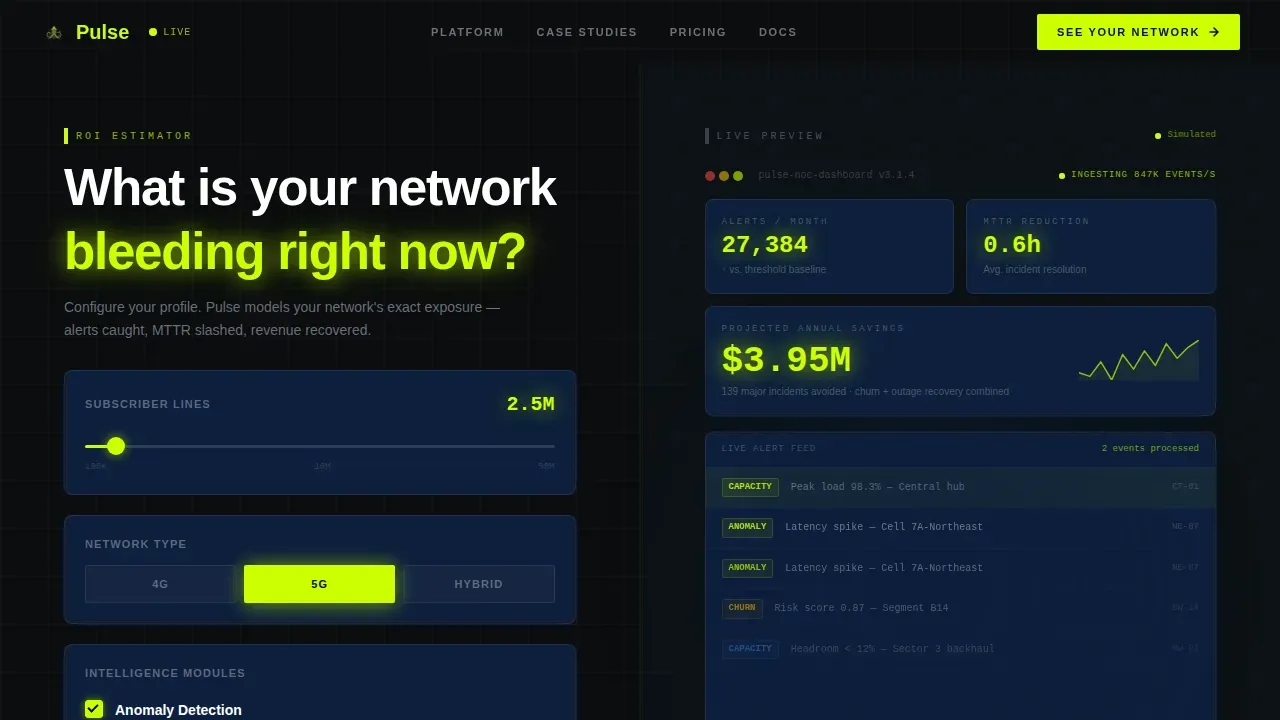
- A 50/50 split-screen hero with a live subscriber slider (100K to 50M), network type toggles (4G, 5G, hybrid), and feature checkboxes for churn prediction, anomaly detection, and capacity forecasting
- An animated right-panel dashboard preview that responds to calculator inputs and displays projected alerts caught per month, estimated MTTR reduction, and an animated annual savings figure
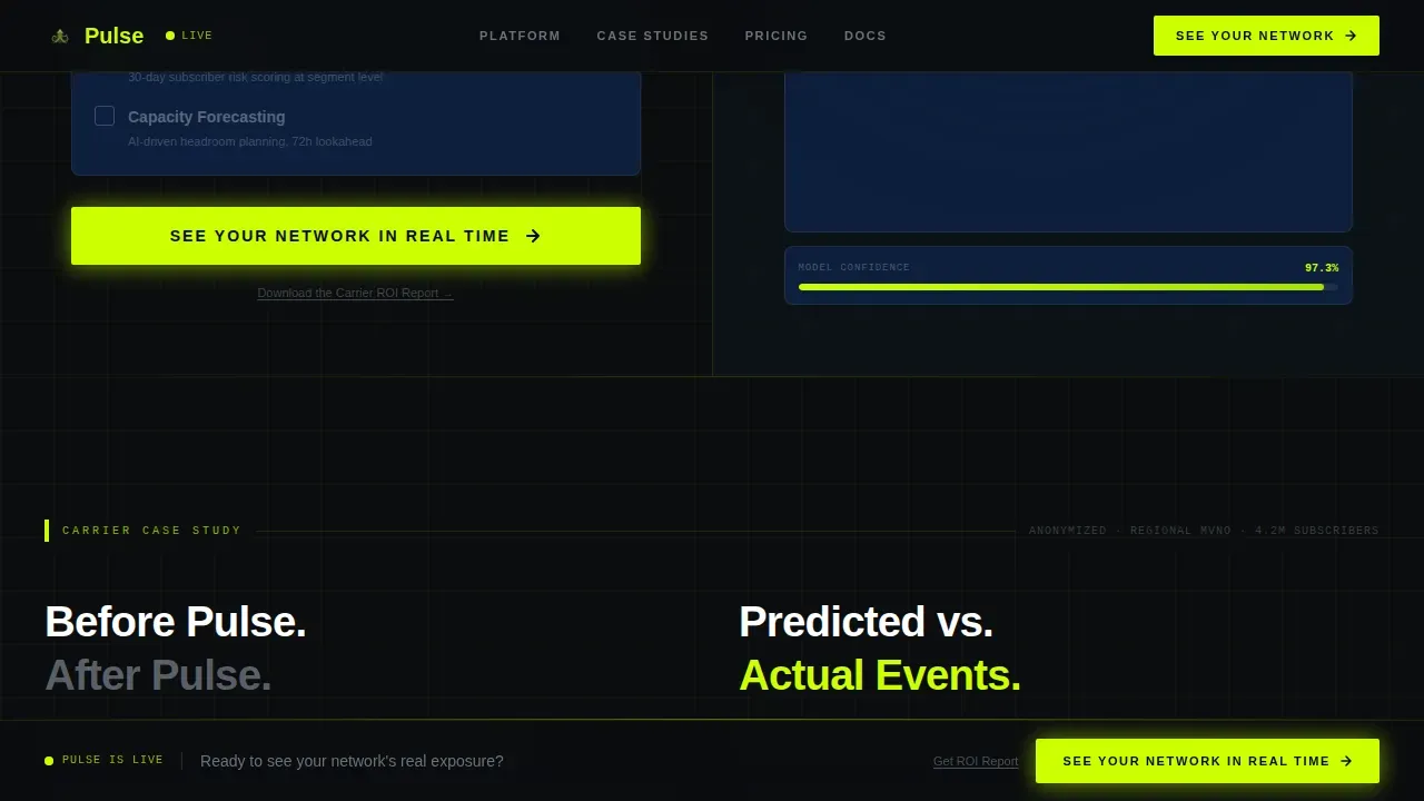
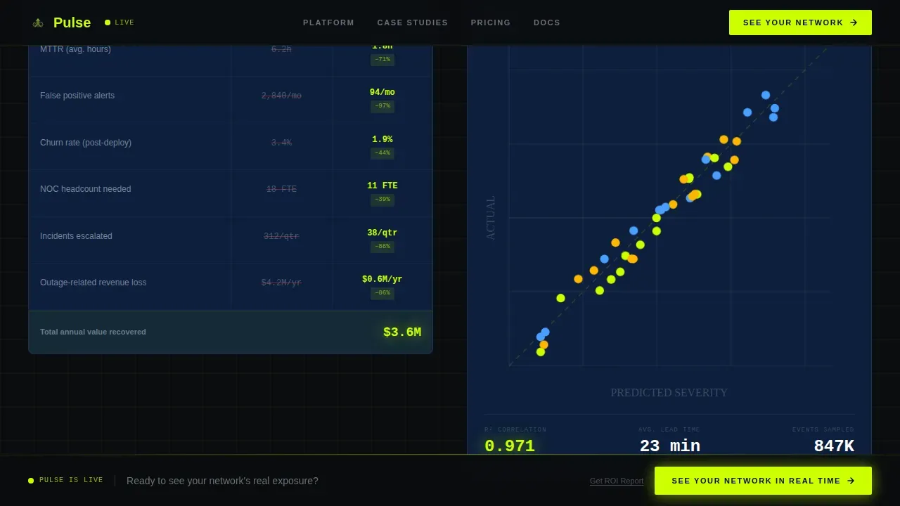
- Three escalating scroll segments with a carrier case study section, a before/after key performance indicator (KPI) table, an AI prediction accuracy chart, and a persistent call-to-action bar
Feature list
This template includes purpose-built components designed to generate trust and move enterprise visitors toward a single conversion goal.
Interactive ROI Calculator Panel
The left hero panel contains a live slider, toggle switches, and checkboxes. Users set their subscriber count, select network type, and choose the features they care about. The right panel updates instantly, displaying simulated key metrics including alerts caught, MTTR reduction, and projected savings. This interaction gives visitors real time insights tied to their own inputs before they read a single word of copy.
Animated Dashboard Preview
The right panel renders a simulated dashboard that reacts to calculator settings. Numbers tick upward as inputs change. This approach lets visitors explore what the platform surface looks like with their own data inputs, making the product tangible without requiring a login. It showcases live data processing in a way that static screenshots cannot, helping users gain valuable insights into what the platform can do for them.
Escalating Proof Stack Sections
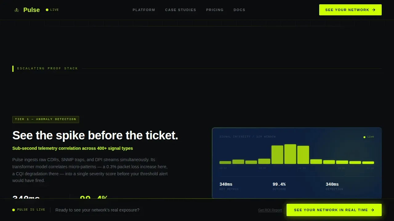
Below the fold, the layout continues the left-right split across three scroll segments. Each segment raises the complexity of the problem addressed: from simple anomaly detection, to predictive capacity planning, to AI-driven churn intervention. The structure helps visitors identify trends in the argument and follow the logical escalation toward the conclusion that the product is the right fit.
Carrier Case Study with KPI Table
One scroll segment presents an anonymized carrier case study with a before/after KPI table on the left and an AI prediction accuracy chart on the right. This section provides deeper insights into real-world impact, giving technical buyers the verifiable proof they need to build internal business cases and make informed decisions.
Persistent Call-to-Action Bar
After the first scroll, a fixed bottom bar stays visible throughout the rest of the page. It carries the primary call to action alongside a secondary text link for the carrier ROI report. This design keeps the conversion path visible at all times, ensuring visitors can act on their intent the moment they feel ready, for maximum impact.
Footer Pattern
The footer uses a minimal single-row layout styled after developer-oriented design patterns. It keeps the bottom of the page clean and distraction-free, so the page ends on the call to action rather than on navigation clutter.
Page sections overview
| Section | Purpose |
|---|---|
| Split-Screen Hero | ROI calculator left, animated dashboard right |
| Calculator Results Panel | Displays projected alerts, MTTR reduction, savings |
| Carrier Case Study | Before/after KPI table with real carrier data |
| Prediction Accuracy Chart | AI accuracy plotted against actual network events |
| Anomaly Detection Segment | First escalating proof: network fault detection |
| Capacity Planning Segment | Second escalating proof: predictive infrastructure scaling |
| Churn Intervention Segment | Third escalating proof: AI-driven subscriber retention |
| Persistent call to action Bar | Fixed bottom bar with primary and secondary actions |
| Minimal Footer | Single-row developer-style footer |
Design & branding system
The visual identity runs on a terminal aesthetic that feels like a Bloomberg trading screen rebuilt for a high-stakes network operations center. Every color and type choice serves signal clarity over decoration.
- Color palette: void black (#0B0D0F) as the primary canvas, electric chartreuse (#CCFF00) for all call-to-action elements and data highlights, deep terminal blue (#0D1F3C) for card surfaces and containers, and cool phosphor gray (#A8B2C1) for body text and axis labels
- Typography: DM Sans in bold weights for data labels and headlines, monospace for all number outputs inside the calculator and dashboard preview; this pairing keeps the interface user friendly while preserving a technical, high-density feel
- Animation approach: ticker animations on savings figures, scroll-linked section reveals, and cursor-reactive glow effects on the calculator panel create a high-interactivity experience that reflects the real time nature of the product being sold
Mobile & speed optimization
The template is designed desktop-first to match the NOC and enterprise audience who review analytics products on large monitors. The layout remains fully responsive for mobile visitors.
- The split-screen hero collapses to a stacked single-column layout on smaller screens, placing the calculator above the dashboard preview so the interactive element stays the first thing users engage with
- Scroll-linked animations and ticker effects are implemented using client-side components only where interactivity is required, while static sections use server-rendered components to keep the page loading quickly
- The persistent call to action bar adapts to mobile viewports, staying visible and tappable without obscuring the content beneath it
How this template helps you convert
Pulse is structured around a click-through conversion model. Every design decision funnels toward one outcome: getting a qualified visitor to book a demo.
- The calculator pre-qualifies intent by capturing subscriber scale, network type, and feature priorities before the visitor scrolls. By the time they see the primary call to action inside the results panel, they have already invested in the experience and hold personalized insights about projected savings and MTTR reduction.
- The escalating proof stack below the fold deepens commitment with each scroll segment. Visitors who were ready to act at the hero can click immediately. Visitors who need more evidence encounter the case study, the accuracy chart, and the churn intervention segment, each one raising their confidence that the platform can deliver on the promise. The persistent bottom bar tracks with them the entire way, so no moment of readiness goes uncaptured.
Other information about this template
This template is built to support teams that operate within analytics ecosystems where a structured metrics layer and governed data sources are essential for enterprise credibility. The following points cover additional context that buyers exploring this template may find useful.
- Tableau Pulse delivers real time, personalized insights directly to users where they work, and this template's dashboard preview section is designed to visually communicate that same flow-of-work intelligence philosophy to prospective buyers
- Tableau Pulse offers a user friendly interface that allows teams to create and manage specific metrics for their business needs; teams evaluating this template to promote a similar product will find the proof stack structure a natural fit for communicating that value
- To deploy Tableau Pulse within an organization, administrators visit the settings page for their site; the site setting to deploy Tableau Pulse is off by default, and a combination of settings and permissions control access to Tableau Pulse and its features
- Users must have a site role of Creator, Site Administrator Explorer, or Explorer (can publish) to create, edit, or delete metric definitions; governance for Tableau Pulse involves deciding who can define new metrics and who approves them, ensuring all insights are built on approved, reliable key performance indicators
- Tableau Cloud hosts the metrics layer that Tableau Pulse surfaces; metrics in Tableau Pulse are not part of the project content hierarchy in Tableau Cloud, and access to view a metric requires appropriate permissions on the connected data source
- The data that users see when viewing a metric respects row-level security applied to the data source; by adjusting permissions on a published data source, administrators can control whether users can view metrics based on that data source
- Tableau Pulse allows users to follow metrics and receive regular digests by email or in Slack; slack digests and email digests keep the entire organization aligned on the same up to date data without requiring everyone to log into a dashboard
- Tableau Pulse ensures that all roles are looking at the same definitions of metrics, which greatly reduces debates over whose numbers are correct; this single source of truth is a key differentiator for enterprise buyers
- Users can provide feedback on insights in Tableau Pulse to further personalize their experience; users can also mute specific metrics in their feed if those become less relevant to their current business goals
- Tableau Pulse uses generative AI to analyze data and produce easy-to-read explanations for the metrics it monitors, helping a data analyst and non-technical users alike gain valuable insights without deep technical training
- The Tableau Pulse interface supports a conversational interface that allows users to pose natural language questions to their data directly within the platform, making deeper analysis accessible to users across all roles including an account executive who needs to track revenue trends without SQL knowledge
- Tableau administrators can help users get the most from Tableau Pulse by checking that the data required for metrics is available and turning on optional features in the settings panel
- This template's design approach aligns with best practices for high-converting analytics landing pages: a benefit-first headline, a single prominent call to action at multiple points, structured card layouts for data presentation, and high-contrast visual hierarchy to highlight critical KPIs
Theme
Startup Velocity
Creative direction
Calculator/Tool First
Color system
Acid Digital
Style
Split Screen (50/50)
Direction
Click-Through
Page Sections
Live ROI Calculator with Subscriber Slider
Animated Dashboard Preview Panel
Carrier Case Study and KPI Table Section
Escalating Three-part Proof Stack
Persistent Bottom Call-to-action Bar
Related questions
Who is this landing page template designed for?
Does this template include actual live data or real network connections?
Can I adapt the calculator inputs for a different industry or use case?
What conversion model does this template follow?
How does the scroll structure support visitors who need more evidence before converting?



