Signal - Carrier-Grade Telecom Landing Page Template
Signal is a telecom-focused social media template library built for carrier marketing teams who need professional, on-brand posts fast. It includes ready-to-customize designs for tower rollouts, coverage map carousels, outage status threads, and 5G launch countdowns. The landing page uses a comparison table and glass-morphism design to show exactly why Signal outperforms generic alternatives.
by Rocket studio
Quick summary
Signal is a carrier-grade social media template library for telecom marketing teams. It delivers ready-to-brand post designs for tower rollouts, outage alerts, coverage carousels, and 5G countdowns. The landing page is a single-page comparison-table experience built to generate leads from regional carriers, mobile virtual network operators, and enterprise telecom PR teams.
Who this template is for
This template is built for telecom marketing professionals who move fast and need polished content without starting from scratch every time.
- Regional carrier marketing coordinators managing multiple social platforms under tight daily deadlines
- Mobile virtual network operators (MVNOs) that need big-carrier polish on a lean budget
- Enterprise telecom PR and communications teams who need an outage response post live before a hashtag trends
What problem this template solves
Telecom content teams face a painful gap. Generic design tools were not built for carrier workflows, and hiring freelancers or briefing in-house designers takes time that outage windows and launch countdowns simply do not allow.
- There are no telecom-specific post layouts in generic tools, so teams waste hours adapting formats that were never built for network communications
- Outage response content needs to be approved and published within minutes, not hours
- Smaller carriers and MVNOs lack the design resources of major operators, but their audiences expect the same visual quality
What you get with this template
The Signal landing page is a complete, single-page lead generation experience. Every section is crafted to move a telecom marketing visitor from first impression to form submission.
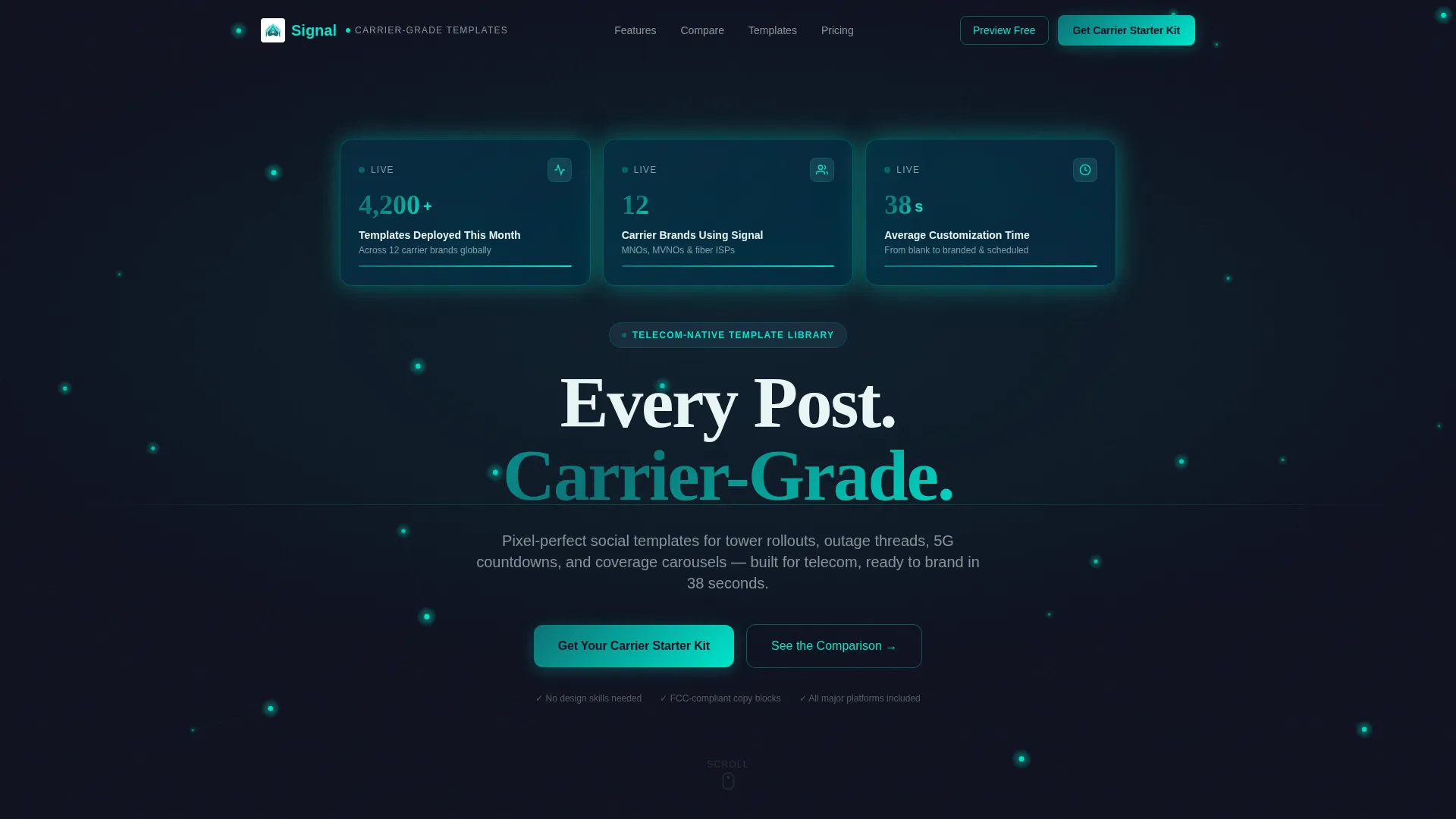
- A stats-driven hero header with three glass-morphism metric cards showing deployment volume, active carrier brands, and average customization time
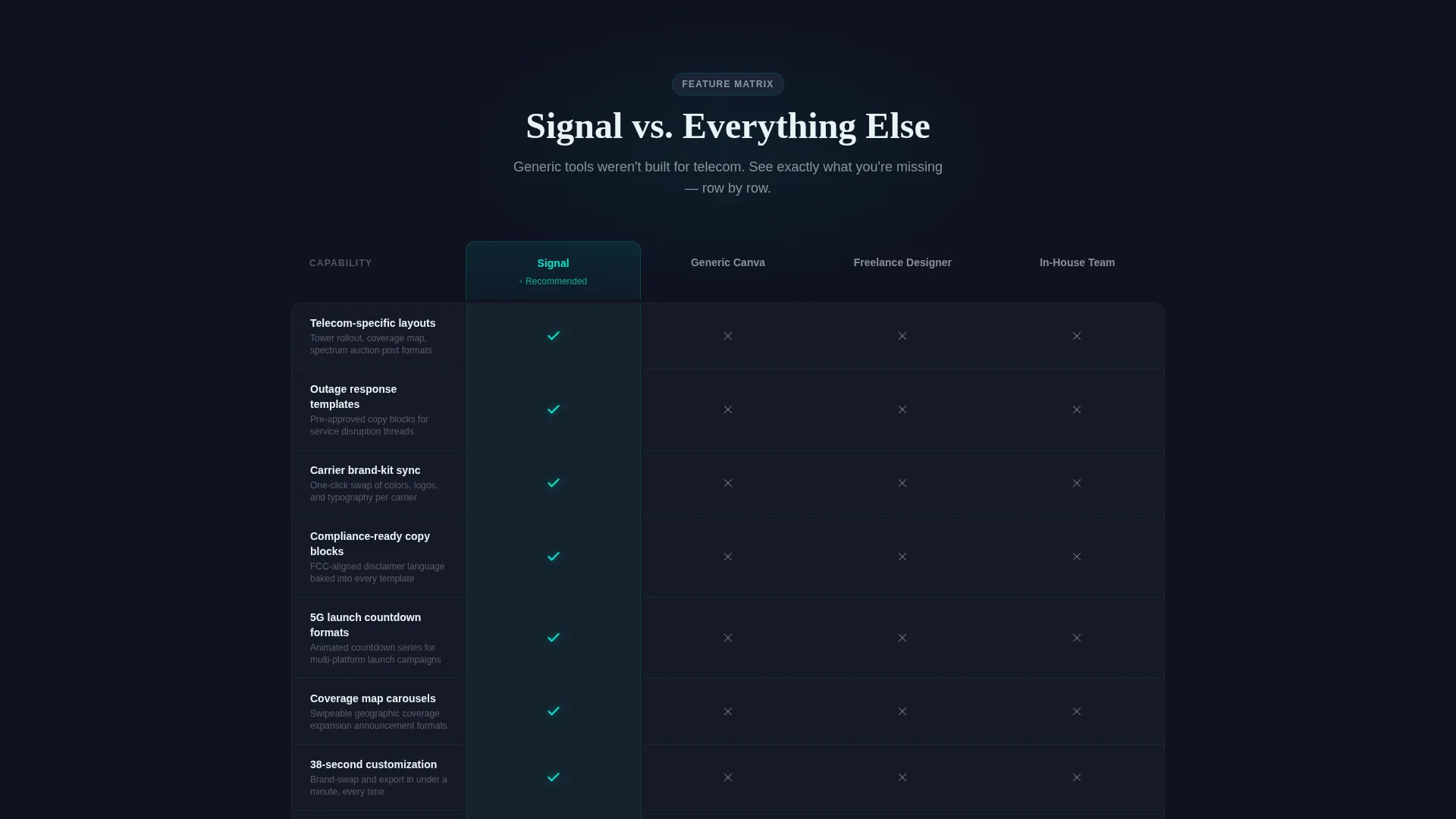
- A structured comparison table that measures Signal against generic tools, freelance designers, and in-house design teams across rows covering telecom layouts, outage response, brand-kit sync, and compliance-ready copy blocks
- Two conversion paths: a two-step carrier starter kit form and an email-only free template preview gate for lower-intent visitors
Feature list
This section outlines the core capabilities built into the Signal landing page template.
Stats Dashboard Hero Header
The header opens with three floating glass-morphism metric cards displayed over a dark, animated network topology background. Each card highlights a key trust signal: templates deployed, active carrier brands, and average customization time. Numbers render in oversized cyan with a count-up animation that draws the eye immediately.
Structured Comparison Table
The Feature Matrix is the page's central persuasion engine. It compares Signal directly against generic design platforms, freelancers, and in-house teams across capability rows. Teal checkmarks light up against grayed-out indicators for competing options, making the value gap instantly readable.
Expandable Glass Feature Cards
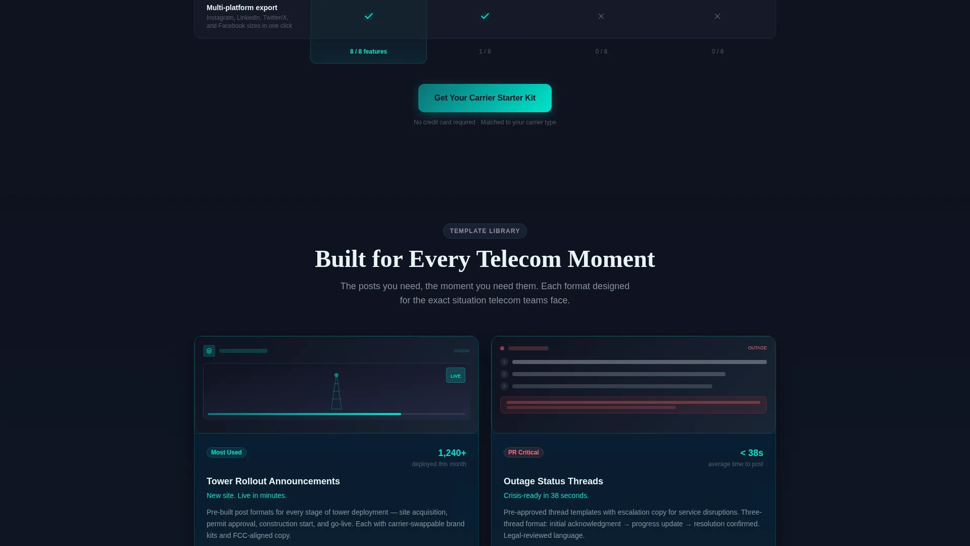
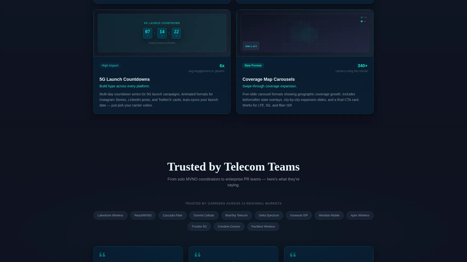
Below the comparison table, each winning capability row expands into its own glass card. Each card includes a live template preview so visitors see real proof alongside the claim. This keeps the scroll purposeful and builds confidence incrementally.
Two-Step Lead Capture Form
The primary call to action, "Get Your Carrier Starter Kit," appears in the sticky navigation bar and again after the comparison table. Step one collects company name, role, and carrier type. Step two asks an optional question about posting volume and content bottlenecks, giving the team useful qualification data.
Email-Gated Free Preview Path
A secondary conversion path lets lower-intent visitors access ten free template previews by submitting only their email address. This lowers the barrier for prospects who are not yet ready to complete the full form, keeping them engaged in the funnel.
Tech Glass Visual System
The entire page uses a glass-morphism aesthetic with frosted panel surfaces, translucent card layers, and teal-and-cyan interactive states. The visual language feels like a network operations center interface, which aligns directly with the telecom audience's professional context.
Page sections overview
| Section | Purpose |
|---|---|
| Stats Hero Header | Opens with metric cards and animated network topology to build instant trust |
| Comparison Feature Matrix | Positions Signal against alternatives across telecom-specific capability rows |
| Expanded Glass Cards | Backs up each comparison claim with a live template preview per feature |
| Primary call to action Block | Repeats the Carrier Starter Kit call to action after the comparison table |
| Two-Step Capture Form | Qualifies leads by role, carrier type, and content challenge in two steps |
| Free Preview Gate | Offers email-only access to ten templates for lower-commitment visitors |
| Sticky Navigation Bar | Keeps the primary call to action accessible throughout the entire scroll experience |
Design & branding system
The Signal landing page runs on the Teal Catalyst color system, a palette engineered to feel like fiber-optic infrastructure under lab light. Every surface, interaction state, and data point reinforces the carrier-grade positioning.
- Core palette: deep fiber-optic teal (#0D7377) as the primary brand anchor, dark charcoal (#1A1E2E) for backgrounds, signal-pulse cyan (#00E5CC) for hover states and active indicators, and frosted panel white (#E8F4F5) for card surfaces and table rows
- Glass-morphism layers create translucent, frosted panel cards that float over the dark background, giving every content block a sense of depth and precision
- Interactive elements glow like status LEDs on a live network dashboard, reinforcing the operational, always-on identity of the telecom niche
Mobile & speed optimization
The landing page is structured for clean rendering across screen sizes. The glass-morphism card system and comparison table are designed to remain readable and functional on smaller viewports without losing visual impact.
- The sticky navigation bar with the primary call to action stays accessible at every scroll depth, on both desktop and mobile
- The comparison table layout adapts so that capability rows remain scannable without requiring horizontal scrolling on narrow screens
- Glass card previews and metric animations are contained within the page structure to keep the experience smooth on touch devices
How this template helps you convert
Signal's landing page is built around a single principle: let the comparison do the persuading before the form ever appears.
- The stats hero earns trust immediately by showing real deployment metrics in oversized, animated figures before the visitor even reads the headline
- The Feature Matrix forces a direct side-by-side comparison, making gaps between Signal and generic alternatives impossible to overlook
- The dual conversion paths capture both high-intent visitors ready to request a starter kit and lower-intent visitors willing to share only an email, so no realistic lead leaves the page empty-handed
Other information about this template
This section covers additional context that helps potential users understand the full scope of the Signal template and its intended use case.
- Signal is specifically scoped for telecommunications social media content, covering post types like Mobile Network Operator (MNO) announcements, MVNO campaign posts, fiber internet service provider updates, and enterprise PR communications
- The template library concept means users are not buying a single post design; they are getting a categorized set of ready-to-brand layouts organized by telecom use case
- The two-step form includes a role dropdown with options for social media manager, marketing director, PR and communications, and agency, making it useful for teams of different sizes and structures
- The free preview path is intentionally low-friction: email only, no company details required, designed to bring hesitant visitors back into the funnel after they experience the template quality firsthand
- The page is delivered as a single landing page with no multi-page navigation, keeping the visitor's attention focused on the comparison and the offer throughout
Theme
Tech Glass
Creative direction
Feature Matrix
Color system
Teal Catalyst
Style
Comparison Table
Direction
Lead Generation
Page Sections
Stats Dashboard Hero Header
Telecom Comparison Table
Expandable Glass Feature Cards
Two-step Lead Capture Form
Email-gated Free Template Preview
Sticky Navigation Call to Action
Related questions
Who is Signal designed for?
What types of social media post templates are included?
How does the two-step lead capture form work?
Can visitors access templates without completing the full form?
Is Signal a single landing page or a multi-page website?



