Developer Documentation Reviews Website Template
Signal is a card grid landing page template built for Angular community forums. It combines a Dashboard Pro aesthetic with a Glassmorphic color system to create a dark, high-contrast interface that feels alive. From an interactive header preview to scroll-triggered stat counters and a frictionless GitHub OAuth signup flow, Signal is designed to launch a developer community fast.
by Rocket studio
Quick summary
Signal is a single-page Angular community forum landing page template. It uses a modular card grid layout, a deep void black and frosted glass visual system, and a freemium conversion model. The design mimics a live monitoring dashboard, making the community itself feel active and worth joining the moment a visitor arrives.
Who this template is for
This template is built for teams and individuals who want to launch a credible Angular developer community without building a custom design from scratch. It speaks directly to the people who would actually populate the forum.
- Angular developers, open-source maintainers, and community managers launching a niche technical forum
- Frontend engineers who want a polished, developer-first landing page that mirrors the tools they use daily
- Indie builders and organizations promoting a freemium membership model to a technical audience
What problem this template solves
Generic community landing pages fail to earn trust from senior developers. A page that looks like a marketing brochure pushes technical audiences away before they read the first paragraph. Signal closes that gap.
- It removes the visual mismatch between "developer product" and "generic SaaS page" by adopting a dashboard-native design language
- It handles conversion friction by leading with live community signals rather than abstract feature lists
- It presents a clear free-versus-pro tier split so visitors understand the offer without a sales conversation
What you get with this template
You get a fully structured, single-page landing page with every major section pre-built and ready to customize. The layout follows a deliberate scroll sequence that builds urgency from the first viewport to the final call to action.
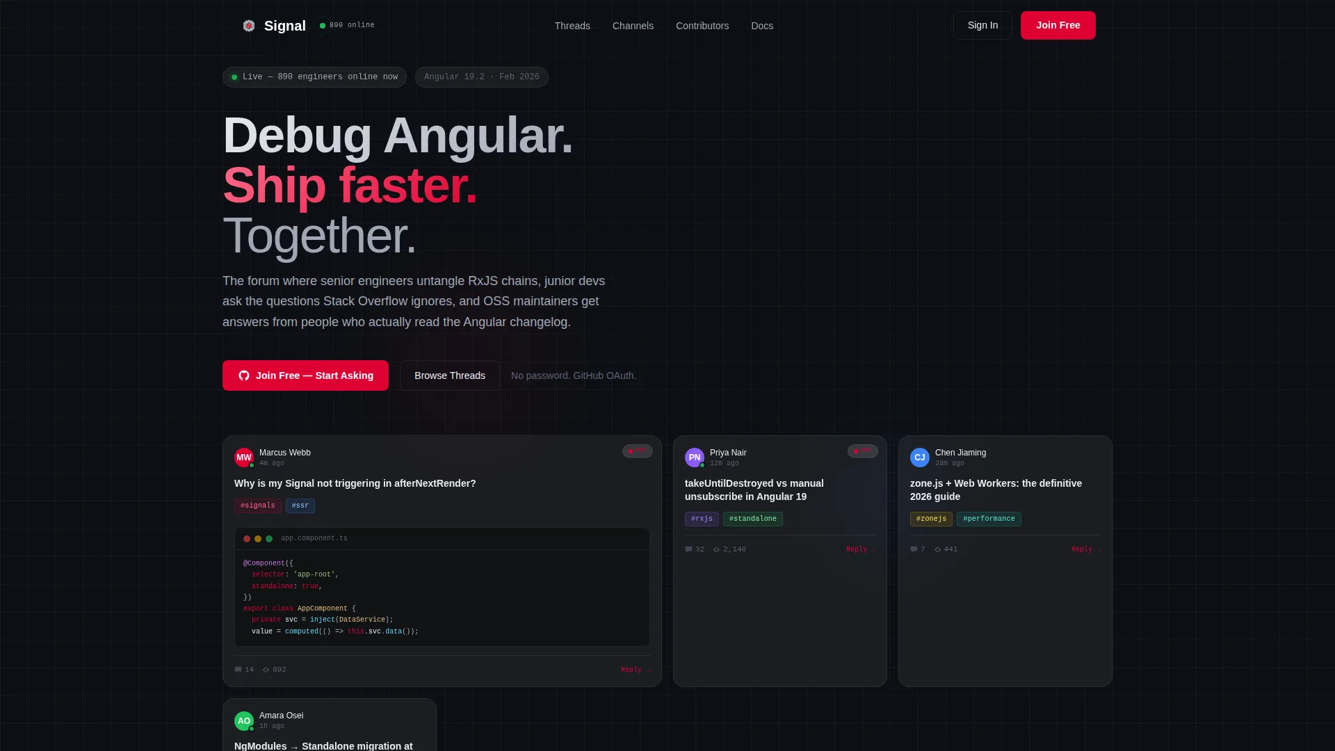
- An interactive header that renders a live-looking forum card grid with hover effects, thread titles, reply counts, and tag pills
- Scroll-animated community stat modules, a trending threads section, a contributor spotlight grid, and a pinned frosted navigation bar with primary and secondary calls to action
- A minimal signup form asking only for a GitHub handle and email, with OAuth authentication reducing signup to a single click
Feature list
This section covers the core built-in capabilities included in the Signal template.
Interactive Forum Header Preview
The header renders a functioning micro-replica of the forum interface directly in the viewport. Glassmorphic cards display live-looking thread titles, real-time reply count indicators, contributor avatars with green online-status dots, and tag pills such as #rxjs, #signals, and #ssr. One card is shown mid-expansion with a syntax-highlighted code snippet and a glowing cursor, making the product demo feel indistinguishable from the real interface.
Scroll-Triggered Stat Counters
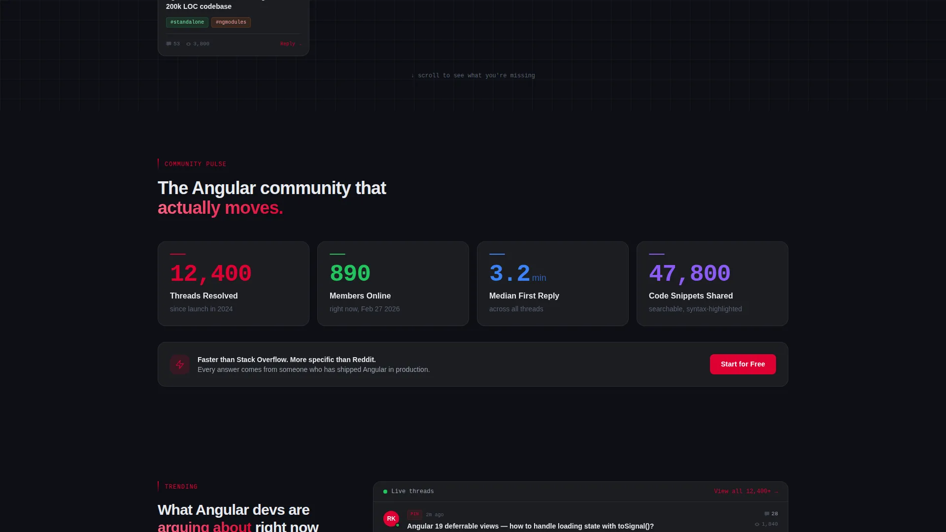
Three community health metrics animate on scroll: 12,400 threads resolved, 890 members online, and a 3.2-minute median first reply time. Counters roll up from zero as each module enters the viewport. This creates an immediate sense of an active, responsive community before a visitor reads a single line of descriptive copy.
Trending Threads Section
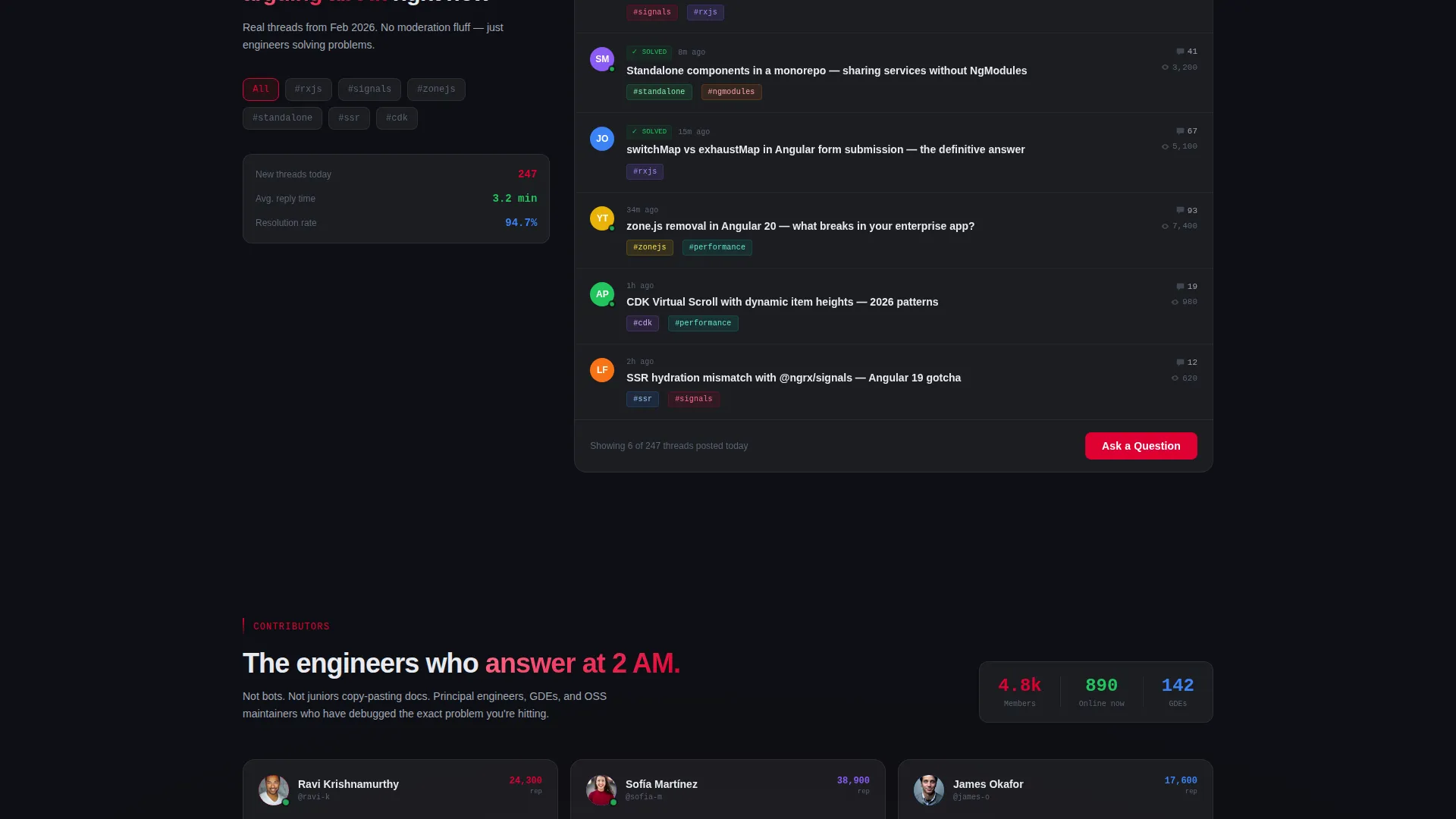
A dedicated section surfaces trending thread titles drawn from current Angular discourse, including topics relevant to Angular 19. Each thread entry reinforces topical relevance and shows visitors the kind of conversations they would actually join. The section adds social proof through specificity rather than vague activity claims.
Contributor Spotlight Grid
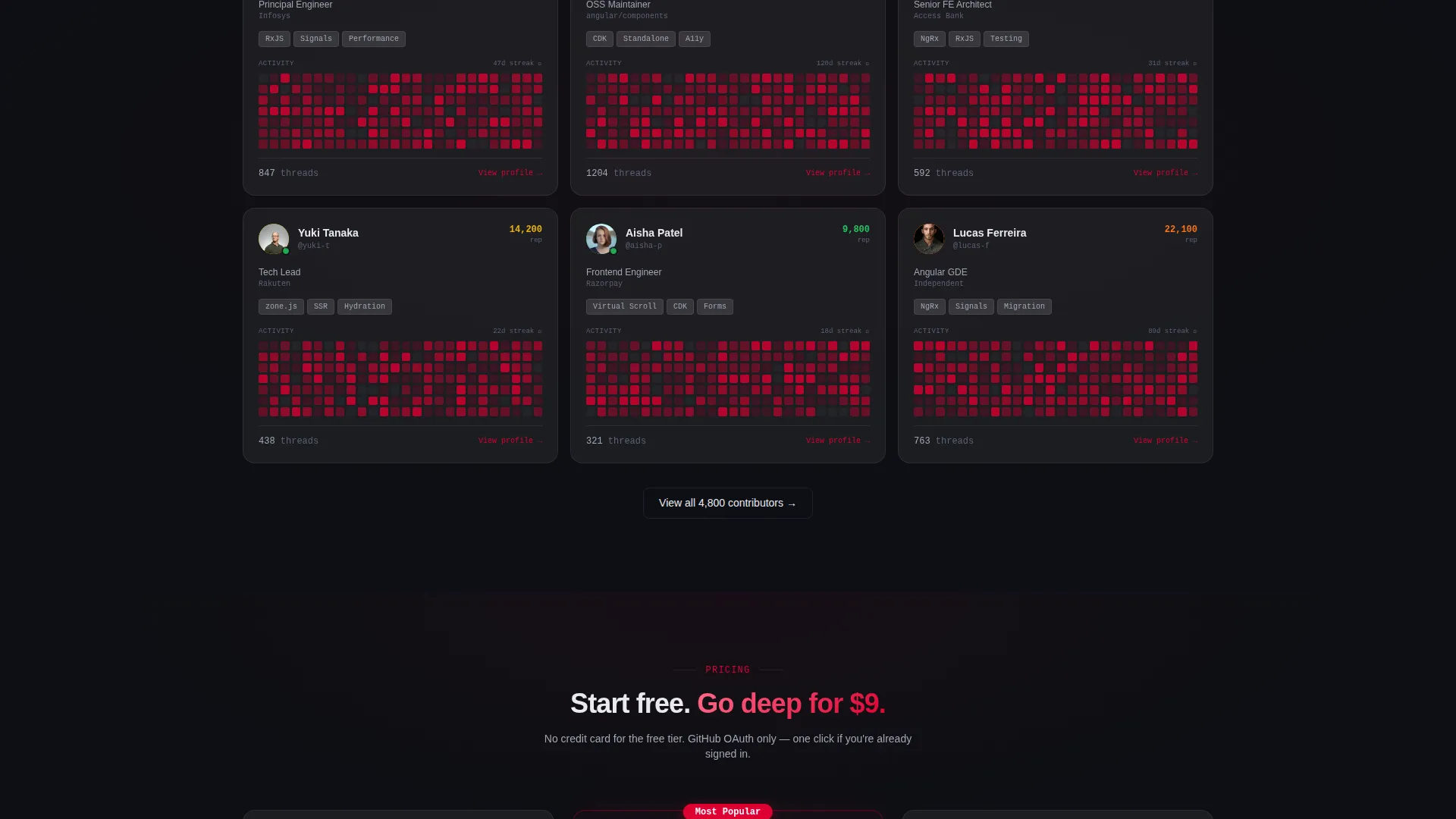
A grid section highlights community contributors with GitHub-style activity heatmaps. Each contributor card adds credibility by showing real participation patterns. This section signals to senior engineers that the community has depth and that their peers are already present.
Pinned Frosted Navigation Bar
After the first scroll, a frosted translucent navigation bar pins to the top of the viewport and stays visible throughout the page. It carries the primary call to action, "Join Free - Start Asking," and the secondary call to action, "Go Pro for $9/mo," so conversion options remain accessible at every point in the scroll journey.
Staggered Card Entry Animations
Cards across all grid sections enter with 60-millisecond stagger delays. Status dots pulse. Counters roll. The motion is intentional and restrained, reinforcing the dashboard aesthetic without distracting from the content. Every animation serves a functional signal rather than decoration.
Page sections overview
| Section | Purpose |
|---|---|
| Interactive Header Preview | Shows live-looking forum cards with hover effects and syntax-highlighted code to demonstrate the product immediately |
| Pinned Navigation Bar | Keeps primary and secondary calls to action visible after the first scroll |
| Community Stats Module | Animates thread count, online member count, and median reply time on scroll to establish community activity |
| Trending Threads | Surfaces real Angular thread titles to show topical relevance and conversation depth |
| Contributor Spotlight Grid | Displays contributor cards with activity heatmaps to build credibility with senior developers |
| Freemium Signup Section | Presents free tier details, pro tier pricing, and a minimal GitHub OAuth signup form |
Design & branding system
The visual identity follows a Dashboard Pro theme executed through a Glassmorphic color system. Every design decision reinforces the feeling of opening a perfectly architected monitoring tool at midnight.
- Base layer in deep void black (#0D0F14), frosted panels at rgba(255,255,255,0.06) with 12-pixel blur, electric Angular red (#DD0031) for live-state indicators and hover accents, and cool interface gray (#A1A7B5) for secondary type
- Glowing elements carry informational weight against the dark substrate, so colored accents feel like real status signals rather than decoration
- Card hover states produce a lift and blur-shift effect, reinforcing the glassmorphic depth system throughout the scroll experience
Mobile & speed optimization
The card grid layout is built to reflow cleanly across viewport sizes. The modular structure means each section collapses into a readable single-column format on smaller screens without losing the dark dashboard feel.
- Glassmorphic panels maintain their frosted appearance and blur depth on mobile without requiring layout overrides
- Staggered card animations and scroll-triggered counters are scoped to section entry points, keeping motion purposeful and lightweight across devices
- The pinned navigation bar adapts to mobile viewports, keeping both calls to action reachable without crowding the screen
How this template helps you convert
Signal is structured around a deliberate conversion sequence. Each section builds on the previous one, adding another reason to join before the visitor reaches the signup form.
- The interactive header preview establishes that the community is alive right now, replacing skepticism with immediate product credibility before any claims are made in copy
- The scroll-triggered stat counters and trending threads section layer in social proof through specific numbers and real conversation titles, making the free tier feel worth trying
- The pinned frosted navigation bar keeps "Join Free - Start Asking" and "Go Pro for $9/mo" visible at all times, and the GitHub OAuth form reduces signup to a single click for any developer already signed in
Other information about this template
Signal is categorized under Documentation and Support, specifically Angular Documentation and Angular Community Forum use cases. The template style is a card grid modular layout, which suits communities that grow content over time and need a structure that scales visually without redesign.
- The freemium tier details are built into the template: free members can read everything, post five threads per month, and access all code snippets; the pro tier at $9 per month unlocks unlimited posting, private channels, and priority replies from maintainers
- The template is suited for use with OAuth-based authentication flows where no password field is needed, reducing the signup form to a GitHub handle and email entry only
- The creative direction is Launch Energy, meaning the scroll sequence is structured like a countdown: each section escalates the sense that the community is moving and that the visitor is not yet part of it
Theme
Dashboard Pro
Creative direction
Launch Energy
Color system
Glassmorphic
Style
Card Grid (Modular)
Direction
Freemium/Trial
Page Sections
Interactive Forum Header with Hover Effects
Scroll-triggered Animated Stat Counters
Trending Threads Section
Contributor Spotlight with Activity Heatmaps
Pinned Frosted Navigation Bar
Staggered Card Animations and Pulse Effects
Related questions
Who is this landing page template designed for?
What conversion model does this template support?
Can I customize the thread titles, stats, and contributor cards?
Does the template include the signup form and OAuth flow design?
How does the interactive header preview work?



