Revenue Intelligence Landing Page Template
Signal is a scroll-reveal landing page template built for revenue intelligence platforms. It uses a progressive spec-sheet layout, a high-contrast carbon fiber color system, and a click-through flow designed to move VP Sales leaders, RevOps managers, and CROs from curiosity to demo booking, with no form fields standing in the way.
by Rocket studio
Quick summary
Signal is a single-page, scroll-reveal landing page template engineered for revenue intelligence platforms. It opens with social proof from peer-set logos, builds credibility through progressive spec-card reveals, and drives qualified buyers toward a live demo booking page. The layout is purpose-built for senior sales and revenue operations audiences who make fast decisions under pressure.
Who this template is for
This template is designed for go-to-market teams launching or repositioning a revenue intelligence platform. It speaks directly to the buyers who feel pipeline uncertainty most acutely.
- VP Sales leaders managing large teams who have lost committed deals late in the quarter
- RevOps managers buried in CRM hygiene work who need cleaner, more reliable data surfaces
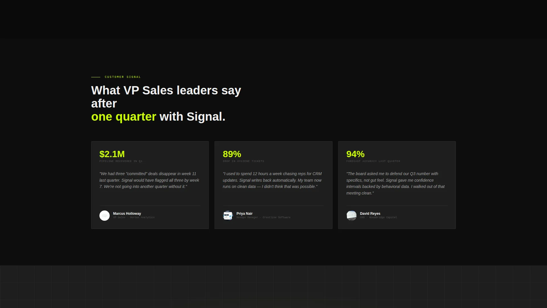
- Chief Revenue Officers building board-ready forecast decks who need accuracy they can defend
What problem this template solves
Most landing pages for complex sales tools bury the value. They lead with screenshots, lose the buyer in feature lists, and ask for a form fill before trust is earned. Signal reverses that sequence deliberately.
- Deals disappear in week 11 because leaders lack early signal, the page addresses that fear directly in its opening headline
- Forecast confidence is hard to communicate in a slide deck, the template builds that confidence visually before any call to action appears
- High-intent buyers abandon pages that feel slow or generic, the spec-card layout keeps senior audiences moving forward
What you get with this template
Signal delivers a fully structured, conversion-optimized landing page layout with every section defined and sequenced. Nothing is left to guess.
- A scroll-reveal progressive layout where each capability reveals as a technical specification card on scroll
- A persistent bottom call-to-action bar that appears after the third spec card and follows the visitor through the rest of the page
- A full-width closing conversion block with a supporting reassurance line, linked to an external demo scheduler with no form fields on the page
Feature list
Signal's feature set maps directly to how senior revenue buyers evaluate tools. Each element earns its place in the layout.
Progressive Scroll-Reveal Spec Cards
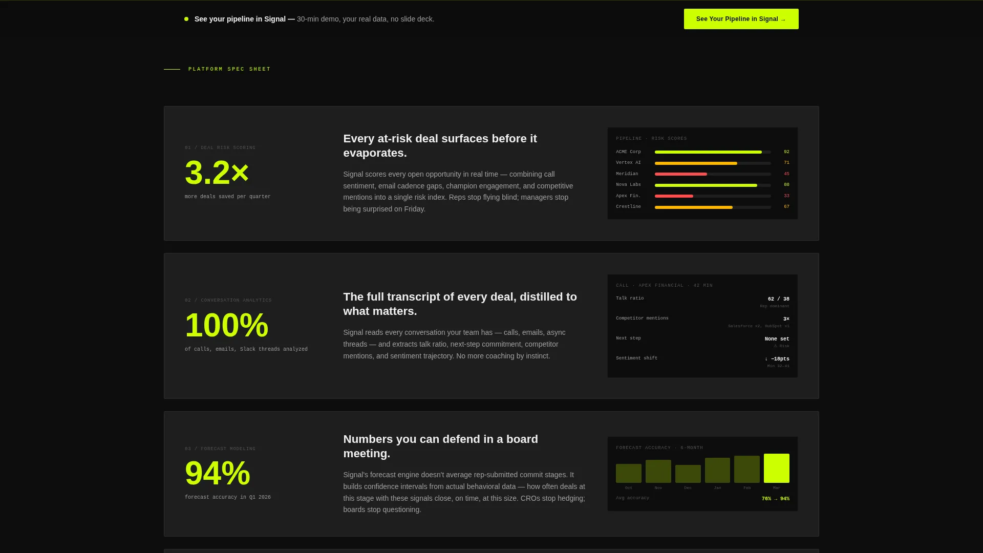
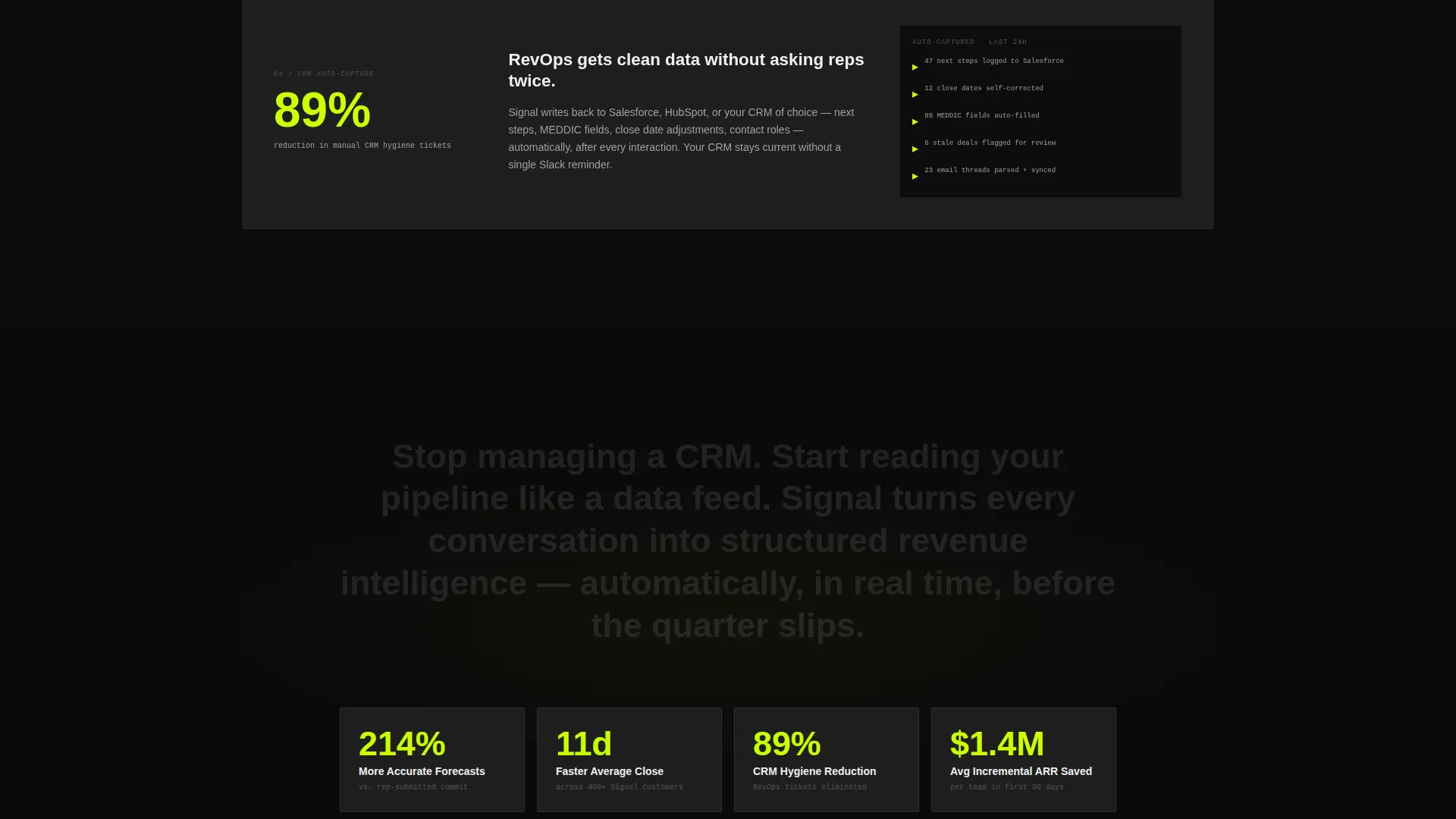
Each capability surfaces as a scroll-triggered specification card. The metric appears large on the left in electric chartreuse, a one-sentence explanation sits in the center, and a minimal user interface fragment fades and scales in on the right. Pacing starts with breathing room and accelerates as sections stack tighter, building momentum toward the closing conversion frame.
Logo Bar with Confidence Headline
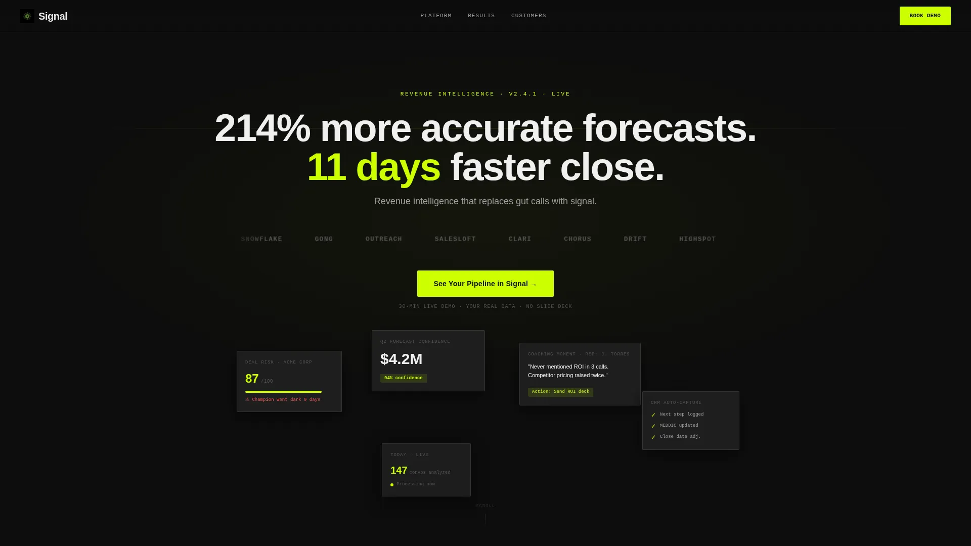
The header opens with a slow-drifting horizontal scroll of monochrome peer-set customer logos against a deep black field. A single stat headline fades in above the bar. Below the bar, a plain category subhead sets context immediately. No product screenshot competes for attention at this stage.
Persistent Bottom call to action Bar
After the visitor clears the third spec card, a persistent bottom bar locks in place carrying the primary call-to-action. It stays visible without blocking content, so the door to demo booking is always one tap or click away.
Click-Through Demo Flow
The page carries no form fields. Every call-to-action click passes UTM context through to an external Calendly-style scheduler. This removes conversion friction for buyers who have already decided and just need a clear next step.
Three-Stage Proof Sequence
The layout stacks proof in a deliberate order: logos first, metrics second, product evidence third. By the time the call-to-action goes persistent, the visitor has moved through a complete trust-building arc rather than being asked to commit cold.
High-Contrast Carbon Fiber Visual System
The color system uses deep cockpit black for backgrounds, machined graphite for card surfaces, titanium gray for secondary text, and electric chartreuse as a singular accent on calls-to-action, live data points, and hover states. White is reserved for headlines and primary stats. Chartreuse never exceeds ten percent of any viewport so it retains its visual voltage.
Page sections overview
| Section | Purpose |
|---|---|
| Logo bar header | Opens with peer-set logos and a stat headline to establish trust before any product claim |
| Primary call to action block | First call-to-action placement beneath the logo bar to capture ready buyers early |
| Spec card: deal risk | Reveals deal risk scoring as the first capability card with metric, explanation, and user interface fragment |
| Spec card: conversation analytics | Surfaces conversation analytics capability with the same spec-card structure and scroll trigger |
| Spec card: forecast modeling | Presents forecast confidence scoring as a data-driven capability card |
| Spec card: CRM auto-capture | Covers CRM auto-capture as the fourth progressive reveal in the spec sequence |
| Persistent call to action bar | Locks into view after the third spec card and stays visible through the closing block |
| Full-width closing block | Final conversion frame with primary call to action and a reassurance support line |
Design & branding system
Signal's visual identity channels a prototype vehicle cockpit aesthetic. Everything is matte and dark by default, with one color reserved to mean action.
- Background layers stay in the deep cockpit black to machined graphite range, keeping the interface focused and instrument-like
- Electric chartreuse appears only on calls-to-action, live data points, and hover states, and never exceeds ten percent of any single viewport
- White is reserved strictly for headlines and primary statistics, so hierarchy reads instantly without needing extra size or weight
Mobile & speed optimization
The scroll-reveal layout is structured to translate cleanly across screen sizes. Progressive disclosure works with touch-based scrolling as naturally as it does with a desktop mouse.
- Spec cards are built to reflow vertically on smaller viewports, keeping the metric, explanation, and user interface fragment readable in a stacked format
- The persistent bottom call to action bar is sized for thumb reach on mobile, making the demo booking action accessible without pinching or zooming
- The logo bar horizontal scroll adapts to narrower screens while maintaining the slow, confident drift that reinforces brand familiarity
How this template helps you convert
Signal is engineered to earn the click rather than demand it. The conversion architecture follows a clear logic.
- Trust is established before any product claim lands, using peer-set logos and a specific stat headline in the first viewport to anchor credibility immediately.
- Evidence accumulates through the spec-card scroll, so each section the visitor reads makes the decision easier, and the persistent call to action bar appears only after that proof has stacked.
- The closing block removes every remaining obstacle with a plain reassurance line, a thirty-minute live demo, real pipeline data, no slide deck, so the final click feels low-risk and obvious.
Other information about this template
Signal is built on the Startup Velocity theme using a Carbon Fiber color system and a Spec Sheet creative direction. These intersection choices were made to match how senior revenue buyers think and move.
- The template style is Scroll Reveal (Progressive), meaning capabilities are revealed one at a time in a deliberate sequence rather than shown all at once
- The header concept is a Logo Bar, which front-loads social proof from the first pixel rather than saving it for a later testimonials section
- The landing page direction is Click-Through, meaning conversion happens via a single outbound link with UTM context rather than an on-page form
- This template is categorized under Technology, Advanced Tech and Artificial Intelligence Platforms, in the Revenue Intelligence Platform niche
- The page is purpose-built for platforms that surface deal risk scoring, conversation analytics, forecast modeling, and CRM auto-capture as distinct capabilities
Theme
Startup Velocity
Creative direction
Spec Sheet
Color system
Carbon Fiber
Style
Scroll Reveal (Progressive)
Direction
Click-Through
Page Sections
Progressive Scroll-reveal Spec Cards
Logo Bar with Stat Headline
Persistent Bottom Call to Action Bar
Click-through Demo Booking Flow
Three-stage Proof Architecture
Carbon Fiber High-contrast Color System
Related questions
Does this template include form fields or a lead capture widget?
How many call-to-action placements does the template include?
Can I adapt the spec cards for a different set of platform capabilities?
Who is the intended buyer this page is designed to convert?
Does the template support UTM parameter passing to the demo scheduler?



