AI for SaaS B2B Comparison Website Template
Signal is a dark-themed, dashboard-style landing page template built for SaaS analytics platforms targeting VP-level operations leaders at mid-market companies. It combines a cinematic cockpit aesthetic, AI-generated insight previews, and a Comparison/Versus scroll architecture to move serious buyers from passive browsing to an immediate stack diagnostic.
by Rocket studio
Quick summary
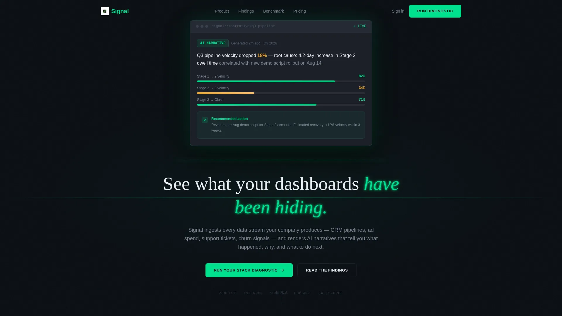
Signal is a single-page, dashboard-style landing page template for B2B SaaS analytics products. It opens with a pitch-black full-bleed scene, fades in a live AI-generated insight widget, and guides visitors through a numbered "Finding" scroll that exposes analytics blind spots. The primary conversion path is a three-step stack diagnostic, not a demo booking.
Who this template is for
This template is built for SaaS companies selling AI-powered analytics or business intelligence tools to mid-market operations teams. It speaks directly to the buyer who lives inside spreadsheets and reporting tools all day and needs to be shown a better way, not just told about one.
- VP-level operations leaders at companies with 200 to 2,000 employees
- SaaS product teams launching or repositioning an AI analytics platform
- Founders and marketers who need a high-conviction, data-forward landing page
What problem this template solves
Operations leaders at mid-market SaaS companies often pull data from multiple sources, CRM pipelines, ad spend dashboards, support queues, and churn signals, and then stitch the story together manually before every leadership meeting. That process is slow, error-prone, and easy to lose in a room with better-looking slides. This template gives your product a page that mirrors the exact frustration your buyer feels and immediately positions your platform as the fix.
- Buyers arrive skeptical and time-poor; a generic hero image loses them in seconds
- Side-by-side comparison grids show the gap between the visitor's current stack and your platform in concrete, measurable terms
- The friction-low diagnostic call to action captures intent before a visitor is ready for a sales conversation
What you get with this template
The template delivers a complete, scroll-driven landing page structured as a proprietary analyst briefing. Every section is purposeful and pre-sequenced to escalate the buyer's sense of urgency from mild curiosity to clear conviction.
- A cinematic Dark Full-Bleed and Glow header with a fade-in AI insight widget and an expanding phosphor-green light rule
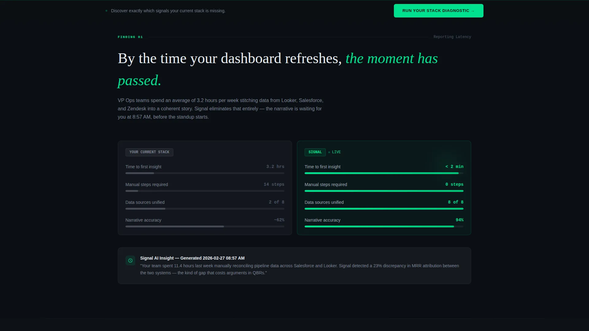
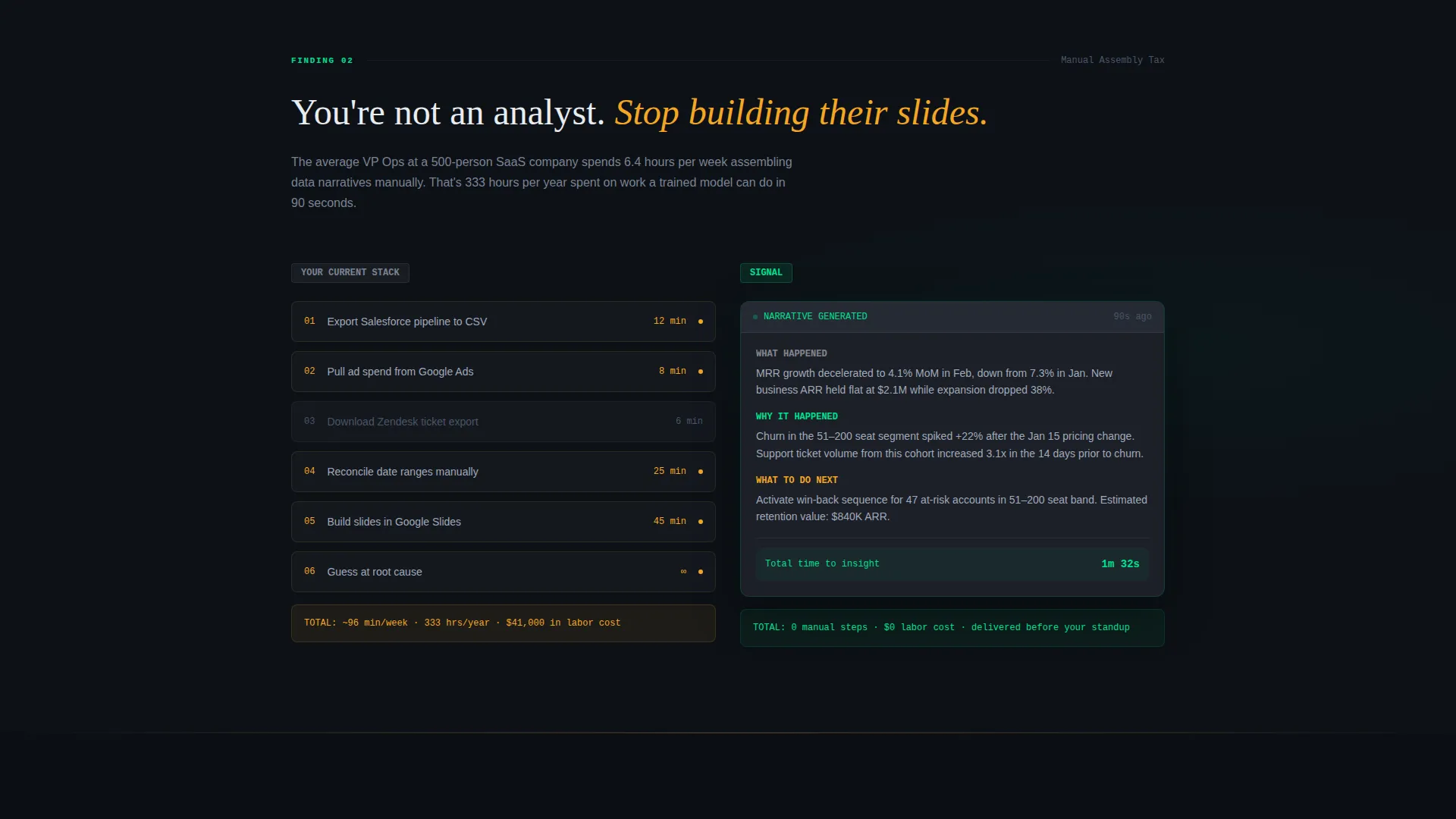
- Four numbered "Finding" sections, each containing a Comparison/Versus grid and an AI-generated insight screenshot
- A three-step gated diagnostic tool (current BI tool dropdown, team size slider, work email) plus a secondary PDF benchmark report gate
Feature list
This template is built around a precise set of design and conversion components. Each one serves a specific function in the buyer journey.
Cinematic Dark Header with Live Insight Widget
The page opens pitch-black for 400 milliseconds before a single dashboard widget fades in at center screen. Its edges emit a soft phosphor-green glow, as if the data itself is the light source. A thin green light rule then expands left and right to reveal the headline, drawing the eye without using a single stock image.
Numbered Finding Scroll Architecture
Each content section is labeled as a Finding, such as Finding 01 and Finding 02, and reads like a page from a proprietary analyst report. The scroll sequence escalates from surface-level reporting gaps to serious decision-making blind spots, building urgency organically as the visitor moves down the page.
Comparison/Versus Grid Sections
Every Finding contains a two-column comparison grid. The left column, labeled "Your Current Stack," is styled in muted carbon gray. The right column, labeled "Signal," is highlighted in phosphor green. Metrics such as time-to-insight, manual steps required, and accuracy percentages appear as visual data bars.
Three-Step Stack Diagnostic call to action
The primary call to action is "Run Your Stack Diagnostic," a lightweight gated tool that collects three inputs in sequence: current BI tool selected from a dropdown, team size set via a slider, and a work email address. It promises a personalized gap report delivered to the visitor's inbox in under two minutes.
Sticky Conversion Bar
A fixed-bottom bar reappears on scroll throughout the page, keeping the diagnostic call to action always visible. Visitors never need to scroll back to the top to take action, reducing drop-off at every Finding section.
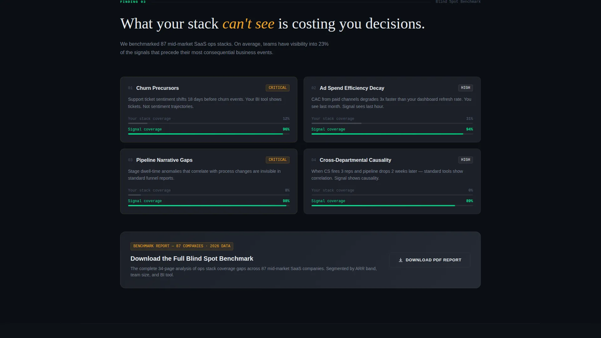
Secondary PDF Benchmark Gate
A second conversion path, "Download the Full Benchmark Report," appears at the bottom of Finding 03. It targets visitors who are still in research mode and not yet ready to expose their current tool stack, giving them a low-commitment way to stay engaged.
Page sections overview
| Section | Purpose |
|---|---|
| Dark Full-Bleed Header | Opens with a cinematic fade-in AI insight widget and expanding green light rule to anchor the product as the hero |
| Headline Reveal Bar | Transitions the viewport from pure black to the primary headline using a horizontal phosphor-green rule |
| Finding 01 Section | Introduces the first analytics gap with a Comparison/Versus grid and an AI insight screenshot as evidence |
| Finding 02 Section | Escalates the reporting problem with a second comparison grid showing deeper manual-effort costs |
| Finding 03 Section | Presents a critical blind spot scenario; closes with the secondary PDF benchmark report download gate |
| Finding 04 Section | Delivers the highest-urgency finding, showing the cost of incomplete data narratives on real decisions |
| Stack Diagnostic Gate | Houses the three-step diagnostic form collecting BI tool, team size, and work email |
| Sticky Conversion Bar | Fixed-bottom persistent call to action bar that follows the visitor throughout the entire scroll journey |
Design & branding system
The visual identity is built on a Carbon Fiber color system that feels engineered rather than decorated. Every color choice has a function. The palette creates depth through subtle elevation rather than color contrast, keeping the eye focused on the data and the narrative.
- Core backgrounds use deep cockpit black (#0B0F14) and woven carbon gray (#1C2028); phosphor green (#00E08E) is reserved for live data accents and interactive elements, while signal white (#E8ECF1) handles all body typography
- Warn-state amber (#F5A623) appears only in competitor-column callouts inside the comparison grids, training the eye to read it as a caution signal
- Typography stays in signal white against dark backgrounds, creating a cockpit-at-night legibility that keeps long comparison grids readable under low contrast
Mobile & speed optimization
The template is structured so that its dense data-grid sections collapse cleanly for narrower viewports. The cockpit aesthetic does not depend on large background images, which keeps the page light by design.
- Comparison grids are designed to stack vertically on smaller screens, preserving the left-versus-right finding logic in a top-and-bottom format
- The sticky diagnostic call to action bar is sized and positioned for thumb reach on mobile, so the primary conversion path stays accessible throughout the scroll
How this template helps you convert
Signal is built around the principle that a buyer who sees their own problem reflected back at them in precise, measurable terms is far closer to converting than one who reads a list of features. Every structural choice in this template serves that goal.
- The Comparison/Versus grid gives visitors a direct, side-by-side picture of their current workflow versus a better one, making the value proposition felt rather than just stated
- The three-step diagnostic tool exchanges a gap report for a work email, creating immediate, tangible value before any sales interaction occurs
- The sticky conversion bar ensures the primary call to action is never more than a glance away, no matter how deep a visitor scrolls into the Finding sequence
Other information about this template
Signal is categorized under Technology, specifically within the AI for SaaS B2B subcategory and the SaaS B2B AI Analytics Dashboard niche. The template style is Dashboard/Data Grid, the theme follows a Directory and Discovery approach, and the creative direction is Industry Report. The header concept is Dark Full-Bleed and Glow. The landing page direction is Comparison/Versus with an Intersection Match Score of 13.
- The template does not use stock imagery or hero illustrations anywhere; the product interface itself functions as the visual centerpiece throughout
- The diagnostic tool dropdown includes the following BI tool options as specified in the brief: Looker, Tableau, Power BI, Metabase, and Other
- This template is well suited for teams building or relaunching an AI analytics platform who want a page that speaks the operational language of their buyer rather than leading with feature lists
Theme
Directory & Discovery
Creative direction
Industry Report
Color system
Carbon Fiber
Style
Dashboard/Data Grid
Direction
Comparison/Versus
Page Sections
Cinematic Dark Header with Fade-in Widget
Numbered Finding Scroll Sequence
Comparison/versus Data Grids
Three-step Stack Diagnostic Tool
Sticky Diagnostic Conversion Bar
Secondary PDF Benchmark Report Gate
Related questions
Who is the target buyer persona for this template?
What is the primary call to action on this landing page?
Does the template include a demo booking or sales call flow?
How many Finding sections does the template include?
Can this template work for analytics platforms targeting teams outside of SaaS?



