Powerful API | Free Website Template | Rocket
Signal is a comparison table landing page built for developer and engineering audiences evaluating communication APIs. It pairs a living interactive API matrix with drill-down scroll sections, code snippet diffs, and latency sparklines. The AI Iridescent color system and Dashboard Pro theme make dense technical data feel immediate, navigable, and persuasive from the first scroll.
by Rocket studio
Quick summary
Signal is a single-page API comparison landing page designed for engineers who need fast, evidence-based clarity. It opens with an interactive dashboard matrix already populated with real provider data, then drills deeper through scroll-driven sections covering Messaging, Voice, Video, Verify, and Lookup. Every visual choice supports a clear argument without asking the visitor to work for it.
Who this template is for
This template was built for technical decision-makers who evaluate communication APIs under real pressure. It speaks to people who read request and response shapes before they read marketing copy.
- Backend engineers comparing API endpoints late at night with multiple browser tabs open
- DevOps leads building internal business cases for a platform migration
- CTOs who need one clear, shareable view that justifies a vendor switch
What problem this template solves
Most API comparison pages make engineers do the work. They scatter evidence across PDFs, separate docs pages, and blog posts. Signal removes that friction entirely.
- Engineers cannot quickly compare latency, pricing, and authentication methods in one place
- Decision-makers waste time rebuilding comparison tables from scratch in spreadsheets
- A single persuasive visual is rarely available when a CTO needs to present a vendor recommendation
What you get with this template
Signal delivers a fully structured, data-dense landing page that escalates from overview to granular evidence as the visitor scrolls. Every section is pre-designed to reduce evaluation time and increase confidence.
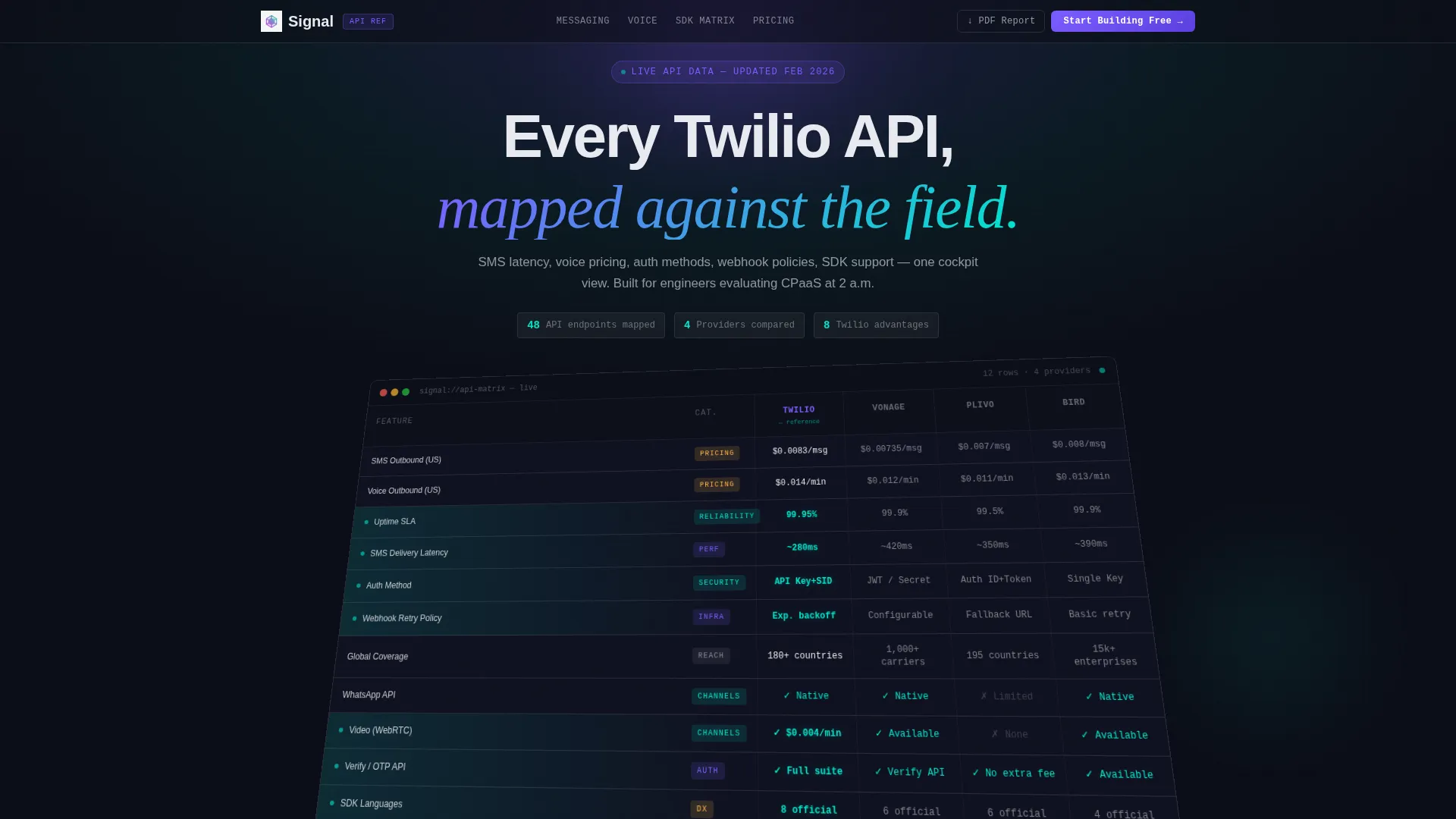
- An interactive API comparison matrix in the hero, pre-populated and ready to read on load
- Five drill-down scroll sections with sub-comparison tables, code snippet diffs, and latency sparkline charts
- A pinned conversion bar with a primary call to action and a secondary email-capture offer
Feature list
This section describes the core built-in components that give Signal its depth and persuasive structure.
Interactive Hero Dashboard Matrix
The header opens as a pixel-perfect comparison grid displaying real data across four provider columns. It loads at a slight isometric tilt and flattens to full screen as the visitor scrolls, creating the feeling of stepping into the control room rather than reading a static page.
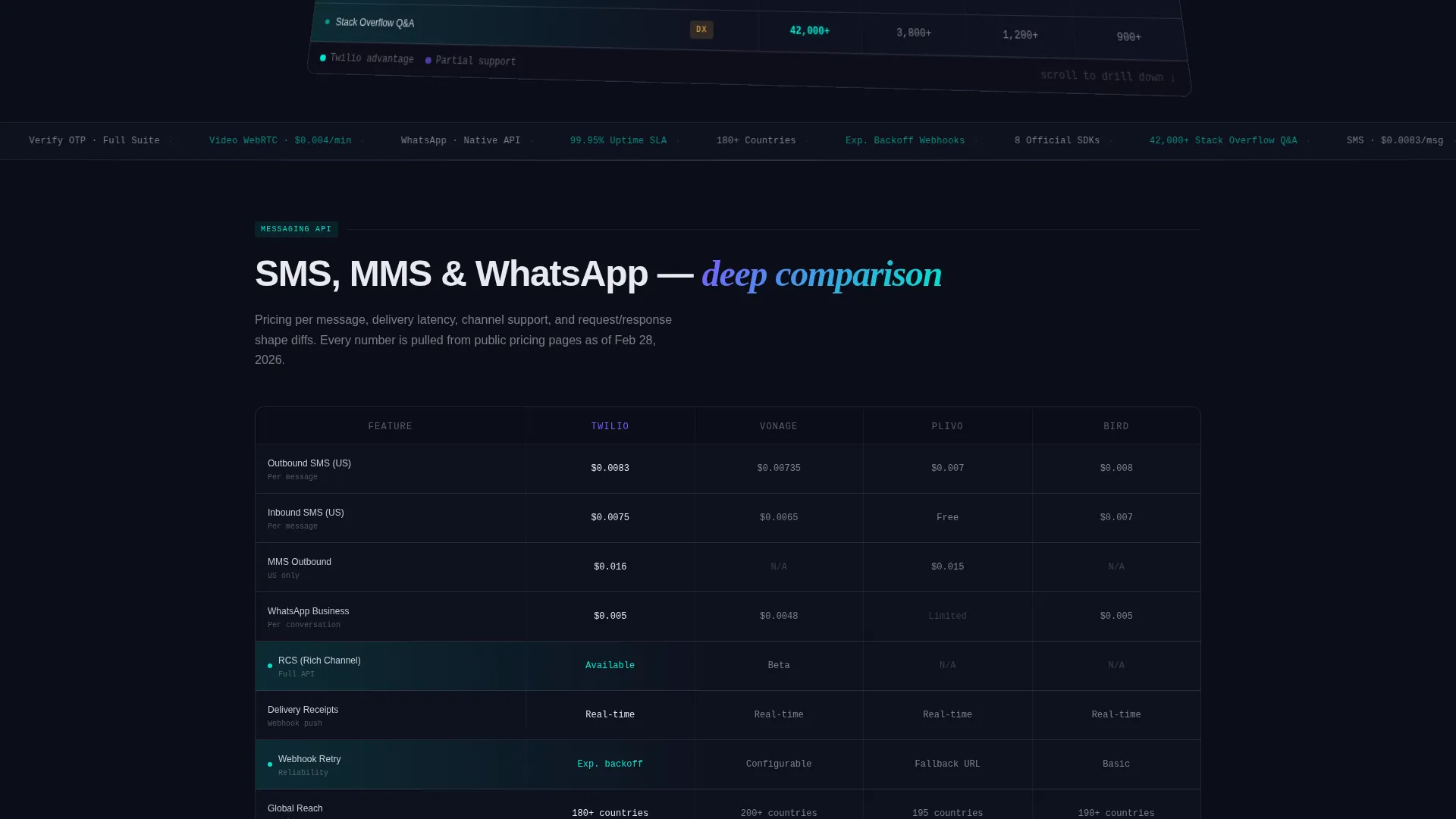
Scroll-Driven Drill-Down Sections
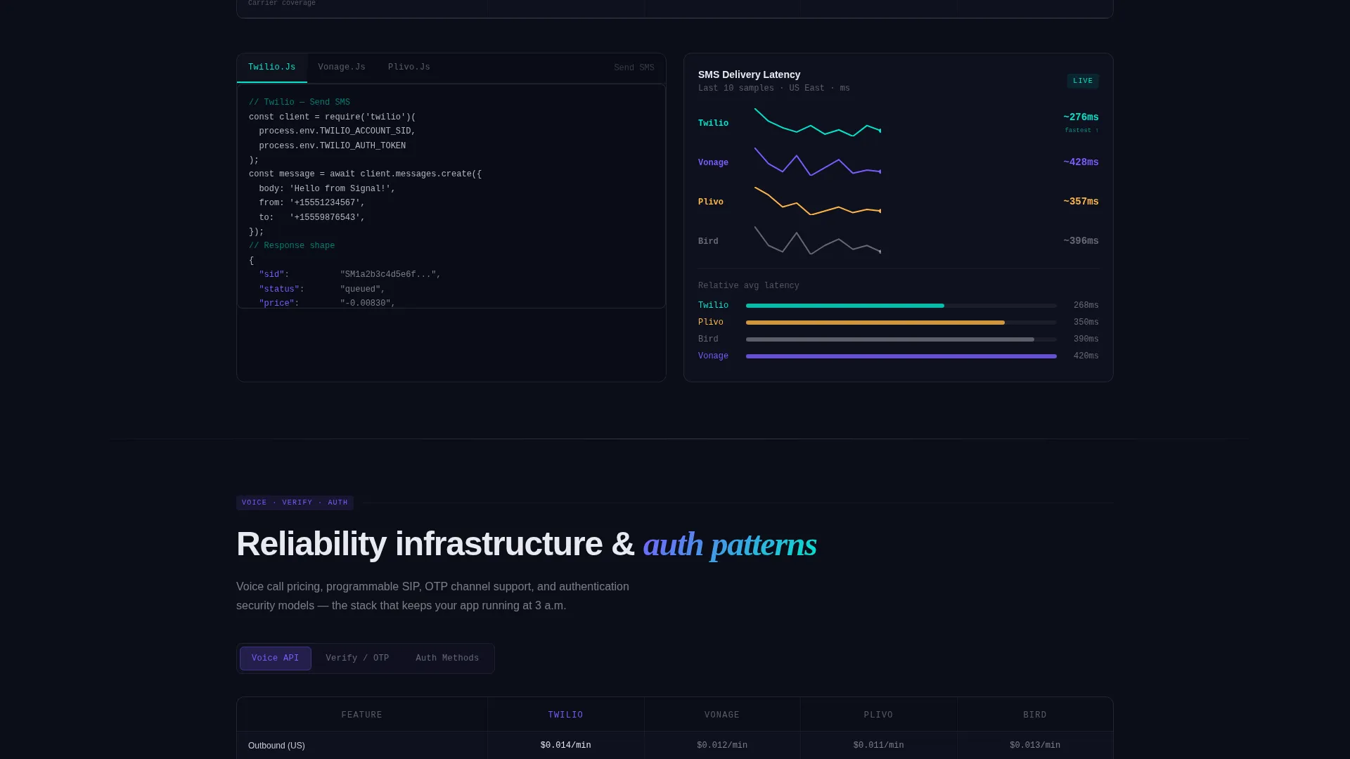
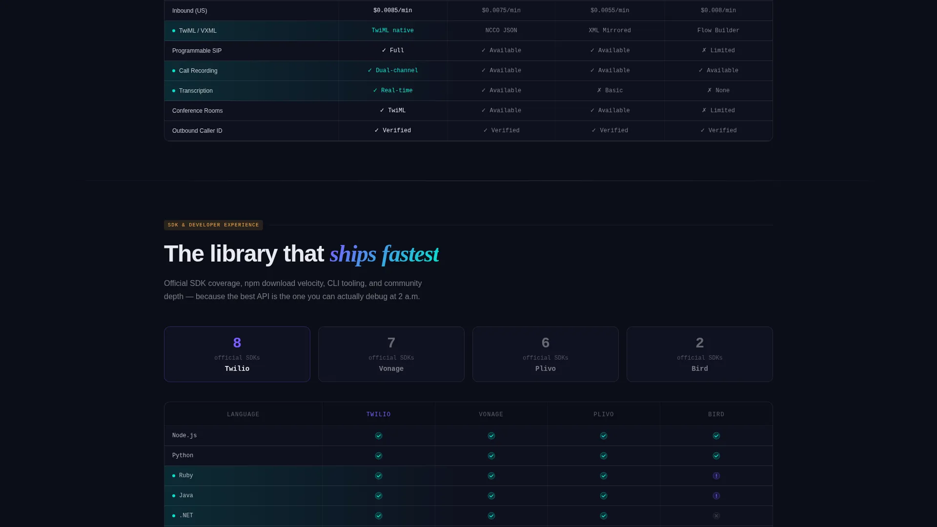
Each scroll section zooms into a single API category: Messaging, Voice, Video, Verify, and Lookup. Every section contains its own sub-comparison table, side-by-side code snippet diffs showing request and response shapes, and a latency sparkline chart per provider.
Visual Win Indicators in Comparison Rows
Every row where the primary provider leads is subtly lit in spectral teal. Partial-support states use holographic violet icons. The visual argument builds row by row so the visitor understands the verdict before reaching the bottom of the page.
Pinned Conversion Bar
A slim top bar stays fixed during scroll and darkens as the visitor moves down the page. It carries the primary "Start Building Free" call to action and remains visible at every point in the reading journey.
Email-Capture PDF Offer
A secondary call to action offers a downloadable full API comparison document. It collects two fields: email address and company size. This gives teams a shareable artifact and gives the page an additional conversion touchpoint beyond the primary sign-up.
Dashboard Pro Theme with AI Iridescent Palette
The template ships with a fully defined color system. Void black backgrounds, pearl-tinted borders at low opacity, and hover states that bloom from holographic violet to spectral teal create a terminal-inside-a-prism aesthetic that feels purposeful rather than decorative.
Page sections overview
| Section | Purpose |
|---|---|
| Pinned Top Bar | Anchors primary call to action throughout scroll |
| Hero Dashboard Matrix | Delivers immediate multi-provider comparison on load |
| Messaging Drill-Down | Compares SMS delivery latency with code diffs and sparklines |
| Voice Drill-Down | Breaks down voice call pricing and webhook retry policies |
| Video Drill-Down | Side-by-side feature and SDK support comparison |
| Verify Drill-Down | Authentication method differences with request/response diffs |
| Lookup Drill-Down | Endpoint-level comparison with latency chart |
| PDF Capture Section | Secondary offer with two-field email and company size form |
Design & branding system
The AI Iridescent color system gives Signal a visual identity that feels native to the terminal and dashboards engineers already live in. Every color decision serves data clarity first.
- Void black (#0B0D17) as the primary background keeps focus on table content; holographic violet (#7B5CFF) marks active states and selected rows
- Spectral teal (#00E5CC) highlights winning comparison rows and confirmation indicators; cool pearl (#E8EAF0) is used for table text and divider lines at 12% opacity
- Hover states use a violet-to-teal gradient so comparison rows respond visibly under the cursor, making the matrix feel interactive without requiring a click
Mobile & speed optimization
Signal's layout is structured to keep dense tabular data readable across screen sizes. The design system uses controlled opacity and gradient layers rather than heavy image assets.
- Comparison tables are built to reflow gracefully so column data stays readable on smaller viewports
- The isometric-to-flat hero animation is tied to scroll position, keeping the interaction smooth without blocking content access
- Border and divider styles use opacity-based pearl tones rather than decorative images, keeping the visual layer lightweight
How this template helps you convert
Signal is built around a simple idea: let the data do the persuading. Every structural choice moves the visitor from curiosity to conviction.
- The hero matrix delivers instant proof on load with no click required, so engineers see comparative evidence the moment they arrive
- Each scroll section adds a deeper layer of technical proof, moving the visitor from a 30,000-foot summary to endpoint-level evidence across five API categories
- The pinned call-to-action bar and the email-capture PDF offer work at different commitment levels, giving both ready-to-sign-up visitors and research-stage visitors a clear next step
Other information about this template
Signal is categorized under Documentation and Support, specifically within the Twilio API Reference niche. It is positioned to serve teams evaluating communication API providers and building internal justification for platform decisions.
- The template style is Comparison Table, matched with a Dashboard Preview header concept and a Feature Matrix creative direction
- The landing page direction is Comparison/Versus, meaning the entire page structure is built to support side-by-side provider evaluation
- Competitor provider columns in the pre-built matrix include Vonage, Plivo, and MessageBird alongside the primary provider column
- The Dashboard Pro theme and AI Iridescent color system are the defining visual frameworks for this template
Theme
Dashboard Pro
Creative direction
Feature Matrix
Color system
AI Iridescent
Style
Comparison Table
Direction
Comparison/Versus
Page Sections
Interactive Hero API Matrix
Scroll-driven Category Drill-downs
Visual Win Row Indicators
Pinned Call-to-action Bar
Two-field PDF Lead Capture
AI Iridescent Dashboard Theme
Related questions
Who is this landing page template designed for?
What data is shown in the hero comparison matrix?
Can I capture leads directly from this landing page?
How does the scroll experience work?
Does the template include code snippet comparisons?


