Signal - Powerful Startup Landing Page Template
Signal is a split-screen landing page template built for startup email newsletters. It pairs a dark, glassmorphic visual identity with an interactive content explorer, letting visitors read real newsletter excerpts before committing. The page drives app downloads through paired store badges, a sticky bottom bar, and a browser preview fallback that earns trust before asking for anything.
by Rocket studio
Quick summary
Signal is a single-page landing page template designed for a weekly startup email newsletter. It uses a 50/50 split-screen layout, a Data Command visual theme, and an interactive section that lets visitors explore sample content before downloading. The page is built to convert curious founders and investors into subscribers through immersive, proof-first design.
Who this template is for
This template is built for newsletter operators targeting the startup ecosystem. It speaks directly to fast-moving readers who want signal, not noise.
- Seed-stage founders who track funding rounds and product launches daily
- Venture capital associates building deal-flow context on tight timelines
- Growth leads at Series B companies monitoring hiring moves and new raises
What problem this template solves
Most newsletter landing pages ask visitors to trust a product they have never seen. That gap between curiosity and commitment kills conversions. This template closes it.
- Visitors can explore real newsletter excerpts before any call to action appears
- The interactive panel system proves content density without a single marketing claim
- The sticky app download bar catches late-stage visitors who scroll past the first prompt
What you get with this template
You get a fully designed, single-page landing page that functions as a live content preview and a conversion engine at the same time. Every section is built to reward curiosity and escalate intent.
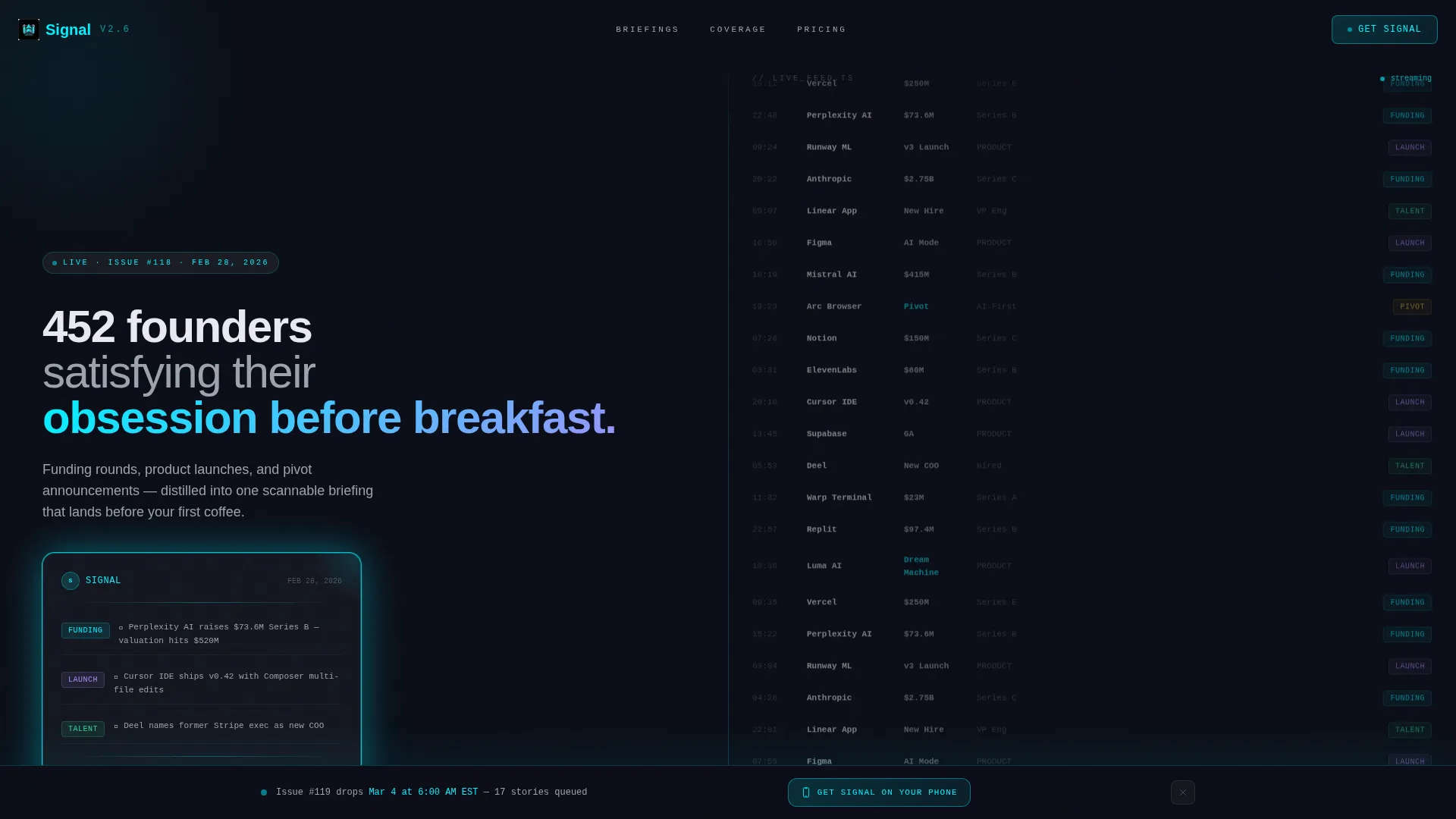
- A 50/50 split-screen header with a floating newsletter card and a live-styled startup data feed
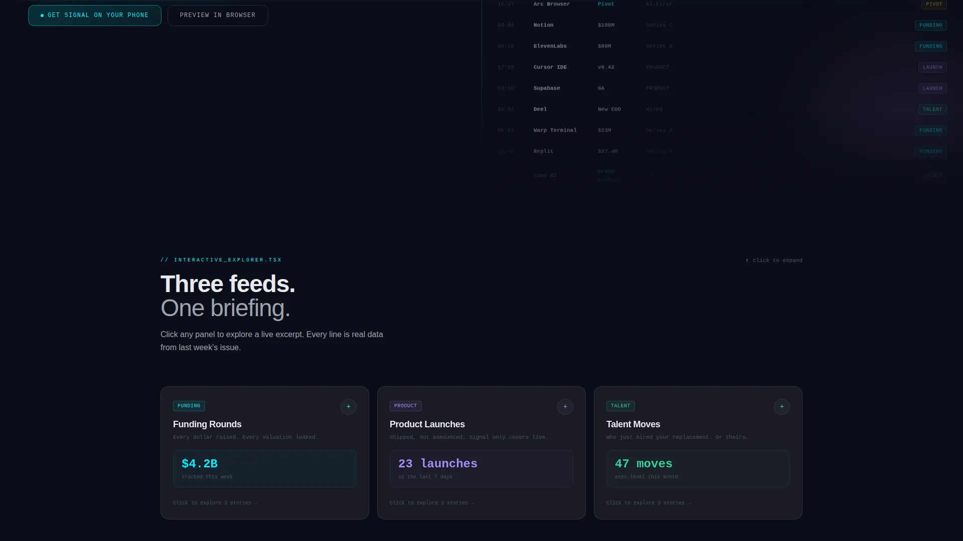
- Three glassmorphic explorer panels covering Funding, Product, and Talent that expand into sample excerpts
- Dual app download call-to-action placements and a secondary browser preview path
Feature list
This template packs its persuasion into interactive structure rather than static copy. Each feature below is drawn directly from the template brief.
Split-Screen Header Layout
The header divides the viewport equally. The left half holds a floating newsletter preview card with a soft cyan glow. The right half displays a monospace scrolling feed of startup names, funding amounts, and category tags. No photography, no illustration. The content itself is the visual.
Glassmorphic Explorer Panels
Three side-by-side panels labeled Funding, Product, and Talent sit in a dedicated scroll section. Clicking any panel expands it to reveal a styled newsletter excerpt complete with sparkline charts and inline annotations. Each panel rewards exploration and demonstrates the newsletter's real information density.
Escalating Scroll Narrative
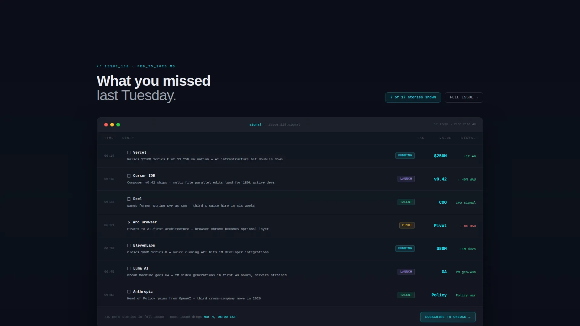
The page deliberately builds context across three scroll stages. Visitors move from seeing what the newsletter looks like, to reading what they missed last week, to previewing what is coming next. This progressive reveal replaces persuasion copy with lived experience.
Dual App Download Call to Action
App Store and Google Play badges appear twice: once directly below the interactive explorer and again in a sticky bottom bar that activates after 60 percent of the page has been scrolled. Both badge sets glow cyan on hover to signal interactivity.
Browser Preview Secondary Path
A "Preview in Browser" option sits alongside the primary download prompt. It opens a full sample issue for visitors who are not ready to download. This secondary path removes friction for skeptical readers and keeps them engaged longer.
Data Command Visual Identity
Void black anchors the background at hex color code 0B0D17. Frosted translucent panels float at 12 percent white opacity. Electric cyan at hex code 00F0FF traces interactive edges and highlights. Muted lavender at hex code A78BFA marks secondary data points and hover states. The result feels like a mission-control dashboard viewed through smoked glass.
Page sections overview
| Section | Purpose |
|---|---|
| Split-Screen Header | Introduces the newsletter with a floating card and live data feed |
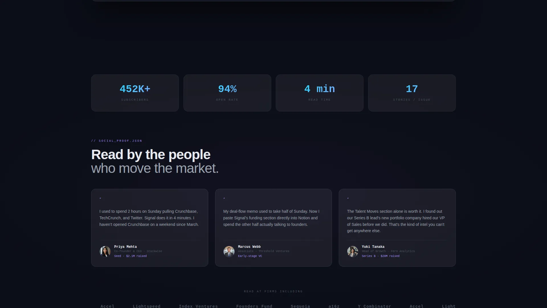
| Social Proof Headline | Anchors trust with the "452 founders" proof statement |
| Interactive Explorer | Lets visitors expand Funding, Product, and Talent panels |
| Primary Download call to action | Presents App Store and Google Play badges below the explorer |
| Browser Preview Path | Offers a full sample issue as a no-download alternative |
| Sticky Bottom Bar | Re-presents the download prompt after 60 percent scroll |
Design & branding system
The visual system is built around depth through transparency rather than shadow or contrast alone. Every layer earns its place by letting the one behind it breathe through.
- Void black background at hex 0B0D17, frosted panels at 12 percent white opacity, electric cyan highlights at hex 00F0FF, and muted lavender accents at hex A78BFA
- Monospace typography throughout the data feed and excerpt panels reinforces the terminal aesthetic without relying on illustration
- Glassmorphic stacking creates perceived depth across panels, cards, and the sticky bar, keeping the interface cohesive at every scroll position
Mobile & speed optimization
The template is structured with a mobile-first content hierarchy so the split-screen layout translates gracefully to smaller viewports. The sticky bottom bar is especially useful on mobile, where it remains visible without obscuring key content.
- The 50/50 split reflows to a stacked single-column layout on narrow screens, preserving readability of the data feed and newsletter card
- The glassmorphic panels collapse cleanly on touch devices, with tap-to-expand behavior replacing hover states for the interactive explorer
How this template helps you convert
Every design decision points toward a single outcome: a visitor who has already consumed real newsletter content before being asked to download.
- The interactive explorer lets visitors read three actual startup stories before the primary call to action appears, replacing abstract promises with concrete proof of value.
- The dual-placement download prompt and the sticky bottom bar ensure the conversion moment is always reachable, whether a visitor skims or reads every section in full.
Other information about this template
This template sits within the Technology category and the Startup Digital Presence subcategory, making it a strong fit for any operator building a startup email newsletter audience.
- The template style is Split Screen (50/50) with a Dark Full-Bleed and Glow header concept, matching a Data Command theme
- The Interactive Explorer creative direction and the App Download landing-page direction are baked into the layout, not add-ons
- The Glassmorphic color system is fully defined in the template, so brand colors, opacity values, and glow states are ready to use without additional design work
- This template can support any weekly briefing format covering funding rounds, product launches, talent moves, or pivot announcements
Theme
Data Command
Creative direction
Interactive Explorer
Color system
Glassmorphic
Style
Split Screen (50/50)
Direction
App Download
Page Sections
Split-screen Header with Live Data Feed
Glassmorphic Interactive Explorer
Escalating Scroll Narrative
Dual App Download Placement
Browser Preview Secondary Path
Data Command Visual System
Related questions
Can I change the newsletter categories shown in the explorer panels?
Does the sticky bottom bar appear on all devices?
What is the browser preview option for?
Is this template suitable for a newsletter that is not app-based?



