Telecommunications Digital Presence Professional Website Template
Signal is a hub-and-spoke telecom landing page template built around a dark cockpit dashboard aesthetic. It presents every plan, device, and add-on on a single interactive surface with real-time comparison tools, a sticky call-to-action bar, and micro-animations that turn raw data into instant, readable insight for family plan managers and small-business owners alike.
by Rocket studio
Quick summary
Signal is a conversion-focused telecom landing page template that puts every plan, device, and add-on on one screen. Built on a dark carbon-fiber visual system with phosphor-green data accents, it opens with an oscilloscope hero animation and guides visitors through five anchor-linked sections. Each section opens with a hard stat, then expands into interactive comparison tools that show savings before asking for contact details.
Who this template is for
This template is designed for telecom providers and digital storefronts that need to turn browsers into subscribers without relying on PDF brochures or complex sub-menus. It works equally well for business-to-consumer and business-to-business telecom offers.
- Family plan managers juggling multiple lines who want to compare plans side by side at a glance
- Small-business owners evaluating SIP trunk and Voice over Internet Protocol bundle options
- Telecom brands targeting switchers who arrive with a competitor bill and need fast, credible proof of savings
What problem this template solves
Most telecom pages bury plan details across multiple tabs, PDFs, and contact forms. Visitors give up before they find the number that matters. Signal removes that friction entirely.
- Plan pricing, data caps, and throttle thresholds are visible immediately, without any clicking through sub-menus
- The comparison drawer and side-by-side plan selector calculate cost differences in real time, so visitors see their savings before they are ever asked to fill in a form
- A sticky "Compare My Current Plan" call-to-action bar keeps the primary conversion path in view from the second spoke section onward
What you get with this template
Signal delivers a fully structured, single-page telecom command center with five anchor-linked content sections, a sticky conversion bar, and a complete dark-cockpit design system ready to customize.
- Five spoke sections (Hero, Plans, Devices, Add-Ons, Switch) each structured as oversized stat, proof panel, then interactive selector
- A comparison drawer with carrier dropdown, monthly-spend slider, and line-count stepper that gates the email and ZIP ask behind a visible savings result
- High-density micro-animations using GSAP ScrollTrigger, including counter animations, progress bar fills, and a county-by-county coverage map reveal
Feature list
This template ships with a focused set of interactive components. Each one is built to move a visitor one step closer to a decision.
Oscilloscope Hero with Floating Plan Cards
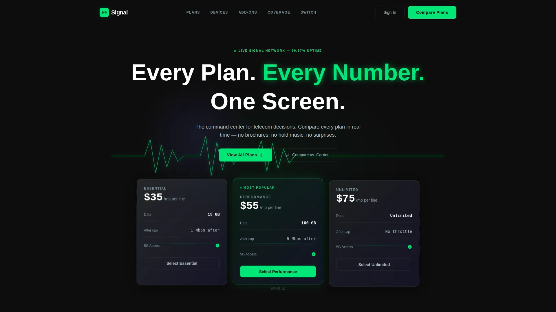
The landing page opens to a full-bleed black viewport. A phosphor-green signal pulse traces across the center, then expands to reveal three floating plan cards showing monthly price, data cap, and throttle threshold before the visitor scrolls. No lifestyle photography, no stock imagery.
Anchor Navigation Bar
A docked anchor nav sits below the hero and stays accessible as the visitor scrolls. The five links (Plans, Devices, Add-Ons, Coverage, Switch) let users jump directly to any section without losing their place on the page.
Interactive Plan Comparison Table
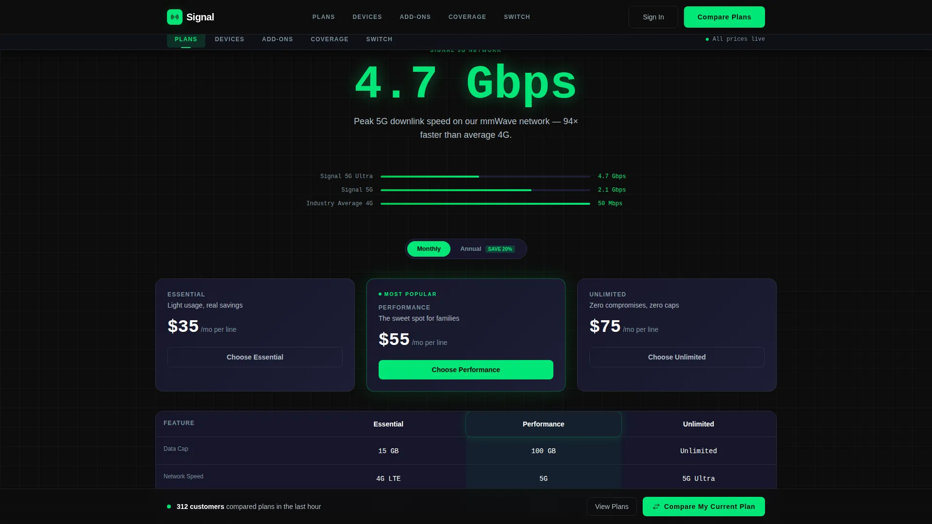
The Plans section opens with a single oversized stat ("4.7 Gbps peak 5G") and then expands into a three-plan comparison table with toggles. Visitors can drag any two or three plan cards together and watch cost differentials calculate live.
Savings Comparison Drawer
Clicking "Compare My Current Plan" opens a slim drawer. Visitors select their current carrier from a dropdown, set monthly spend on a slider, and adjust line count with a stepper. The savings result appears first. The email and ZIP form only appears after the result is shown.
Devices and Add-Ons Grid
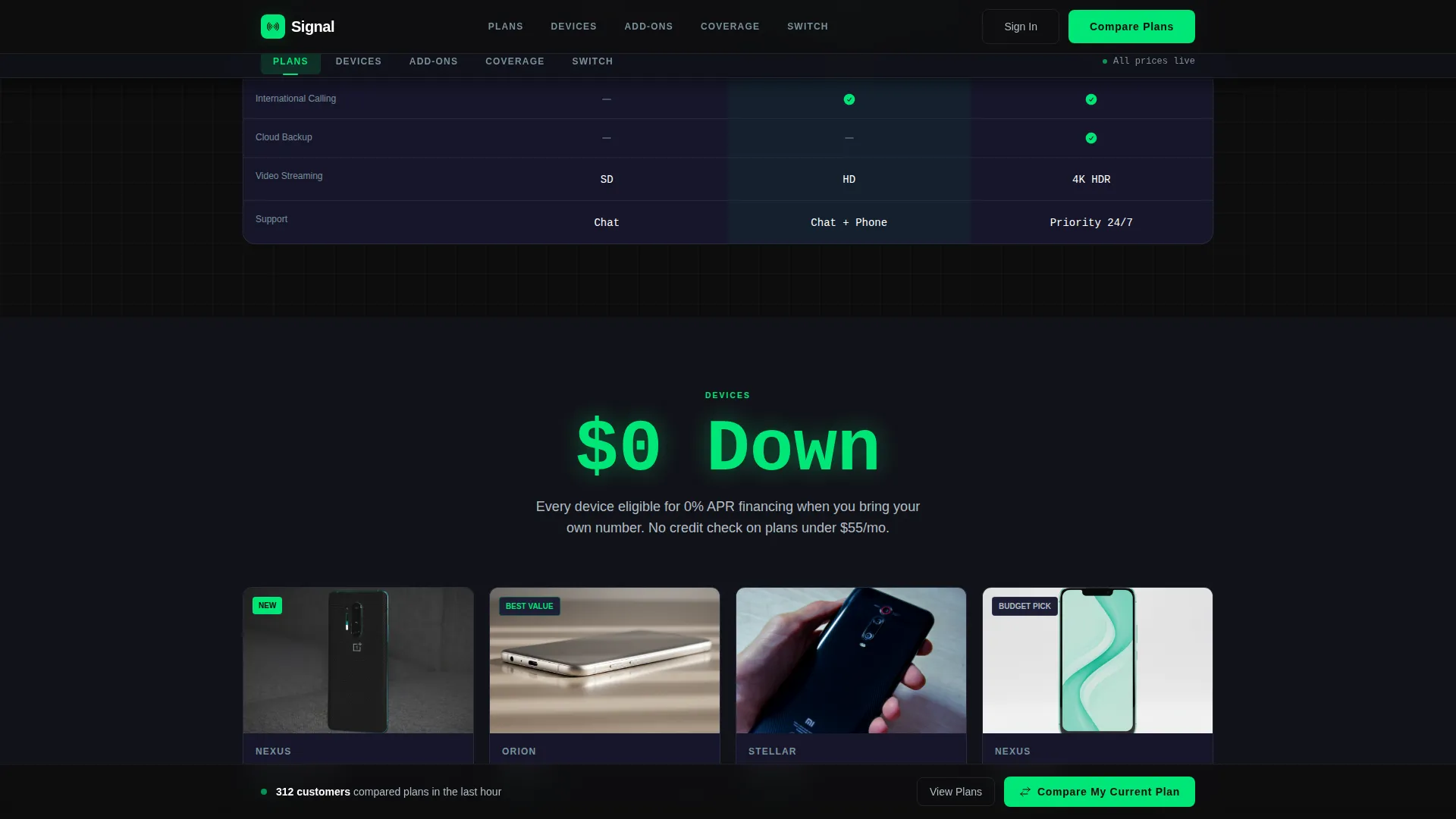
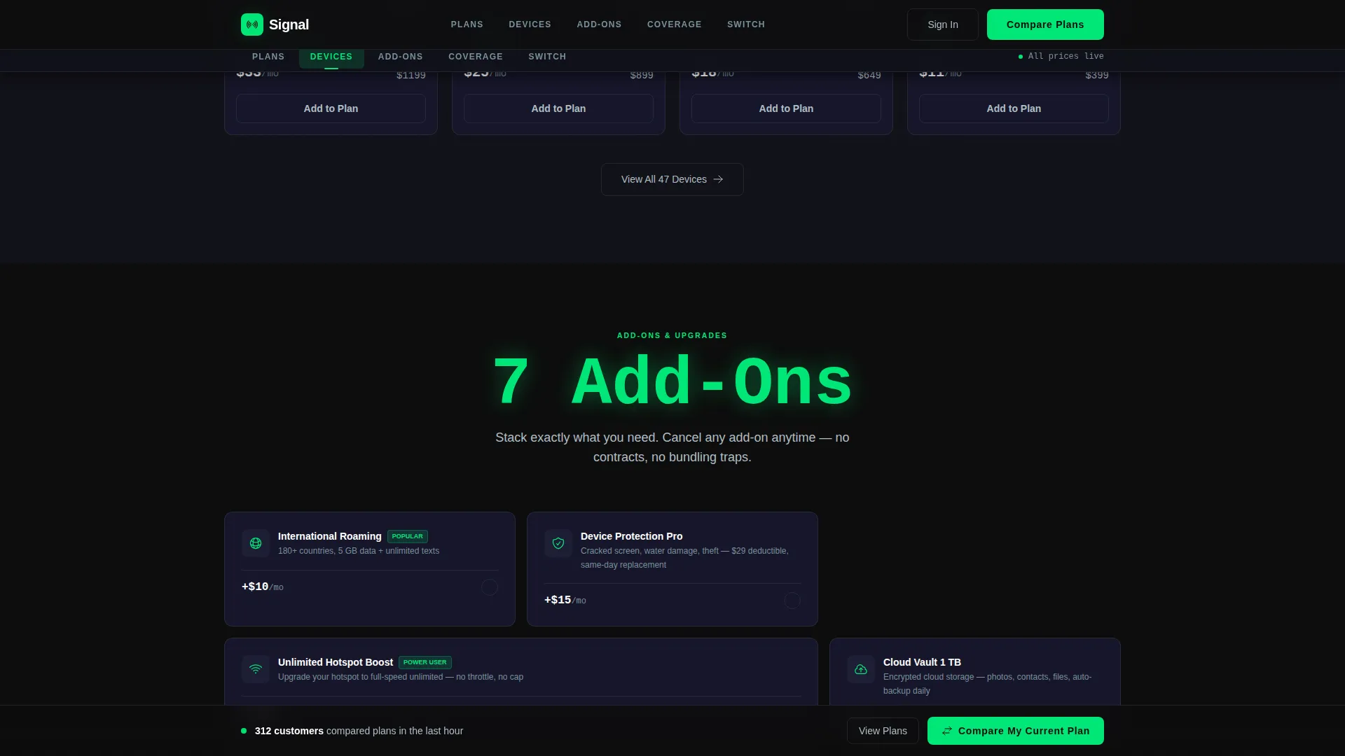
The Devices section displays a financing-tier grid with upgrade eligibility indicators. The Add-Ons section uses a bento-style grid layout covering hotspot, international, and security packages. Both sections follow the same punch-stat rhythm as the Plans section.
Sticky Conversion Bar
A persistent bottom bar carries the "Compare My Current Plan" call to action. It activates after the visitor passes the second spoke section and follows them through the rest of the page, keeping the conversion path always reachable.
Page sections overview
| Section | Purpose |
|---|---|
| Hero (Oscilloscope) | Opens with a full-bleed signal animation and three floating plan cards displaying key stats |
| Plans Comparison | Delivers peak-speed stat then expands into an interactive three-plan comparison table |
| Devices Grid | Shows latest device options with financing tiers and upgrade eligibility indicators |
| Add-Ons Bento | Presents hotspot, international, and security packages in a scannable bento-grid layout |
| Switch and Coverage | Displays average savings stat, comparison drawer, and an animated county-level coverage map |
| Footer (Single-Row) | Closes with a linear single-row footer for navigation links and legal copy |
Design & branding system
Signal's visual language is built entirely around precision and data legibility. Every color choice serves a functional role rather than a decorative one.
- Background tones run from deep cockpit black (#0D0D0D) to woven carbon gray (#1A1A2E), creating depth without distraction
- Phosphor green (#00E676) drives all interactive states, live-data accents, and progress indicators so the eye goes directly to what is actionable
- Titanium (#B0BEC5) handles secondary text, labels, and divider lines so supporting copy never competes with the glowing data layer; DM Sans covers all headlines and body text while JetBrains Mono renders every number and data value for precision readability
Mobile & speed optimization
The template is designed desktop-first to honor the command-center dashboard aesthetic, but it includes a responsive mobile fallback so the experience holds across screen sizes.
- Static content sections are built as server components, keeping initial load lean even with high-animation density
- Interactive calculators, the comparison drawer, and the savings counter run as client components, isolating heavy interactivity from the static render path
- GSAP ScrollTrigger animations activate on intersection rather than on page load, preventing unnecessary processing until each section enters the viewport
How this template helps you convert
Signal is structured so that every scroll step increases a visitor's confidence and reduces their reason to leave. The conversion architecture follows a deliberate sequence.
- The hero presents plan data immediately, so the visitor's first question ("what does it cost?") is answered before they read a single line of copy.
- Each spoke section opens with a hard stat before expanding into proof and selection tools, building credibility incrementally rather than asking for trust upfront.
- The savings result appears before any contact form, so the email and ZIP ask feels like a delivery rather than a demand, lowering the psychological cost of sharing personal information.
Other information about this template
Signal is part of the Dashboard Pro theme family and uses the Carbon Fiber color system. It is built for a telecommunications digital menu use case within a broader telecommunications digital presence context.
- Template style: Hub and Spoke with anchor navigation, making it suitable for telecom providers who need a structured single-page storefront rather than a multi-page site
- Typography pairing: DM Sans for all readable body and heading text, JetBrains Mono for all numeric and data displays, reinforcing the engineered cockpit aesthetic throughout
- Animation stack: GSAP ScrollTrigger handles scroll-driven reveals, SVG path draw powers the oscilloscope hero pulse, and counter animations drive the savings and speed-stat moments
Theme
Dashboard Pro
Creative direction
Stats-First Impact
Color system
Carbon Fiber
Style
Hub & Spoke (Anchor Nav)
Direction
Comparison/Versus
Page Sections
Oscilloscope Hero Animation
Anchor Navigation with Five Spokes
Live Plan Comparison Table
Savings Comparison Drawer
Devices and Add-ons Grids
Sticky Conversion Bar
Related questions
Who is this landing page template best suited for?
Can I customize the plan cards and comparison table with my own data?
Does the savings calculator require a backend or third-party service?
How does the sticky call-to-action bar behave?
Is the template desktop-only?



